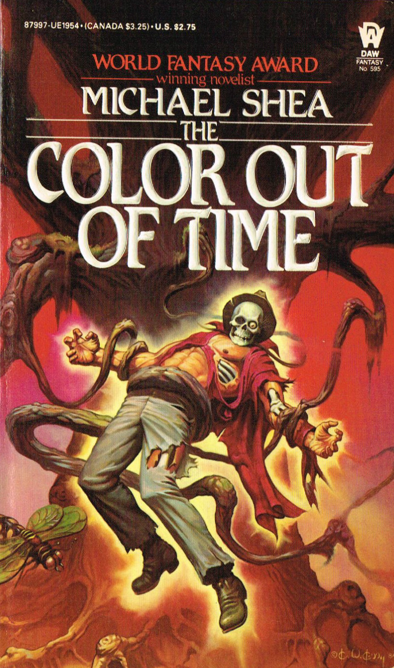
Vintage Treasures: The Color Out Of Time by Michael Shea
 I had a hard time deciding whether a book from 1984 qualified as vintage or not.
Then I realized that back in 1984, Ronald Reagan was still in his first term as president. A little checking also showed that the Nr. 1 song in September 1984 was “Missing You” by John Waite and the top film was Ghostbusters.
The final proof that 1984 can be considered vintage is that I was 23 years old back then. So, yeah, I figure that a book from 1984 qualifies as vintage.
So back in 1984, I stumbled across The Color Out of Time at one of our two bookstores in Newark, Ohio. (As added trivia, Newark is the real world counterpart of Gary Braunbeck’s haunted town of Cedar Hill, the fictitious setting for many of his stories). Anyway, this book was especially special back then, as Cthulhu Mythos-themed fiction was scarce. It wasn’t the thriving sub-genre that it is today. So when you found some you grabbed it, paid for it, and then ran like hell to get home and start reading.
Color is one of my favorite Mythos-related books, and it won’t be leaving my collection any time soon. Its rarity on the collectors market shows that those who have it aren’t in any rush to get rid of it. To me, that says a lot about the quality and re-readability of a book.
Michael Shea is one of those rare writers who don’t have a high output, but everything they do produce is of extremely high quality. I’ve been a fan since the 1970s, when I first read A Quest for Simbilis way back in junior high school.