Art of the Genre: When Great Art is actually Bad Art
I had a question proposed to me in my Saturday blog here on Black Gate concerning the multiple covers of Howard Andrew Jones’s The Desert of Souls. I’ll repost the question here.
I see a lot of photo-manipulation covers and hybrid photo/3D/digital painted covers, and I feel that a lot of them actually look pretty cheap and nasty. If I was Howard Andrew Jones, for example, I would be very happy with the first The Desert of Souls cover (100% digitally painted, stirring, full of life and movement, etc) and very unhappy with the second cover (a mish-mash of photo elements and, I don’t know? 3D elements? What’s going on with those faces? It almost looks like a romance novel cover.) What do you think about this trend?
I’m going to break this down into two different answers. The first will deal with The Desert of Souls, and the second on the current state of science fiction/fantasy covers in general.
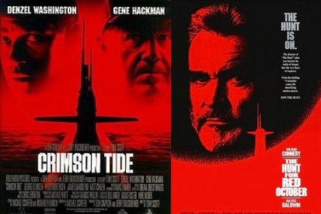
The question immediately reminded me of Hollywood and their great marketing machine. In 1990 Paramount Studios released Hunt for the Red October. The movie cost roughly $30 million to make and grossed $200 million worldwide, which is to say it was an enormous success. The movie poster featured a shadowy submarine, Sean Connery’s face, all in black and red, and the title in white lettering.
 Summer is almost here, and the time is almost right, for dancing in the streets. Or sitting your butt down in a movie theater to watch a big green thing in purple pants beat up aliens.
 The Alloy of Law
 Last weekend I went to Toronto to attend the
