Art of the Genre: When Great Art is actually Bad Art

I had a question proposed to me in my Saturday blog here on Black Gate concerning the multiple covers of Howard Andrew Jones’s The Desert of Souls. I’ll repost the question here.
I see a lot of photo-manipulation covers and hybrid photo/3D/digital painted covers, and I feel that a lot of them actually look pretty cheap and nasty. If I was Howard Andrew Jones, for example, I would be very happy with the first The Desert of Souls cover (100% digitally painted, stirring, full of life and movement, etc) and very unhappy with the second cover (a mish-mash of photo elements and, I don’t know? 3D elements? What’s going on with those faces? It almost looks like a romance novel cover.) What do you think about this trend?
I’m going to break this down into two different answers. The first will deal with The Desert of Souls, and the second on the current state of science fiction/fantasy covers in general.
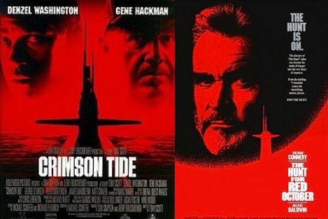
The question immediately reminded me of Hollywood and their great marketing machine. In 1990 Paramount Studios released Hunt for the Red October. The movie cost roughly $30 million to make and grossed $200 million worldwide, which is to say it was an enormous success. The movie poster featured a shadowy submarine, Sean Connery’s face, all in black and red, and the title in white lettering.
In 1995 Hollywood Pictures produced the movie Crimson Tide with Gene Hackman and Denzel Washington. Again, another submarine thriller with a cost of $53 million to make and a sturdy $157 million gross sales. In essence, Tide was a clone or piggyback of a successful movie, and to illustrate this, its movie poster featured a shadowy submarine, Hackman and Washington’s faces, all in black and red, with the title in white lettering.
This is mental marketing, and for Hollywood Pictures it worked very well. The lesson; if you can disguise yourself as a hit movie, you just might be a hit movie yourself when all is said and done.

In the case of Crimson Tide, great clone marketing actually turned out to make good money…
The same can be said for novels. There is a reason you see trends in the industry, and that if I walked into a bookstore in 1970, 1980, 1990, or 2000 the bulk of all books would resemble one another.
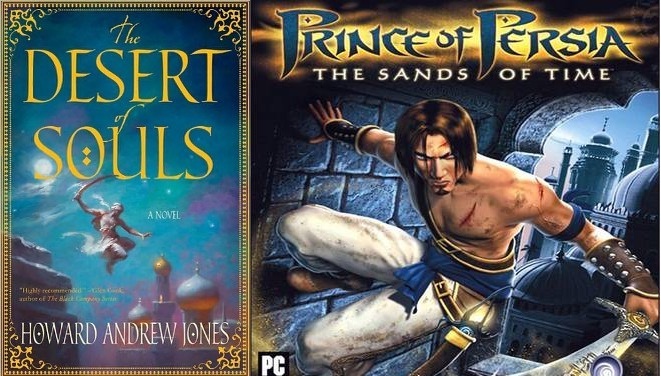
In the strange case of The Desert of Souls, the cover for a novel was directly impacted by a Hollywood blockbuster, or in reality, a huge Hollywood flop. In 2010 Disney released The Prince of Persia: The Sands of Time. Prince was a complete disaster, only currently topped by Disney once again with John Carter of Mars, and the marketing of this Arabian fantasy movie spammed the American marketplace and then putrefied on its shelves.
My son is 6 and loves Legos, so I’m up on the current Lego trends, and each time I go into a Target store and STILL see Prince of Persia Lego sets on shelves it reminds me what a disaster this movie was. Simply put, Prince of Persia didn’t sell in the theatre, and it sold even worse at brick and mortar retailers.
Enter the release of The Desert of Souls in early 2011… The cover mentioned above in the reader’s question as being so ‘stirring, full of life and movement’ suddenly harkens back to the disaster still languishing on shelves of B&N, Toys R Us, etc. That stirring movement, a roguish fellow leaping between middle-eastern buildings with a scimitar in Desert, suddenly becomes Prince Dastan from Prince of Persia, and negative marketing perception takes over. This is by no means the fault of the book, which has been fantastically reviewed, nor is the cover anything but beautiful, and yet it is intrinsically tainted by mere association with a failed franchise.
So, St. Martin’s Press, who produced Desert, now has a problem. Their Art Director picked a lovely cover piece, but because of unforeseen [which is debatable] circumstances, well outside the publishing industry, the company is now faced with a tough choice. They can stick with the original cover and hope the novel breaks the negative association marketing, or they can change the cover when the book goes into trade paperback format.
Obviously, they chose the second option, but in doing so they’ve had to compromise. The newest digital amalgamation cover falls in line with most books seen on shelves today, the fully painted look of the hardcover too expensive to replace. I will say this however, as much as the 2nd Desert of Souls cover might not hold up to the first, it’s still a strong showing compared to the bulk of most covers I see rolling off the presses these days. It also holds less of a connection to Prince, so that also has to give it a plus.

Thus, in the case of the Desert of Souls hardcover release, great art actually turned out to be bad art…
As for the trend in science fiction and fantasy covers today, I’ll go on record once again and say I’m not a fan. I walked into Mysterious Galaxies here in L.A., a fine bookstore specializing in Horror, Science Fiction, and Fantasy only, and was both moved and saddened. Galaxies is a phenomenal store for a guy like me, and I could literally spend hours in it each time I go, but the more I walk the isles and look at the covers, the more I feel something has been lost in the industry.
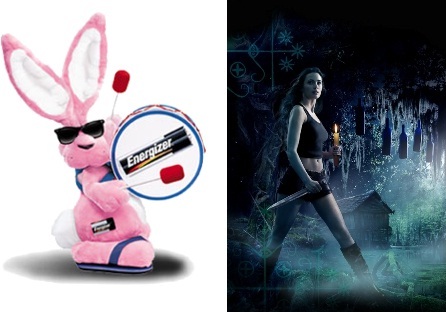
There is a line I’m often reminded of in the movie Gross Point Blank when Alan Arkin’s therapist character is talking with John Cusack’s assassin character. Cusack says he keeps having a dream where he is the Energizer Bunny, and Arkin says something like this, ‘No Martin, it’s a horrible dream! The bunny has no anima, no spirit… it just moves around banging on those cymbals all day long!’
To me, that’s what I see on the bookshelves today, an Energizer Bunny. There is no anima there, no spirit, just a splash of digital ‘paint’ and a woman’s leather-clad ass. For the most part, there are currently three types of covers in fantasy and science fiction.
- 1. The Pissed-Off Vixen: You know the one, the queen of Urban Fantasy. She must be wearing leather. She has to have a weapon in hand. She needs to either expose her midriff or wear a mini-skirt and boots. These are all digital touch-ups over physical models.
- 2. The Anime Star: Japanese animation continues to grow in the U.S. as covers start to feature more and more cartoony characters with big eyes and small mouths in fully digital anime style art.
- 3. The Digital Oil: This new wave started in 2003 and continues today. It’s painting on a computer tablet using the same techniques as you would with oil. A computer generates the final image, and in some cases you have a very hard time of telling if the image is digital at all. However, I see these pieces a just a bit too ‘perfect’, too polished, or sometimes taken in the opposite direction and too vague as portrayed in ‘shadow’ covers where everything is all hazy figures, blades, banners, or battle.
It was for the above reasons that I chose to found Art of the Genre as a publishing house. I could no longer sit back and watch the industry lose itself in a miasma of soulless covers. As long as I can remember reasonable variation, the palpable flavor of oil, and the characterization of hand-crafted cover art, I’m going to strive to keep it alive.
I hope that answers the above question, and as always thanks for dropping in!
I brought up the new desert of souls cover when Howard posted the picture for the paperback. I love the hardback cover, it’s what really motivated me to try the book. At the same time I know nothing about price of Persia. And I didn’t go see the movie because I can’t stand jake ‘how ever you spell his last name’
I do not like the new cover but I figured I was in the minority. I think Howard even replied to my post saying that the saw a sales increase with the new cover.
I think Wayne Reynolds only uses oil paint. Maybe that’s why I enjoy his work so much…
Glenn: It was an interesting story concerning Howard’s book, and I was glad to field it. As for Wayne Reynolds, he uses acrylic, which isn’t oil, but it’s still ‘real’ and gorgeous.
Oh boy…
About Desert of Souls and its covers, the new cover (the one with the cartoonish figures) is much more reminiscent of the movie/game Prince of Persia, than the hardback’s (the one with the figure leaping from the roof with the shamshir held high).
The hardback reminds me more of an old Arabian Nights/Sinbad movie (or book cover).
So to me, if they were actually trying to distance themselves from a box-office flop by changing covers…they flopped.
BTW – The Hardback cover is wonderful…the paperback one,…no offense to Mr Jones, is rubbish. Wouldnt stir me to pick it up on a dare.
But…looking at the new cover a few minutes…if it didnt have the cartoon figures hovering above the title lettering and if it had a slight zoom on the city, it would be a nice cover…those figures are what destroy it for me.
Bah…Maybe I am just getting old…
The Red October / Crimson Tide cover theme even got recycled onto a nonfiction book:
http://www.amazon.com/Stalking-Red-Bear-Submarines-Operations/dp/B0046HAJKY/ref=pd_sim_b_3
Lazy, lazy, lazy.
I’m with TW. The new Desert of Souls is cover is MUCH more video game-like and reminiscent of Prince of Persia than the original. The two guys have a blandly digitalish appearance and the brownbrownbrownbrownbrownbrown tones of the art are very much in keeping with modern video games.
TW: You must be with me concerning covers without spirit. When you do digital art in the way the 2nd DoS cover was done, it does look like you’re playing a version of BioWare’s newest MMORPG. That doesn’t scream ‘novel’ to me either. Still, both covers are ill timed and situated where Prince was concerned…
Lugo: Nice catch on Stalking the Red Bear! Lazy indeed, and to think its even in novel form is hilarious!
Andy: I would agree with the coloring, but at least the new cover didn’t have any ‘scimitar leaping’, which I think screamed ‘Prince of Persia’ to buyers in all markets. The violet of the hardcover is gorgeous, the browns of the trade paperback don’t enchant in the same fashion.
I also prefer the old cover, but I know that my tastes are not congruent with most people’s. (I actually would’ve liked it just as well if it was just the minarets without the leaping guy. It has a bit of an Edward Dulac(?) feel to it.)
Joe: I would agree, the first cover had character, but not the correct market 🙁
And the Pissed-Off Vixen needs tattoos. Lots of tattoos, preferably on the most improbable of the exposed parts of her body.
At least the Age of Headless Women seems to be waning. Is it that the focus groups said it was easier to get the buyer to identify with the protagonist if the protagonist had no face, or is it that there’s a rising generation of cover artists who can’t do faces to save their lives? Maybe it’s about the speed and ease (and therefore low cost) of retouching photos of models.
Clearly I’m an outlier, because any trend this pervasive with this much staying power must be selling books to _somebody_, but the of the fastest ways to put me off a book in the SF/F section is to put headless people on the cover, male or female.
I just prefer for humans to retain their heads. Call me prissy.
Sarah: You are SO prissy! 😉 I TOTALLY forgot the people without heads… probably because I hated it so I wiped it from my mind 🙂
Thanks very much for taking my suggestion on board. This is a very interesting article. I do disagree with a few of your points, though. For example, I don’t believe the Prince of Persia film was as disastrous as you’ve said (For example, it’s technically the ‘most successful’ film adaptation of a videogame ever and it did make at least $150 million in worldwide earnings); and I’d consider it more ‘forgettable’ than ‘regrettable’ as far as movies go. So I’d call into question its ability to negatively affect the sales of DoS by association. (I’d even argue that the second cover is MORE evocative of the Prince of Persia film). Perhaps it was only a problem for marketing types?
And anime-style cover art? I don’t think I ever seen a fantasy or sci-fi novel with anime-style cover art. Do you know of any examples?
Yes, I’m pointing out some of my disagreements with what you’ve written, but it’s mostly just to justify my own existence and not to invite you into some sort of discussion about it all. ;D
Also, this business about publishers not wanting to fork out money for an actual digital painting reminds me about some of the things you discussed in the ‘Outsourcing Art’ article. But of course that’s a whole other kettle of fish.
Cephalophore: Persia was a disaster. It cost $200 million to make, not to mention the untold millions in marketing. $150 million was the worldwide gross, meaning the ticket cost, which the studio doesn’t get anywhere close to 100% of. All told, I’m going to say Prince lost Disney upwards of $200 million.
That being said, those numbers don’t matter, what matters is the enormous back stock of Prince product languishing in discount bins for months at retailers. B&N took a bath on Prince, so their buyers are NOT going to purchase a product that resembles Prince in any fashion when they’ve still got tons of Prince inventory stinking up the shelves at the front of their stores with red tags on them.
Next time I’m at Mysterious Galaxies, I’ll snap shots with my phone, although I’m not sure where to send the pictures 😉
I never said publishers didn’t want to fork over money for digital paintings. They do it ALL the time. Collectors don’t like digital because there is no original to keep secreted away in their home. Publishers don’t retain originals anyway, so why would they care. All I was saying is that a Publisher wants to buy ONE cover, not have to recover a book on it’s initial run because margins are too tight. In this manner, they would have to cut corners on the production value of a 2nd cover.
You know, the more I think about it, the more I doubt that the Prince of Persia thing is the actual excuse for the new Desert of Souls cover. Because seriously, the new cover is so much closer in appearance/style to the game/movie artwork compared to the old one that excuse holds no water.
I am actually beginning to wonder if it is because the hardback cover looks “old fashioned” and the new one looks like just one more cover among the dozens of other covers with the same style of bad artwork.
TW: Trust me, it was Prince of Persia. I can’t go into it, my above isn’t a hypothesis.
All I will say is if that was the publisher’s line, I will question their marketing skill and/or their veracity…
😉