Browsed by
Category: Art

A Tale of Two Covers: Stand on Zanzibar by John Brunner

A Tale of Two Covers: Stand on Zanzibar by John Brunner

Stand on Zanzibar-small Stand on Zanzibar 1976-small

For this installment of A Tale of Two Covers, we look at my favorite book by one of my favorite writers: John Brunner’s Hugo Award-winning Stand on Zanzibar.

Stand on Zanzibar was published in 1969. I read it about a decade later, when I was in my mid-teens, and it pretty much blew my mind. It’s set in the far-distant future of 2010, when the Earth groans under the weight of a staggering seven billion souls, terrorists are the major threat facing America, China is a new economic superpower, erectile dysfunction and depression are treated with pills, and the head of state is President Obomi.

Pretty clear-eyed predictions (over the years, in fact, Brunner has been lauded for his amazing forecasting). But it wasn’t his predictive skills that drew me to the book — it was the brilliant structure. Brunner painted an astonishingly vivid picture of the future of our planet by interspersing his chapters with numerous brief vignettes, news items, book quotes, and snapshots of life all over the world. It was the most believable and compelling rendition of the future I’d ever encountered, and it has stayed with me for decades.

Read More Read More

Screw ISIS! Here Are Five Great Reasons to Visit Brussels

Screw ISIS! Here Are Five Great Reasons to Visit Brussels

Belgian_Flag_(5089051595)

These colors don’t run! Photo courtesy Wikimedia Commons.

Well, the pseudo-Muslims are at it again, killing innocent people and trying to turn one of the world’s great faiths into a whacked-out death cult. It’s been 24 hours since the Brussels attacks and now people are mourning, the politicians are posturing, and the police are hunting down suspects. A few extra bombing runs against Islamic State are probably being planned too.

It is, sadly, all too predictable. We’ve seen this before and we will see it again. So I’d like to buck the vibe and take a look at what Brussels has to offer visitors. It’s a beautiful European capital that’s all too often overlooked by people headed to more popular destinations such as London and Paris. That’s a shame, because I’ve visited Belgium several times and have always enjoyed my visits to the city. It’s a fun place with great food, awesome beer, and plenty to see. The fundamentalists haven’t changed that and never will. Here are five things you won’t want to miss.

Read More Read More

The Rock-Hewn Churches of Lalibela, Ethiopia

The Rock-Hewn Churches of Lalibela, Ethiopia

DSC_0708

The Church of St. George, cut into the bedrock at Lalibela

Last week I discussed the unique blend of Baroque and Abyssinian styles that created the Castles of Gondar, Ethiopia. I’ve also written on the splendid ancient civilization of Axum in the same country. But Ethiopia has a lot more to offer than that. The most famous historic sites, and certainly the most impressive, are the rock-hewn churches of Lalibela.

In the late 12th century, much of what is now northern and central Ethiopia was under the rule of the Zagwe dynasty. Ethiopia had been Christian since 330 AD and had developed its own liturgy, practices, and traditions. Like with all other Christian lands, many Ethiopians dreamed of going on pilgrimage to Jerusalem and Bethlehem. For some time this was possible, although it involved a long trek overland to catch a boat on the Red Sea, then another trek across the desert to get to the holy cities. But as the Crusades turned the Holy Land into a battleground, it turned a difficult journey into an impossible one. The rulers of the Zagwe dynasty came up with a unique solution.

Read More Read More

A Tale of Two Covers: The Last Page by Anthony Huso

A Tale of Two Covers: The Last Page by Anthony Huso

The Last Page Anthony Huso-small The Last Page Anthony Huso paperback-small

I bought the hardcover edition of Anthony Huso’s debut novel The Last Page after reading Matthew David Surridge’s review in Black Gate 12.

The Last Page is a high fantasy steampunk novel, and a love story. We follow the sexually charged relationship between the improbably named Caliph Howl, heir to the throne of the northern country of Stonehold, and a witch named Sena. The two of them meet at university, go their own ways, and then come together again after Caliph has become king and Sena has acquired a vastly powerful magical tome…  what really makes the first book work is its language. The prose is strong, quick and dense in the best ways. The diction, the word choice, is inventive; the imagery is both original and concise. At its best, Huso’s language recalls Wolfe or Vance…

The last time I was in a bookstore I did a double take when I saw the trade paperback edition, which has been given a dramatically different cover. The hardcover edition (above left) was packaged as an urban fantasy, with a beautiful woman with glowing eyes on the cover. The paperback (at right) has been completely redesigned as a fantasy adventure novel, showing a huge fleet of airships massing over a sprawling fantasy landscape. If you’re not paying attention, it’d be pretty easy to mistake it for a completely different book.

Read More Read More

Acquiring Michael Whelan’s Cover for The Bane of the Black Sword

Acquiring Michael Whelan’s Cover for The Bane of the Black Sword

Michael Whelan The Bane of the Black Sword-small Michael Whelan The Bane of the Black Sword DAW-small

I thought I’d move a bit further ahead in time tonight than my usual pulp related posts, though it does have a bit of a pulp connection for me. I was discussing this piece with a friend of mine earlier today, so I figured I’d post it. By Michael Raymond Whelan, this is the cover for The Bane of the Black Sword by Michael Moorcock, featuring the one and only Elric of Melnibone (click the art for bigger versions). Both Deb and I loved the Elric books when we read them as teenagers, in the DAW editions featuring all those great Whelan covers, and when we had the chance to pick this up, we jumped at it.

We bought this in a hotel room many years ago, from our friend Randal Hawkins. He and his wife Donna drove up from the K.C. area with the painting, and we met them at a hotel about half way between there and Chicago to do the deal. It wasn’t the only time we did a deal like that in a hotel room with Randal — we bought other art from him that way as well, over the years, as well as many pulps. Hence the bit of a pulp connection for me. Those were good hotel rooms! Randal passed away much too young, but we have fond memories of visiting with him and Donna in K.C., looking at their great art collection, as well as their place in Las Vegas. And we often think of him when we look at this piece.

Frank Kelly Freas Illustrates A. Bertram Chandler’s “The Far Traveller”

Frank Kelly Freas Illustrates A. Bertram Chandler’s “The Far Traveller”

Frank Kelly Freas The Far Traveller-small Frank Kelly Freas The Far Traveller b&w-small

Analog August 1976-small
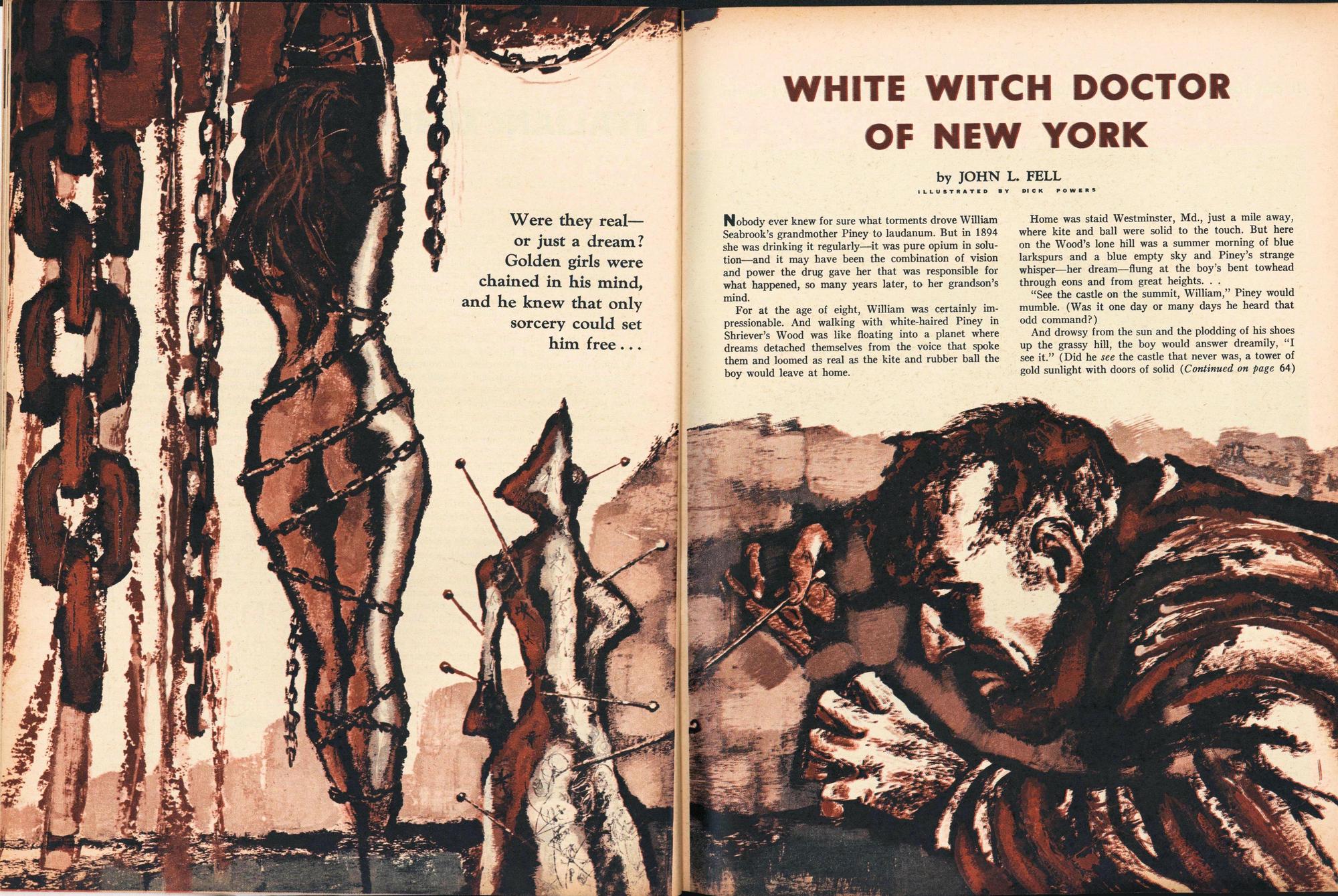
I thought I’d go back to Frank Kelly Freas today, and post one that most folks won’t be familiar with, at least as it looks in the original. This was an interior illustration by Freas for the August 1976 issue of Analog, illustrating A. Bertram Chandler’s “The Far Traveller” (click on the images above for full-size versions). This was one of the tales in Chandler’s Commander Grimes series. The Analog cover, by John Schoenherr, is at right.

Since it was an interior, it was printed in black and white (which you can see above), but the original was in color. I assume Freas did that for the shading effects he’d get when it was reproduced in black and white, but perhaps one of my artist friends can chime in with their thoughts on that.

Art from the SF digests during that period holds a special place for me. This was the summer when, as a 12 year old, I discovered that SF digests were still being published. A few months earlier, I’d found my first SF digests (primarily F&SF from the 1950’s and early 1960’s) at a garage sale in a large barn. But in May 1976, I was spending the day at my dad’s office, and after lunch I went to the drugstore across the street.

There I found the June 1976 issues of both F&SF and Analog, and snapped them up in a heartbeat. After that, I bought them and the other couple of digests then being published religiously. I was fortunate enough many years ago to acquire the cover to that June 1976 Analog (which I’ll post at some point), but the cover for the June 1976 F&SF continues to elude me. But one day!

Witch Doctors and Mind-Reading Sleuths: Richard Powers’ Interior Art for 1950s Men’s Adventure Magazines

Witch Doctors and Mind-Reading Sleuths: Richard Powers’ Interior Art for 1950s Men’s Adventure Magazines

Richard Powers White Witch Doctor men 1957 01-small

In going through several hundred issues of men’s adventure magazines for this year’s upcoming Jerry Weist estate auction at the Windy City Pulp and Paper Convention, I came across the interior illo above by Richard Powers. It’s from the January 1957 issue of Men.

I was actually surprised how many great artists appeared in the issues of Men that I went through, including Bama, Saunders, De Soto, Belarski and many, many more. Some really great art in there!

Read More Read More

Tracking Down Frank Kelly Freas’ Planet Stories Cover for “The Ambassadors of Flesh”

Tracking Down Frank Kelly Freas’ Planet Stories Cover for “The Ambassadors of Flesh”

Planet Stories Summer 1954-small

A little while ago, I posted one of our two big IlluxCon purchases — a Hubert Rogers Astounding cover that we had arranged to buy over the summer from a friend, and the deal was completed at IlluxCon. This is the other major piece we picked up there, also from the same friend (click for a bigger version).

It’s by the great Frank Kelly Freas, and is the cover for the Summer 1954 issue of Planet Stories. It illustrates “The Ambassadors of Flesh” by Poul Anderson, which was the third of his Dominic Flandry stories. Needless to say, Flandry saves the day, and the girl.

Like all of the original Planet Stories covers I’ve seen, the block where the magazine’s logo went was just painted as a solid color. My friend had the logo scanned and printed onto mylar, which is laid in on top of the painting as it’s framed, so the logo is actually not on the artwork. Freas won the first of his ten Best Artist Hugos in 1955, about a year after this painting was published.

On a side note, artist Herman Vestal, a Fiction House regular, contributed a double-page spread which ran as the interior illustration for this story. Several years ago at Windy City, I managed to pick up the left half of that illo (still looking for the right half!), which has Flandry in a good action scene. I’ll post that down the road.

Bradley W. Schenck Shows Us Grace Keaton on Her Aeroflite Flying Scooter

Bradley W. Schenck Shows Us Grace Keaton on Her Aeroflite Flying Scooter

Grace Keaton on her Aeroflite

Over on his Webomator blog, artist Bradley W. Schenck has posted a work-in-progress I like a lot, part of his ongoing Retropolis art series. He tells this brief story to go along with the painting.

Here’s Grace Keaton on her aged but serviceable Aeroflite flying scooter; it’s a work vehicle, standard issue for couriers in the Retropolis Courier Service. Grace makes her deliveries on the notoriously dangerous Route X and she’s the longest-lasting (in fact, the only surviving) courier on that route.

Route X couriers make four times the wages of normal couriers and Grace works half days. That’s a comfortable living for a graduate student. Unless you weaken. But somebody has to deliver along Route X. How else would the denizens of Retropolis’ Experimental Research District get their ‘mildly’ toxic chemicals, their suspiciously glowing minerals, or their generally illegal biological specimens?

See all the details here.

Ancient Lixus: A Roman City in Morocco

Ancient Lixus: A Roman City in Morocco

The amphitheater of Lixus. Photo courtesy Almudeana Alonso-Herrero.
The amphitheater of Lixus. Photo courtesy Almudena Alonso-Herrero.

Happy New Year! Or Sana Sayeeda as they say in Arabic! I’m back from another trip to Morocco, and this time besides staying at our usual place in the medina of Tangier, I and my wife also visited the ancient city of Lixus on Morocco’s Atlantic coast.

Like many cities of Roman Morocco, it’s been inhabited since prehistory, and became a Phoenician colony starting around the 8th century BC. The Phoenicians called Lixus Makom Shemesh (“City of the Sun”). It is believed to be their southernmost colony, but considering the many good bays and coves that stud the Atlantic coast to the south, I’m wondering if an archaeological survey might uncover more.

The ruins stand on a hill overlooking Oued Loukos estuary and the city was an important fishing port as well as a fish processing and salt panning center, the products then being shipped to the Mediterranean. Salt is still being panned in this region today.

Read More Read More