An Adventure to be Had: A Journey Through the Art of Darrell K. Sweet
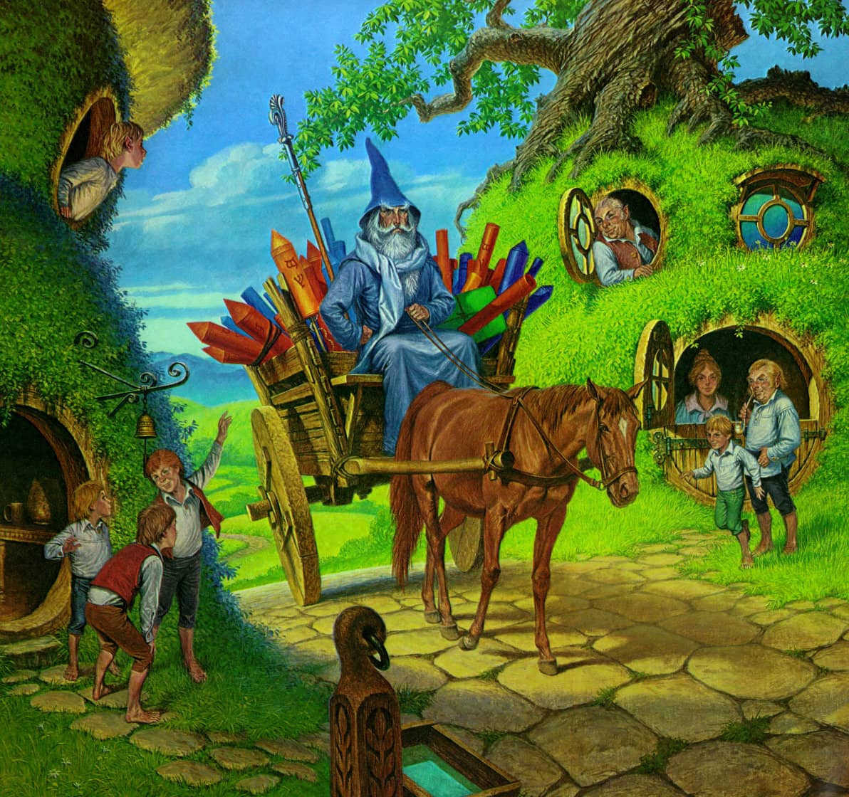
The Arrival of Gandalf, Darrell K. Sweet (2010)
“A Sweet cover promised an adventure to be had.” — Irene Gallo, Tor.com
Growing up a child of the late 60s, I stumbled my way into fantasy novels in the dying years of the 70s and through into the 80s. Across this time, there was one man who influenced the books I chose to read more than any other, and by quite a significant margin. No, it was not a particularly skilled author, or a philanthropist uncle who funded my addiction, nor was it a sibling or friendly role model who led by example. The man who guided me through the fantasy/sci-fi landscape of my youth was Darrell K. Sweet, a cover artist.
[Click the images for sweeter versions.]
Yes, my adolescent self committed the ultimate literary sin and judged every book by its cover! It’s not that I purchased each book that featured Sweet on the cover, as that would have been impossible given my meagre pre-teen budget, nor did I only purchase books with Sweet on the cover. But, if I spied his recognizable artwork, then the book would jump into my hands, and as often as not find its way onto my self-built ‘brick and plank’ bookcase.

Darrell K. Sweet
The Artist
If the name Darrell K. Sweet is unfamiliar to you, I can all but guarantee that, if you’re a fan of speculative fiction, you have seen his artwork, and there’s a better than even chance he is lurking somewhere in your collection.
Sweet was responsible for a respectable portion of the speculative fiction covers for Del Rey, Dell, Ballantine, Bantam, Tor and other publishers in his time, and was active in the genre for almost 40 years. Overall, he produced over 1000 paintings in his career and in his busiest periods delivered a published book cover every two weeks.
This is all the more remarkable when you consider the quality of Sweet’s pieces (all done strictly by hand), the fact that he was expected to read each novel in advance of commencing the work, and often had to incorporate alterations from the authors and publishers, sometimes completing two or more paintings for each cover. Accordingly, Sweet learned to perfect the use of acrylic paints in his artwork, as the drying times required for oil paint would have prevented him from meeting his deadlines.
Sweet’s journey into fantasy cover art was likely an unexpected one for him. He was born and raised in New Jersey, and took to art from a young age with his primary interests being western and wilderness motives. Most of his early work draws on these themes, and he continued to produce paintings with Western and Native American subjects throughout his life. He was rarely seen without a suitably styled hat and jacket and eventually realized his dream by relocating to join his son in Wyoming. He remained there, working and living, until his death in December 2011.
Sweet’s legacy includes over 3000 images, and cover art for more than 70 different authors, including a string of fantasy series that places him firmly in the upper echelon of artists in the genre.
Some Self-Imposed Guidelines
The covers that follow are pulled from the string of fantasy series that led me through the genre, from 1978 through to the turn of the millennium. I have decided to highlight one cover from each series that I was attracted to due to Sweet’s art, and to group them based on the decade in which the first book appeared.
It’s not my intention to critique the writing of each series, or the authors, or to analyze the finer points of Sweet’s use of color and composition. I don’t proclaim to be an artist, or to know any more than the average person about art. But, I have seen many thousands of covers from my time employed in various book shops, and have been a fan of the genre for almost as long as Sweet painted covers. And to embrace the cliché, I know what I like.
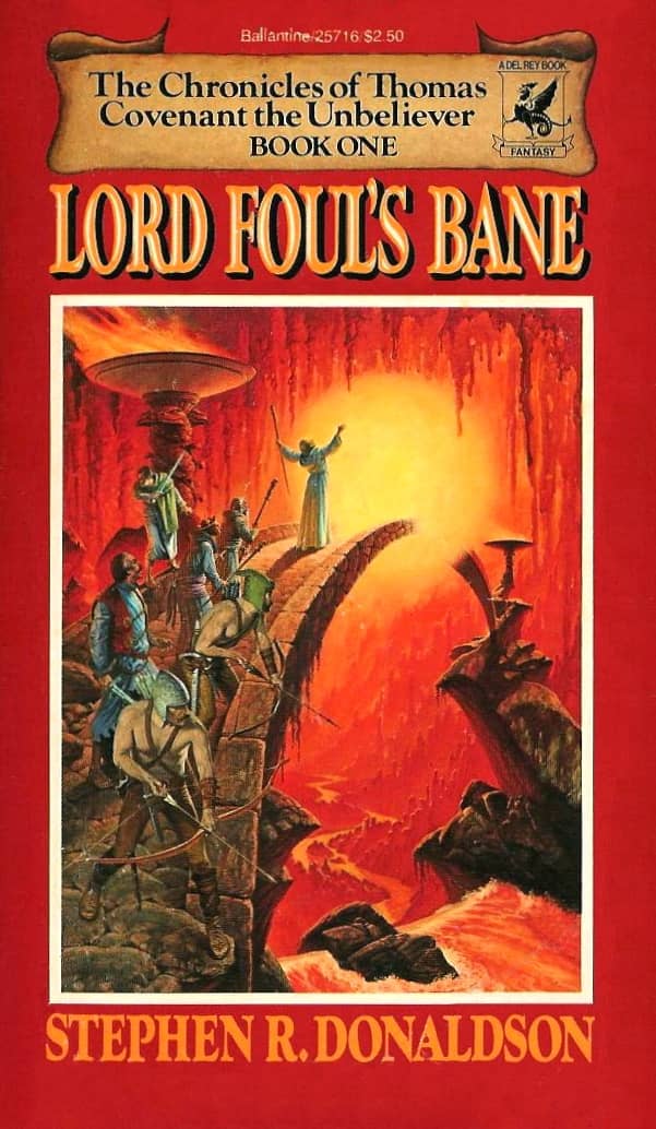
Lord Foul’s Bane by Stephen R. Donaldson (Del Rey, 1978)
Sweet in the 70s
The Novel Series
The Chronicles of Thomas Covenant by Stephen R. Donaldson
The first time I became aware of the effect of Sweet’s art was one rainy lunchtime in my middle school library, where Stephen R Donaldson’s Lord Foul’s Bane stood in all its glory on the top row of a spinning wire display. Archers and swordsmen stood behind a wizard as he attempted a spell in middle of a glowing bridge, leading to who knows where. I had to find out. As it turns out, it led to two other novels in short succession, as I completed the first trilogy of Thomas Covenant.
The trifecta of covers are an amazing set, the red, blue, and green mirroring the 3 primary colors of light. Additionally, at Sweet’s suggestion, the art is framed by their incumbent color, producing a classic effect, which renders them as possibly the most recognizable of his covers. Sweet continued the run with a set of painted covers for the second trilogy in the series as well.
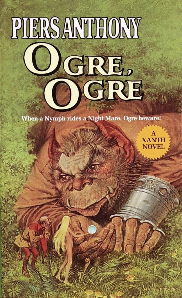
Ogre, Ogre by Piers Anthony (Del Rey, 1982))
Xanth by Piers Anthony
There’s no series that produced more Sweet covers than Piers Anthony’s Xanth. Ironic, really, in that of the first four books in the series, Sweet only provided the cover for the third, Castle Roogna. Sweet took over the run at number five, Ogre, Ogre, and provided 31 consecutive covers for the series up until his death.
Fitting then that Ogre, Ogre is my choice of cover. It’s design was so admired by Anthony, that he prominently included it in the collage of Sweet’s work it for his autobiography. Anthony also provided the forward to the excellent book on Sweet’s work, Beyond Fantasy, the Art of Darrell K. Sweet, even though the two had never met in person.
This all sits strangely at odds with the fact that Sweet was sometimes uncomfortable with Anthony’s work, and crafted his covers appropriately. It has been said that the more fantastic the subject matter, the more accomplished Sweet’s painting. Nowhere is this more apparent than in Xanth.
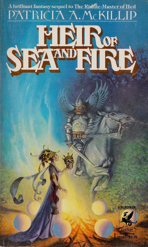
Heir of Sea and Fire by Patricia A. McKillip (Del Rey, 1978)
The Quest of the Riddle-Master by Patricia A. McKillip
The Riddle-master series appears here out of chronological order to reflect the fact that I didn’t find the series until after reading the others mentioned above. This was the first of Sweet’s major fantasy series, and in my opinion, it remains the best trilogy of his work. His use of a flat color palate for the backgrounds shares the style of his science fiction work of the earlier 70s, while the striking color and placement of the primaries makes them leap off the page and sparks immediate interest in their story.
My choice of Heir of Sea and Fire is because of the interplay between the figures and the corresponding depths of color. Cases could be made for either of the others in the series, and I was particularly drawn to Harpist in the Wind for its possible homage to Rembrandt’s The Philosopher.
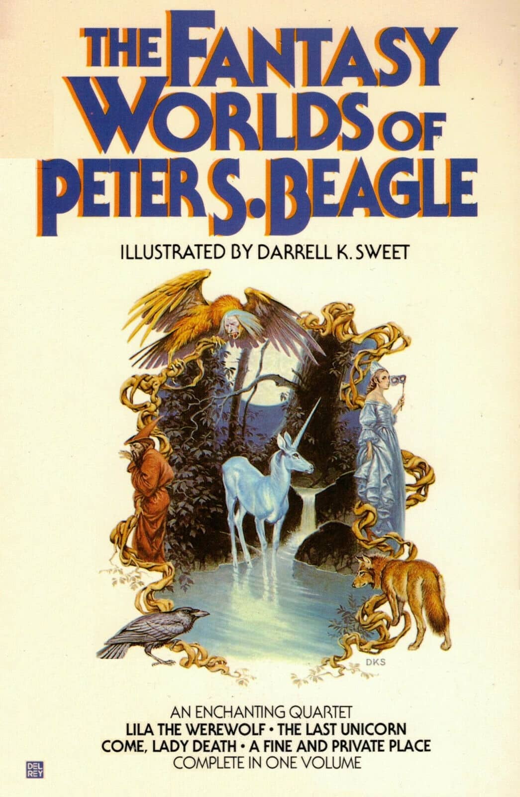
The Fantasy Worlds of Peter Beagle (Del Rey, 1979)
An Unignorable One-Off
The Fantasy Worlds of Peter S. Beagle
I know, the rules said I would only cover series of novels, but the art on some stand-alones and compilations is too good to ignore. This particular cover was released into the wild in 1978 by The Viking Press (and reprinted in paperback the next year by Del Rey), and combines elements that Sweet would use successfully throughout his career, including the framing of the artwork, this time accomplished with an impressive menagerie of subjects from the volume.
At the center of it all is the moonlit unicorn, which takes advantage of Sweet’s love of all things equine, a result of his western influence. Even though I owned the trade paperback version, I wished it were even larger!
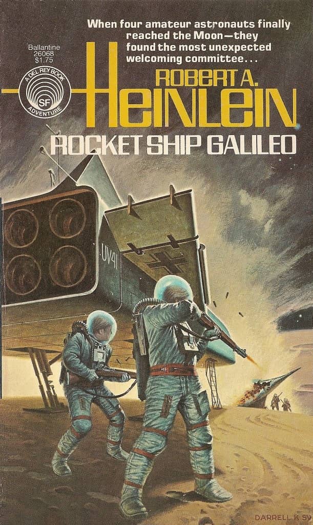
Rocket Ship Galileo by Robert A. Heinlein (Del Rey, 1977)
One More Thing…
Although the bulk of Sweet’s work involved producing covers for fantasy novels, he actually entered the speculative fiction genre through his work in science fiction. Throughout the 70s, and less often, into the 80s and 90s, Sweet’s covers adorned books for the likes of Phillip K Dick, Theodore Surgeon, Frank Herbert, Isaac Asimov, Fritz Leiber, Poul Anderson, Anne McCaffrey, Philip José Farmer, L. Sprague de Camp, and Roger Zelazny, while producing a series of covers for the affectionately named ‘Heinlein Juveniles.’
These science fiction covers tended to be comparatively drab in nature, though still interesting, with a palate that reflected stark landscapes and monotone technology. Perhaps this is, in part, what led to his shift into the prismatic world of fantasy.
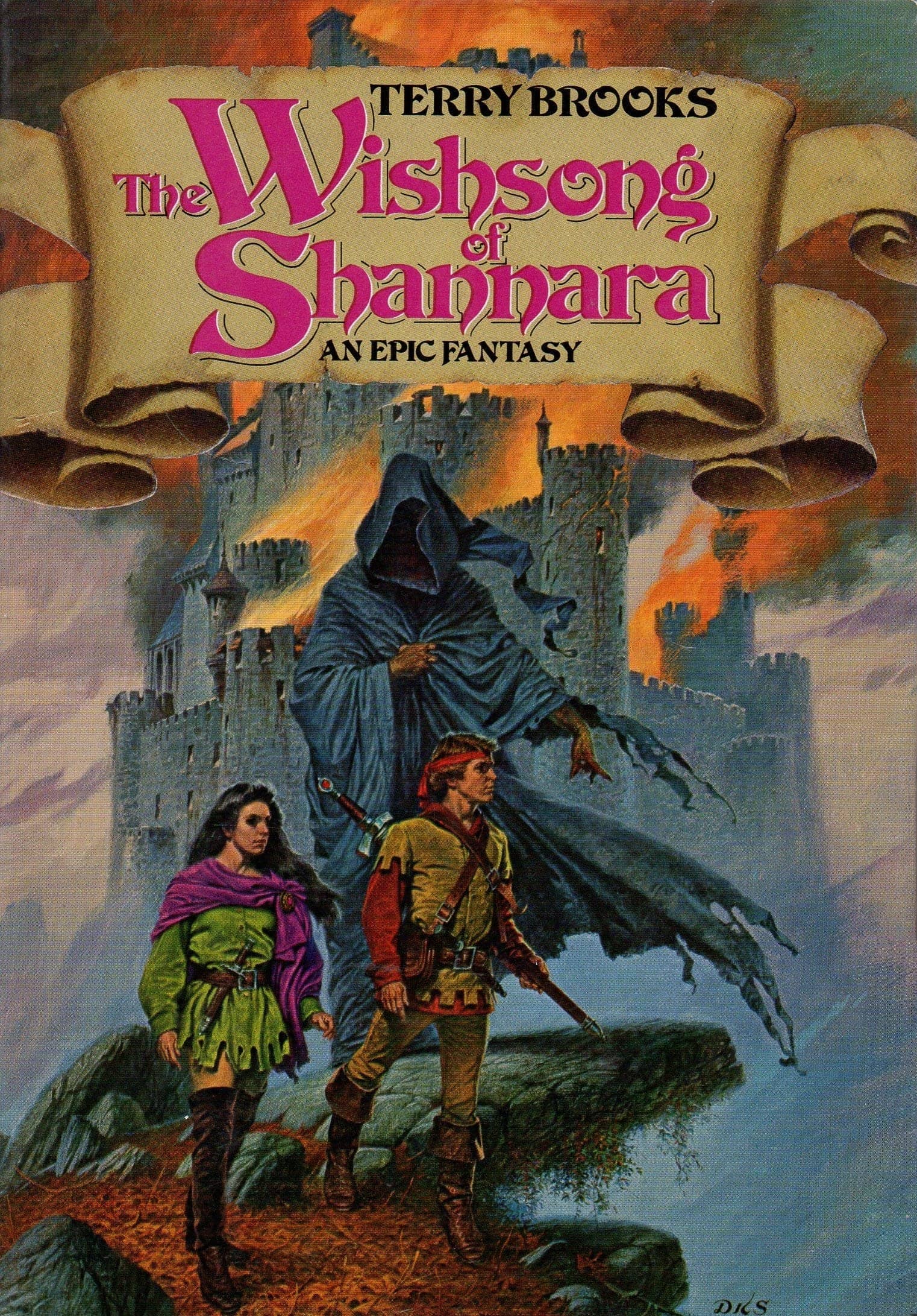
The Wishsong of Shannara by Terry Brooks (Del Rey, 1985)
Sweet in the 80s
The Novel Series
Shannara by Terry Brooks
The 80’s represent Sweet at the height of his powers, and Shannara is near the top of the list. Sweet produced the cover art for only two books in the lengthy Shannara run, but they were books two and three of the initial series. The cover of the first being drawn by the iconic Brothers Hildebrandt. When it was time to compile the three books from the first series, however, it was Sweet’s artwork from The Wishsong of Shannara that was used, and I still love this cover for the layering and the misty castle that frames the background.
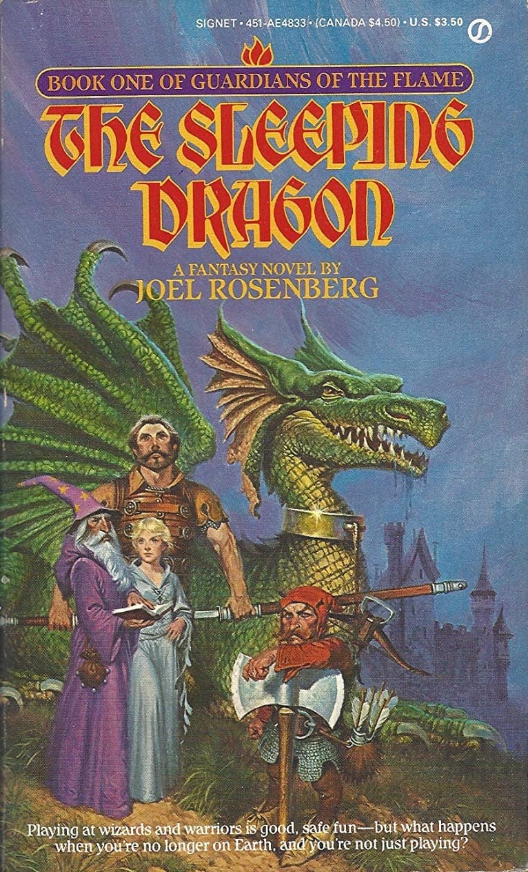
The Sleeping Dragon by Joel Rosenberg (Signet, 1983)
Guardians of the Flame by Joel Rosenberg
I suspect my love of Advanced Dungeons and Dragons may have influenced my feelings for the cover of The Sleeping Dragon. Rosenberg’s story is based on a similar roleplaying game, and Sweet’s artwork mirrors this.
It’s not the strongest of his works or his most interesting dragon, but it does pull all the pieces together and accurately reflects the story on the other side of his cover. Again, Sweet only provided art for the first two books in this series, reversing the trend of him replacing other artists partway through.
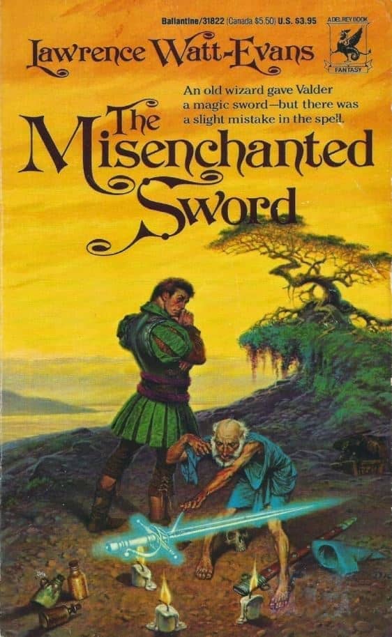
The Misenchanted Sword by Lawrence Watt-Evans (Del Rey, 1985)
Legends of Ethshar by Lawrence Watt-Evans
Sweet often employed a narrative structure to his artwork, adopting a scene from within the novel and capturing the tone and feel of the story in full color. The Misenchanted Sword is a prime example of this, capturing a unique moment from the book’s early chapters. The bright sunset coupled with the front-lighting from the candle provides well lit characters with a vivid backdrop. Sweet does a wonderful job capturing the reluctant hero and the fun incumbent in the book.
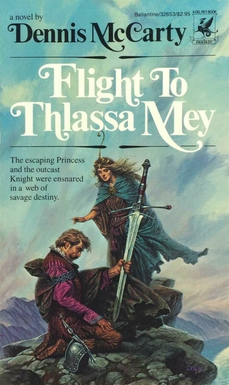
Flight to Thlassa Mey by Dennis McCarty (Del Rey, 1986)
Thlassa Mey – Flight to Thlassa Mey by Dennis McCarty
Flight to Thlassa Mey is one of my guilty pleasure novels, and likewise I adore its cover. I have always been drawn to the trope of the fallen knight seeking redemption, and for me the cover of this book captures it perfectly. From the atmospheric tones of blue, purple, and grey, to the knight immersed in his own world, oblivious to the support around him, to the detail of the central figures, the mood and relationship of the characters is laid bare. If I had but one cover painting to choose for a wall in my home, this would be it.
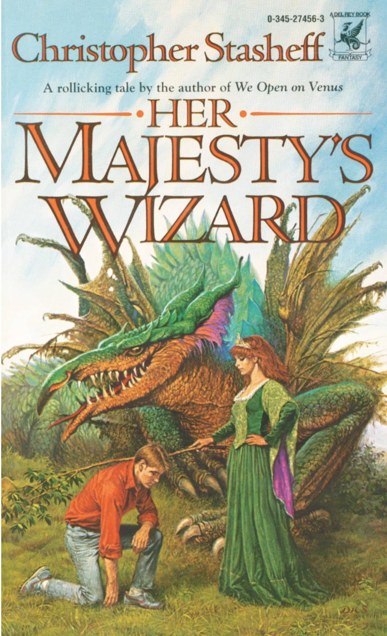
Her Majesty’s Wizard by Christopher Stasheff (Del Rey, 1986)
A Wizard in Rhyme by Christopher Stasheff
Sweet was known for the stylistic design of the dragons that graced his covers. Often cruel and dangerous, yet possessing a well-fed and slightly time-worn look to their form. In Her Majesty’s Wizard, Sweet steps things up to show a bedraggled dragon, who maintains a sinister air even as its wings are in tatters. I find the co-ordination of the layering of greens in the various elements to be extremely satisfying, with only the subtle use of magenta to highlight the varying components.
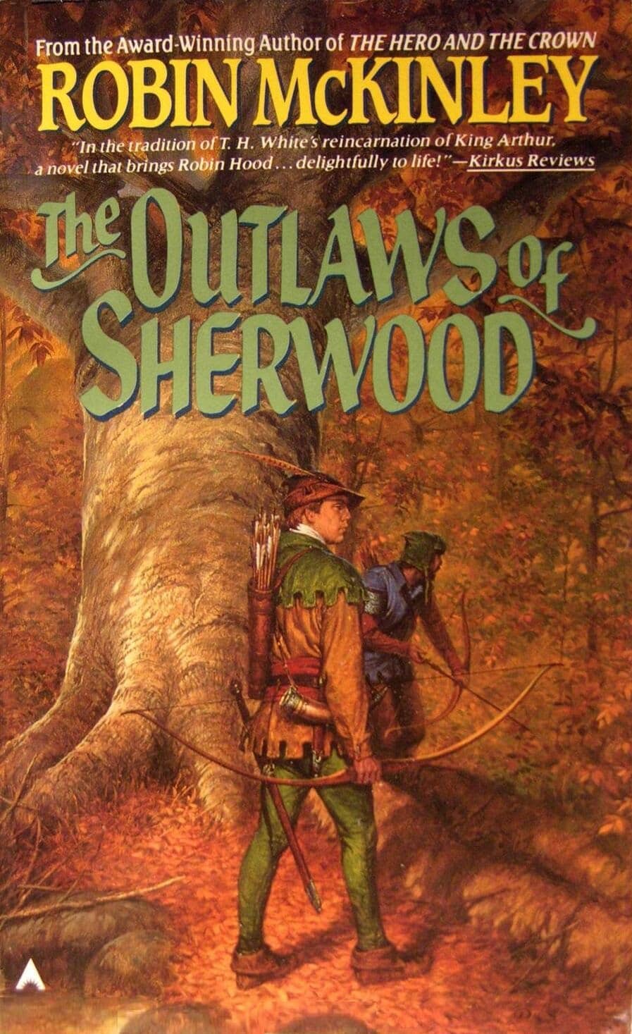
The Outlaws of Sherwood by Robin McKinley (Ace Books, 1989)
An Unignorable One-Off
The Outlaws of Sherwood by Robin McKinley
One of Sweets less colorful covers, though its place here is due specifically to the simplified palate he chose. A rare Robin Hood cover where green is not the primary shade, even though it is still woodland based. The spare usage makes the green more distinctive where it appears on Robin, and pulls the viewer’s eye to the central figure, regardless of how camouflaged he may be. Sweet drew on the scenery from near his home in New Jersey as inspiration for the setting, as he did on a number of occasions.
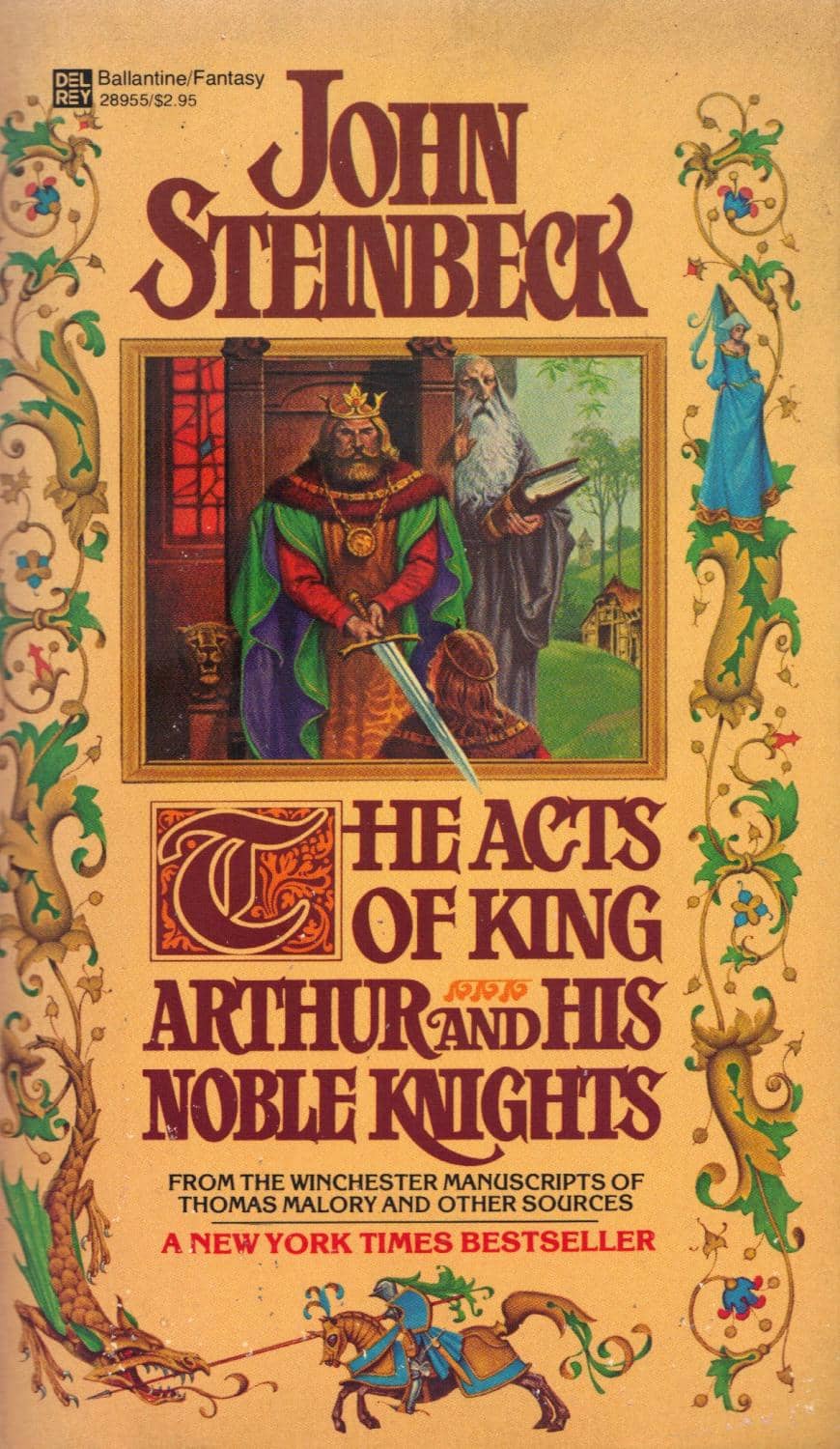
The Acts of King Arthur and His Noble Knights by John Steinbeck (Del Rey, 1980)
One More Thing…
Through the 80’s Sweet was commissioned to produce covers for some of the greatest fantasy series ever written. I have chosen not to highlight these in the main portion of this article, primarily because I discovered these books in editions where Sweet was not the cover artist. None-the-less, they are worthy of mention, not least because some view his covers as the definitive pictures associated with these books. In the early part of the decade, Sweet prepared covers for Tolkien’s The Hobbit and The Lord of the Rings, as well as producing a 1982 calendar that hung on my wall that year.
Two years later Sweet turned his hand to the first three books of Isaac Asimov’s Foundation series. At the end of the decade and onward, Sweet decorated the covers of eight of Terry Pratchett’s Discworld novels for the American editions. For good measure, Sweet provided compellingly thematic artwork for John Steinbeck’s lone speculative novel with The Acts of King Arthur and His Noble Knights, a book twenty years in the making!
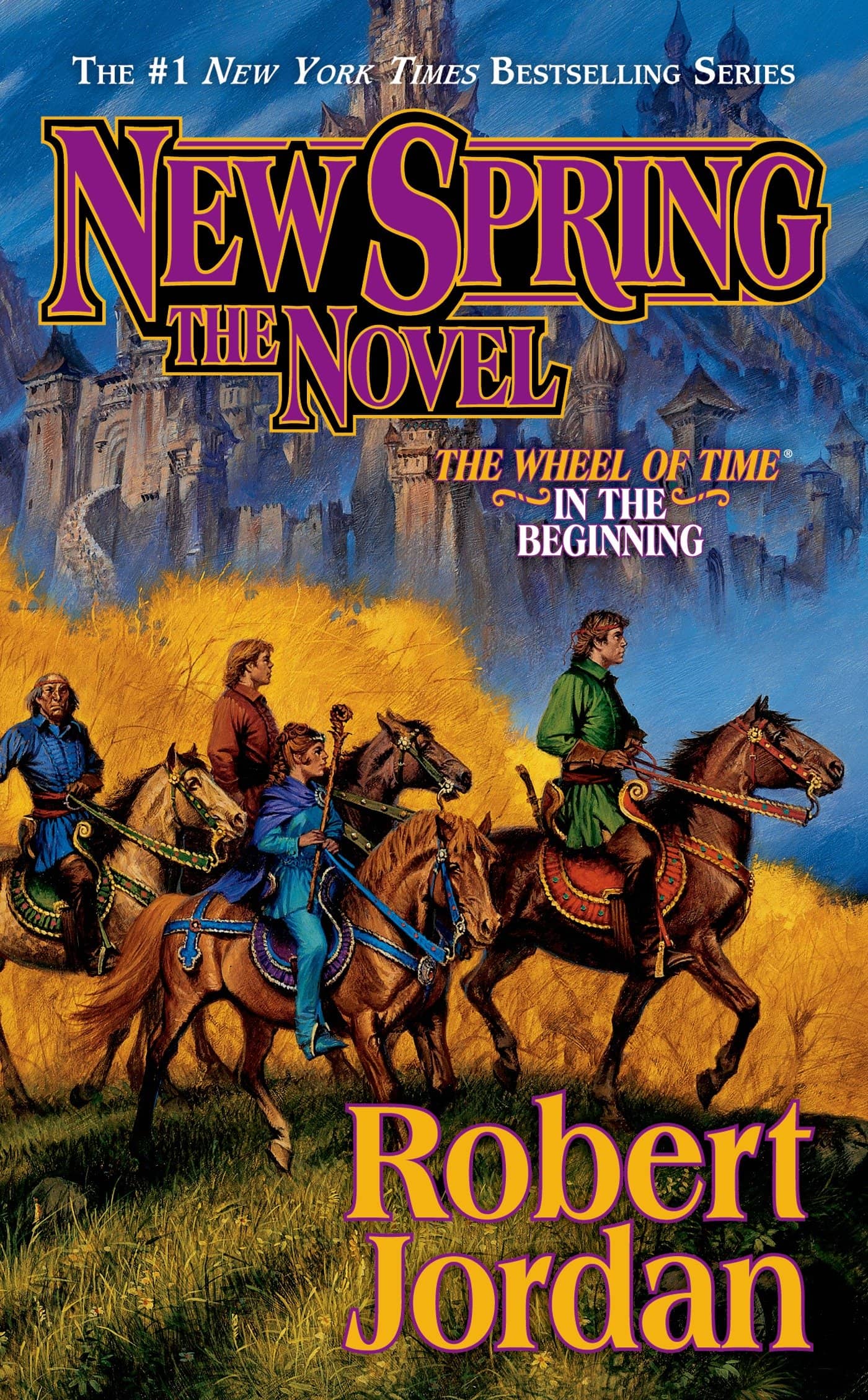
New Spring by Robert Jordan (Tor, 2004)
Sweet in the 90s (and Beyond)
The Novel Series
The Wheel of Time by Robert Jordan
Where does one start with the marriage of Darrell K. Sweet’s artwork and Robert Jordan’s seminal series?
For me, it starts with the prequel, New Spring. Sweets artwork accompanied each volume in the series, barring the finale, which was published after Sweet’s passing. There is an uncorroborated story that Jordan and his wife specifically chose Sweet as the artist for the series, and that it was the author’s wish that a single artist provide the covers for the entire run.
It has been suggested that the earlier covers in the series are the strongest, with the opener The Eye of the World most often getting the nod as the best. I prefer New Spring, however, as I think that, while the elements are similar to The Eye of the World, the boldness of the coloring, the proportionality and the depth of composition are stronger here.
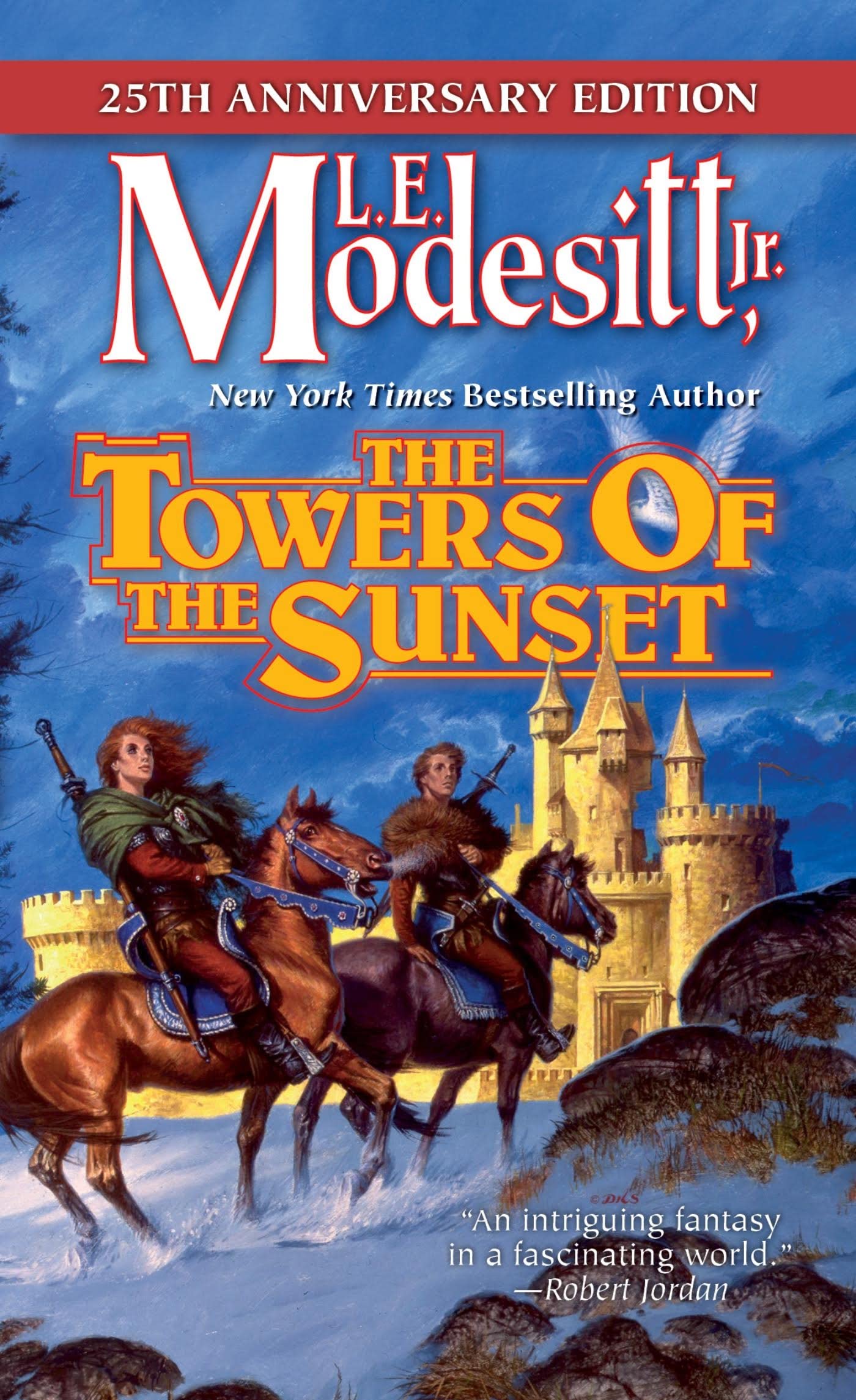
The Towers of the Sunset by L. E. Modesitt, Jr. (Tor, 1992)
The Saga of Recluce by L. E. Modesitt, Jr.
At first blush, the cover for The Towers of Sunset shares much in common with Jordan’s New Spring. It’s the change in season, though, that warrants its inclusion here.
I am obviously a fan of the composition of ‘horse and riders in front of castle,’ but it’s the winter element that Sweet captures here that seals the deal. The stormy sky and blowing snow are elements that feature in a number of Sweet’s other covers, and here they bring a sense of motion and realism that pulls the piece together.
It’s worth noting that Sweet painted fifteen covers for Modesitt’s Recluce series, second in number only to Xanth.
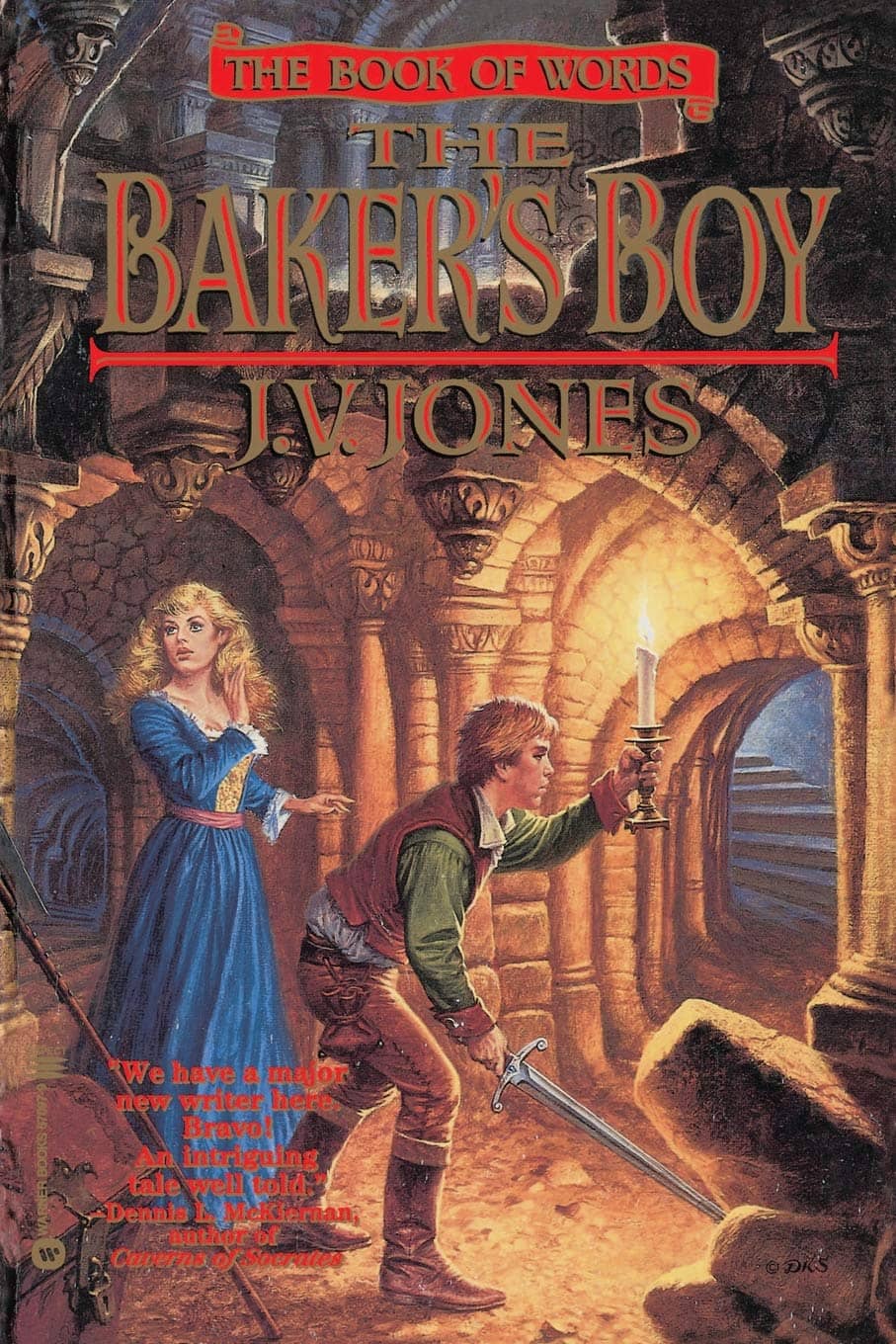
The Baker’s Boy by J. V. Jones (Warner Aspect, 1995)
The Book of Words by J. V. Jones
One of my favorite features of Sweet’s covers are when he delivers intricate backgrounds, whether a series of rocky outcroppings, or, in the case of The Baker’s Boy, an amazingly detailed castle labyrinth. The effect of the lighting as it plays among the characters and the columns is a joy to behold.
Of note, the fresh-faced male protagonist in this cover was modelled after Sweet’s son, a practice that Sweet used on several occasions, including The Outlaws of Sherwood, mentioned earlier.
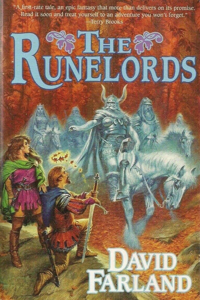
The Runelords: The Sum of All Men by David Farland (Tor, 1998)
The Runelords by David Farland
The bold, red autumnal background of The Sum of all Men provides the perfect frame for the centralized spectral forms. Sweet somehow manages to imbue them with an inner glow while still providing an impressive level of detail. The human figures in the foreground provide a contrasting lift of vividness. You may notice that the female lead bears a striking resemblance to another on the cover of The Wishsong of Shannara. (Go on, scroll up and have a look.)
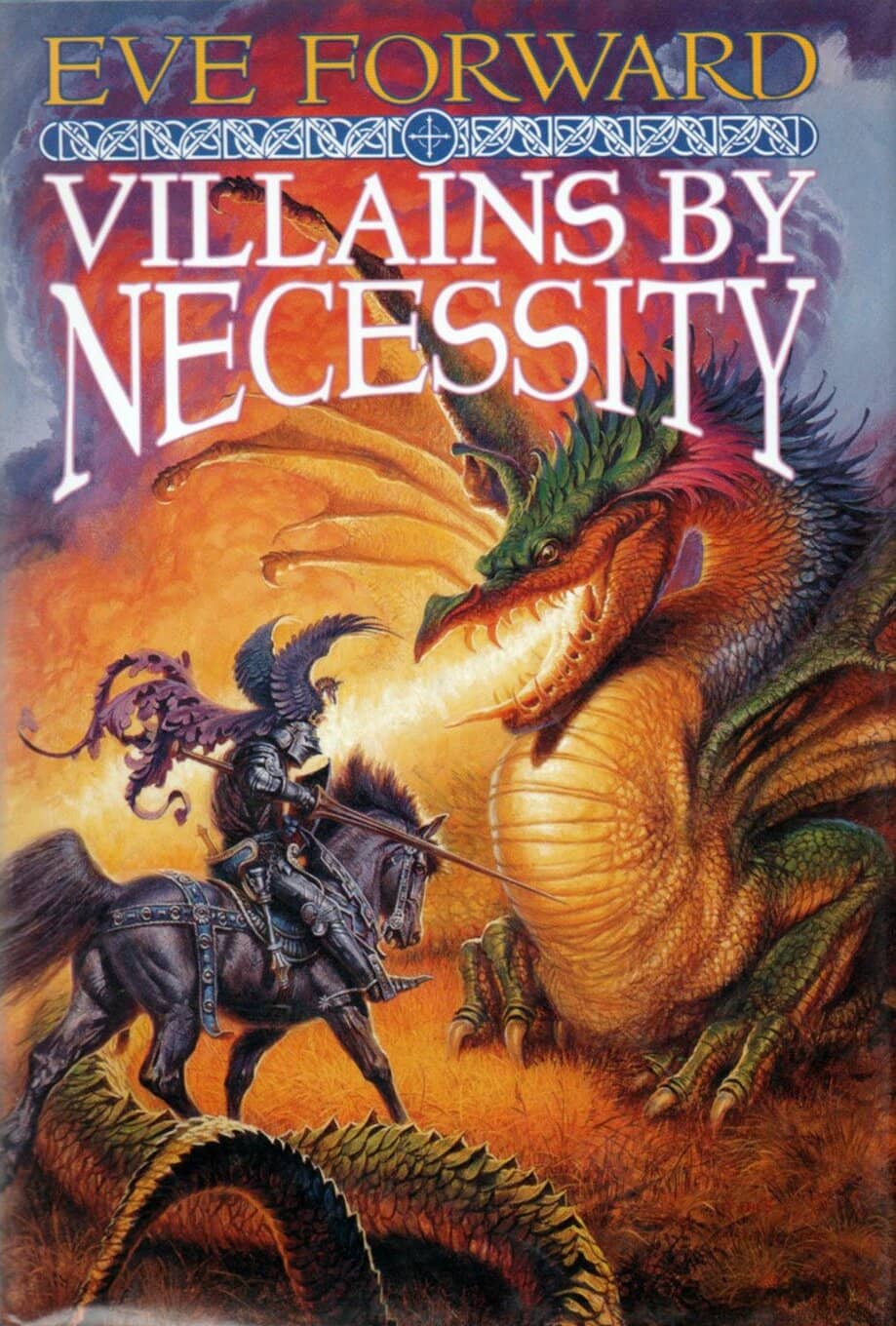
Villains by Necessity by Eve Forward (Tor, 1995)
An Unignorable One-Off
Villains by Necessity by Eve Forward
I think it fitting that the final book highlighted here is one of Sweet’s most vibrant covers, the trademark of his fantasy artwork, and one prominently featuring an exemplary ‘Sweet’ dragon. The classic George and the Dragon motif is brought to life as the fire lights the principles, with the dragon displaying the colors of flame, and the knight the contrasting coolness of the greys and purples. The strength of the composition proves Sweet was on his game well into the 90’s.
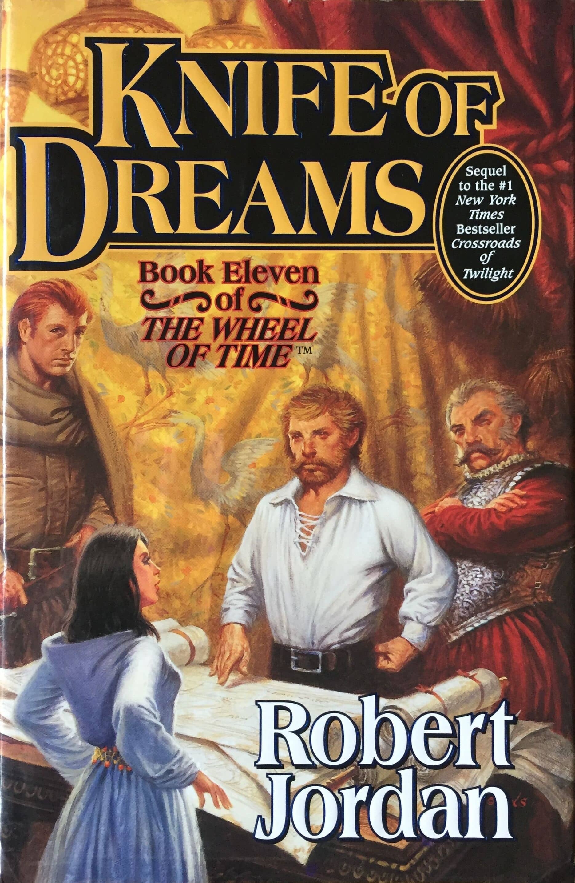
Knife of Dreams by Robert Jordan (Tor, 2005)
One More Thing…
That brings us to the elephant in the room. Regardless of the many covers Sweet was commissioned to provide, and the unofficial accolades he received, he was not without his detractors. A noticeable cohort of these were readers of The Wheel of Time series, most especially in the latter half of the run.
I can admit that it’s hard to get as excited about these paintings as it is some of the others. The cover for Knife of Dreams, for example, is often slated for its lack of color and dynamism, as well as the fact that Perrin, the figure on the left, was significantly shorter than his description indicated. These points all feel valid to me, although, as Sweet once reported, he was asked to make Perrin shorter to allow sufficient room for the title text.
It’s difficult to find verified published quotes from either Jordan or Sweet responding to these criticisms, so what is left is direct interactions between Jordan and his fans, either through web chats, or personalized letters. If you’ll humor me, I’ll distil some of these down.
Letter to Tom McCormick, December 1993
With regard to the covers, both my editor and I have fought long and hard to get them to be the way they should be. I do not assign blame. On those occasions when either my editor or I have been able to speak directly to Darrell Sweet, the problems in sketches have been solved handily for the most part.
Compuserve Question and Answer, 26 June, 1996
There is no way that someone else can do an illustration that gives exactly the image that is in my head. Given the limits on how much description I can give Darrell Sweet when he’s doing his cover paintings, he’s doing a good job.
AOL Chat, 21 October, 1994
I know that the covers are a hot topic for discussion, pro and con. I’d like to point out that I have had no end of letters saying that the reason they first picked up one of the books was the cover.
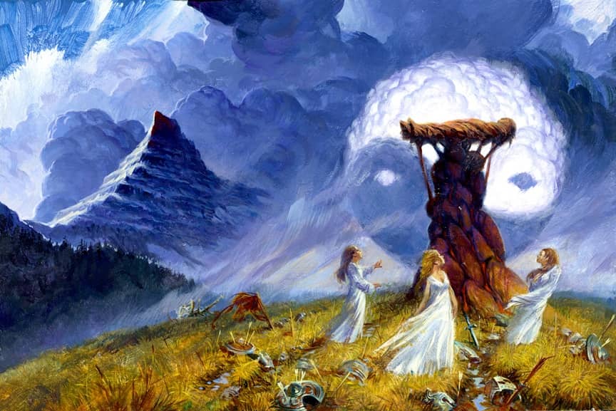
A Memory of Light sketch by Darrell K. Sweet
Final Thoughts
Darrell K. Sweet helped define a major era of fantasy art, and given the enormity of the body of his work, I am saddened that he never received a major award for his efforts. Perhaps it was simply a case of being overlooked while in plain sight. Popularity is often excluded from formal recognition on its own grounds, and there’s little argument that Sweet was indeed popular. He was, however, a guest of honor at the World Fantasy Convention in 2010, a year before his death.
Of course, one has to accept, moving forward, that Sweet’s art is of its time. There’s something about the simplicity of his paintings, the brightness of the colors and the optimism inherent in his narrative composition that falls outside current trends. I can’t help but feel that this is our loss.
I’ll leave the last word to Sweet, himself. “An artist generally sits in a room alone before a canvas and paints… I always just assumed my artwork would talk for me.”
Darryl R Williams has been an avid fan of speculative fiction since discovering a trove of Ray Bradbury paperbacks at a flea market at the tender age of nine. He presently resides among the castles of Wales with his wife, three children, and three dogs, and spends his days working in Public Health. His first novel is almost done. His last article for Black Gate was B is for Bradbury.
The cover designs for the fantasy novels one and all lack appeal, so far as I am concerned, an astonishing drop after the succession of covers for the Ballantine fantasy series edited by Lin Carter (1969-1974). The figures generally look posed and as if they are ordinary people of the time wearing costumes. In this I’m reminded of the Hildebrandt brothers’ art, from about the same period. Sweet’s Heinlein cover is OK, but (meaning no offense to the man) his paintings for the Tolkien books were the rock bottom for American paperbacks, in my opinion, utterly lacking in magic.
We all enjoy what we enjoy, and there’s no need to justify that. For me, though, his art usually looked stiff and uninspired.
Like the author, I was influenced by Sweet’s covers, having actually read several feature in this article. As a wannabe writer myself, I always imagined that I would have reached a high level of success if one or more of my works warranted a Sweet cover illustration.
I shared the same dream, Tom. It’s a pity we won’t have them realised. Still, there are lots of other incredible artists out there for when we’re published!
Sweet also drew the absolutely horrible cover of The Knight and Knave of Swords by Leiber. The two characters on the front I think are suppose to be Fafhrd and the Mouser, but they look nothing like the characters are described. (Mouser is even wearing grey.) He did have some technical skill and think that the covers here are better but he dropped the ball on that one.
I’m glad I’m not the only person who often found Sweet’s work rather dull. The characters’ faces tended to look alike, with little variation in eyes, noses, etc. The children looked like miniature adults. Ed Emshwiller frequently used his wife as a model, but his work NEVER suffered from the repetitiveness that I saw in Sweet. Sweet’s colors were vibrant, but as Dale Nelson suggested, the characters look posed and unnatural.
This has gotten me thinking about what I find lacking in Sweet’s work, and I think they don’t work for me because of their flatfooted literalness…which is maybe why his most successful paintings were those he did for those monuments to flatfooted literalness, the Xanth books.
I’m a Sweet fan. Loved the Convenant covers. And those first sequels to Sword of Shanarra popped with color. I didn’t like everything he did, but I liked a lot of it. Also liked the Lords of Dus covers. I think that’s an under-appreciated series. Thanks for the essay!
Thanks, Bob. I completely agree with you on The Lords of Dus. The series made my shortlist for the article, but I tried to keep to one listing per author, and I couldn’t resist The Misenchanted Sword. (Plus, Sweet published two different covers for The Lure of the Basilisk, so how would I choose?)
It is one thing to know an artist as prolific and recognizable as Mr. Sweet, and another to learn that he produced over 1,000 paintings in his career. Wow-zer! With that body of work, it would be hard to not find something to love … or to critique. I like his more “bounded” works, like the Beagle cover and the Steinbeck cover. But I did find his “splashy” illustrations to often fit the bill, like the cover for Brian Daley’s The Doomfarers of Coramonde, showing the protagonist in disguise as a flamboyant style of sell-sword.
I see what you mean about the bounded covers, and would include the Thomas Covenant series in that cohort. There’s something classic about how they present. I love the cover for Doomfarers as well, and I only left it out as I personally didn’t discover it until a decade after it was published. As you say, there’s a lot to like (and, apparently, dislike) across Sweet’s body of work.
Which maybe answers the question of why Sweet never won a major award. His work was undoubtedly popular with a lot of people, or he wouldn’t have gotten so may commissions, but just as clearly there were many people – maybe more than the usual number – who didn’t like it. Being so unavoidable for so long probably didn’t help in this regard; I think he wound up taking on a lot of work that didn’t necessarily suit his talents. I think his Riddle-Master and Thomas Covenant covers show him at his best, but 1000+ images means that there will necessarily be many paintings that do NOT show him at his best. Artists gotta eat, though. Fair enough?
He won a Hugo award in 1983.
I can’t say he was one of my favorites; I think his prolific covers gave a little much of a sense of sameness to fantasy series that were very different, and maybe made it harder for his best work to stand out. I never felt as strongly as some of the WoT fans about those covers…but when TOR did a series of recovers for the release of a trade edition, I found many of those to be far more compelling. (Book 4 in particular)
I was always a bigger fan of Larry Elmore, Michael Whelan, Keith Parkinson and the like? I mean, Vallejo was doing Star Trek covers! I never passed on a book because Sweet did the cover…but I’m afraid I know people who did.
These covers bring back memories, especially the 80’s comedic and titillating portal fantasies. One series I recall was the Jack Chalker’s Dancing Gods series.
I guess I was mostly neutral on Sweet’s work, but at times, they could be a little hokey.
Thanks for the write-up.
It’s interesting the amount of variety he’s shown in different genres, and am now going to have
to seek out a John Steinback retelling of King Arthur which I’ve never heard of before. That was probably my favourite cover of those shown here. It’s funny, judging a book by it’s cover probably IS one of the better ways to go; if we’re honest with ourselves.
I am so glad I found this. I owned a copy of The Misenchanted Sword with Sweet’s artwork on it and loved the cover. When the book was destroyed due to undiscovered water damage, I wanted to buy a replacement copy only to find a lackluster cover on the reprint available. I bought the new book anyways, because I really enjoyed the story (I even bought a copy for a friend).
I also own Her Majesty’s Wizard and, before a huge move, owned a lot of the Xanth series. I wonder how many other books I have on my shelves whose covers were designed by Sweet. Hmm. A fun reason to go through my fantasy and sci fi shelves, though it may take me a bit as I likely will “need” to read the books as I am sorting. 😉
[…] themes. Such artists include Larry Elmore, Boris Vallejo, Luis Royo, Don Maitz, Michael Whelan, Darrel K. Sweet, and Ciruelo […]
Thanks for the write up on Sweet. Like a lot of artists who have long careers, his work could be really great, or really mediocre (or downright bad). I think we should judge him on his best work which was wonderful. The Misenchanted Sword cover you posted is very nice, as is the Lord Foul’s Bane cover. All the Thomas Covenant covers are really good in fact (I own one of the originals which you can see on my blog linked below). His covers are why I read the series to begin with (though I know the author Donaldson was not a fan of them – perhaps because, as others have mentioned, his work tends to be very literal). Some of his LOTR illustrations are very nice – I especially like the one where they are in the eagles nest. I am looking for the ORIGINAL PAINTINGS for his Thomas Covenant series. Finders fee paid! 🙂