Looking at the Density of Comic Book Page Layouts
I may have picked the most boring blog post title in history, but this is something I’ve been thinking a lot about lately.
I was listening to Kieron Gillen’s excellent podcast Decompressed. Decompressed is a look under the hood at the craft of comic book creation and in the 4th one, he interviewed Matt Fraction and David Aja, the creative team behind Marvel’s Hawkeye from 2012. During the episode, Matt Fraction mentioned that Hawkeye was meant to feel different from most of the mainstream comics at the time, especially with respect to how much compression there was.
[Click the images for Jack Kirby-sized versions.]
He specifically noted Marvel’s Master of Kung-Fu from the 1970s as an example of readers feeling like they got a lot of story, even though there were only 17 pages of comic, including splash pages. So, I set out to investigate this myself.
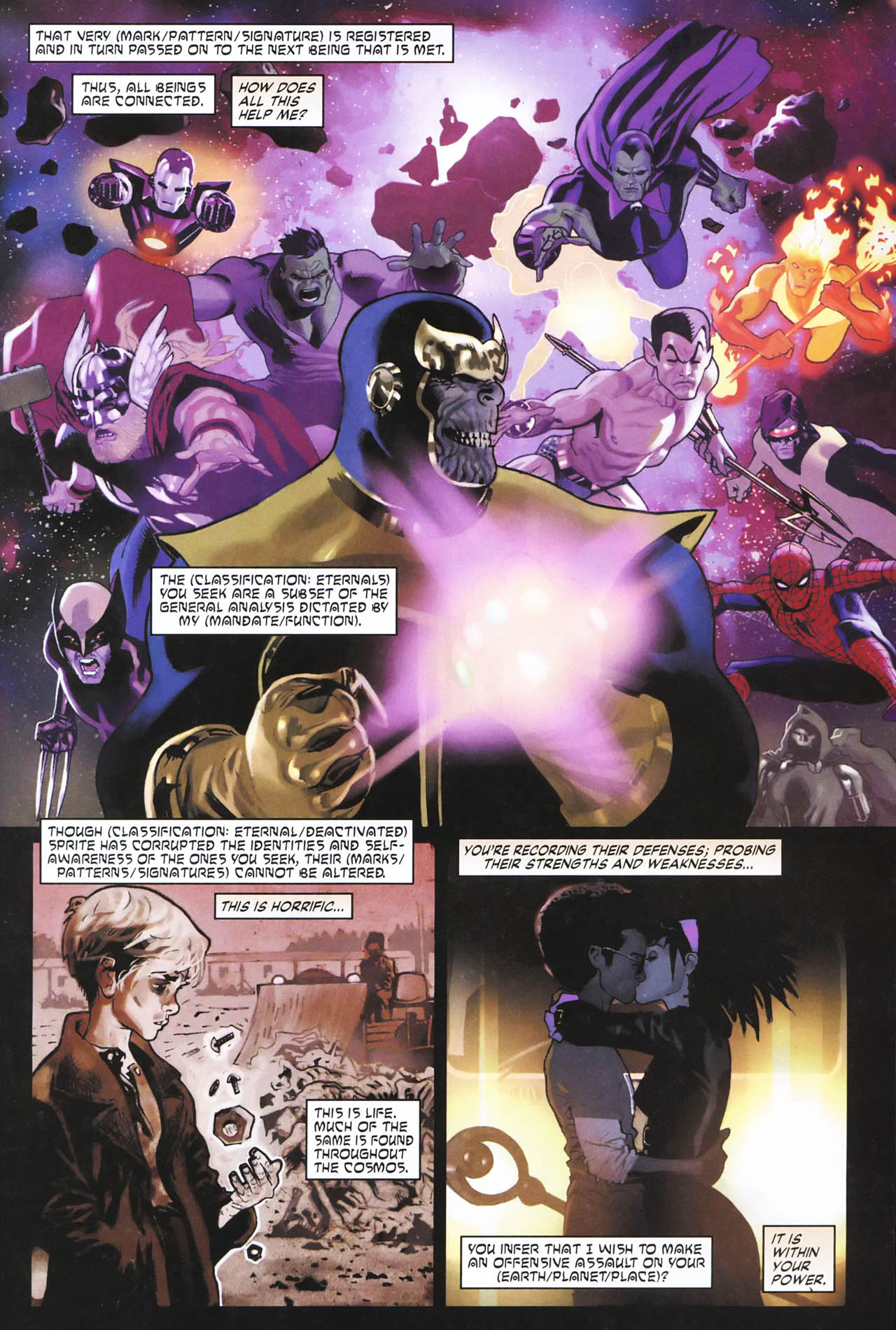
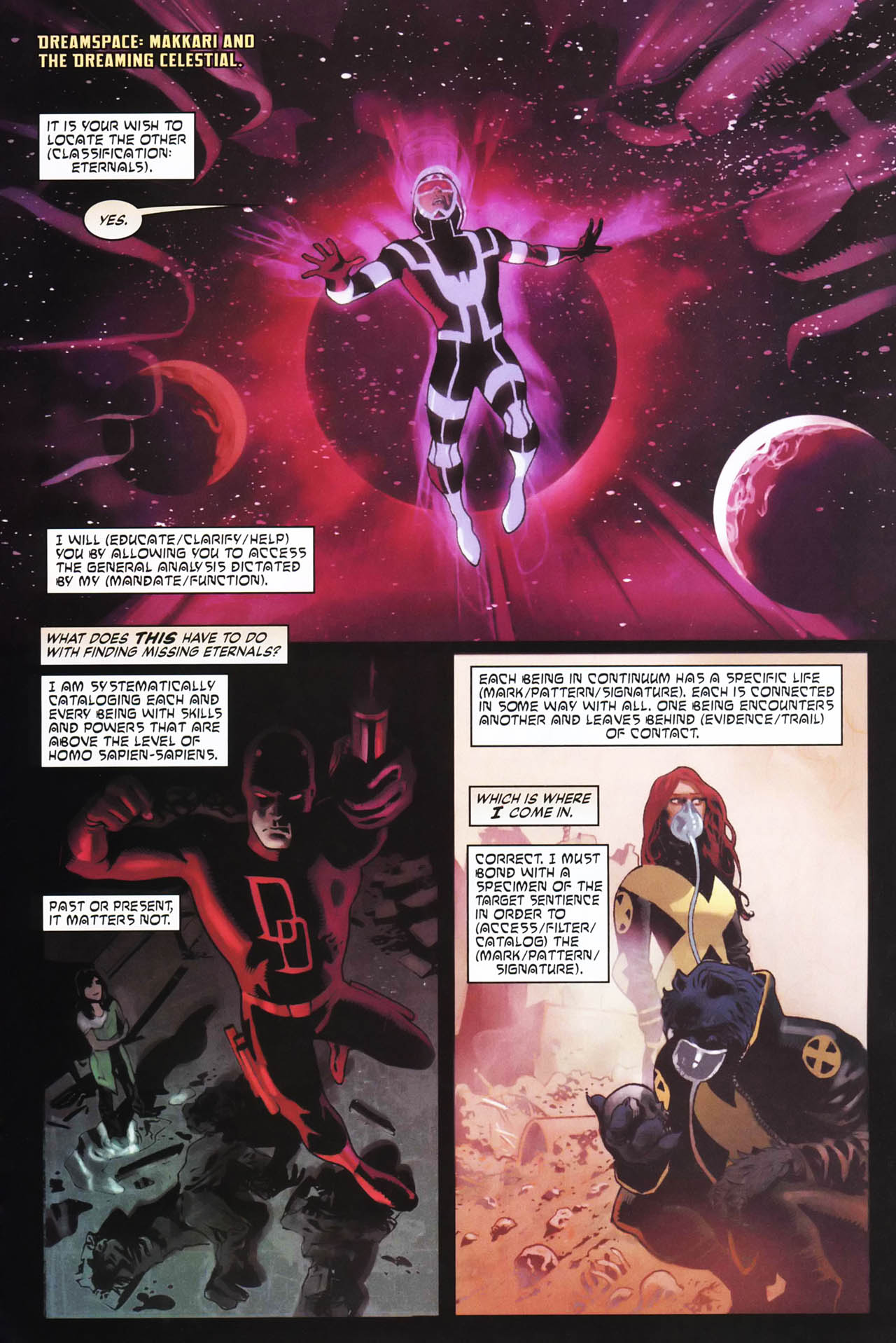
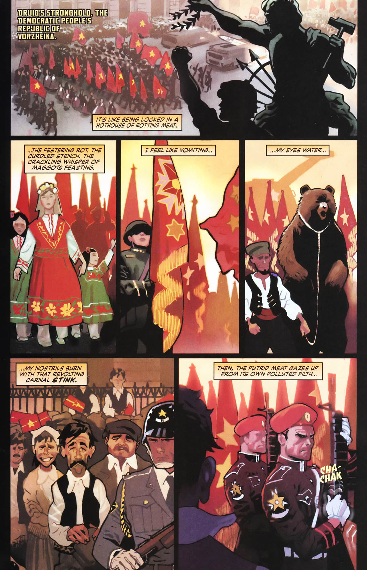
I did a quick look at mainstream comics with modern pacing and layout sensibilities. For example, you see above Neil Gaiman and Daniel Acuña’s Eternals from 2008.
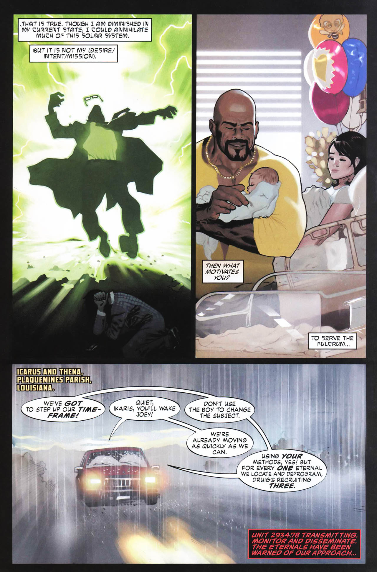
Many of the early pages of issue #1 are 3 panels, and sometimes 4, although as the issue picks up speed, later pages are 6 and even 7 panels.
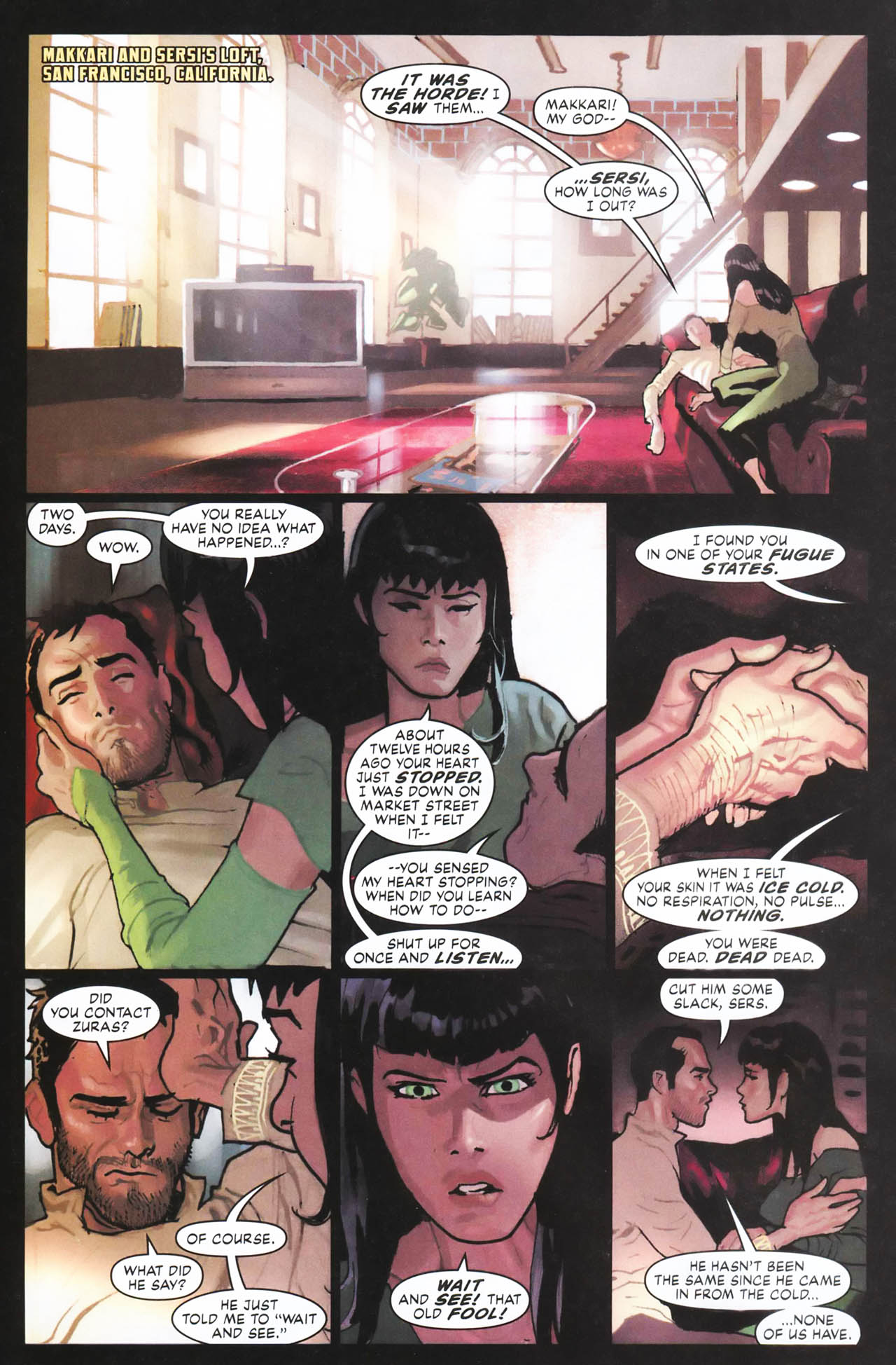
The panel count goes up for both visual exposition (below) and heavier dialogue (above), but nowhere in the issue do we get big paragraphs of dialogue or captions as we did in the 1970s and 1980s.
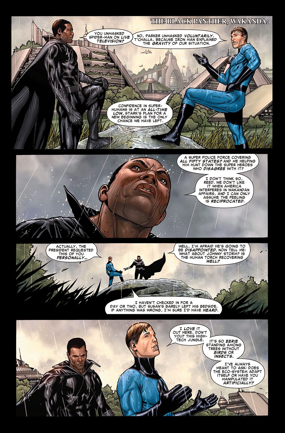
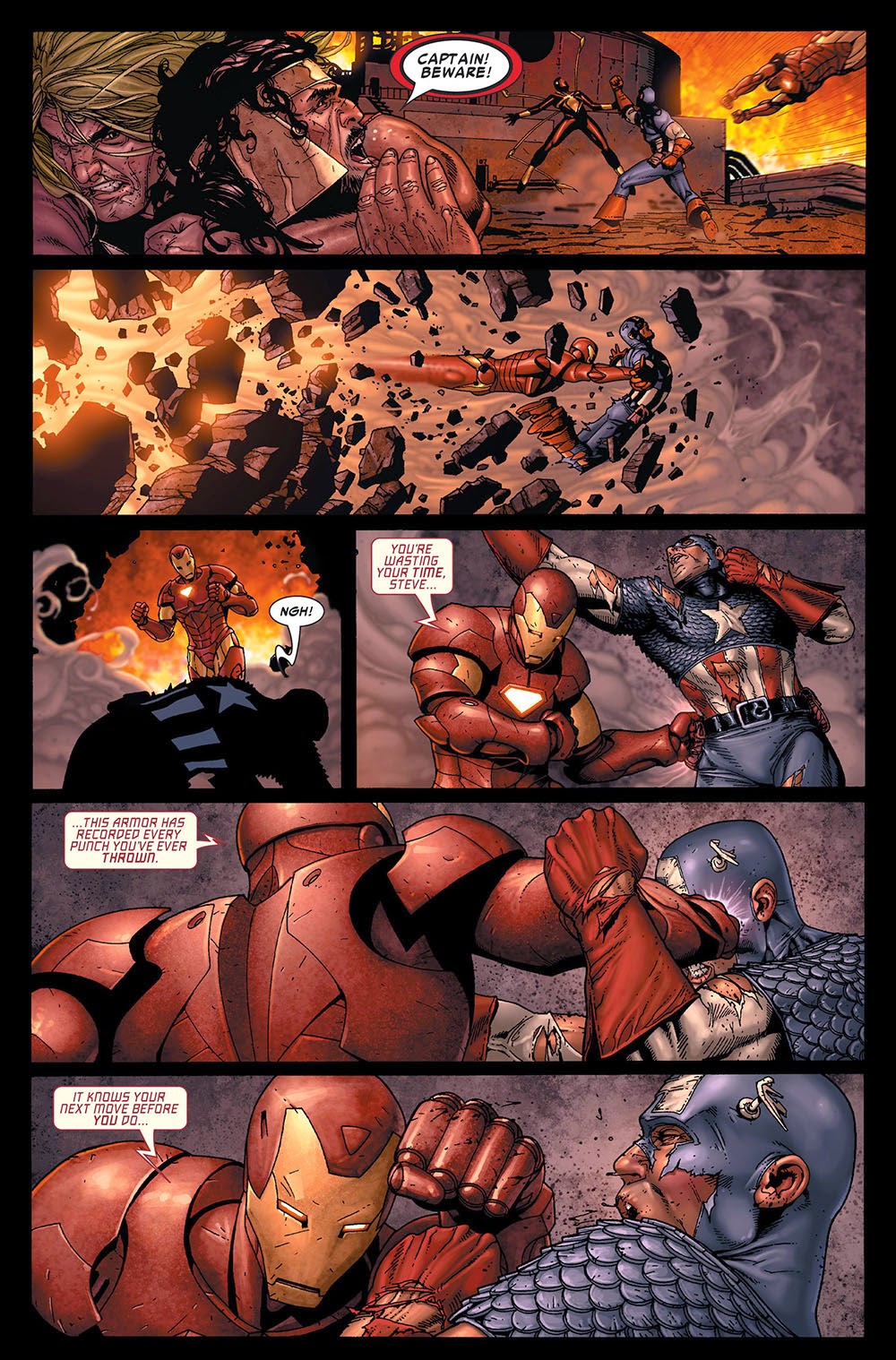
Civil War from 2006 by Mark Millar and Steve McNiven has a similar panel pacing: 4 panels per page at the beginning and even the battle scenes having only 6 panels.
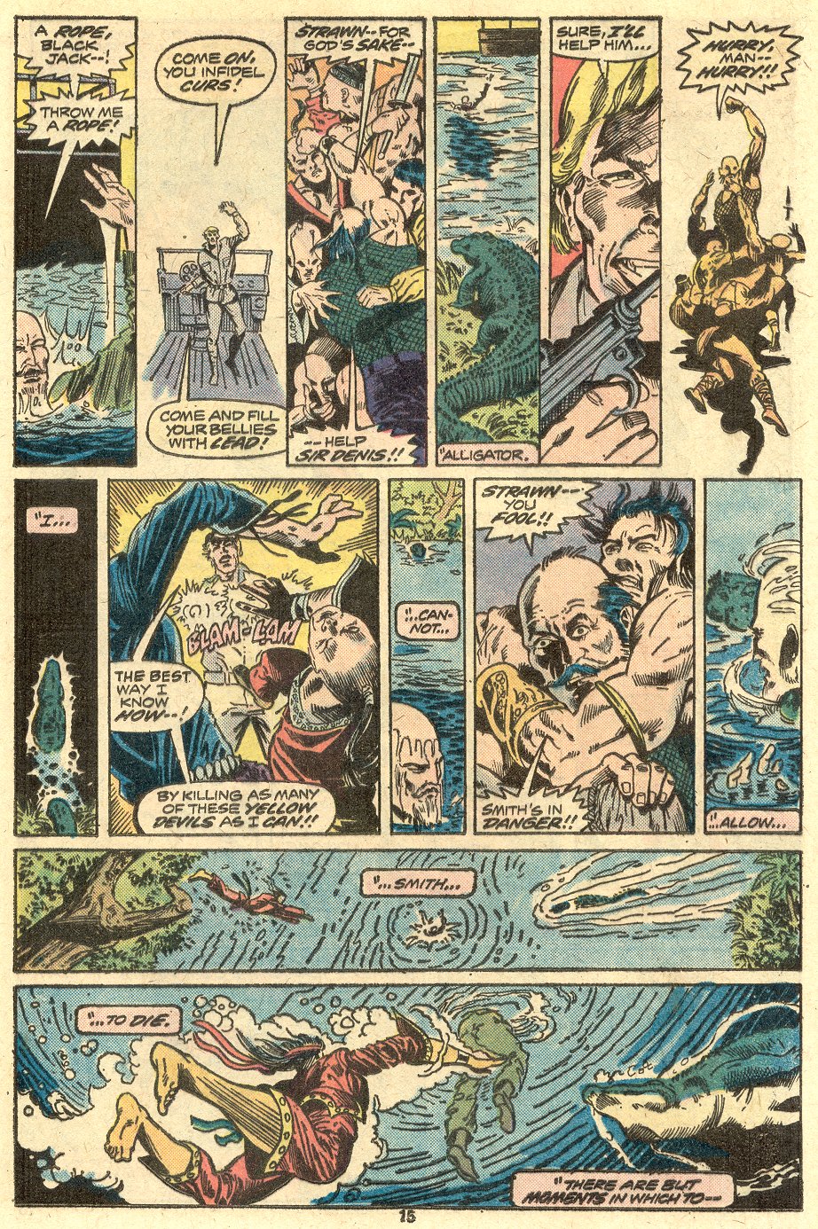
This modern pacing and decompression contrasts sharply with what had been going on in Master of Kung-Fu in the mid-1970s. Doug Moench and Paul Gulacy were stuffing the pages not only with panels, but with words. The next three images are from Master of Kung-Fu #22, and I wanted to show a tense set-up scene of 10 panels, the action page that follows with 9 panels (or 8 panels and an inset panel), and then a ‘quiet’ page with only 5 panels.
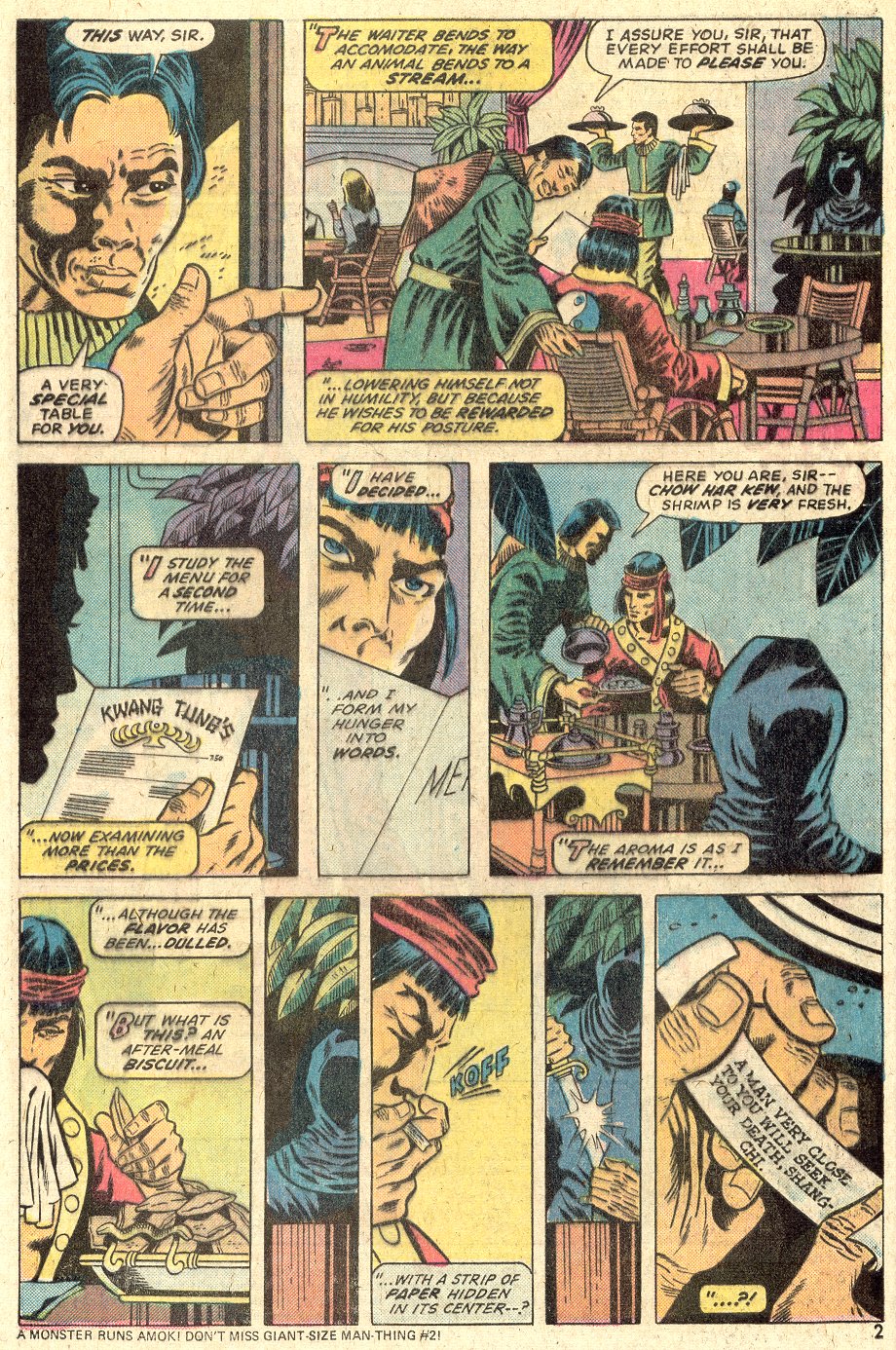
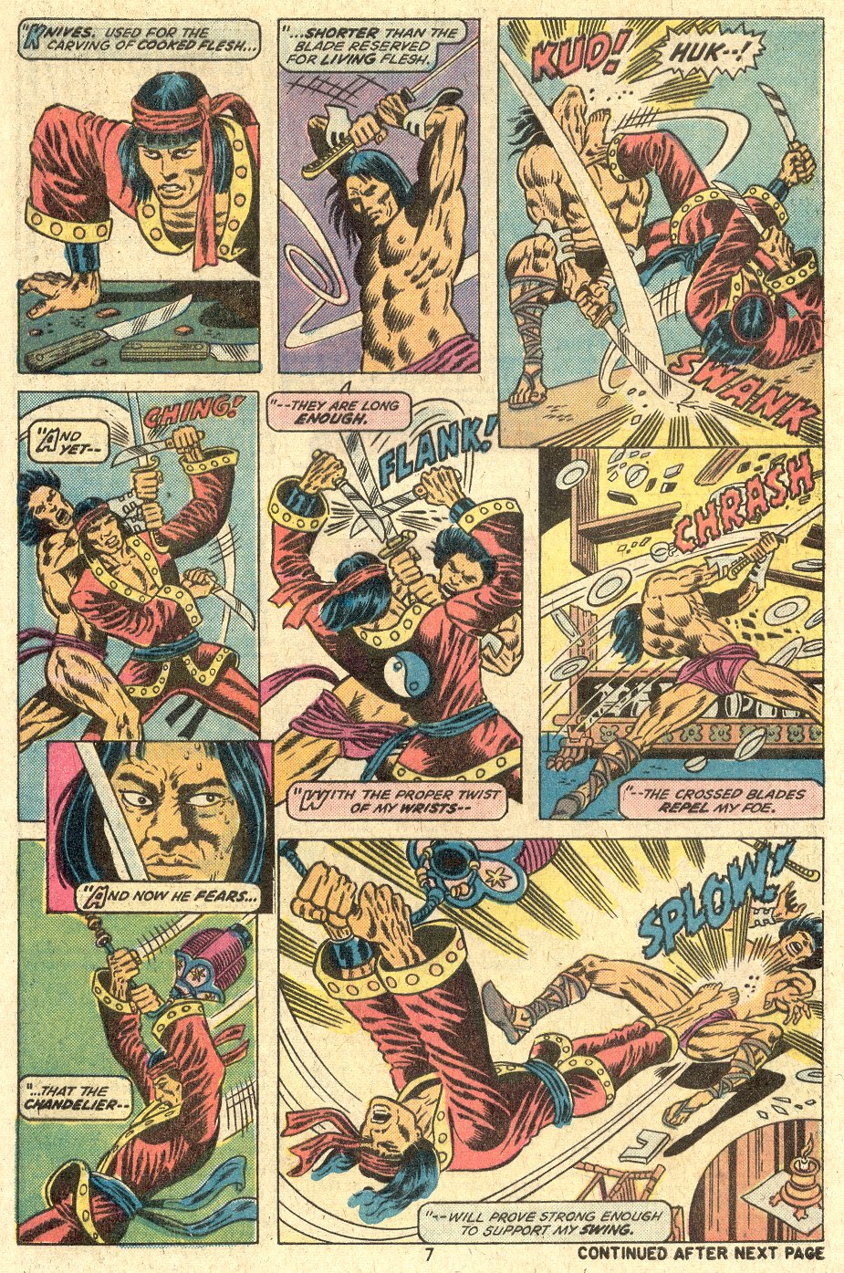
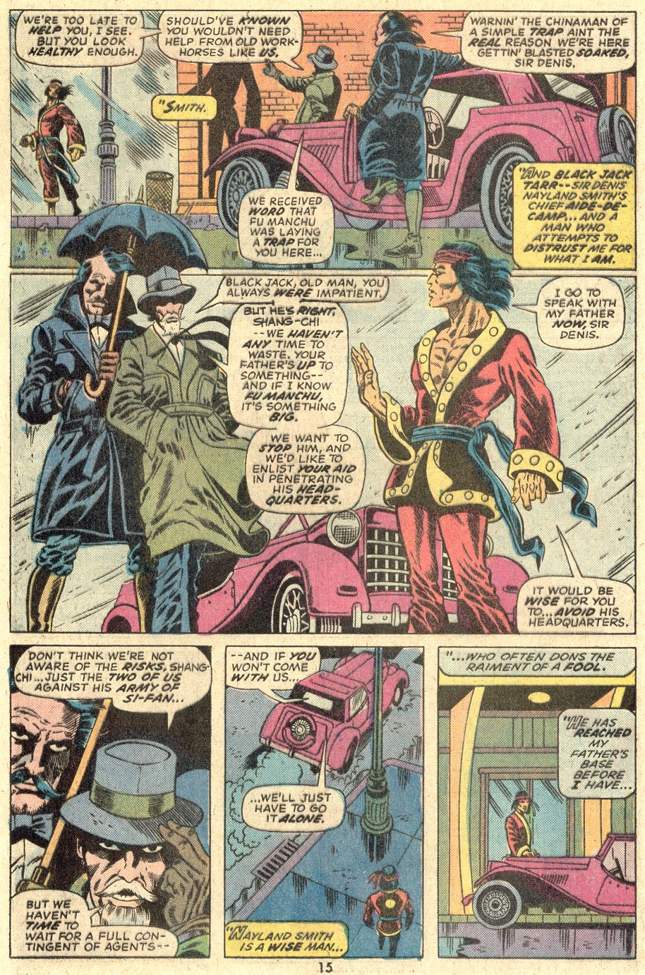
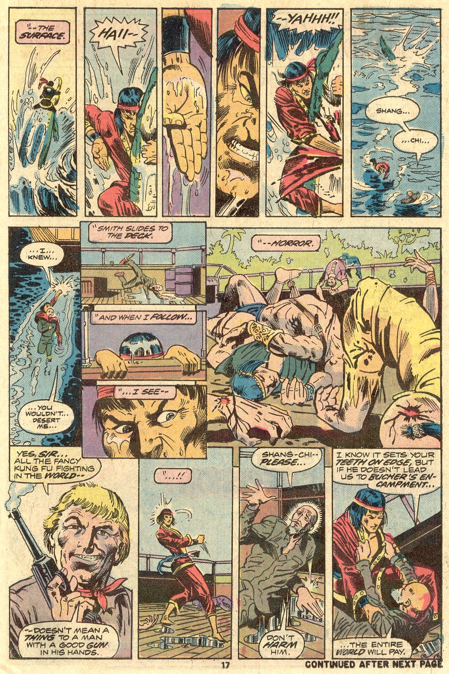
So there are a ton of words on the page, but we should park that storytelling choice. We’ll come back to it when looking at the Hawkeye layouts. Below are some remarkable pages from Master of Kung-Fu #23 with a record-setting 12, 13, and 15 panels.
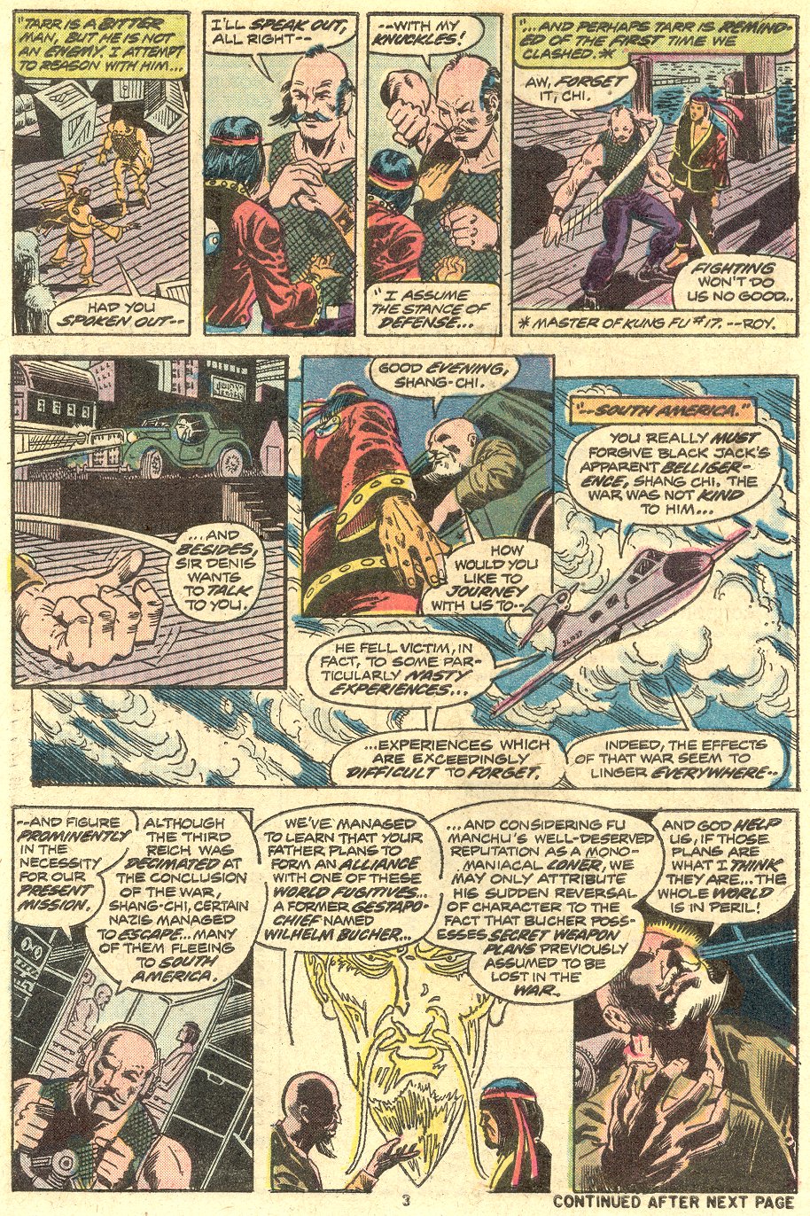
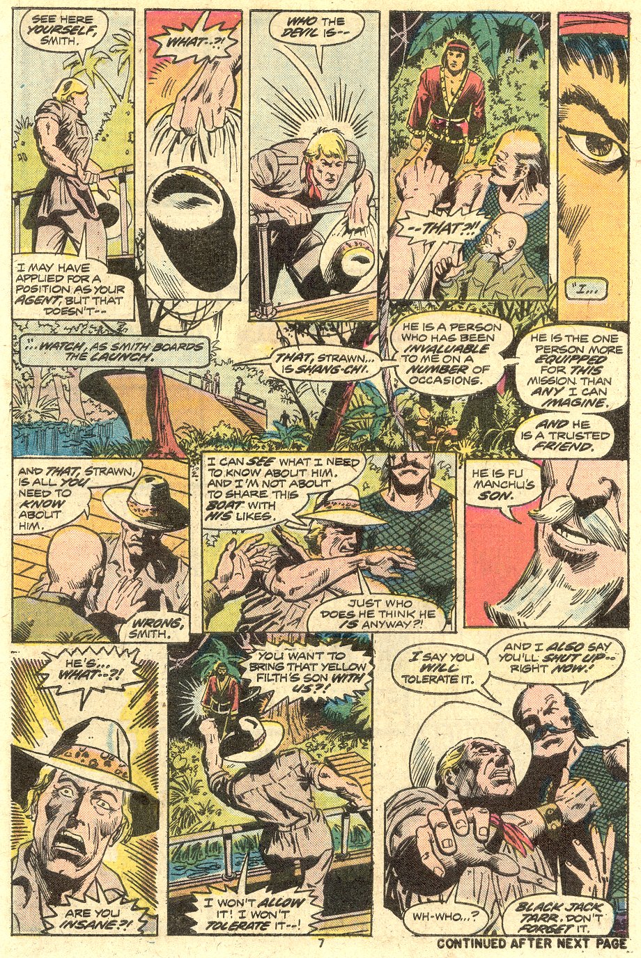
It’s interesting to look at these without looking at the words and seeing how effective the story is being told visually. I think that Gulacy is doing a good job of telling the story, but that the pages are just crowded, so that any individual panel communicates, but they’re just small.
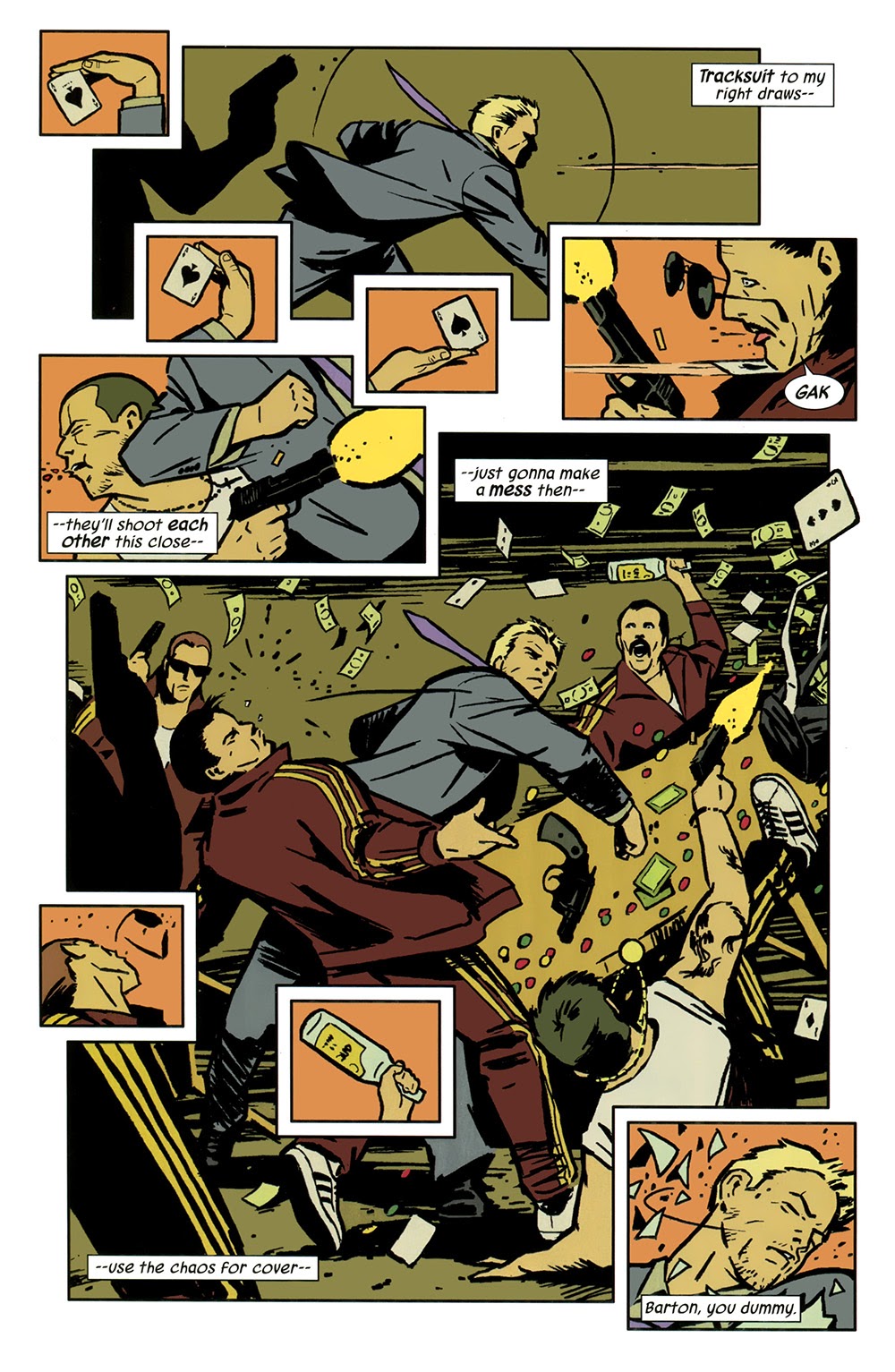
So, after looking at old Master of Kung-Fu issues, I could very much see Matt Fraction’s point that there’s a lot of story in every issue. And now comparing the layouts in the 2012 Hawkeye series, we can see that his scripts and Aja’s art did something similar, but with modern sensibilities.
Eight panels in a page (above) is a lot by modern standards, but the brevity of the first person captioning leaves more space for the art to tell the story. Moreover, comparing Aja to Gulacy made me realize how Aja is able to use negative space, whereas Gulacy couldn’t, just because of the density of the art.
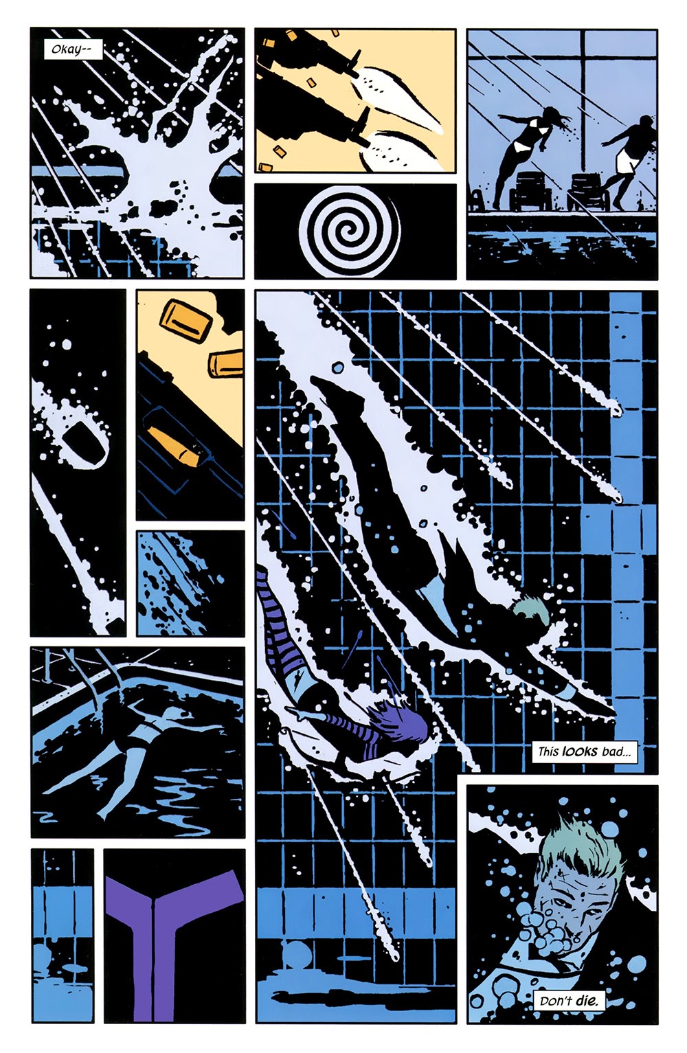
The pages above and below have 10 panels, double the sort of modern upper limit, but it feels like there’s a lot of story without loss of clarity, nor a feeling of crowding.
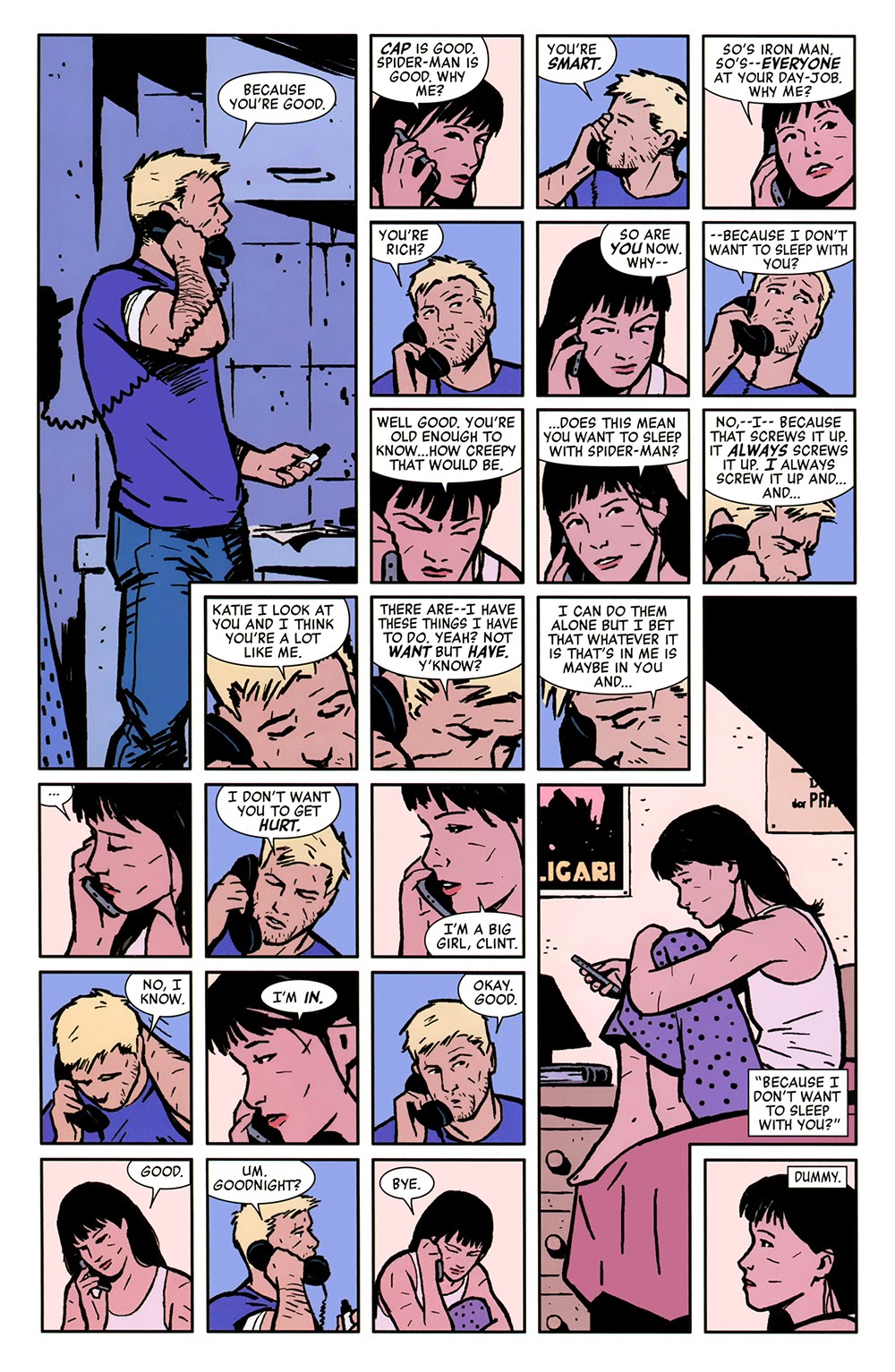
The Hawkeye pages below have 12 and 24 panels respectively, and the lack of words and use of negative space in the first page keep things clean. In the second, the panels separate the beats, so that the banter has an authentic feel and sense of timing.
I had fun looking at this part of the comic craft and really recommend Kieron Gillen’s podcast if you’re interested in hearing more about how comics are made. In fact, there’s enough material in just this topic for me to come back to it again, maybe with friends.
Derek Künsken’s first science fiction novel, The Quantum Magician will be out from Solaris Books in October in English. The novel will also be out in late spring in Mandarin and Derek will be a special guest at the first Asia-Pacific SF Conference in Beijing in mid-May. He tweets from @derekkunsken if you want to see occasional tweets about science and comics.
Don’t get me going on this. In the much-ballyhooed JLA-Avengers crossover series of many years ago, George Perez (a fine artist but a notorious panel-packer) had the moment where Superman stops Thor’s hammer with his bare hand crammed into a little panel in the corner of the page; the climatic moment of the whole series was drained of most of its drama. Jack Kirby would have taken a full page with it, and he would have been right.
Thomas — Indeed!
One of my favorite comic artists, Keith Giffen, is the master of the 9-panel format. He packs a lot of story into each page, and his comics are NOT quick reads. Here’s a typical example from Legion of Super Heroes (click for a Kirby-sized version).
Hey John! I agree 1000% on Giffen – that run of the LSH was one of the best I’ve ever read and he used small panels to pace out the dialogue beats and make them funny without sapping away any of the drama or stakes.
Thomas: I’ve never read that cross-over. I looked at a few of company cross-overs when I first started collecting and was disappointed. I think it was X-Men/Teen Titans (I didn’t like the artist choice), and maybe I saw a Batman/Hulk??
I’ve been thinking about this a lot lately. I regularly switch between Marvel Silver Age and modern comics.
At least up until 1969 (where i’m at in my current Marvel reading order) A good chunk of the dialogue is just having the characters or narrator tell the reader what is happening in the panel.
They did pack a ton of story in. Just look at what Ditko did with Dr Strange 13 pages of mostly 9 panel grids.
Or better yet, what Jack Kirby did with Tales of Asgard. He created the basics of Thor’s world in 5 page stories.
I think the decompress or “writing for the trade” is at least a small part in the drop off of issue sales.
Its basically impossible for any kid to get into comics unless they have a parent who is a mega fan. $4 for a book and you usually aren’t getting anything close to a complete story. Or even a book with a distinct beginning, middle, and end.
Oh and if anyone here can bear reading digital comics Comixology has the first Master of Kung Fu Epic Collection on sale for $.99. Thats a 474 page book.
What gets me is that back when trades were really just selections of multi-issue stories from the regular series, you felt like you got a lot of bang for you buck because it was so dense. Modern “written for the trades” books have about as much story in an entire volume as a single comics issue used to have up through the Bronze Age.
JLA/Avengers is actually quite a good story. The biggest problem with it isn’t the art but the dialogue. Busiek’s never been particularly good at scripting a traditional superhero story (ironic considering his love for the genre) and the characters seem like they’re constantly over-stating things, like in the example above.
[…] Looking at the Density of Comic Book Page Layouts […]