The Art of Author Branding: The Berkley Poul Anderson
 |
 |
 |
 |
 |
 |
The first six of what would eventually be fourteen Berkley Poul Anderson paperbacks with this design,
including the first three books of the Polesotechnic League. Covers by Rick Sternbach
(Satan’s World) and Richard Powers (all others). July 1976 – December 1977
Back in May, inspired by Mark R. Kelly’s review of one of the very first science fiction novels I ever read, the 1977 Ace paperback edition of Robert Silverberg’s Collision Course, I took an extended look at Silverberg’s mid-70s career at Ace, and how the marketing department gave his books a distinct visual identity — one very different from the way his novels were later packaged at Berkley, Bantam, Tor and others.
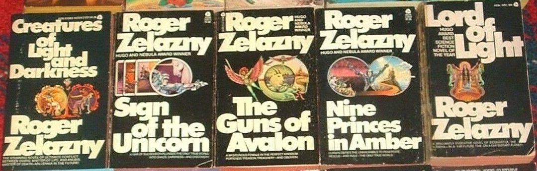
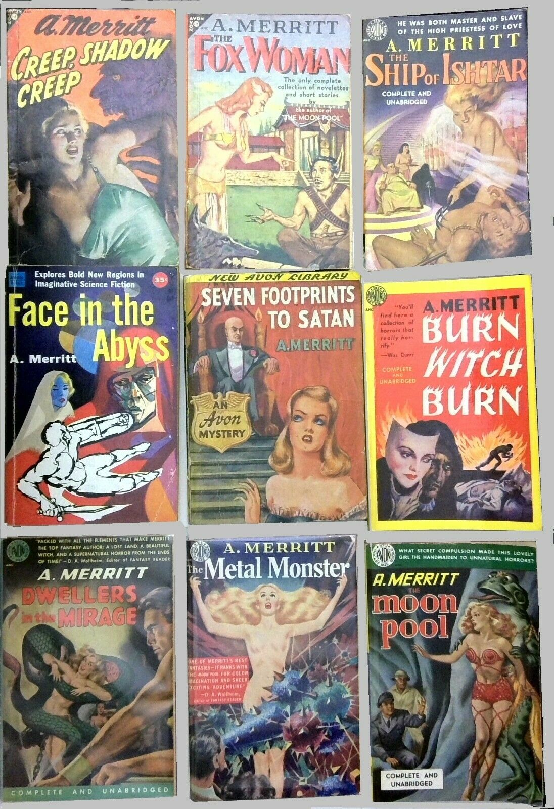
In many ways this kind of author branding reached its zenith in the late 70s, and in the Comments section of that article there were plenty of suggestions for examples I should look at next. Joseph Hoopman suggested Avon’s black-bordered Roger Zelazny (great choice!) and their vintage A. Merritt, Charles Martel mentioned the distinctive Laser Books cover series by Kelly Freas, Thomas Parker expressed fondness for Frank Frazetta’s Ace paperback covers for Edgar Rice Burroughs, and Bob Byrne suggested Tim Hildebrandt’s gorgeous covers for the first half-dozen Garrett, PI books by Glen Cook, among other ideas.
All good choices, and if fortune holds I’ll look at many of them. But today I want to highlight a set of paperbacks more contemporary to the Ace Robert Silverberg — the 14 Poul Anderson volumes published by Berkley and Berkley Medallion between 1976 – ’79.
[Click the images for 70s-sized versions.]
 |
 |
 |
 |
 |
 |
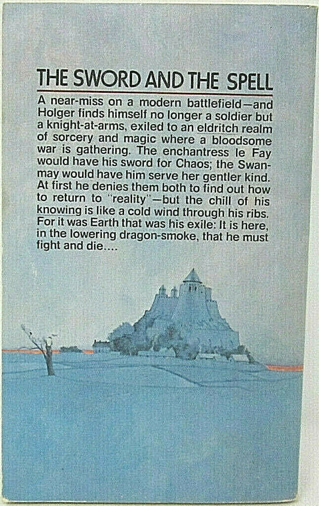
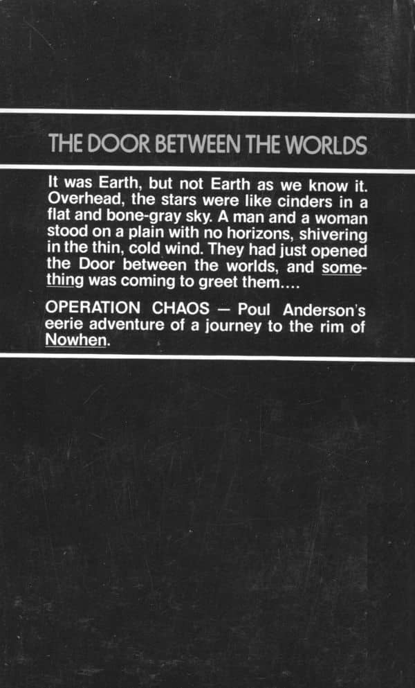
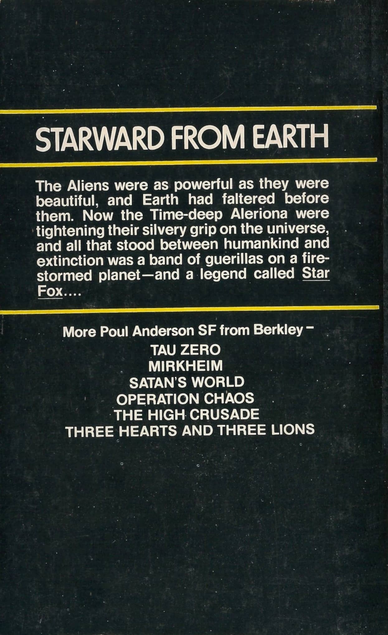
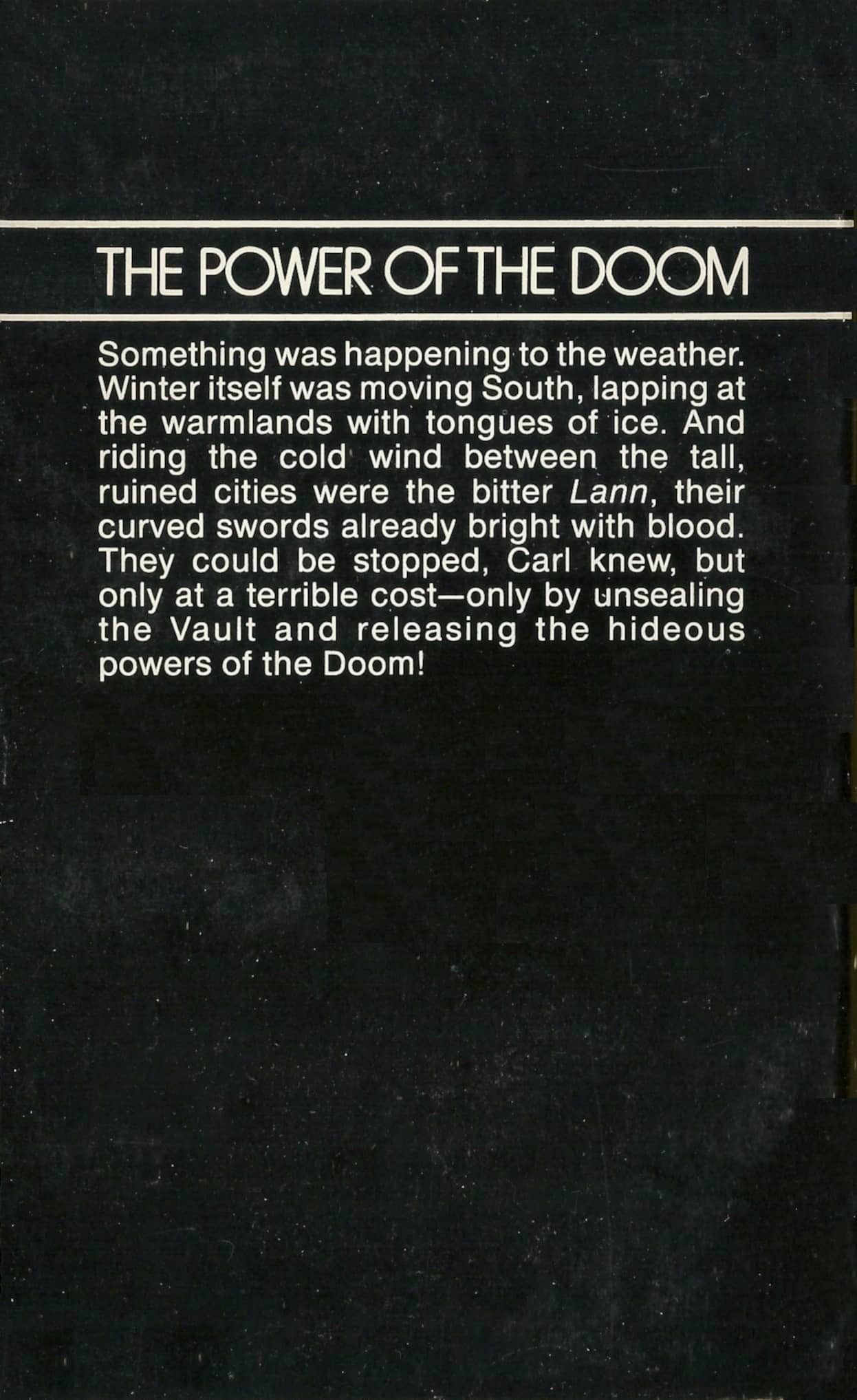
Back covers for the first six volumes
These books, like the Ace Silverberg, were hugely influential in my early SF reading and collecting. Although the covers aren’t as visually impressive as the ones Berkley released with fresh artwork just three years later (see below), they still did exactly what they were designed to do. They helped a confused 12-year-old standing in front of a vast and intimidating wall of science fiction paperbacks at WHSmith understand that all these books were by the same author.
And that was a big revelation, and a major step forward in demystifying the field, and helping me comprehend how science fiction worked. Not merely as a literature, but as a genre, as a type of book that was marketed, branded, and visually identified as science fiction. It didn’t just make it easier for me to pick out Poul Anderson and Robert Silverberg. It made me feel at home in the SF section, and taught me to spot — very nearly on a subconscious level — science fiction from a distance.
At the same time I was learning the colorful and simple visual language that publishers used to make SF authors stand out, I was discovering the authors — Isaac Asimov, Lin Carter, Frederick Pohl — who wrote extensively about science fiction and fantasy, in book introductions and editorials and anthology sidebars. Without any real effort, I was gently introduced to a branch of literature with a rich and deep history, in a way that quickly made me feel like an expert.
By the time Star Wars landed in movie theaters in 1977 with the impact of a category 5 hurricane, heralding SF as the virtual future of American pop culture, I was already confidently plucking familiar authors off the paperback spinner racks and plunking my change down at supermarket checkout aisles, feeling very adult in my discerning selections and knowledge of the field. Science fiction welcomed me — and thousands of readers like me — with open arms, congratulated us for our adult choices, and sold us paperbacks by the truckload.
And though I thought I cared only about authors, it was the unsung book designers who were truly key to winning me over. They instilled a powerful brand loyalty I wasn’t even consciously aware of until many years later.
 |
 |
 |
 |
 |
 |
 |
 |
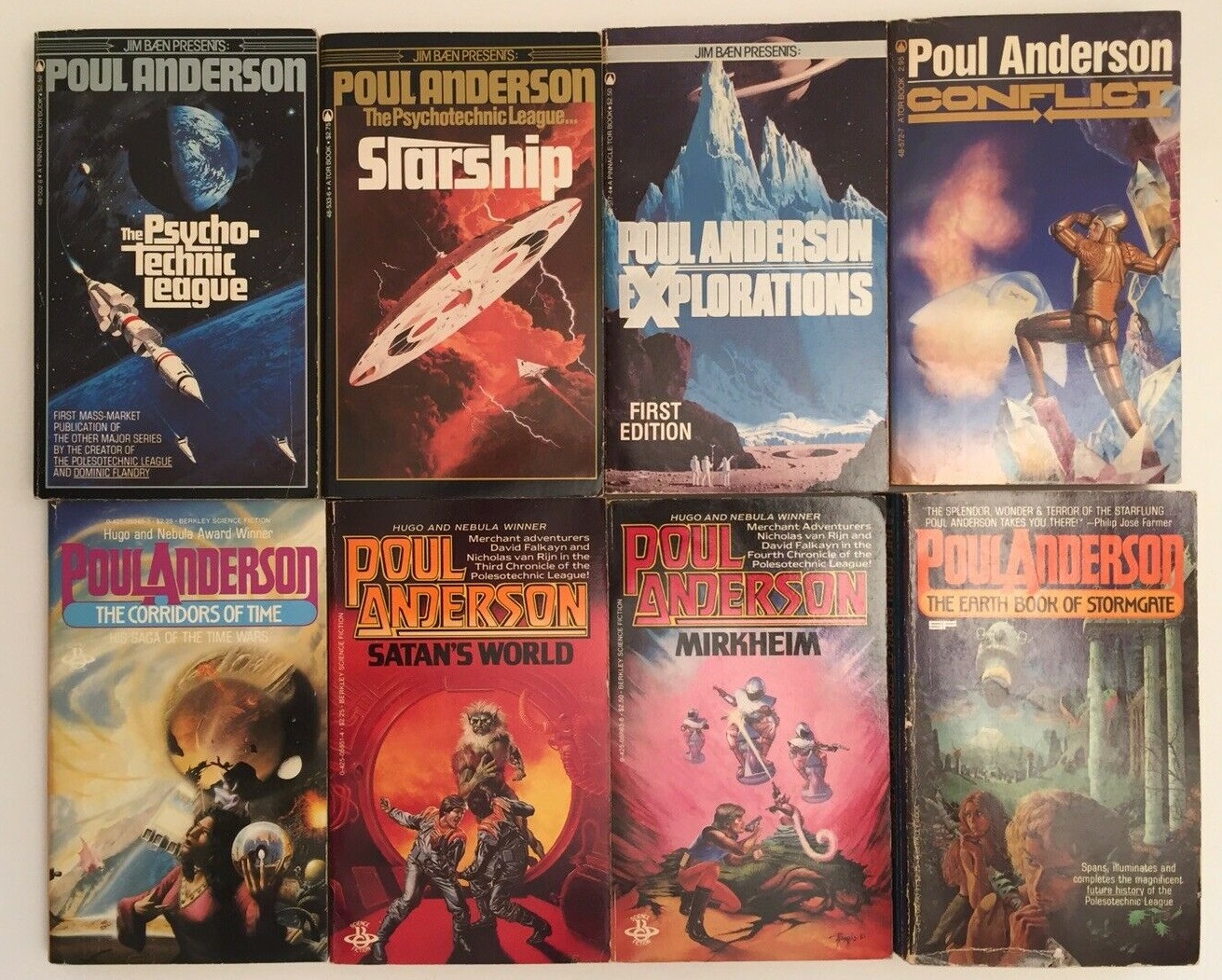
The last eight Berkley Poul Anderson paperbacks (in order), published January 1978 — January 1979.
Covers by Rick Sternbach, Wayne Barlowe, Tony Roberts, and unknown. See below for full credits.
Alongside A.E. van Vogt. Frank Herbert, and Isaac Asimov, Poul Anderson was one of the first authors I discovered in those early days of excited genre exploration. But whereas van Vogt, Herbert, and even Asimov had an impressive but limited number of books in circulation at the time, Anderson’s catalog seemed virtually limitless. Every time I visited the bookstore there was a brand new Poul Anderson book on the racks. Even more than the ubiquitous Asimov, he seemed to dominate the field in those days.
Truthfully however, I think it was Berkley (which also sold SF under the Berkley Medallion imprint) that dominated. In later years it would be Ace, Del Rey, and DAW that claimed the lion’s share of my paperback dollars. But in the late 70s and early 80s it was Berkley all the way. In 1981 alone they released books by Frank Herbert, Philip K. Dick, Robert A. Heinlein, Jack Williamson, Philip José Farmer, Peter Straub, Elizabeth A. Lynn, Dean R. Koontz, Harry Harrison, Piers Anthony, George R. R. Martin, Michael Moorcock, Alfred Bester, Damon Knight, Arthur C. Clarke, T. H. White, John Varley, Charles L. Grant, M. K. Wren, Avram Davidson, Robert C. Wilson, Eric Van Lustbader, Ben Bova, Barry B. Longyear, and many, many others.
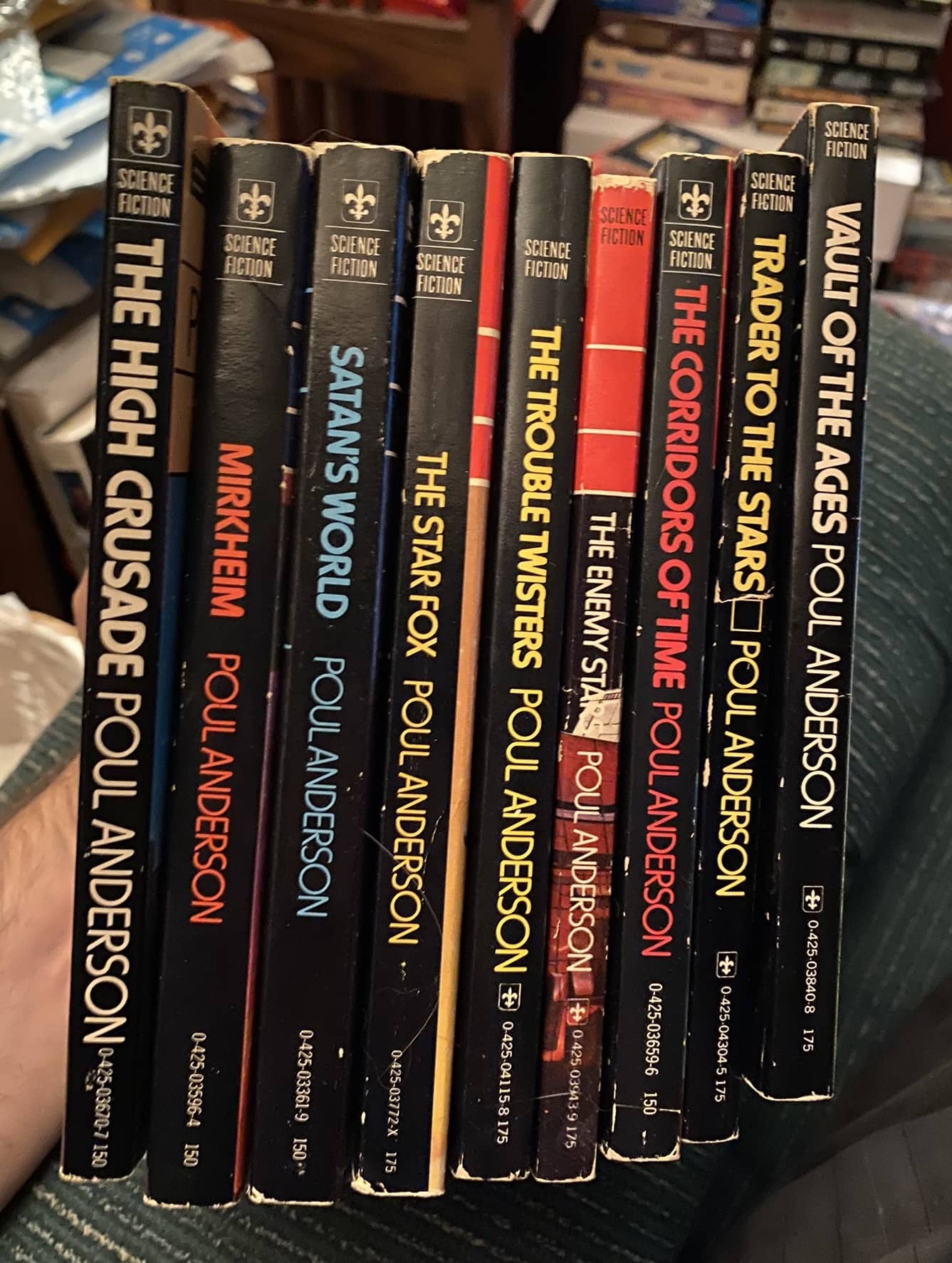
I’ve tried to determine precisely how many Poul Anderson books Berkley (and Berkley Medallion) released in the six year span between 1976-’82, and eventually I gave up. It’s a lot. I count 19 distinct titles, somewhere in the high 20s if you include reprints with new covers, and a lot more than that if you include reissues.
When I started thinking about which author and publisher I’d like to feature next in this series on Author Branding, there really wasn’t any contest. I knew I wanted to delve into the ’76-79 Berkley Poul Anderson and catalog just how many there were (I guessed nine; I was off by five).
 |
 |
 |
 |
 |
 |
 |
 |
Back covers to the last eight volumes
The Berkley Poul Anderson relied on very simple design to create a distinctive visual brand:
- A color banner (often black) on the top third of the cover, with title, credit, and author blurb
- Clean art below the banner, uncluttered (with the exception of a single blurb line of white text)
- The Berkley colophon on the top right (which vanished after the first half-dozen books)
- The Berkley SF logo in the top left, eventually replaced with a more streamlined SFiction logo after the first five books.
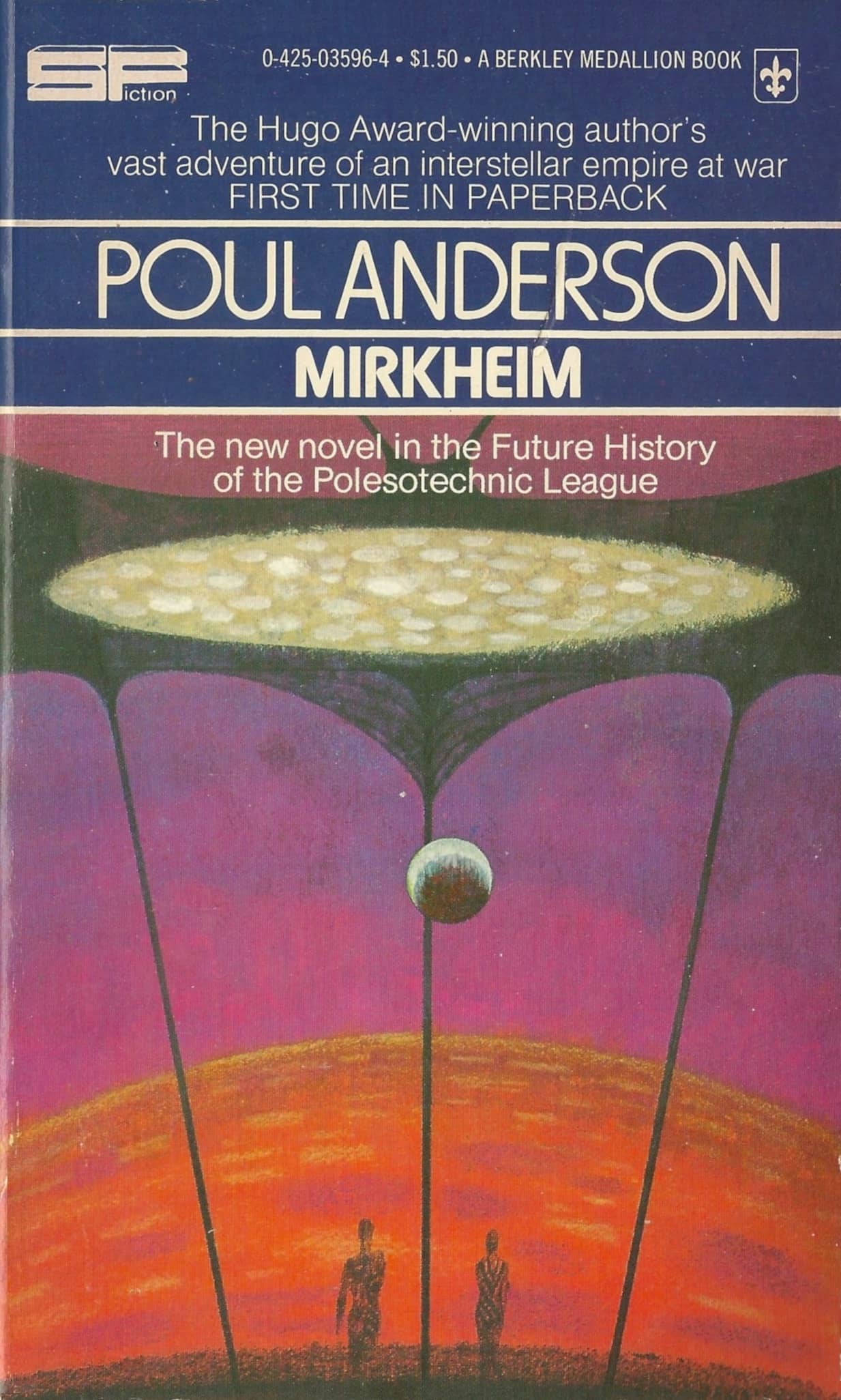
Unlike a lot of publishers who succeeded in creating a visual brand for their authors, the Berkley Poul Anderson didn’t rely on a single cover artist. Maybe that was the plan at first; the first four books in the series had covers by Richard Powers, perhaps the most iconic SF artist of the 60s and early 70s. But by the start of 1977, Powers was out, and he never did another cover for the series (with the exception of the paperback Mirkheim, which recycled the cover he produced for the January 1977 hardcover.)
 |
 |
Covers by Angus McKie
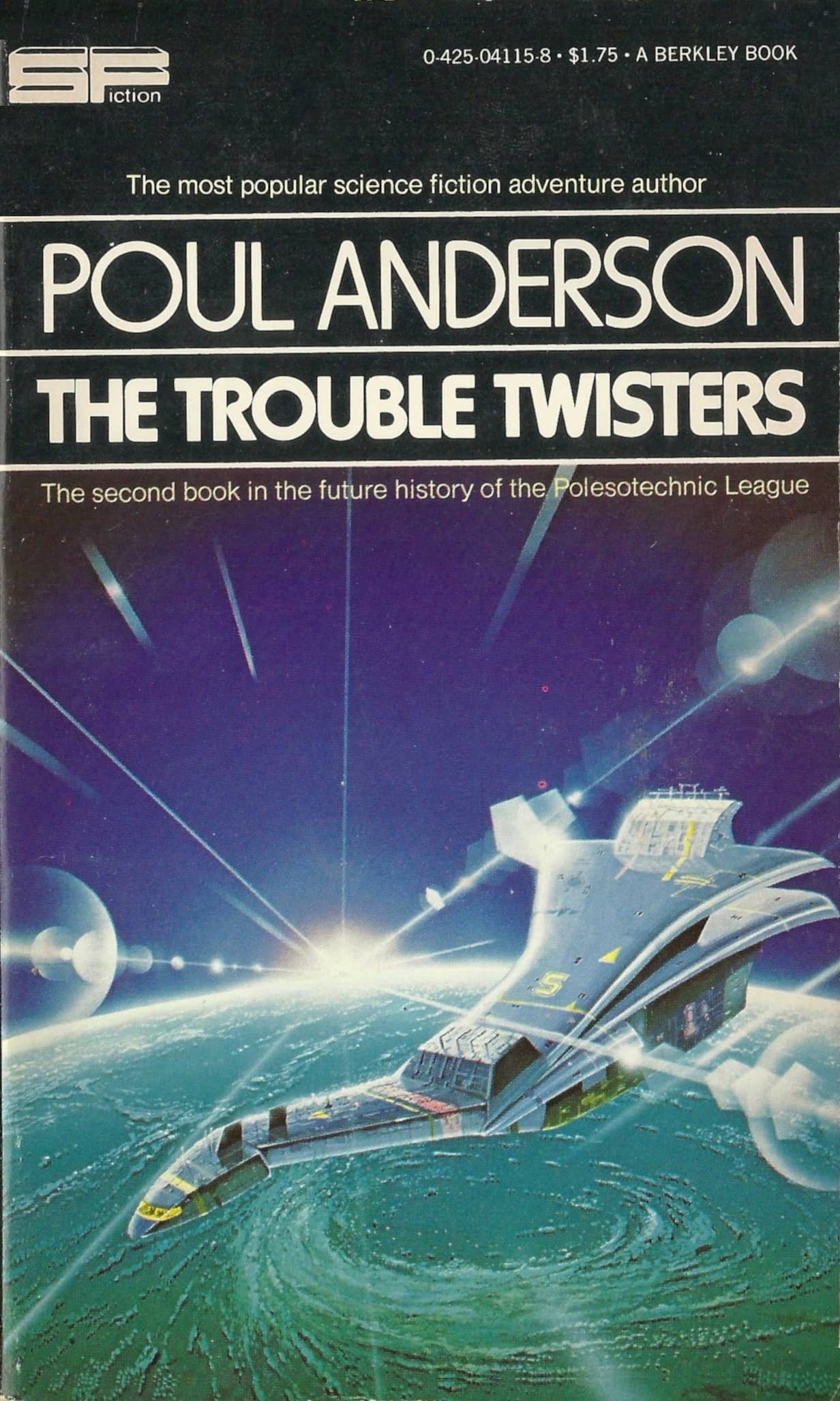
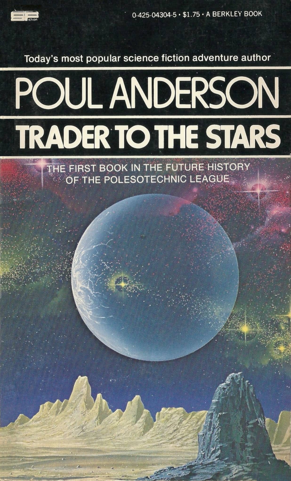
In fact, two January reprints that year swamped out their Powers covers for reprint art by British artist Angus McKie, which makes me think that the artistic change was fairly abrupt.
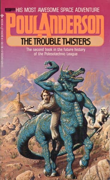
The Trouble Twisters, January 1977 [fourth printing] — cover by Angus McKie
Trader to the Stars, January 1977, [second printing] — cover by Angus McKie
Like most 70s science fiction, these are all short books, quick adventure reads focused on a young male audience.
Typical of 1970s paperbacks, these are short books
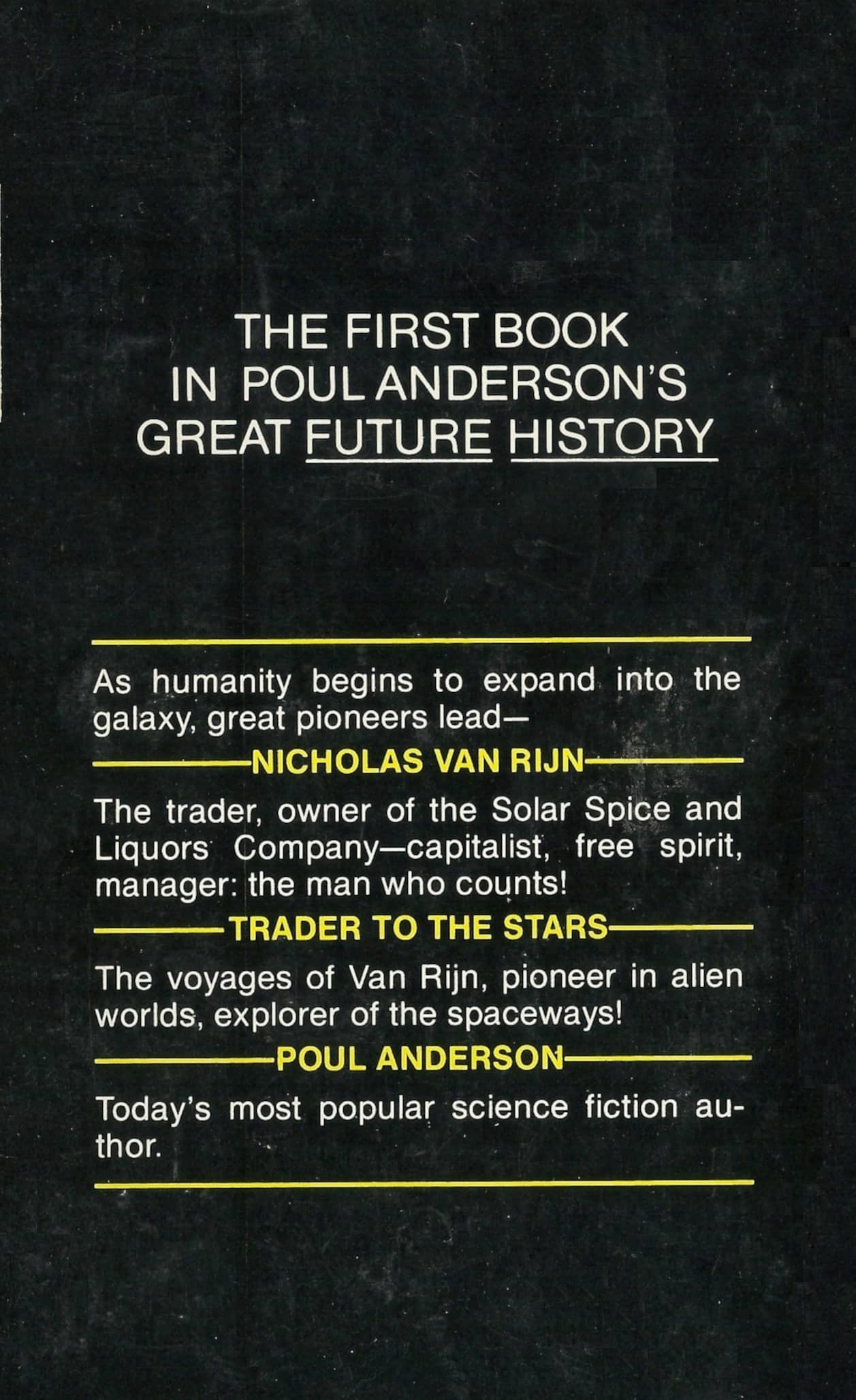
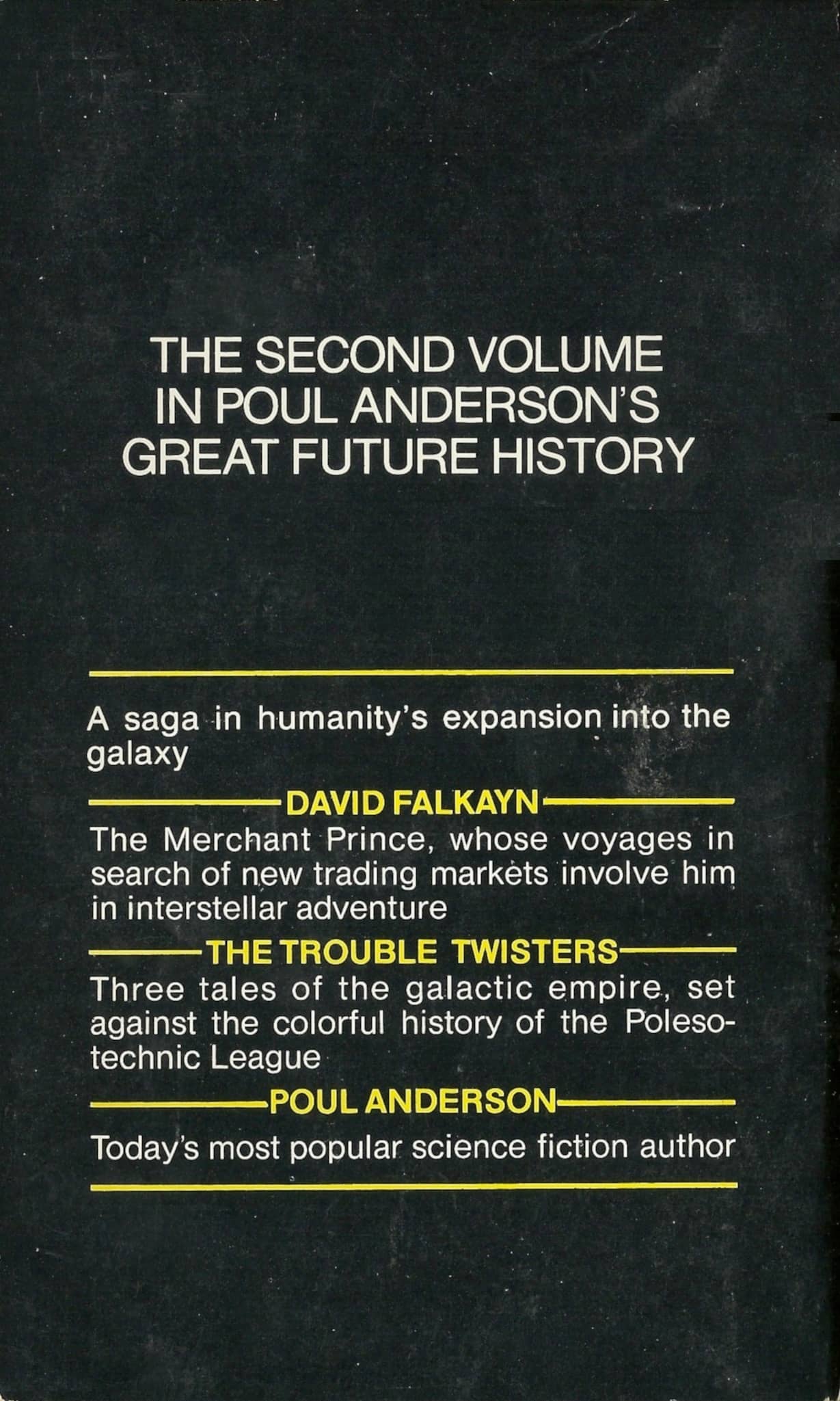
Although the logo on the front cover proclaims it a novel, Trader to the Stars (1976) is actually a collection of three novellas staring starfaring merchant Nicholas Van Rijn. In fact, three of the first four books in the series were collections.
The Berkley Poul Anderson volumes were published between 1976-79, and consisted of 14 volumes totaling no less than 2,743 pages:
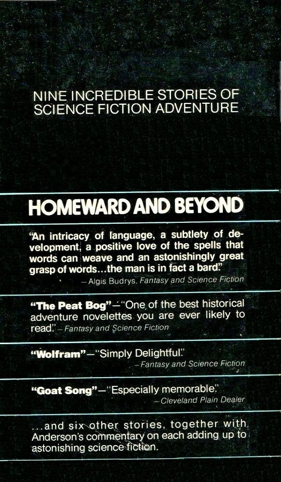
Homeward and Beyond (250 pages, $1.50, July 1976), cover by Richard Powers — collection
Trader to the Stars (159 pages, $1.25, August 1976), cover by Richard Powers — collection
Tau Zero (188 pages, $1.50, September 1976), cover by Richard Powers
The Trouble Twisters (190 pages, $1.25, October 1976), cover by Richard Powers — collection
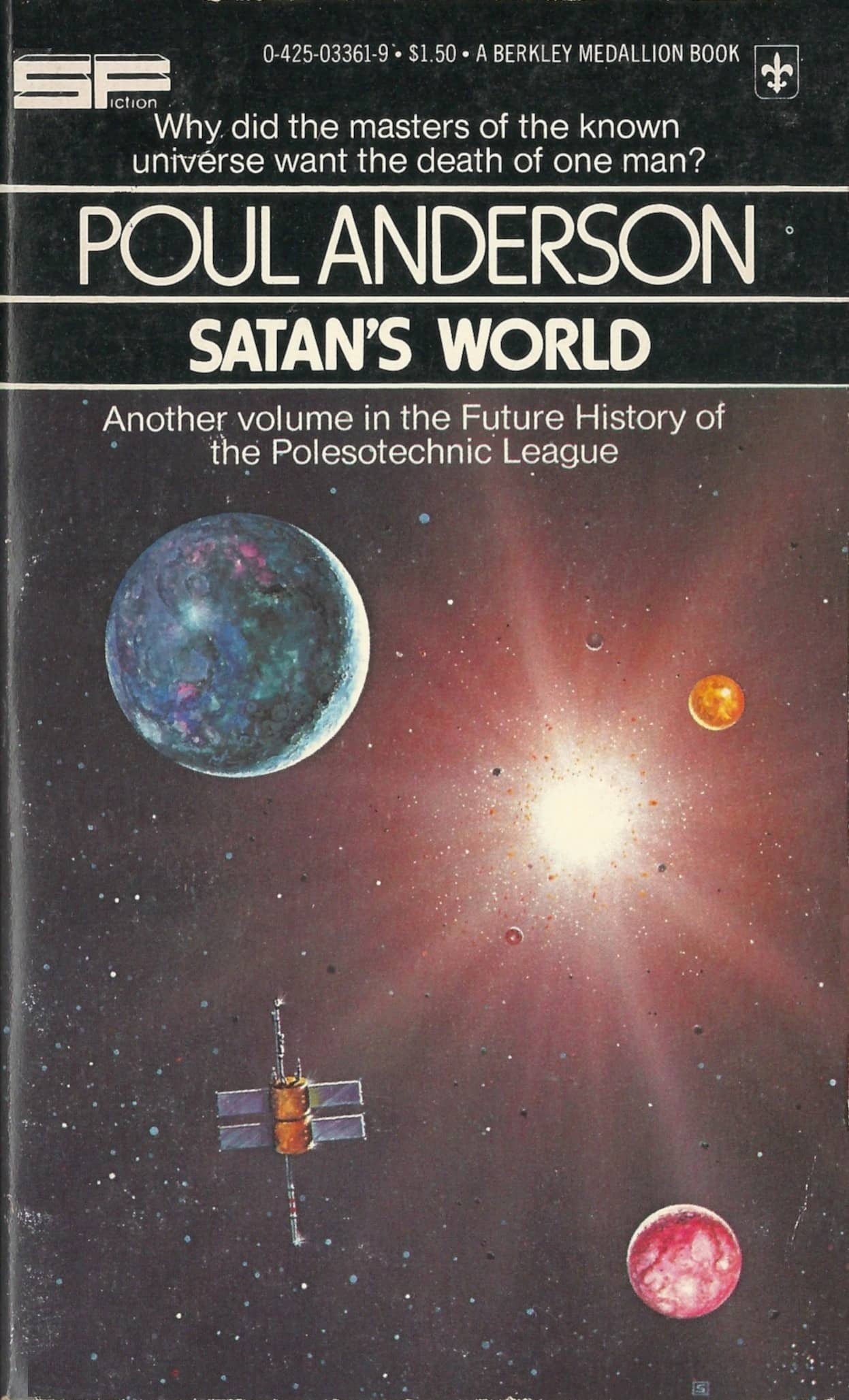
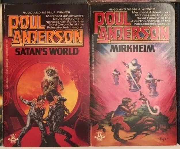
Satan’s World (220 pages, $1.50, April 1977), cover by Rick Sternbach
Mirkheim (216 pages, $1.50, December 1977), cover by Richard Powers
Time and Stars (214 pages, $1.50, January 1978), cover by Rick Sternbach — collection
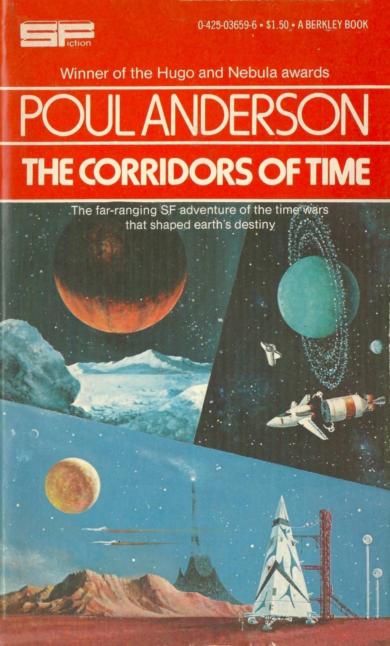
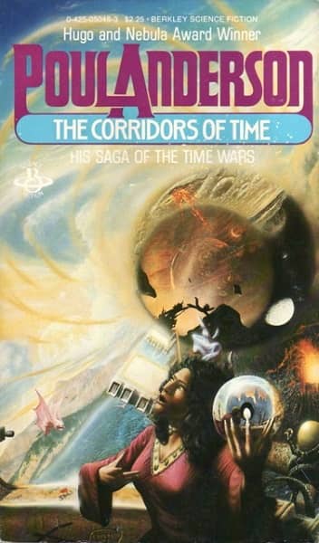
The Corridors of Time (186 pages, $1.50, February 1978), cover artist unknown [Berkley]
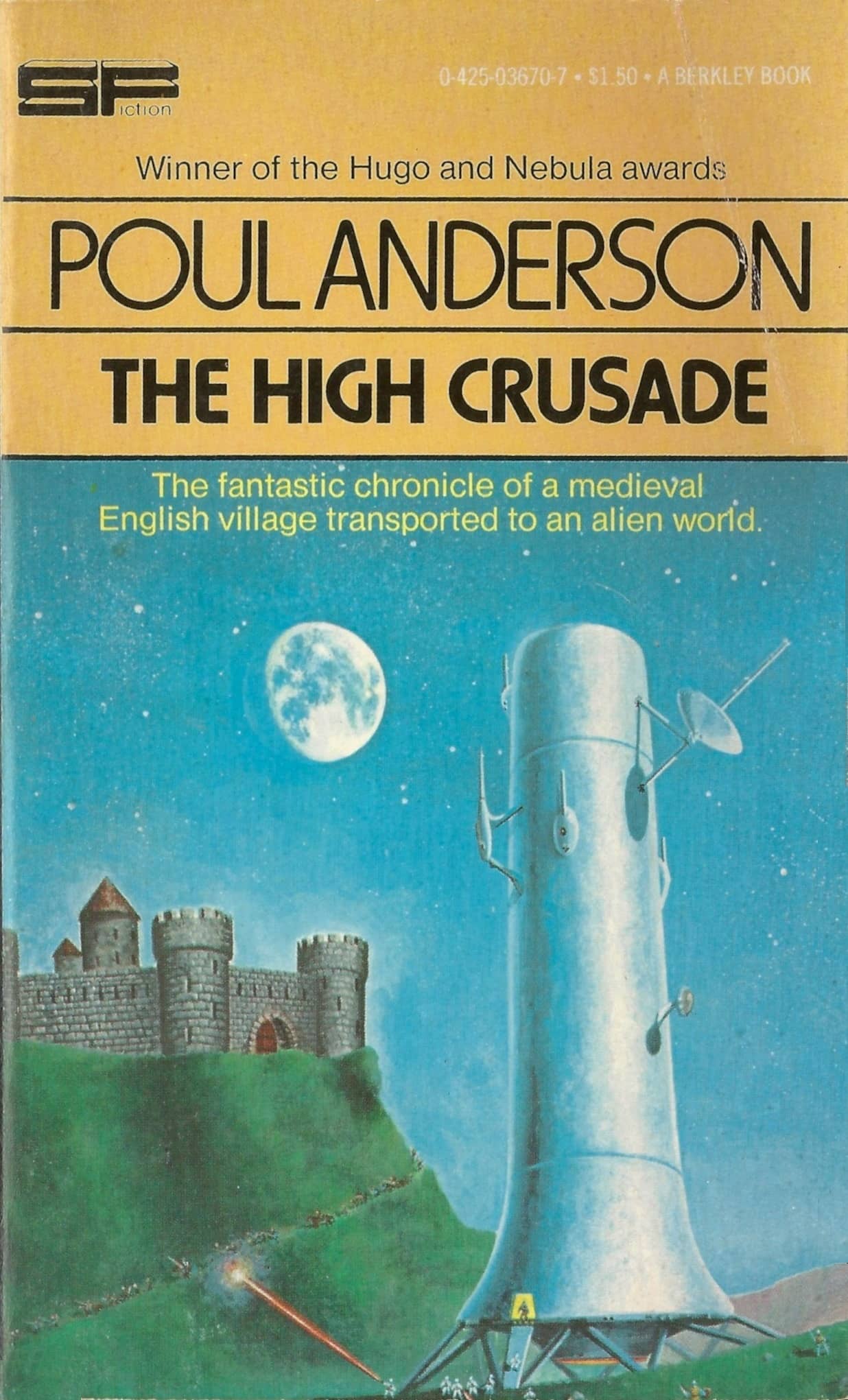
The High Crusade (167 pages, $1.50, March 1978), cover artist unknown
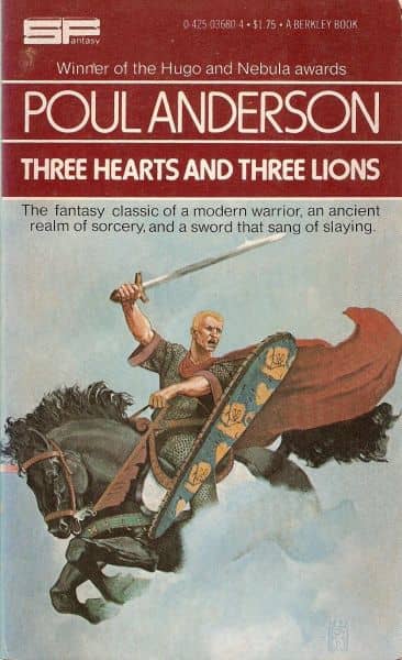
Three Hearts and Three Lions (167 pages, $1.75, April 1978), cover by Wayne Barlowe
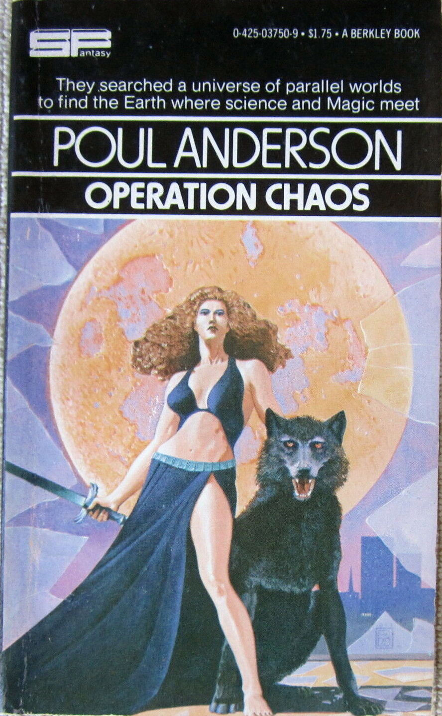
Operation Chaos (211 pages, $1.75, May 1978), cover by Wayne Barlowe [Berkley]
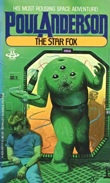
The Star Fox (247 pages, $1.75, June 1978), cover by Tony Roberts [Berkley]
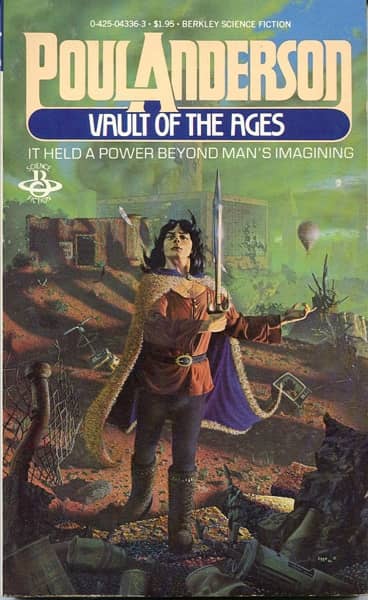
Vault of the Ages (170 pages, $1.75, October 1978), cover by Wayne D. Barlowe [Berkley]
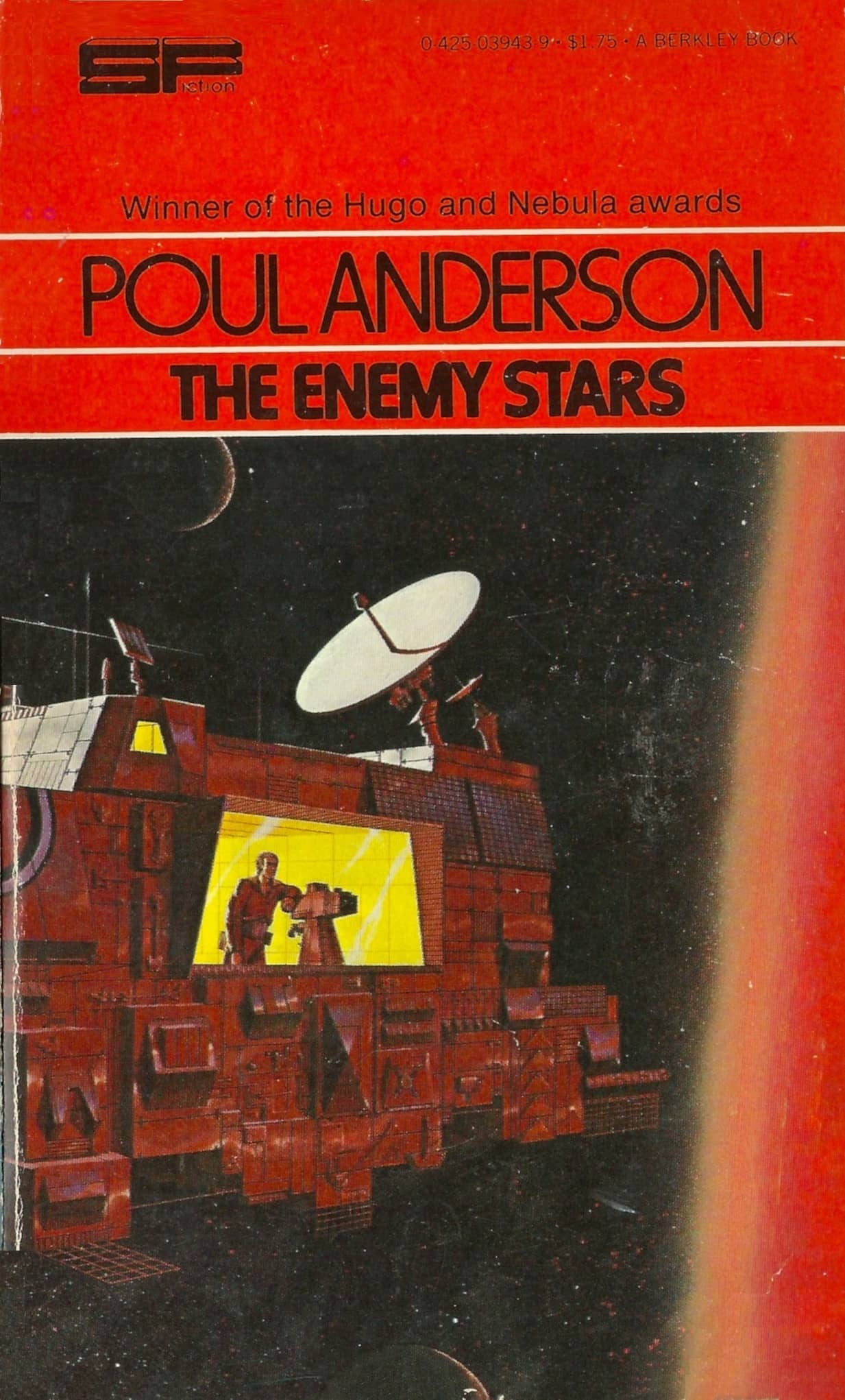
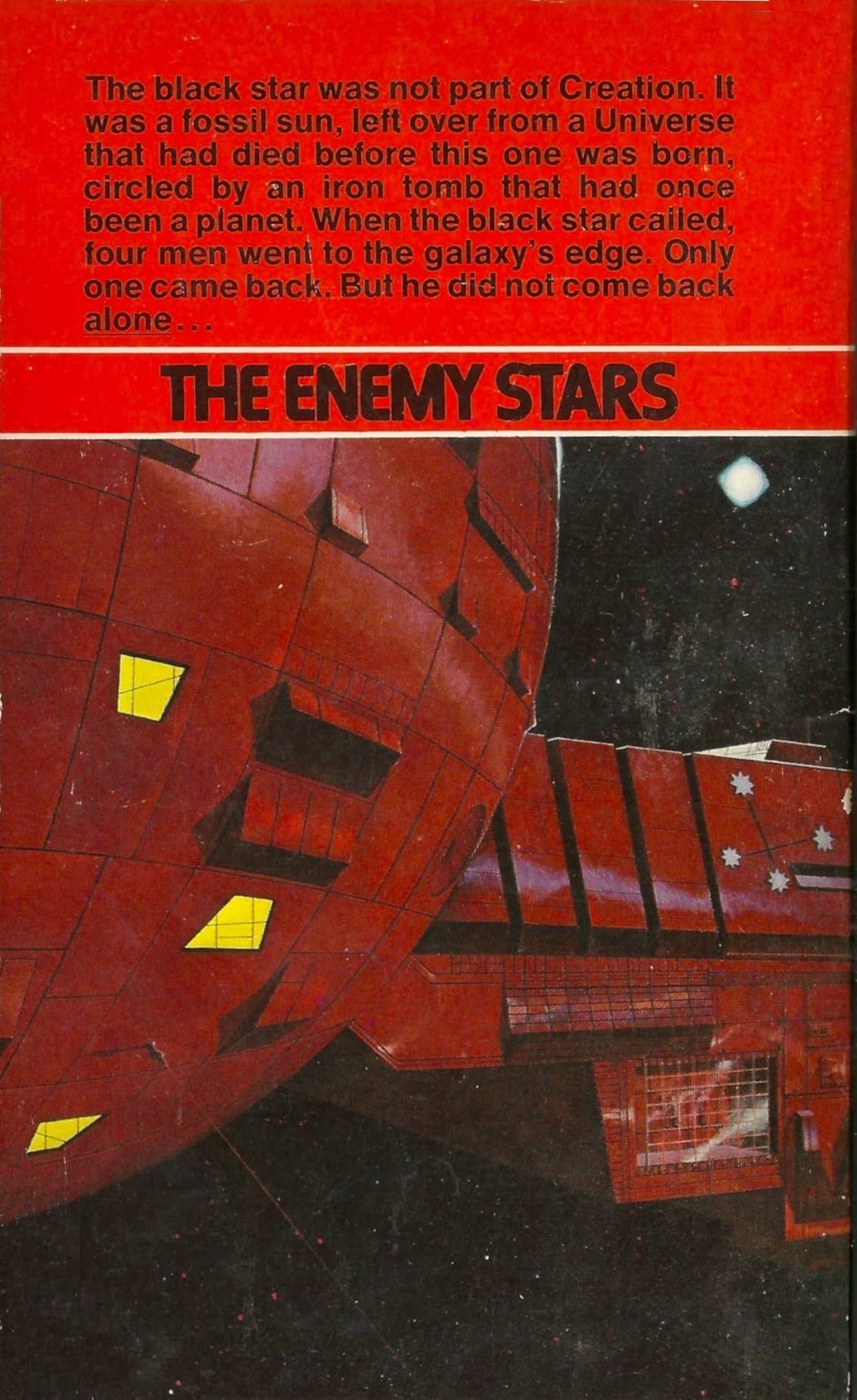
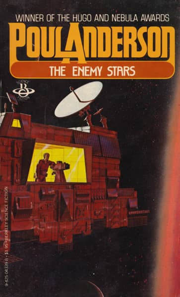
The Enemy Stars (158 pages, $1.75, January 1979), cover artist unknown
I’m sure there’s an easy way to tell the difference between the Berkley and Berkley Medallion volumes, but I don’t know what it is. So in the list above I tag those books issued under the Berkley name, according to ISFDB.
In 1979, Berkley revamped Poul Anderson’s author brand, addressing its major weakness — the non-uniform and generally bland cover art. It retooled the design, eliminated the top banner, and hired David Egge and at least three other artists to create more colorful and striking images.
The effort succeeded. Here are the eleven volumes issued between 1979-1982, only one of which re-used previous art (The Enemy Stars).
 |
 |
|
 |
 |
 |
 |
 |
 |
 |
 |
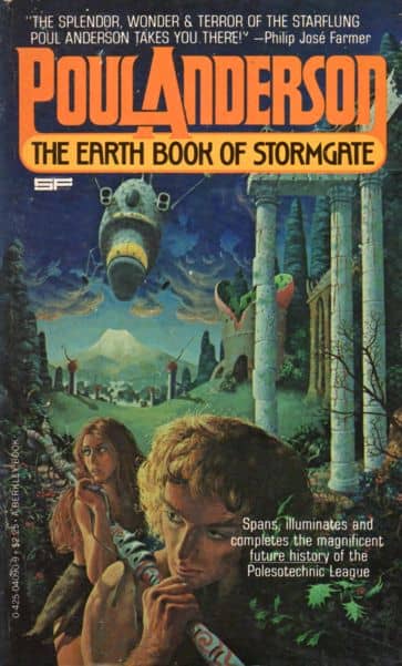
The 1979 redesign. Covers by David Egge, Bob Fowke, Greg Theakston, Benvenuti, and unknown
Here’s all eleven books with the new design, including three collections.
The Earth Book of Stormgate (446 pages, $2.25, May 1979) — cover by Bob Fowke — collection
The Avatar (404 pages, $2.25, October 1979) — cover by Greg Theakston
Tau Zero (188 pages, $1.95, May 1980) — cover by David Egge
Vault of the Ages (160 pages, $1.95, May 1980) — cover by David Egge
The Enemy Stars (158 pages, $1.75, May 1980) — cover artist unknown
The Star Fox (247 pages, $1.75, May 1980) — cover by David Egge
The Trouble Twisters (190 pages, $1.95, May 1980) — cover by David Egge — collection
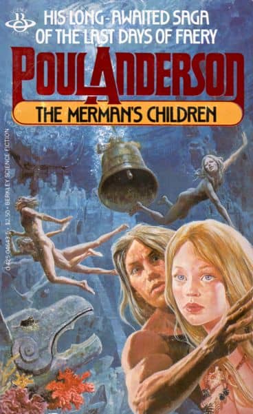
The Merman’s Children (268 pages, $2.50, October 1980) — cover by Benvenuti
The Corridors of Time (186 pages, $2.25, September 1981) — cover uncredited
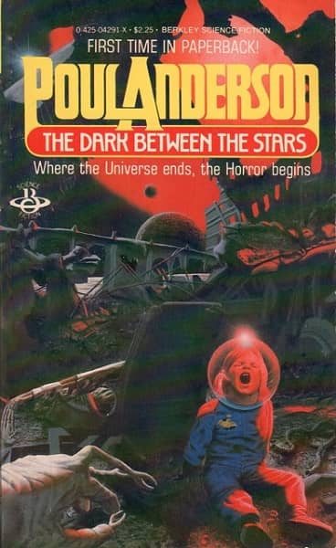
The Dark Between the Stars (219 pages, $2.25, December 1981) — cover by David Egge — collection
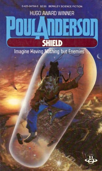
Shield (201 pages, $2.50, April 1982) — cover by David Egge
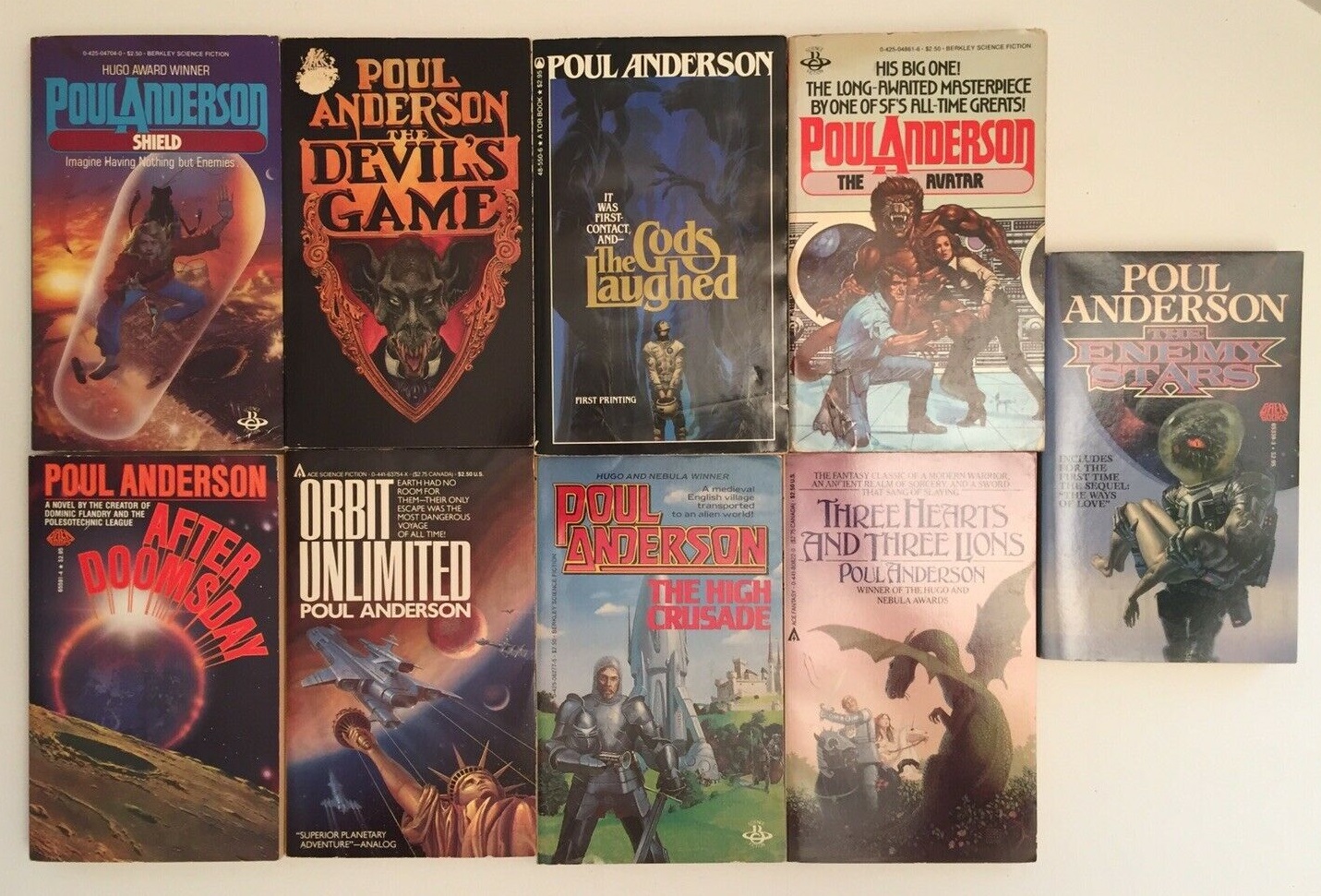
By 1982, Berkley did a third redesign, with new artwork and more cover text. As striking and as interesting as it was, that’s a topic for another article (though here’s a taste from Sample #1 of the Poul Anderson cover catalog below, which should give you the general idea: Satan’s World and Mirkheim).
The 1982 Berkley redesign. Covers by Ferris
As I mentioned in my Silverberg article, the most successful author brands were created around authors with a large following and a deep back catalog, and Poul Anderson had both. Anderson, who died in 2001 at the age of 74, was a popular and enormously prolific author with a career spanning over five decades. He was packaged and repacked numerous times by countless publishers over the decades. Like Robert Silverberg, it’s easy to have a dozen different editions of the same Poul Anderson volume and still not have a complete set.
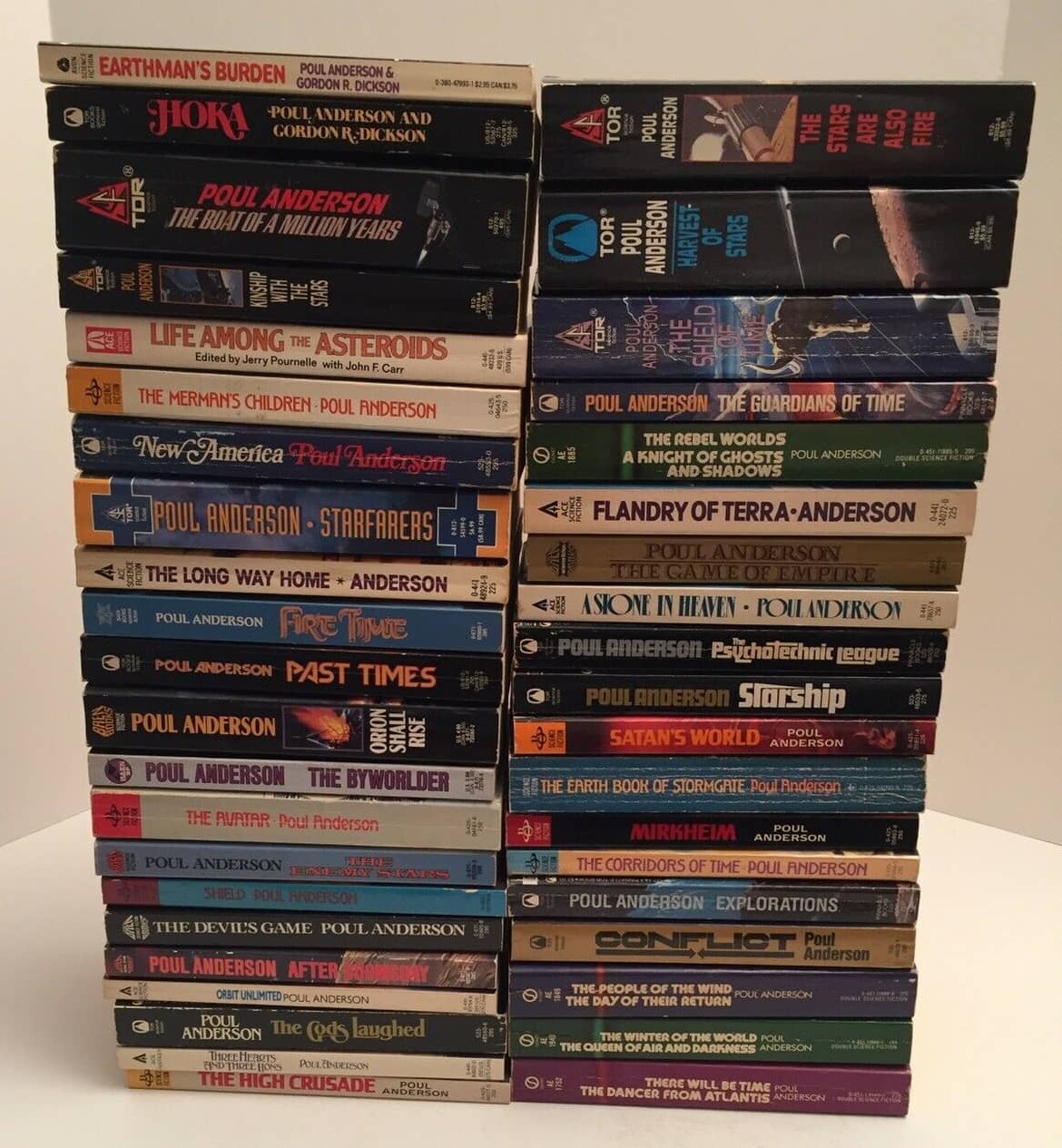
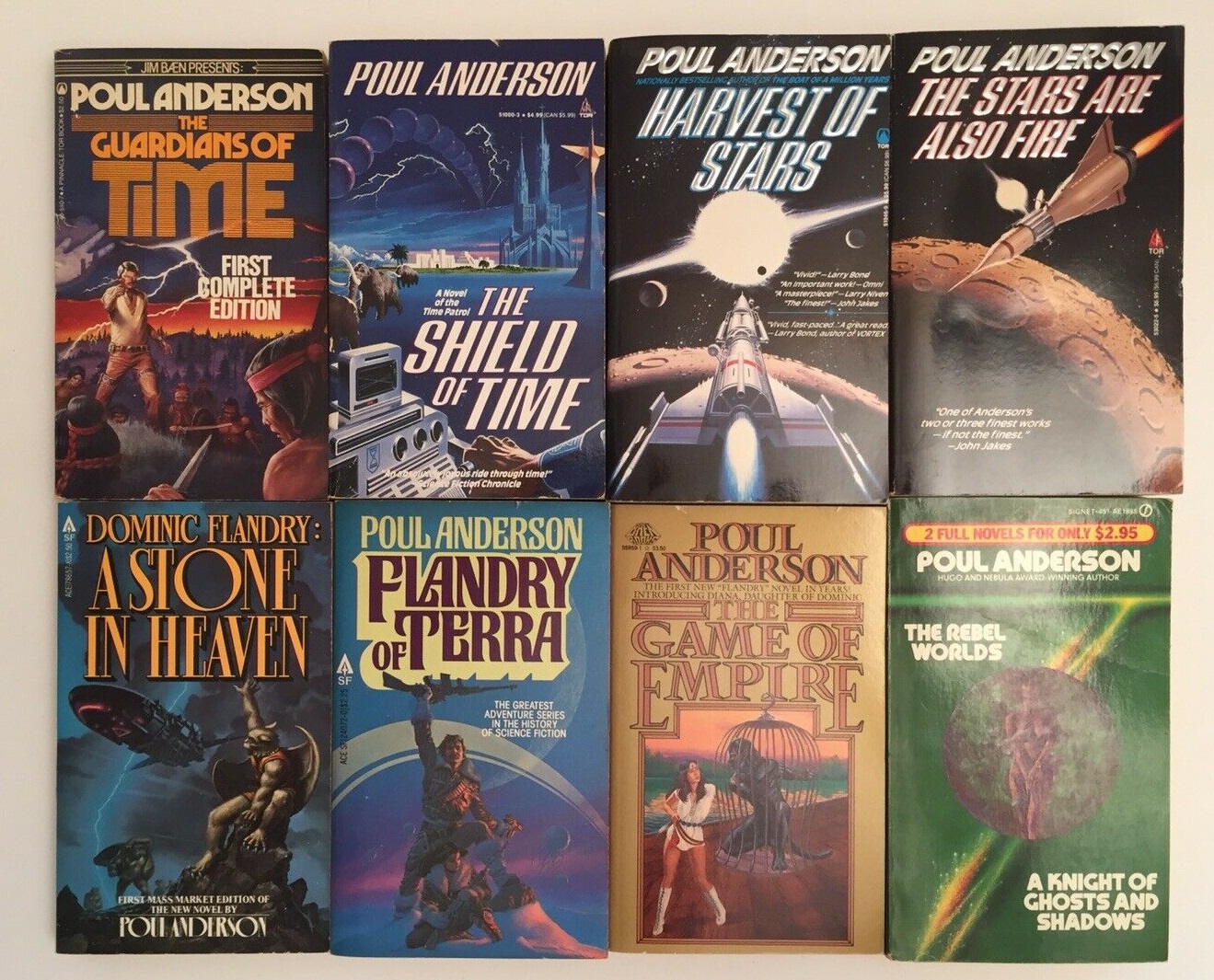
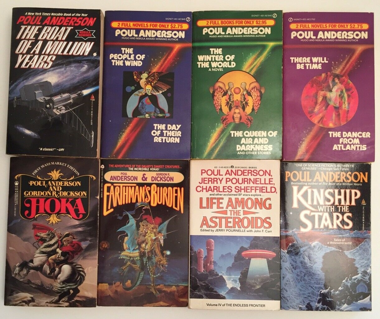
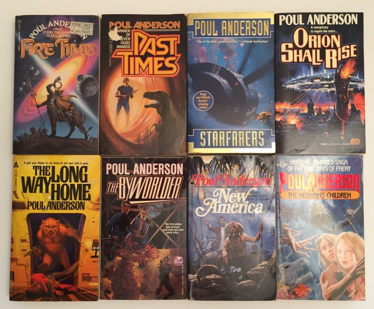
41 Poul Anderson vintage paperbacks (purchased on eBay last month for $49.95)
Not surprisingly, Poul Anderson is one of the most collectible authors in science fiction. Not merely for the quality of his work and his unique importance to the field — both of which are undisputed — but because of the highly inventive and varied ways his books were sold over the decades.
I recently acquired a paperback collection of 41 Poul Anderson paperbacks in great condition — mostly unread and in better shape than my tattered volumes (click the image above for a closer look). I count samples of over half a dozen different Poul Anderson author brands created by Ace, Baen, Tor, Berkley, Signet, and others. They make an interesting virtual tour of his publishing career in the 80s and 90s.
I’m too lazy to create thumbnails for them all, but if you’re curious what they looked like, check out photo samples of the lot below
Poul Anderson vintage paperback Sample #1
Poul Anderson vintage paperback Sample #2
Poul Anderson vintage paperback Sample #3
Poul Anderson vintage paperback Sample #4
Poul Anderson vintage paperback Sample #5
Our previous articles in this series include:
See all of our Vintage Treasures here.
I’ve never been sure what “collectible” means. It can’t mean easy to find, can it? Is it about things that attract collectors?
The association of Michael Scott Rohan and Ian Miller cover art is worth a look.
A large chunk of my wishlist is authors who were popular or midlist in previous decades but now in a self-publishing phase, using print on demand usually.
One of the things that fascinates me about authors in this phase of their career (admittedly new authors do it too) is the way they present their own books, because they either do the cover art all by themselves or become the art/design director for their own work.
I’ve been enthralled by SP Somtow in the past 2 years, he self-publishes the majority of his old books and some new ones and he has changed the cover art for some books within a relatively short space of years.
I’ve also been baffled by the covers some authors have chosen. If you’re mostly being bought by old fans, why have a tacky cover when you could just have your name and book title?
Unrelated: I’ve been thinking about when you said months ago that comments are very important to you. Is it compatible with the site design to have a long bar down the side that tells you about comments on older articles? That could give older articles a longer lifespan.
Ah I love the cover art displayed here. Especially the Richard M Powers pieces.
I will note though that the cover art for the Trouble Twisters here did double duty on the cover of Rhapsody in Black by Brian Stableford.
I love Richard Powers artwork but they are so abstract that they could be used for any book.
Perhaps worthy of adding to your list, John, is the first author I can recall having his novels branded with a consistent look, a certain Mr. Heinlein with his series of Scribner’s juveniles (1947-58)
I think it was Steele Savage (what a name!) who did those Scribner’s Heinleins.
Something about those last eight label Berkley covers (’78-’79)pulls me in like the later ones just can’t.
I don’t buy a lot of vintage paperbacks but i bought The High Crusade a several years ago without knowing anything about it or Poul Anderson.
> I’ve never been sure what “collectible” means. It can’t mean easy to find, can it? Is it about things that attract collectors?
Hi Robert,
It’s the latter. It means things that appeal to collectors.
There are lots of rare and expensive books that, for one reason or another, aren’t collectible. And there are LOTS of things that AREN’T rare, but are still collectible and in high demand (such as videogames, toys, and expensive comics that appeared a year ago.) Collectability is a rare and elusive combo of factors that appeal to collectors, and we’re strange and unpredictable. 🙂
> The association of Michael Scott Rohan and Ian Miller cover art is worth a look.
Interesting choice! I LOVE Ian Miller’s art, but the one try I made with Rohan fell flat… what do you suggest I start with?
> I’ve also been baffled by the covers some authors have chosen.
> If you’re mostly being bought by old fans, why have a
> tacky cover when you could just have your name and book title?
Robert,
Ho-boy. This is a thorny topic. I’ve worked with/advised a LOT of writers who decided to start self-publishing over the last 10 years, and, bluntly as I can say it, the vast majority of those writers don’t have the slightest understanding of the importance of cover art.
Most of them believe their book is the important thing, and cover art is a mere decoration.
Another subset believes cover art is important, but have absolutely zero talent when it comes to Art Direction.
A third group fully understands the value of art, but have willing blind spots when it comes to friends and family, and decide to use a cover painted by their daughter, niece, or close friend.
I’ve seen great self-published books end up with truly awful cover art that way.
Some folks who do a great job? Kay Kanyon’s self-published novels have gorgeous covers. So does Harry Connolly (who hired Chris McGrath for his covers). There are other great examples as well.
> Is it compatible with the site design to have a long bar
> down the side that tells you about comments on older
> articles? That could give older articles a longer lifespan.
Hmmm… that’s a good idea! As an admin I get notifications of comments on older articles, but you’re right — I bet it would help readers stay on top of conversations that pop up.
I’ll investigate whether our blogging software (WordPress) offers an option like that. Thanks for the suggestion!
> I will note though that the cover art for the Trouble Twisters here
> did double duty on the cover of Rhapsody in Black by Brian Stableford.
dmont,
I noticed the same thing. Angus McKie’s splendid artwork was originally used in the UK by Pan, for the second volume of Brian Stableford’s Hooded Swan space adventure series. (Check out the great author branding on these babies!)
This isn’t so common these days, but in the 70s and 80s it wasn’t at all unusual for artwork to get sold multiple times into international markets.
This is one of the reasons that distribution rights were strictly controlled back then. (Pan books were often sold in Canada where I grew up, but you’ve often see stickers and such that said, “Not for sale in the US.”)
The reason was rights, of course. Not just book rights — Stableford doubtless wanted the ability to sell the rights to his series to a US publisher, and rightly so — but art rights. Angus McKie could expect to (and did) re-sell his cover for another purpose to the US market. Neither of those things would have been possible if Pan had been freely selling Rhapsody in Black into the US.
The nuances of art and book rights were lost on me at the time, of course. I just thought it ridiculous that book sellers couldn’t bring their UK stock to sell at conventions in the US. Makes a lot more sense these days. Look hard enough behind that strange law and there will usually be a reason!
Cover-art is an interesting topic in it self.
I grew up in Canada also. The World’s Biggest Bookstore was my second home when I was in high school in Toronto. When I went to Algonquin College in Ottawa I patronized a small Sci-fi/Fantasy/Horror specialty bookshop in the Glebe. Unfortunately it closed up when they opened the Chapters store in the Byward Market. Can’t remember the name of it.
Rohan’s novel Anvil Of Ice (first in a series) is in the Gollancz Fantasy Masterworks series, so that must be a pretty good bet. Lord Of The Middle Air seems quite acclaimed too.
Wish I could say I’ve read them but I’ve been excited by the praise and hope to start Anvil Of Ice this year. I own those books and a few others.
I’ve seen pieces of fantasy art that ended up on books, magazine format comics, album covers and posters. I couldn’t think of a painting that was on all four things but some Whelan pieces ended up in different places. Artists back then seemed to hustle their paintings wherever they could.
Mr. O’Neill,
I checked on my sf/f reading group blog site (a WordPress critter, beamerbooks.wordpress.com) and you can add “Recent Comments” (up to 15, default 5) to a page sidebar, from the Dashboard, under “Appearance” > “Widgets”.
> I love Richard Powers artwork but they are so abstract that they could be used for any book.
Charles,
You’re absolutely right. And after a while, they WERE used for just any book. Powers became so ubiquitous by the early 70s that his covers nearly defined science fiction. And in later years there was almost a sameness to them that made them nearly interchangeable.
> the first author I can recall having his novels branded with a consistent look, a
> certain Mr. Heinlein with his series of Scribner’s juveniles (1947-58)
candor,
Heinlein was definitely one of the first SF writers to benefit from author branding. Although the practice really came into its own when it was widely used for paperback reprints, and the Scribner juveniles were hardcovers.
> I think it was Steele Savage (what a name!) who did those Scribner’s Heinleins.
Thomas,
According to IMBD, Savage didn’t do any Heinleins for Scribner…
http://www.isfdb.org/cgi-bin/ea.cgi?26295
…but he DID do virtually all of the Ace Book Heinlein paperback reprints in 1970/71, including The Rolling Stones, The Star Beast, Time for the Stars, Tunnel in the Sky, Rocket Ship Galileo, Red Planet, Between Planets, and Have Space Suit—Will Travel.
> I don’t buy a lot of vintage paperbacks but i bought The High Crusade a several years ago without knowing anything about it or Poul Anderson.
Glenn,
What an age to discover Poul Anderson!
Did you get a chance to read it? What did you think?
> When I went to Algonquin College in Ottawa I patronized a small Sci-fi/Fantasy/Horror
> specialty bookshop in the Glebe. Unfortunately it closed up when they opened the
> Chapters store in the Byward Market. Can’t remember the name of it.
dmont,
Holy cats — that had to be THE HOUSE OF SPECULATIVE FICTION, run by Pat Caven and Rodger Turner!
What a fabulous store! I bought many (many) a book there over the decades. I was actually a silent partner in the store in its last few years in the mid-90s, while I was living in Chicago.
I’m so glad you mentioned it. What do you remember about it?
John, sadly vintage copies of The High Crusade and The Broken Sword still sit on my shelf unread.
I’ll get to them eventually…
Yes that’s the place – I had a nodding acquaintance with the proprietors and I once held the door for Charles de Lint as he exited. I wouldn’t have known but another patron told me. It was in an older house on a side street just off bank a short walk from the Rideau Canal. It was a snug but well ordered place. I lived over by the Woodroffe Campus but I had cousins who live on 5th avenue and they would have me to dinner about once a month so I would head over early so I could go in and see what was new. My other haunt was a place called Bay Used Books.
I love this Berkley Medallion series! The covers are great. Only compare HOMEWARD AND BEYOND’s Doubleday edition (awful cover) to this one to see what a good art director and great artist can do. (That book is essential for a little known but totally brilliant Anderson historical story, “The Peat Bog”.)
And he sure has had a lot of extended single publisher reprint series, eh? Berkley. Tor. Baen. Signet.
> Rohan’s novel Anvil Of Ice (first in a series) is in the Gollancz Fantasy Masterworks series…
Robert,
Agreed, that usually makes it a good bet. I haven’t tried this series — and you’re right, the Ian Miller art is evocative and very eye-catching. I shall check it out!
Pictured below is the Orbit 1987 reprint:
> I’ve seen pieces of fantasy art that ended up on books, magazine format comics,
> album covers and posters. I couldn’t think of a painting that was on all four things…
> Artists back then seemed to hustle their paintings wherever they could.
Robert,
Very true. Probably the most famous example (well, at least least the one that popped into my head immediately!) was Kelly Freas’ artwork for the October 1953 Astounding magazine, illustrating a Tom Godwin story, which was repurposed for an Astounding John W. Campbell Memorial anthology edited by Harry Harrison, a Kelly Freas art book, and even an album cover by Queen (News of the World)!
There are other examples of course — I can think of plenty of times I’ve been Planet Stories cover art repurposed — but this one of of my favorites.
> you can add “Recent Comments” (up to 15, default 5) to a page sidebar, from the Dashboard, under “Appearance” > “Widgets”.
Eugene,
Really? That’s fantastic — thanks for the tip!! (*dashes off to check it out*)
John- I find it odd but not totally surprising that many authors would not have much aesthetic sense. Visuals are a large part of the attraction of fantastical fiction but I’ve noticed a lot of writers and fans aren’t too fussy about the drawings in their favorite comics or animation and that often stumps me.
> sadly vintage copies of The High Crusade and The Broken Sword still sit on my shelf unread.
> I’ll get to them eventually…
Glenn,
The Broken Sword is the one people keep telling me I need to read (I haven’t read it either.) It gets a lot of attention from serious fantasy fans.
Gabe Dybing did a fascinating deep dive into the “Northern Matter” at Black Gate five years ago:
https://www.blackgate.com/2015/03/04/northern-matter-in-poul-andersons-middle-ages-of-the-broken-sword-and-in-j-r-r-tolkiens-middle-earth/
And if you go even further back, Ryan Harvey did a thoughtful analysis of the two versions of the tale way back in 2008:
https://www.blackgate.com/broken-in-two-poul-andersons-two-versions-of-the-broken-sword/
> Yes that’s the place – I had a nodding acquaintance with the proprietors and I once held the door for Charles de Lint as he exited.
dmont7,
I lived in Ottawa for over 10 years (1976-87) and I have many, many happy memories of browsing at House of SF. I eventually became friends with the owners, Pat and Rodger. Rodger was instrumental in helping me get my first SF blog SF Site up and running.
I miss having a good SF store around. And House of SF was world class.
> And he sure has had a lot of extended single publisher reprint series, eh? Berkley. Tor. Baen. Signet.
Rich,
Amen, brother!
I’m not sure there’s anyone who compares to Poul Anderson in terms of raw number of times he’s been repackaged with new covers. Stephen King maybe?
Ryan Harvey’s post is what caused me to pick it up in the first place. So that means i’ve had the book since around 2009.
Now you’re making me feel old! 🙂
Slightly late to the party here, but most or all of those Stableford cover paintings were also recycled into the Terran Trade Authority art books — Spacecraft 2000-2100 AD, for example.
https://www.amazon.com/Spacecraft-2000-2100-D-Authority-Handbook/dp/0890092117
I didn’t even know about the Stableford covers until much later (maybe another article here?).
And thsoe Savage covers for Heinlein are the ones that Dad had, and which I read when I was growing up. Most of them are on my shelf right now. (And I didn’t realize until fairly recently that they were 1970s printings, which means Dad actually got them AFTER I was born, so when I was reading them, they were almost new.)