Black Gate Online Fiction: Shards of the Glass Slipper: Queen Cinder by Roy A. Mauritsen
 |
 |
Black Gate is very pleased to offer our readers an exclusive excerpt from Shards of the Glass Slipper: Queen Cinder by Roy A. Mauritsen, published by Padwolf Publishing and now available in a brand new audibook narrated by Christopher Crosby Morris!
The new audiobook is available at Amazon, iTunes and Audible.com. Over 15 hours long and richly enhanced with music and sound, it’s a whole new way to experience Shards Of The Glass Slipper — the fairy tale fantasy epic that Patrick Thomas (The Murphy’s Lore series) calls “The Brothers Grimm meets Lord of the Rings.”
Here’s the audiobook trailer.
Try a complete audio sample at Audible.com.
The complete catalog of Black Gate Online Fiction, including stories by Mark Rigney, John Fultz, Jon Sprunk, Tara Cardinal and Alex Bledsoe, E.E. Knight, Vaughn Heppner, Howard Andrew Jones, David Evan Harris, John C. Hocking, Michael Shea, Aaron Bradford Starr, Martha Wells, Nina Kiriki Hoffman, C.S.E. Cooney, and many others, is here.
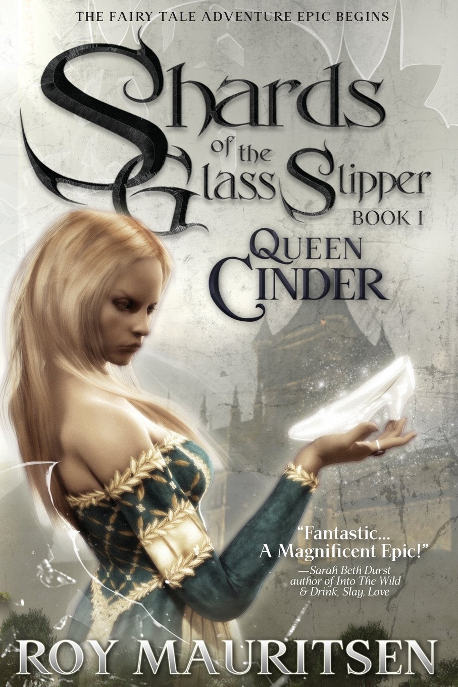
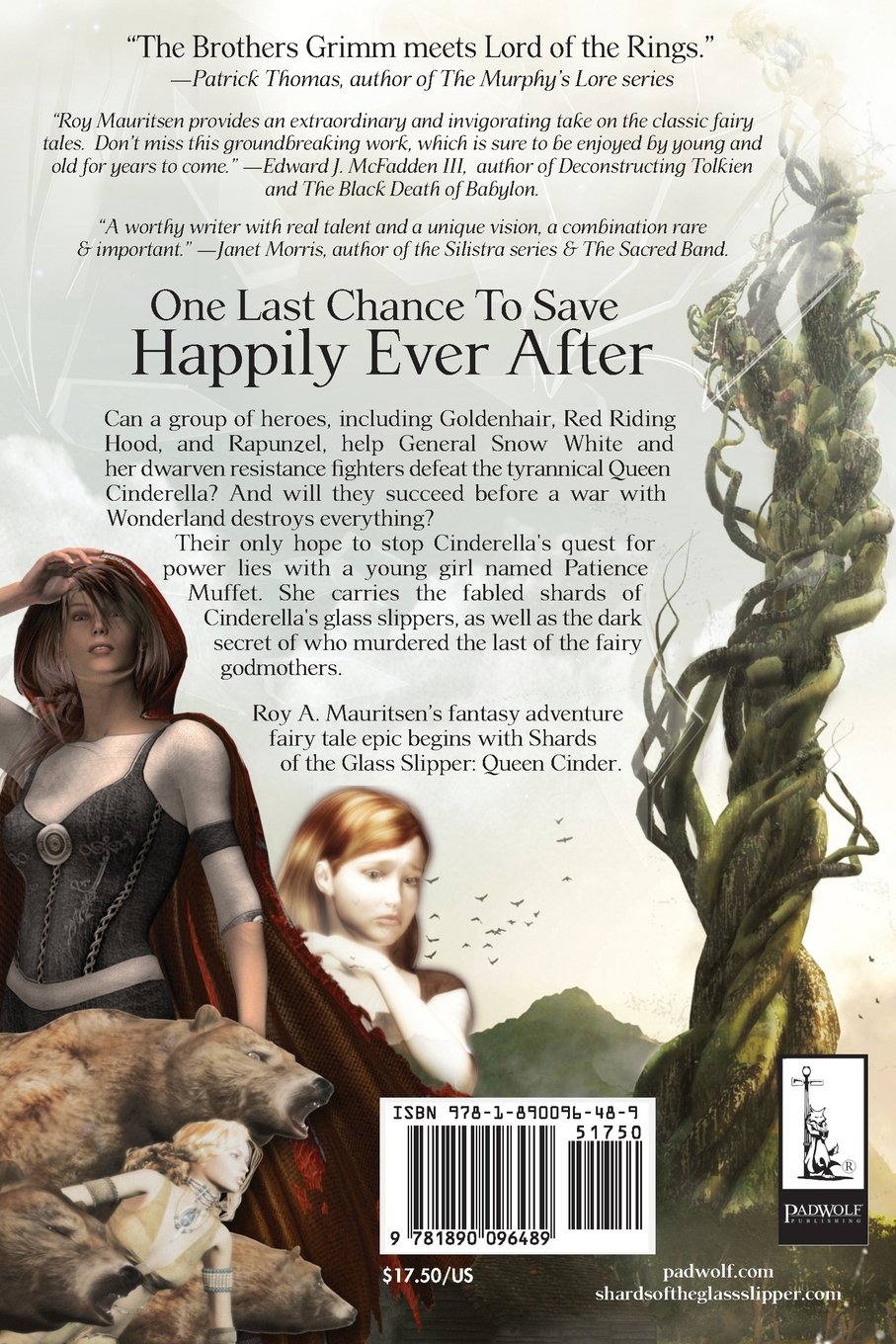
Shards of the Glass Slipper: Queen Cinder was published April 16, 2012 by Padwolf Publishing. It is 322 pages, priced at $17.50 in trade paperback and $2.99 for the digital edition. The 15-hour Audible version is $24.95, or free with an Audible membership.
They ought to fire the art director.
Well, that might be tricky… I believe the Art Director is also the author, Roy A. Mauritsen. He’s done some fine work at Perseid Press over the years.
I assume this is a continuation of your comments on classic Frank Frazetta art vs the modern photo-style of fantasy, in last week’s post?
https://www.blackgate.com/2017/02/28/a-tale-of-two-covers-swords-against-darkness/
With respect, R.K. Robinson, and I’m sure this will shock John, this is a better cover.
Likely amateur work with 3d software, but if that’s a crime I’m on death row also. Unlike writing, my art isn’t developed to professional levels, but I am going to release some of my own comics soon, just not submitting to Marvel for work and knowing I’m a storyteller first.
The other covers they just had a model – who in both cases was IMO far more wooden than Vicky4 with no dials tweaked and the base skin – and nothing else. Also terrible pose and proportion of figure/letters, etc.
This one catches the eye and has elements that speak of the story and the text and elements have better placement. I typed a comment on the end of that earlier article and noted how I’d re-do or edit both. (in the article and in a link later supplied)
Again, John, did you get my email?
We got a ton of “Suck” covers and just pure public service I can help in terms of giving advice for authors to work with artists to get good covers, and for them to propose good covers. There are ways to ask for things, ways to propose those things – even if the author is barely stick figure at best – that work with real artists to help communicate the ideas. This I know and have experience in, having commissioned some works for one of my current characters. I’m inspired by this recent discussion here and am making the article I’ll eventually put on my blog/site regardless – but I think it’d be of good help here. If you read it you’d notice I can account for non retrograde non-pc themes.
Roy Mauritsen does fine work. Most of his work I’ve seen is more cover-design than illustration, but design is an art in itself. Not sure how the cover was generated, but the design elements are well done in “Shards.” Covers set a promise/tone on what to expect in the book…so it is not stand alone. The question is…does the cover represent/match the excerpt(s) well? As usual, Blackgate comes thru with awesome content. Both audio and text excerpts are here to check out.
Well, to each his own when it comes to artwork and book covers. I love the work Roy does, and he works hard. There are covers out there that look like they’re drawn by kids with crayons, and I can name a few of the publishers who have zero taste. They’re small press, and many of them just have a cover made 1-2-3, without any input from the author. We have no say. But I won’t trash anyone’s work in a public forum. That just shows no class. I won’t even make a negative comment. What I dislike stays with me. What I like I talk about. Roy’s cover for the upcoming Pirates in Hell is magnificent, and the work he’s been doing for Perseid Press, for guys like Tom Barczak and Andy Weston is superb. But as i said, to each his own: we all know what opinions can be compared to. ‘Nuff said.
I personally find Roy a fine author and artist both. It shows in the narrative and visuals of his work. My own art is with pen and pencil and brush, but I promise you I can’t hold a candle to Roy in the graphic design department. Either rendering or layout. So far as art goes I may be old school but I will also sing praise for the new school. Roy does great work. Certainly did so for me. I could not of done that good. He did a encredible cover for my book, Mouth of the Dragon. But to close, I will also add, Shards of the Glass Slipper is a really good read. You should totally check it out.
John, Thanks for sharing my work, much appreciated. And to everyone else in the comments- Thank you! 🙂
Right on, Tom Barczak and Seth Lindberg. You expressed yourselves far batter than I did. I try to live by the motto, “Those who can, do. Those who can’t criticize those who can do what they cannot.” Artists should not criticize each other’s work — critique, in private sure. I don’t think Roy Thomas sat around criticizing Barry Windsor, and I’m sure Jimi Hendrix didn’t criticize Jeff Beck. What’s happening today is that old-school cover art is almost a thing of the past. Major publishers can afford to pay an artist, to paint a cover, but small press or indie authors can’t always come up with the scratch. We’re living in the digital age now, and photo realism on book covers is very popular in some genres, and photo-shopping and digital enhancing of images is what a lot of authors are going for. For certain genres, photo realism works, for others, not so much. When a photo is shaded and given depth and color to make it look more like a drawing or painting, those results can be excellent. Some people like CGI, some prefer stop-motion: it’s all a matter of perspective. I like both, and there is good and bad in both. I don’t know what techniques Roy uses, and I’m sure he uses several, depending on the type of book the cover is being designed for. I would count myself fortunate if I had a cover done by Roy Mauritsen. Rant over. Carry on. I’m outta here.
I did art for a whole series for Padwolf years ago, all acrylic on canvas. I’m pretty happy with them over all.
http://media.dunkedcdn.com/assets/prod/12286/p1ba0u2mo7106m1nsb1isp13bj1dkd3.JPG
I should add http://www.jeffdoten.com
We’ve seen several complaints about these covers over the past couple weeks and I don’t really care for the CGI style. But I remember seeing a couple publishers make comments that covers like this sell better.
So it doesn’t matter if it’s the same price or not for a more classic art style. You can’t really blame them if those older style covers don’t help sell books.
I find the artwork of Shards to be quite beautiful and I’m speaking as an artist as well as an author. The work itself is excellent but the cover would catch anyone’s eye. BTW what are you commenting on ‘CGI style’? I’m looking at the otherworldly aspect of the piece and it is eerie and a little spooky. Very nice overall.
I read Black Gate posts virtually every day (By the way – Love the site guys) and stopped by to enjoy a brief listen-in (I’m not really into audiobooks you see – and much prefer a book in my hand).
I’ve read all the “Shards” books so far and love the concept.
In line with the post – Chris Morris does a great job. I really do enjoy the tone of his voice and the depth he brings to the narrative.
As for some of the snotty comments about the cover? Wow! I’m going to sound a little biased here, as Roy Mauritsen has created covers for me on the different series I’ve had published… I love his ‘art’work and look forward to working with him again as he uses varying methods to suit the mood of what the story is all about and I want to ensure readers sit up and take notice.
And as regards the cover for “Queen Cinder” as shown in this post – I like it. It catches the eye, incorporates elements of what to expect, and draws you in. result!
Superb job Roy…
And another great post by Black Gate.
Well said Andrew. And thanks for the kind words about Black Gate!
CGI art is perfectly worthy art. As with anything, it’s not to everyone’s taste but what a boring world it would be if anyone liked the same things, the same pictures, the same images. It would certainly mean that there would be lots of unemployed artists, writers, musicians etc. I find that cover catching. But each to their own