Learning the Uncanny Arts: The Secrets of the Uncanny Magazine Covers
 |
 |
One of the things we’ve learned here at Uncanny Magazine is that people really like our covers. Which is awesome. It means our evil plans :ahem: I mean, our specific vision of what we want for the magazine is working! This is why many of the backer levels of our currently running Uncanny Magazine Year Three Kickstarter include postcards or prints of our art.
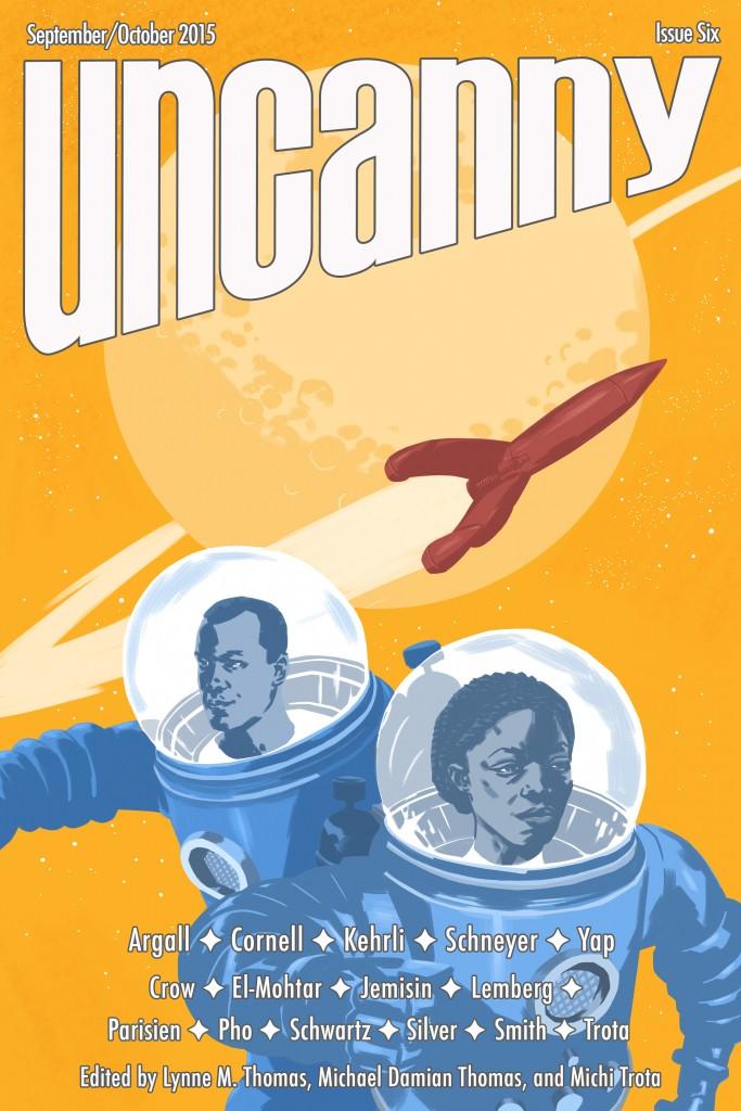
For example, Tran Nguyen’s “Traveling to a Distant Day” won a Spectrum 23 Gold Award and is a finalist for a 2016 Chesley Award for Best Cover Illustration. Galen Dara’s “Bubbles and Blast Off” was super popular on Twitter, to the point where people demanded prints. We worked with Galen to make them happen in our Uncanny Magazine store. (There may be something even cooler going on with the Kickstarter in relation to that. Stay tuned.)
Black Gate thought it would be interesting for us to explain how we select our Uncanny Magazine covers.
So, without further ado…
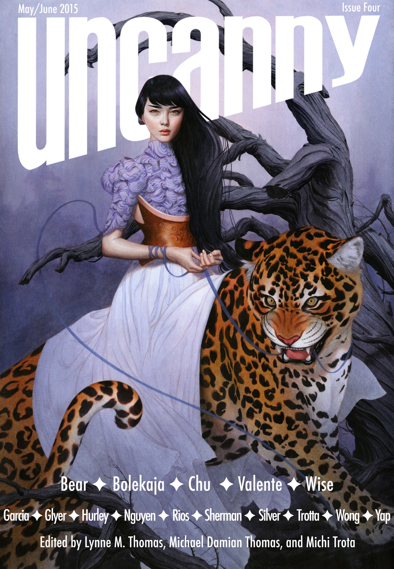
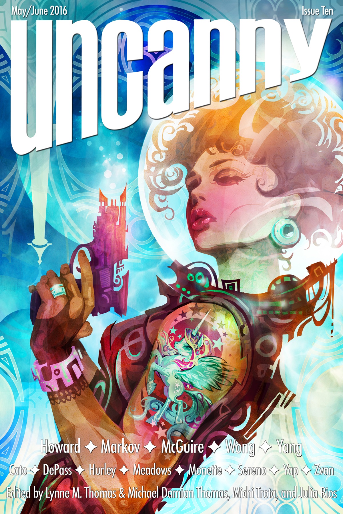
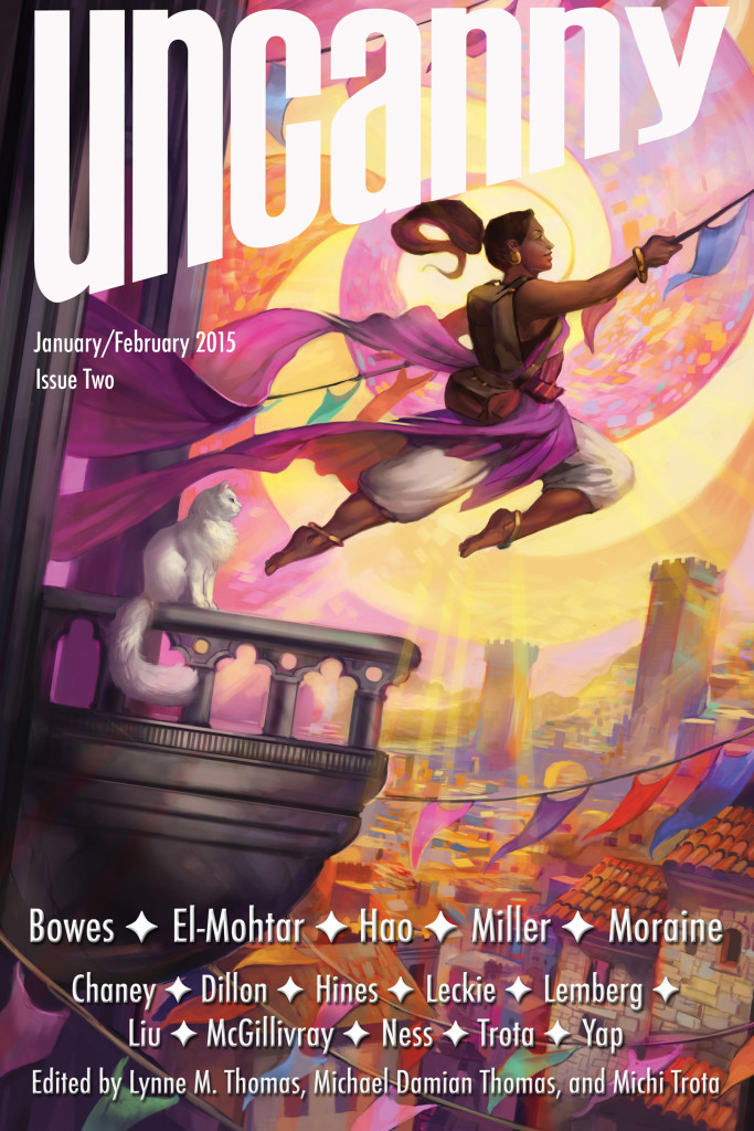
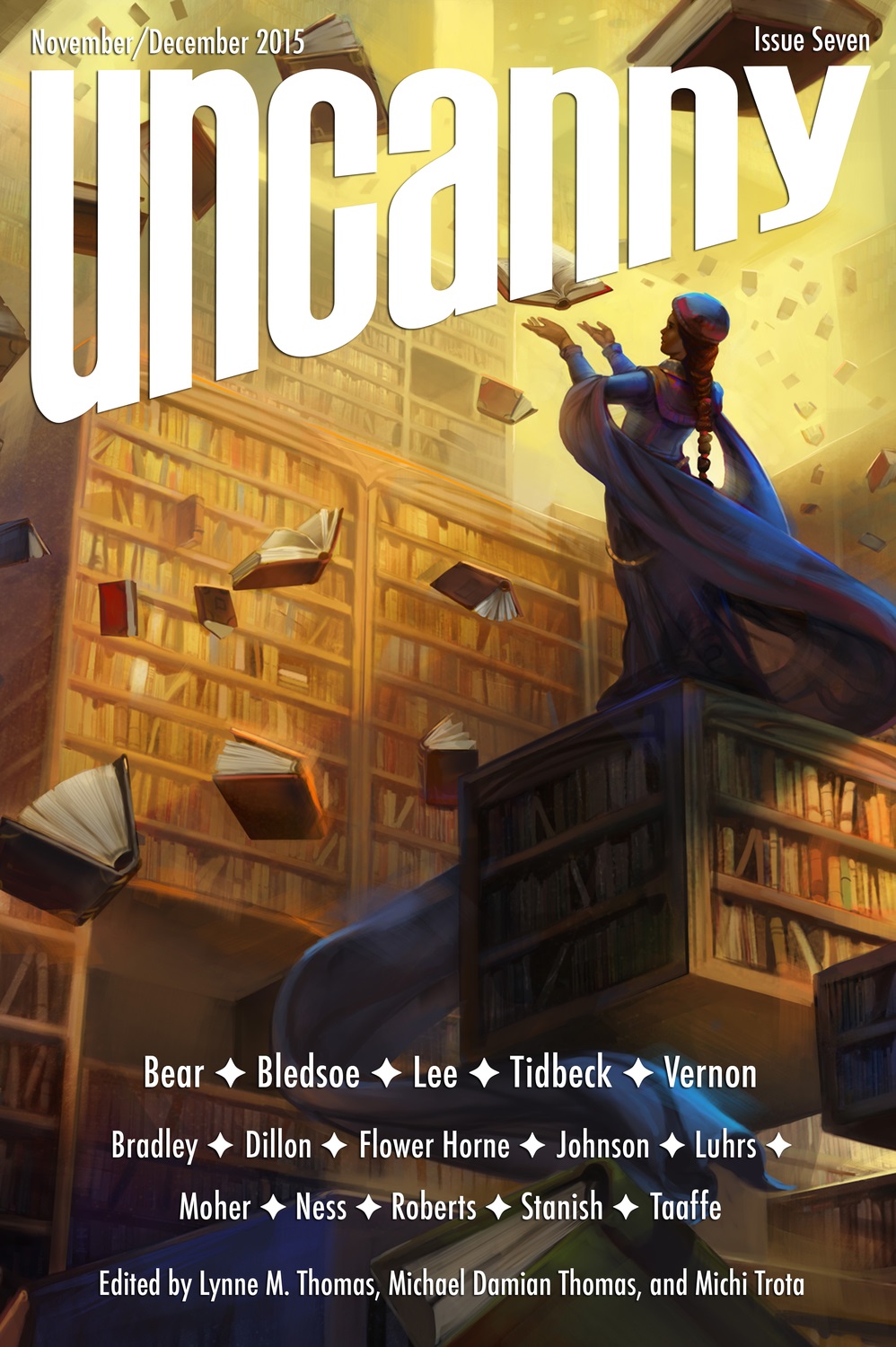
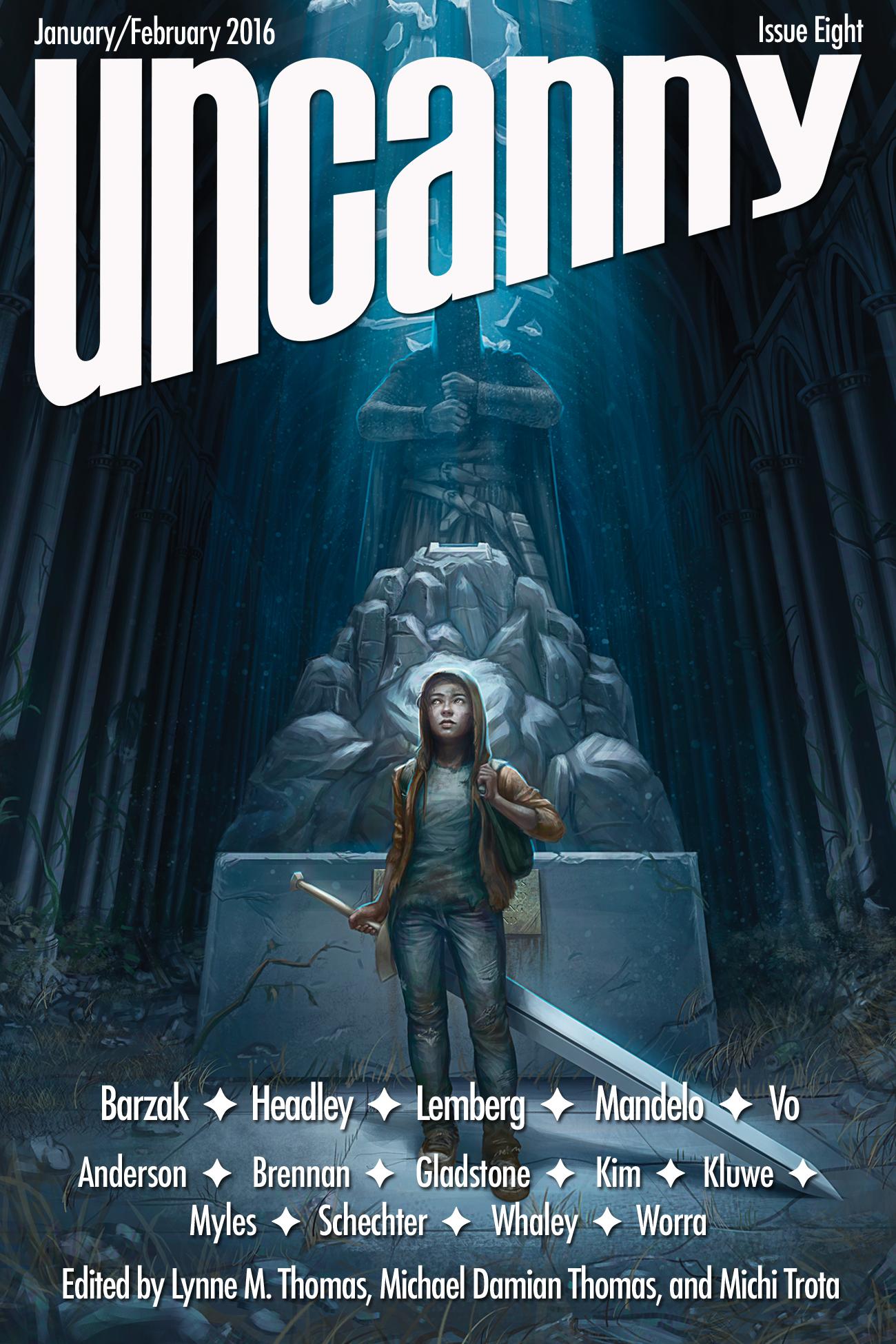
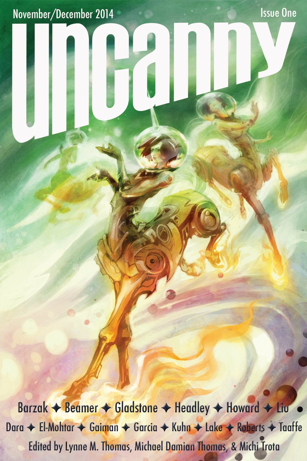
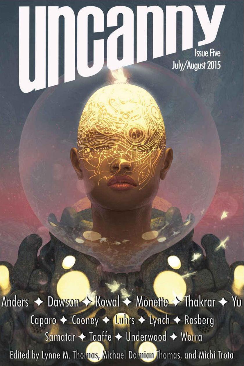
[Click any of the covers for bigger versions.]
 |
 |
We firmly believe that art is important in a general, philosophy-of-life sense. You’re looking at two museum junkies with a couple of art history courses under our belts. We’re not experts, but we have some art understanding.
Cover art is an integral part of the experience of a magazine. First impressions matter. The cover gets eyeballs on the magazine. What we represent on our covers also lets people know what kinds of stories and experiences they can expect within the magazine.
Here’s what we look for in Uncanny Magazine cover art.
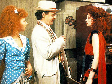
When we were discussing this blog post, Michael described our aesthetic with an obscure Doctor Who reference: “Brave and bold as a Kang should be,” from the 7th Doctor story Paradise Towers. For those who haven’t seen the series, Kangs are groups of young women from different backgrounds that have banded together to survive after a community apocalypse. They rely upon each other. They designate their girl gangs by clothing color (Red and Blue and Yellow Kangs). They prank each other and have inter-group rivalries, but they honor each other. When any particular community loses a Kang to their collective enemies, the Cleaners, they all mourn. They are stronger together.
We’re not looking for oversaturated 1980s aesthetics and color-coded clothing, though that is sometimes nice. Characters are important to us, and are central to how we select our stories, so that is also what we look for in a piece of art.
 |
 |
We seek artists and artistic subjects from inclusive backgrounds, showing strength and engagement with the viewer with emphasis on the character depicted. Our cover characters look back at you; they are rarely passive. We prefer that the characters aren’t particularly sexualized in terms of dress or pose–what we find attractive are competent characters from all kinds of backgrounds doing cool things. (Yes, we are Leverage fans, too.) Our cover characters are the protagonists in their own stories, and they have things to do.
From a technical perspective, our art has to be high-resolution enough to be workable as a magazine cover. It also needs to look defined, sharp, and visually appealing at thumbnail size, with the core character of the piece being at or near the center of the frame–this leaves room for artist Katy Shuttleworth’s wonderful Uncanny wordmark up top, and our creators’ names below.
How we find our artists depends upon whether we are seeking a reprint cover or original art.
For reprints, we search portfolios for art that is suitable, as we described it above. We keep a list of names, and artists can email us links to their portfolios. We have lots of friends who are artists & art directors. We talk to them, too, and occasionally get recommendations of portfolios to look at. If we fall in love with a piece of art, we then query the artist to check its availability. Not every piece is available for reprinting. It depends upon how it was created, whether the original commissioner of the art retained the rights to it, and whether the artist is willing to license it to us for our fee. We also have to see if it works with the graphic design: will our wordmark fit on top without obscuring the art? Can we easily read the names of our writers and editors over the art at the bottom?
For original art commissions, it works a little differently. We find an artist whose other work we enjoy, and who is interested in working with us. We negotiate a commission rate that works for all of us, paid for through Kickstarter stretch goals. Both “Traveling to a Distant Day” and “Bubbles and Blast Off” were original art commissions, paid for using this method.
 |
 |
We then discuss things we like, our vision for Uncanny covers, and our technical needs in terms of graphic design. If the timing works out, we offer them access to the stories that will be in their issue, if they are interested in using them as inspiration. Sometimes we have some suggestions based on what we know are their strengths as an artist.
At that point, we let the artist work. They will send us preliminary sketches of ideas, and we will either say “YES PLEASE DO THAT” or ask them to try something different. Sometimes there are editorial tweaks for aesthetics or for technical reasons, just as with stories.
Once we get the final art, our Managing Editor, Michi Trota, does her magic, adding our wordmark at the top and the creators’ names at the bottom, and sizing the image file for all of our different cover formats.
We’ve been thrilled with our cover art over the past two years, and we hope you’ll consider joining us as members of the Space Unicorn Ranger Corps. Support our Uncanny Magazine Year Three Kickstarter! Please help us make even more amazing art possible! Our stretch goals include covers by Julie Dillon, Galen Dara, and Kirbi Fagan, plus interior art by Grace P. Fong! The postcards and art prints are going to be fantastic!
Shine on, Space Unicorns!
Lynne and Michael’s last post for Black Gate was Behind the Microphones: How the Uncanny Magazine Podcast Gets Made, and we covered the latest issue of the magazine here.
They are the Publishers/Editors-in-Chief of the Hugo and World Fantasy Award-nominated Uncanny Magazine since 2014. Three-time Hugo Award winner Lynne M. Thomas was the Editor-in-Chief of Apex Magazine (2011-2013). She co-edited the Hugo Award-winning Chicks Dig Time Lords (with Tara O’Shea), as well as Whedonistas (with Deborah Stanish), and Chicks Dig Comics (with Sigrid Ellis). Lynne is also a contributor to the Verity! Podcast. Along with being a two-time Hugo Award nominee as the former Managing Editor of Apex Magazine (2012-2013) Michael Damian Thomas co-edited the Hugo-nominated Queers Dig Time Lords (with Sigrid Ellis) and Glitter & Mayhem (with John Klima and Lynne M. Thomas). Michael also moderates Down & Safe: A Blake’s 7 Podcast. Together, the Thomases solve mysteries.
Some of the prettiest covers I’ve seen lately.
Aren’t they though?