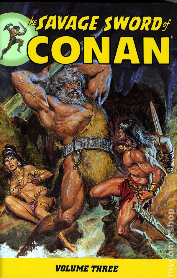
The Great Savage Sword Re-Read: Vol 3
This series explores the Savage Sword of Conan collections from Dark Horse reprinting Marvel Comics’ premiere black-and-white fantasy mag from the 1970s. Click to read previous installments: Volume 1 / Volume 2
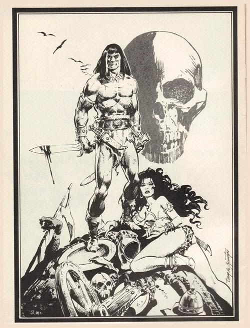
 The third collected volume of Savage Sword of Conan includes issues #25 – 36 but begins with a short Barry Windsor-Smith piece that first ran in Savage Tales #2 a few years earlier. BWS adapts a Robert E. Howard poem called “Cimmeria” in a gorgeous 5-page feature. His black-and-white work is every bit as lush as his color work on the Conan the Barbarian comic (for which he is most well-known). The artists who did the black-and-white comic magazines of the 60s and 70s knew that drawing for a colorless publication demanded more from both pencilers and inkers. Especially inkers.
Savage Sword #25 was the last issue of 1977, hitting the stands while the original Star Wars movie mania was reaching its peak, and spiking sales of the Marvel Comics Star Wars title brought the company a new influx of capital. Roy Thomas had built an excellent Sword and Sorcery magazine during the turblent mid-70s, when publishers had to cut the number of pages in their comics and constantly raise their prices. This issue is another super job by Thomas, who faithfully adapts Howard’s “The Jewels of Gwahlur.” DC legend Dick Giordano steps in to illustrate this issue — seemingly from out of nowhere — and it’s obvious that Giordano is reaching for a Neal Adams-style Conan tale.
Adams had drawn a couple of landmark Conan tales by this time (in Savage Tales #4 and Savage Sword #14), and he left his unique imprint behind as usual — setting standards for other artists to follow. Giordano does a solid job on SS#25, but unless you’re an old-school fan of his work it comes off as Neal-Adams-Lite: a stiffer, less consistent version of the Neal Adams Conan from “Shadows in Zamboula.” Maybe if Giordano had stuck around he would have time to find his mojo on this book, but this feels like a filler issue. It has moments of greatness — certain panels and effects — but the consistency that marks John Buscema’s ongoing Savage Sword work is noticeably absent. The next issue solved this problem and started a new era of Conan greatness, thanks to the arrival of inker extraordinaire Tony DeZuniga.
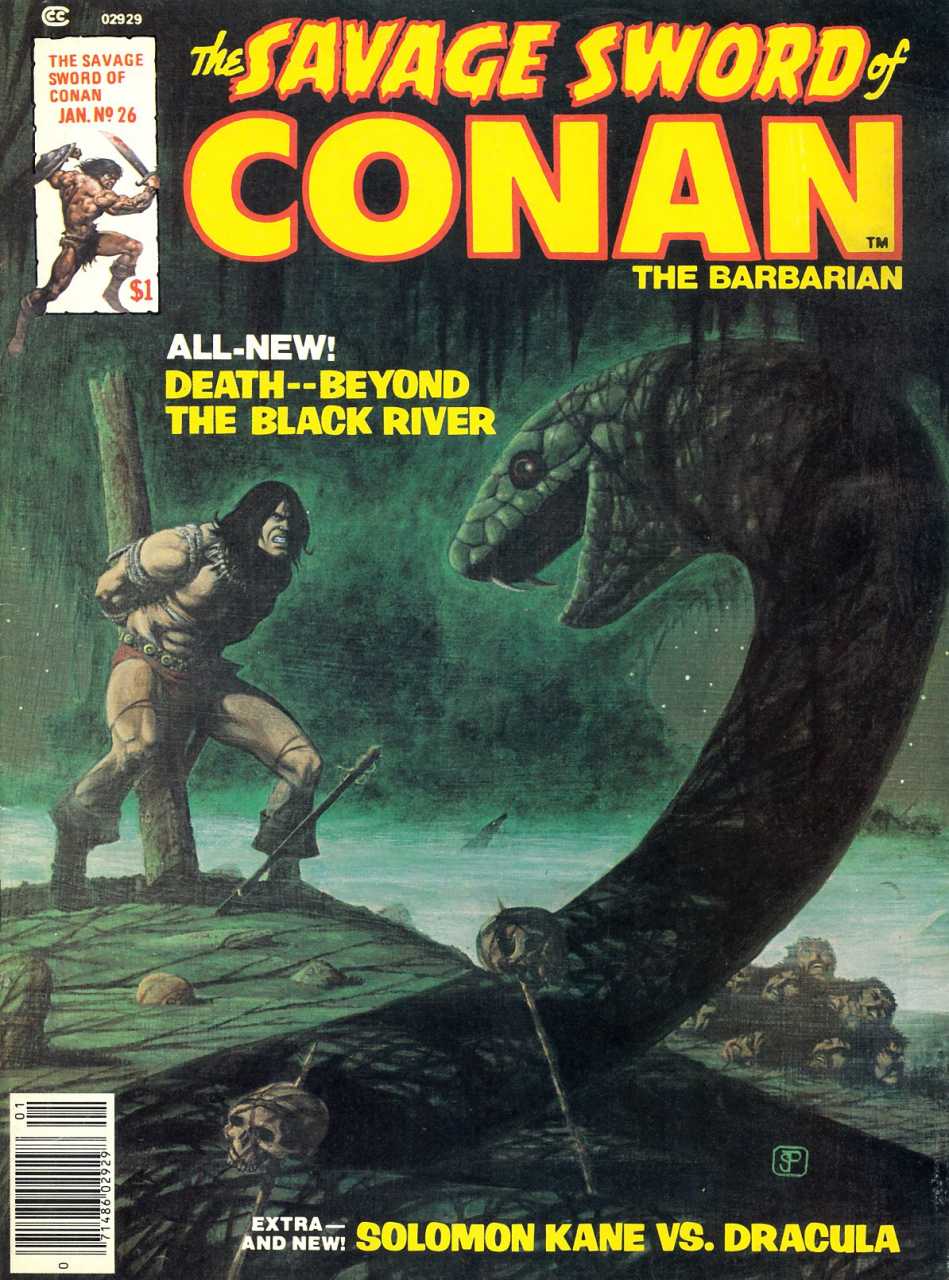
SS #26 is the first issue to be inked exclusively by Tony DeZuniga, who had done ink assists on previous issues with other inkers. As the golden age of the Buscema/Alcala Savage Sword was on the wane, up stepped DeZuniga to begin a whole new take on Buscema’s masterful pencils. So far readers had seen the Buscema/Alcala team gel into a definitive version of Conan, and their work eclipsed most other pencil/inker teams in the two previous volumes. DeZuniga’s lean-and-gritty style had exploded in issues #5 and #10 but was credited to “The Tribe” since the work involved several other inkers. DeZuniga had illustrated a 12-page backup tale by himself in Savage Sword #3. It was quality work, but not until his ink genius collided with Buscema’s pencil genius did he join the ranks of all-time great art teams.
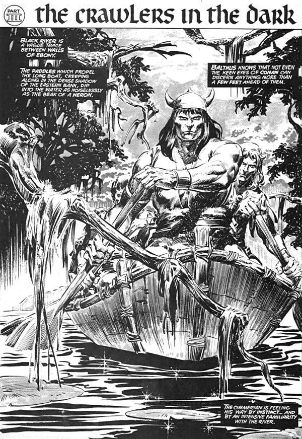
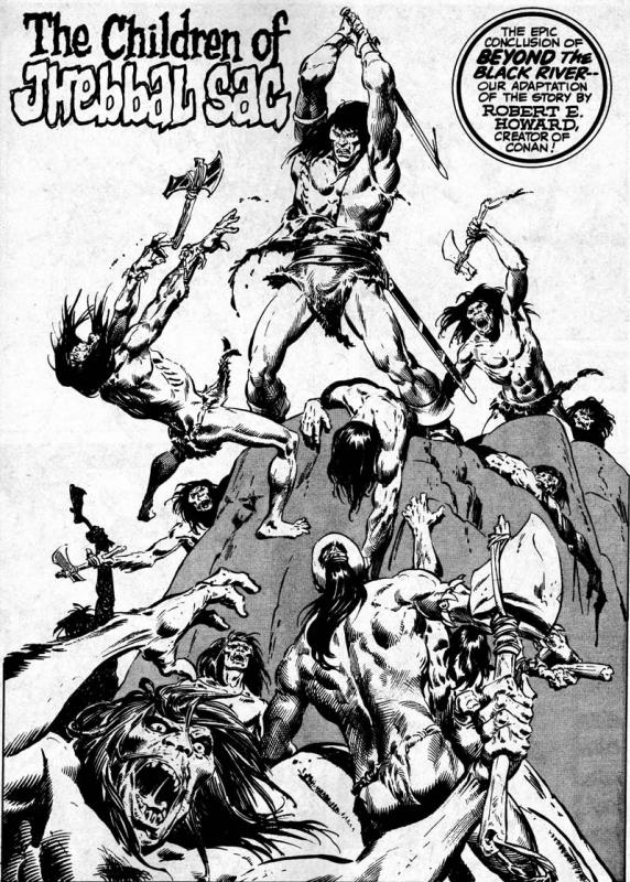
The arrival of the Buscema/DeZuniga art team is the best thing about Volume 3. The first issue of ’78 was a superb adaptation of Howard’s “Beyond the Black River.” Buscema and DeZuniga nail it like no other team before them. Not since Neal Adams dropped by to play in the sandbox (SS #14) has an art team outshone the best of Buscema/Alcala. And as if that weren’t good enough, another major artist was about to hit SSoC and make his own iconic stamp on it.
Issue #27 continues the two-part “Beyond the Black River” adaptation with a perfect blend of pencils and inks that makes it one of the best two-issue runs in the magazine’s history. Here begins the Buscema/DeZuniga era, and the Hyborian Age would never be the same. DeZuniga’s Conan is darker of eye, leaner of jaw. He is the only inker who succeeded in doing the impossible: Bridging the gap between the John Buscema Conan and the Neal Adams Conan. DeZuniga’s inking brought the verisimilitude of Adams’ approach to the rugged and mythic pencil stylings of Buscema. The Buscema/DeZuniga Conan seems more sun-bronzed, more steely-eyed, and more worldly. Unlike Alcala, who used hyper-detailed ink lines to achieve a three-dimensionality, DeZuniga strikes a balance of linework, greytones, and applied zip-a-tone background patterns.
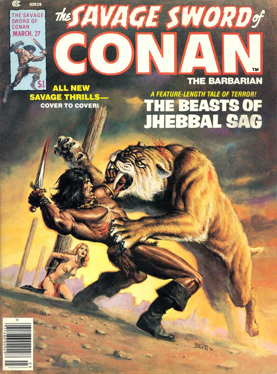
Over the course of the next few years, DeZuniga proved he could deliver the same high quality of Savage Sword pages as Alfred Alcala had done — but doing it in a fashion that made him better at hitting monthly deadlines. Alcala was learning as he went that his early style–which had made him a legend on this title — wasn’t sustainable. And here was someone offering Roy Thomas a sustainable and absolutely gorgeous style for Savage Sword. Roy would have been a fool to turn him away — and DeZuniga had paid his dues. It was Tony’s time to shine, and shine he did. Previously he had made history co-creating Jonah Hex for DC and drawing some great westerns for the Distinguished Competition. His superb job on “Beyond the Black River” marked his arrival as a major force at Marvel.
SS #28 hit the stands in early ’78 and I remember buying it at the local convenience store. It was a Buscema/Alcala masterwork wherein Thomas adapted Howard’s “The Blood of the Gods.” I was 8 years old and this magazine — it certainly wasn’t a comic as I had previously known them — blew my mind in big way. The Earl Norem cover grabbed my eye and when I flipped through the ink-and-shadow covered pages, I forked over my whole dollar that day instead of bying three 35-cent comics. This was the Rated R version of comics. There was blood–skullduggery, backstabbing, guttings, beheadings–the violence here went far beyond the Conan the Barbarian color comic, but I hadn’t even seen that comic at the time. I was comparing my first Savage Sword of Conan story to Spider-Man, Fantastic Four, and the other Marvel heroes that I’d been reading since I was five.
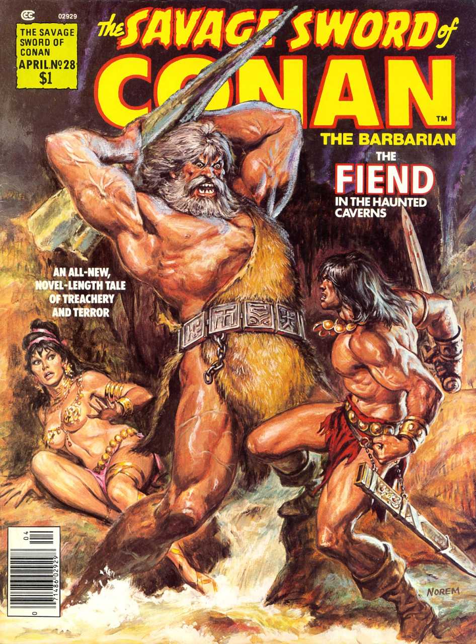
I’ve re-read this great issue many times over the years, and it holds up extremely well. Alcala does a superb job inking — but he’s holding back here. He’s done with the hyper-detailed linework that made him a legend on adaptations like “Tower of the Elephant” and “People of the Black Circle.” Yet now, comparing it to the issues that came before and after it — I can see DeZuniga’s hands all over it. Instead of spending hours inking backgrounds to create the three-dimensional effect, this issue Alcala uses zip-a-tone adhesives and greyscale shadings.
Yet unlike his previous experiments with these techniques, his figures are still meticulously and lushly brush-inked. He’s concentrating more on the figures and not filling every single centimeter of the panel with lines. It’s almost as if — and this is my theory — DeZuniga was assisting Alcala in learning how to use the zip-a-tone adhesive background methods to create depth. (For those unfamiliar with zip-a-tone, they’re basically pre-done patterns of ink — lines and/or dots — that can be peeled and applied to an artboard, saving time and energy but adding depth and texture.)
In some panels you can see that DeZuniga has jumped in with his own inking brush — a hand here, a dead body there, a towering rock formation. His style is more angular and therefore stands out sharply against Alcala’s fluid lines — but only if you’re looking for them. I’d love to know how much uncredited DeZuniga work was involved with SS #28. The result was a terrific Alcala-credited issue that was improved by several DeZuniga-like elements. Beyond that I don’t have any specifics, expect to say that this issue remains one of the very best in any volume.
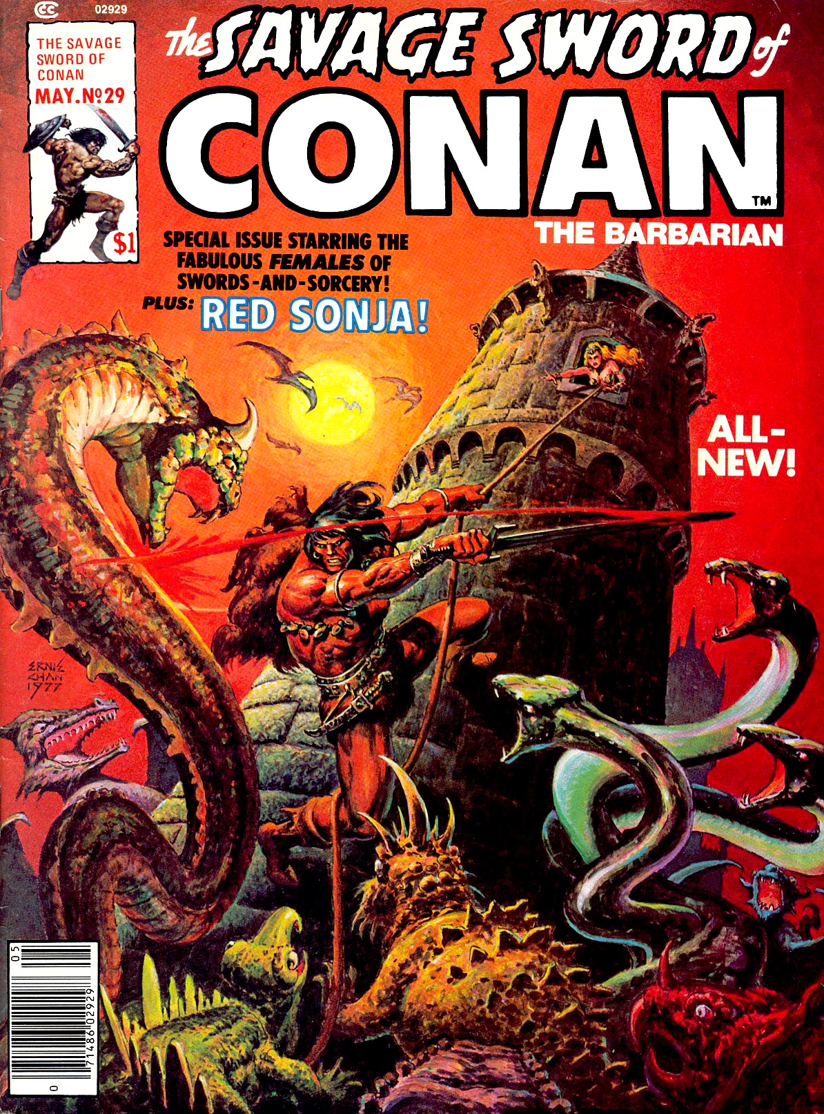
SS #29 was landmark issue all around — a giant named Ernie Chan arrived to tread the jeweled thrones of the earth beneath his sandalled feet. Chan had made his mark creating and drawing Claw the Unconquered for DC — their best effort at matching the success of Marvel’s early Conan comics. At this point Chan had contributed a couple of painted covers to Savage Sword, but this was his first issue on interiors — and boy did he knock it out of the park. Thomas adapts a story by Christy Marx to create fantastic and haunting Conan tale called “Child of Sorcery.” One-man-show Ernie Chan brings it to life by handling both pencils and inks himself.
Chan had a secret weapon: He had been inking John Buscema on a stellar run of Conan the Barbarian for quite awhile. In fact he and Buscema had cemented themselves on that comic as THE team to beat after Barry Windsor-Smith left the title. Buscema/Chan delivered several dozen issues in a row, including such masterpieces such as issue #100’s “Queen of the Black Coast.” All those issues merging his inks with Buscema’s pencils on the color comic metamorphed Chan into an artistic powerhouse ready to tackle his own issue of Savage Sword single-handedly.
Chan had also inked his fair share of Gil Kane comics, such as the nigh-perfect adaptation of Howard’s “Valley of the Worm” in Supernatural Thrillers #3. He had done a few terrific pin-ups for Savage Sword, but with #29 Chan proved he was second to no man when it came to Conan illustrators. He also painted a marvelous cover for the issue, making SS #29 one of his career-best pieces and one of the single best issues of Savage Sword ever.
SS #30 features the work of another “one-man-show,” Frank Brunner, who had done magnificent work on the Dr. Strange comic in the 70s (He was inked by Chan on that comic!). Roy Thomas adapts one of the most legendary of Howard’s original Conan tales, “The Scarlet Citadel.” Brunner’s art is impressive yet inconsistent; the issue comes off as a run-of-the-mill “filler.” It never quite rises to the level of quality seen in Brunner’s Dr. Strange issues, but there are several high points to enjoy. By this time, with thirty issues under his belt, Thomas had set a standard for Savage Sword that was rarely exceeded by comics and magazines of the time.
Artists who worked on Savage Sword of Conan can be divided into two camps: Recurring regulars and guest artists. It’s not precisely fair to compare these two groups in terms of art quality because the “regulars” have a lot more time to improve their styles and perfect their version of Conan and the Hyborian world. This is why the work of John Buscema set the ultimate standard, but his style was so powerful it created three more “ultimate styles” that would define the book forevermore: 1) The Buscema/Alcala issues. 2) The Buscema/DeZuniga issues. 3) The Buscema/Chan issues. Beginning with issue #30, “Child of Sorcery” a fourth “ultimate style” was established: 4) Ernie Chan solo.
Roy Thomas had found four “go-to” teams (one of them a single person) who could always be depended on to deliver high-quality work. He supplemented these teams with guest artists who sometimes rose to the challenge, and sometimes did not. But the majority of issues in the first three volumes belong to one of these four “ultimate styles.” (You might consider Neal Adams’ SS #14 to be it’s own fifth “ultimate style,” but it was only a single issue and falls more appropriately under the “guest artist” category.)
In SS #31-32 the reigning team of Buscema/DeZuniga return for another tour de force story. The two-part adaptation of the L. Sprague deCamp’s novella “The Flame Knife,” which was based on the plot of an unpublished Howard story. Despite its dubious origins, this particular adaptation is another high-point in Savage Sword history. DeZuniga’s superb line inking and highly skilled texturing processes made Buscema’s pages seethe with action and detail — without letting obsession for details slow him down.
DeZuniga hit deadlines every time, and rarely does he turn in an obvious “rush-job” (if ever). The same cannot be said of Alcala, whose throne DeZuniga was gradually stealing. Alcala’s earliest work was hyper-rendered linework of stunning quality, but it wasn’t sustainable. DeZuniga wasn’t about to make that mistake. Once again he brings a Neal Adams-like realism to Buscema’s larger-than-life characters and gorgeous fantasy landscapes. “The Flame Knife” adaptation picks up a plot element sewn way back in SS #5, as one of Conan’s old rivals turns up among his foes, and an army of man-eating ghouls allows Buscema and DeZuniga to inject some serious horror into this tale of feuding desert kingdoms.
SS #33 is another fill-in issue illustrated by the odd pairing of Gene Colan and Pablo Marcos. Each artist was his own consummate stylist, so it’s not hard to believe that their styles really don’t mesh at all here. This issue is problematic because of that very fact; I’d love to see the raw Colan pencils for this issue because they probably would have contained that terrific Tomb of Dracula style that Colan delivered in spades during the 70s. Pablo Marcos does his best to make each panel fully deep and immersive, but there’s not much synergy here with Colan’s pencils. Who knows? Maybe the issue was a rush-job for Colan? Another reason to see the original pencil pages. Beyond that, this issue is rather below-average compared to where the magazine was usually landing.
SS #34 features the pencils of the great Carmine Infantino, and Alfredo Alcala inks them with great care. The result is an adaption of the L. Sprague DeCamp/Lin Carter tale “Lair of the Ice Worm” that is better than the preceding issue, but cannot reach the high bar firmly set at Savage Sword by John Buscema and his various inking partners. As great and skilled as Infantino was, this issue is a reminder that there’s only one John Buscema, and it was his pencils that ruled the pages of Savage Sword. Maybe it’s not fair to compare the Infantino/Alcala team to the Buscema/Alcala team, but one can’t help but do so when reading this issue. It’s not a terrible issue, but it leaves you hoping that The Great Buscema will return — and soon. And Buscema will return, but not before Ernie Chan steps back in for another single-artist issue that rivals any of Buscema’s best.
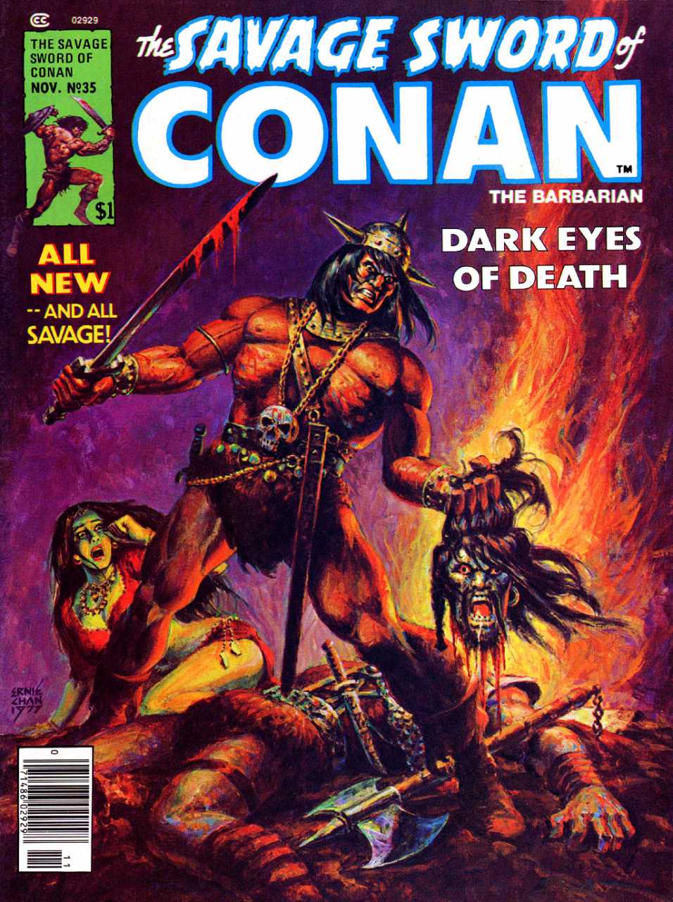
SS #35, “Black Tears,” was adapted from a story by DeCamp/Carter. Chan once again delivers pencils and inks, his second majestic solo issue. As of this second Chan issue it’s official: Chan has created his own “ultimate style” — by taking what he did with Buscema on the color Conan comic and leaping into Savage Sword on his own. Chan’s Conan was nearly identical to the Buscema/Chan of the color comic, but just different enough that you could tell it wasn’t Buscema. Chan’s sense of layout, design, and his superb figurework were every bit as effective as his Buscema/Chan collaborations. Chan doesn’t use applied backgrounds or greytones — it’s all line and brushwork, and it’s fantastic.
“Black Tears” is a dark and shadowy tale of desert magic, whereas Chan’s first SS tale “Child of Sorcery” was a lighter piece with fairy-tale-like elements. For anyone who was reading the color comic and wanted to see THAT Conan in Savage Sword, Ernie Chan delivered. His style without Buscema is a bit more gritty and line-heavy, the world he evokes a bit more fluid and less classical. Still, he delivers full-throttle Sword and Sorcery as it should be, and becomes the new Force To Be Reckoned With among artists coming to Savage Sword. Another painted cover featured Conan holding the severed, dripping head of his enemy. I was nine years old when this cover shocked and fascinated me. It’s one of Chan’s most iconic covers, not to mention one of most enduring single issues.
Volume 3 ends with SS #36, where the classic team of Buscema/Alcala return to deliver a solid issue. This time Alcala’s holding back on his overly-rendered style — breaking it out for certain panels and splash pages, allowing more white space than he did in his earlier work. There’s a marked absence of zip-a-tone and other greytone effects in this issue, which reinforces my theory that DeZuniga was assisting Alcala with those processes on issue #28. Alcala must have made a conscious decision to focus more on the figures and ease up on the time-consuming backgrounds. At a certain point it looks like he’s trying to ink Buscema in a minimalist way, so that Buscema’s innate style can shine through.
This makes for an inconsistent issue where some pages look more Buscema and some pages look more Alcala. It’s better than any non-Buscema issue (excepting the Chan and Adams issues — which are way better), but SS #36 is not up the usual standards — standards that ironically were set by this same team, then taken to new levels of greatness by DeZuniga and Chan.
Overall, Volume 3 is another must-read because it begins the Savage Sword careers of Tony DeZuniga and Ernie Chan, two of the most powerful artists in the history of comics regardless of whether or not they were collaborating with the great John Buscema. Roy Thomas was wise enough to establish the penciling of John Buscema as the backbone of this series, and that allowed him to build several excellent teams to keep the magazine rolling into the future.
And all this time, Buscema was STILL drawing almost every issue of the color Conan the Barbarian comic. Talk about an artistic powerhouse…
NEXT TIME: Volume 4 sees more DeZuniga masterpieces and John’s lil’ brother Sal Buscema steps in to carve his own niche in the Hyborian Age.
John R. Fultz is the author of several novels including The Testament of Tall Eagle and the Shaper Trilogy: Seven Princes, Seven Kings, and Seven Sorcerers. His website is www.johnrfultz.com
[…] Third entry in a series running now at BlackGate.com […]
[…] “Beyond the Black River.” We DID want to point you toward another Conan re-read series over at Black Gate. John Fultz is re-reading the Savage Sword of Conan. He’s up to volume 3. It’s […]
This was GREAT! I became hooked on The Barbarian series and was wondering where to start with Savage Sword…..Looks like from the start! Great overview. Very much appreciated.