One Picture = One Thousand Words . . .?
 About a month ago Gabe Dybing wrote an excellent post in which he, among other things, praised my Dhulyn and Parno Novels (thanks again, Gabe). I obviously don’t quarrel with anything he had to say, but there was one observation that made me raise my eyebrows, and that was his take on the cover art. The whole post is worth reading (not just the part about my books) but what Dying has to say about my covers is important not just for me, but for any of us involved in the writing and reading of books. Looking at the art from the sales perspective, what it is about the cover that encourages a reader to buy a book, Dybing has two caveats. First, he feels the characters are too “posed,” in that they’re “battle-ready” when nothing is in fact happening. Second, he objects to the photo-realism, since it could restrain the readers in imagining the characters for themselves. As it happens, he feels the artist, Steve Stone, did capture Dhulyn pretty well, except for her skin colour, and her “wolf smile.”
 Interesting bit about that. The artist chose his models from modeling/acting agency photos to match the physical descriptions I’d provided to my editor/publisher, Sheila Gilbert at DAW. It wasn’t until the models arrived for the session that Stone realized the woman was black. I know, it does make you wonder what the photos were like, but that’s not a question I can answer. The situation was explained to her, and apparently the model/actress didn’t mind being depicted as a woman from a race noted for the pallor of their skin and the redness of their hair.
As for the wolf’s smile, you don’t really want to see that. Ever. Trust me.
On the whole, I think I’ve been very lucky with my cover art, but before I go on I have to confess a couple of things. First, I have almost no visual memory (except for faces), and don’t really respond to visual cues. Off the top of my head, I couldn’t describe to you the cover of any book, not even the ones I’ve read over and over. Okay, I can recognize the Tenniel drawings from Alice in Wonderland, the original art from the Chronicles of Narnia, and the Dali illustrations from a recent edition of Don Quijote, but there I’m thinking about the artists, not the books. And even there I’m pretty sure I couldn’t tell you what was on the covers.
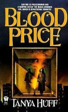
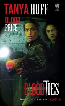
 In any case, all this got me thinking about covers in a more concrete way than I usually do. What Dybing had to say about photo-realism struck me particularly when I was preparing my last post on Tanya Huff’s Blood Books. The covers that were the easiest for me to find as illustrations for the post were the current ones, which are actual photos of the actors portraying Huff’s characters in the Blood Ties series. How’s that for restraint on the reader’s imagination? As I said then, the actors happen to be well-chosen, but once your eye has taken in those images, you can’t really think about Vicky and Henry and Mike any other way. I’m reminded of John Le Carre saying that once he saw Alec Guiness walk away from him while in character as George Smiley, he, the actual author who had been writing these books for years, could never see Smiley as anyone else, ever again.
Aside: Huff has some funny anecdotes about the actors’ relative heights with respect both to each other and to the written characters, but I’ll leave that for her to tell you the next time you see her at a con.
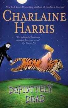
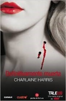
Those of us who have been reading Charlaine Harris’ Sookie Stackhouse books since before the True Blood series began can see the same type of change in the cover art in the more recent editions. But just as interesting is the change in the art from one country to another, as the books go into translation. Huff’s books were translated before they were televised, and the Spanish versions, for example, used the same original cover art that you see above. Harris’ books, on the other hand, have covers that are both different from the original, and from the editions that came out after the TV series began. You can see from the example here that they’re photos, all right, but you couldn’t say that they give you any clear idea of what the actors look like.
 All of these covers are meant to catch the readers’ eye, of course. As Dybing points out, there is a “sales perspective” involved, and it’s from that perspective that publishers make their decisions about cover art. Tying in with a TV series is an obvious step, but if you look at any book that has been in print for a couple of decades – any classic Fantasy or SF – you can see how the cover art has changed to reflect fashions in visual media. Nothing is more dated than a Heinlein cover from the 1960’s.
So, how important is cover art? I know that I never buy a book based on it, and I never have. I also know that that’s simply not true for many, maybe even most, other people. I know I like my own covers, and I know that I had a lot more say (meaning some) about them than most authors get. I know that professionals in the publishing business – or the graphics field for that matter – often feel that self-published authors get the cover art badly wrong.
One last word about the covers of my Dhulyn and Parno Novels. Unlike at a convention, when I’m doing a signing in a general bookstore I’m often approached by people who don’t read fantasy. They seem nervous as they eye the books. I say, “I’m a fantasy writer. Of course, you can tell from the book covers that I don’t write about ballroom dancing.” For some reason, this makes them laugh, and they stop being nervous. So there’s a useful thing about the cover art. Oh, and my favourite one is The Soldier King.
Violette Malan is the author of the Dhulyn and Parno series of sword and sorcery adventures (now available in omnibus editions), as well as the Mirror Lands series of primary world fantasies. As VM Escalada, she is writing the upcoming Halls of Law series. Visit her website: www.violettemalan.com.
It’s all about the cover. The match of a perfect cover and text is a wonderful thing. You can stare at the cover and return to that place inside the book at any time. The perfect book with the perfect cover is a Favorite Thing that you can have with you on your bedside table, school desk, or in the coffee shop.
Particularly for fantasy, the cover has to be painted. Like the words inside the book, the cover is a created thing of art and not real and lives in an abstract place in our heads. Photo covers are pictures of people in costumes which breaks the illusion. The cover and the text have to be in sync with each other to create that complete package.
Because I’m an artist, a bad cover ( in my mind) reflects on me, on my choice. But when everything is all good, it’s something I may just love forever.
The Soldier King is my favorite cover too, Violette. In contrast to the first, and less so with the second, Dhulyn and Parno appear to be doing something that justifies their poses — tracking, in this instance, I presume.
Sorry I missed your thank you last time. You are much welcome. Thank you for the engrossing hours.
I don’t have much more to add to how I obviously feel about the importance of covers. They do appear to be only slightly less important in telegraphing a tacit promise with the reader. But there are many readers, and many overlapping demographics, and certainly infinitesimal considerations and obstacles in the actual production of cover art.
More than once I’ve had the experience of viewing someone’s illustrations of my own writing, and they all have been favorable, sometimes wonderful, and the representations always surprise me in some way.
Tanya Huff writes some of the best military sci-fi I’ve read. She writes it with such authenticity that makes me think that she must have been in the military. I’m not into vampires much but she writes so well, and I like her style enough to give her a go.
@ Barsoomia: I also prefer a painted cover. My covers are technically painted, but in the photo-realistic style. While covers don’t influence me to buy a book, I do associate a cover with a book once it’s bought. For me, for example, the Tolkien drawings/paintings for the middle-earth novels are always going to be perfect.
@Gabe: The Soldier King is the only one of my coves that is, in fact, directly based on a scene in the book. I won’t go so far as to say that I wrote the scene in order for the cover to be based on it, but there was some correlation, for certain.
@Wild Ape: Tanya was in the Royal Canadian Naval Reserve. I’m not greatly into vampires myself, but I also love Tanya’s writing. I started reading Charlaine’s books because we have the same agent, and he gave me one. I have to say (and I’ve also told her this) that I prefer her “Grave” books.