Art of the Genre: Top 10 Literary Sci-Fi/Fantasy Covers of the 1970s

I was born in 1971, which makes me old, but not too old, at least in my mind. Although I was indeed a living creature on this planet during the bulk of the 1970s I didn’t really have much conscious thought that was dedicated to anything resembling fiction.
Sure, I saw Star Wars at the local cinema, I had the action figures, but that was about as close to anything literary as I got, the bulk of my time sucked up with Hot Wheels and green-plastic army men. However, while I was learning to walk, potty on a toilet, ride a bike, and crushing on my first girlfriend, the forces of American fantasy art were going into overdrive around me.
Truly, the 1970s was a creative bloom in fantasy and science fiction art, and although I do enjoy both the 60s and even the 50s, I think it is best I start with the decade where this genre moved from the minds of a chosen few to the big time of the greater American consciousness.
As I grew along up, my appreciation for art in general started to move me into the realm of fantasy books and their unreal covers. That’s not to say that 1970s art played directly into this progression, as I was really a child of the 1980s, but the greater knowledge I gained of the industry as a whole, the more I appreciated the groundbreaking art from the decade of my birth.
So, today, having spent nearly twenty years studying the fantasy art industry, and ten of that working directly in it, I’ve grown to love the literary art of the 1970s and wanted to share with you my thoughts concerning some of the very best it had to offer.
This brings me to yet another Top 10 List because such things make sense to me, limit my ramblings, and offer a small slice of the topic at hand. That being said, I bring you The Top 10 Literary Sci-Fi/Fantasy Images of the 1970s!

Number Ten: To Your Scattered Bodies Go, by Philip Jose Farmer, 1971. Although first published in 1971, Farmer’s initial delve into his Riverworld mythos was later covered in a Berkley Edition by artist Vincent Di Fate in 1973. Vincent, like many of his contemporaries in Science Fiction, was better known for painting space scenes, but in this cover he took a more cerebral approach, the pallet a fantastic mixing of blue with a dash of crimson that helps set it all in motion. This cover transcends, it captivates, and it represents so many other great concept pieces that can be found on the shelves of second-hand bookstores from the time period. All one needs to do is hold this book up, and a fantasy reader can place its age, and that says all you need to know about it being included in this list.
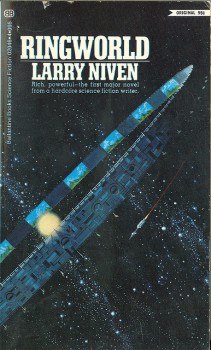
Number Nine: Ringworld, by Larry Niven, 1970. This is the only book on this list created before my date of birth, but it’s a classic one that deserves a place. I well remember seeing ‘space covers’ and I think most of you understand what I mean when I say that. There is something inherently evocative about space, and artist Dean Ellis is one of a handful of painters who helped define my love of what space should feel like. I recently finished reading Glen Cooks Starfisher trilogy rereleased from Night Shade Books and covered by a John Berkey classic licensed painting which even today captures the perfect feel of what Ellis does with his various visions from the 70s. This simple yet elegant cover sings with the prospect of foreign space, light-years of travel, and all that man has yet to discover. In essence, we have no relation to dragons, elves, or dwarves, but there is no doubt we’re all made of star-stuff, and I think that link must drive home the relevance of covers depicting scenes of deep space.
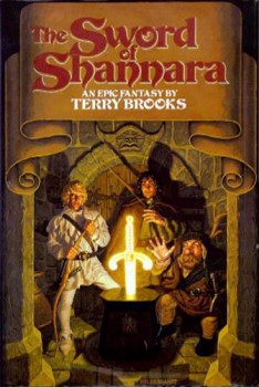
Number Eight: The Sword of Shannara, by Terry Brooks, 1977. Now I’m going to fill you in on a little wrinkle about 1977, that being that it was THE year for great fantasy and science fiction in the decade. Once you go through this list, I think you’ll be amazed by how many 1977 titles and images are included, but I digress. In this epic cover, done by The Brothers Hildebrandt , we take our very first step into the art of the 1980s. That makes this piece worthy of placement here because it helps move the entire industry away from harder lines, muted tones, and non-character driven covers. The Hildebrandts heavy Brandywine type oil craft spurred a gold-rush of oil painters in fantasy at the turn of the decade included Sweet, Elmore, Easley, and countless others. Their importance to the genre can never be denied, and this is truly the cover that started it all.
 Number Seven: Lord Foul’s Bane, by Stephen R. Donaldson, 1977. Yep, another 1977! There is some intrigue concerning this image which was done by S.C. Wyeth. Many folks wonder if the artist was any relation to N.C. Wyeth, although I could find nothing to link the two. I’m also sure to catch some flak for the fact that the ‘better’ version of this book’s cover was rendered by Darrel K Sweet, which I whole-heartedly agree to be true, but that Sweet cover came in the 1980s, and this one still harkens back to a simpler decade where the magic of covers still could feature simple landscapes. In this, Wyeth is included because he’s basically the last hurrah for this type of cover. Also, on a personal note, I was so moved by this image in my youth that I created a similar place in my own gaming world, so that’s got to count for something, right?
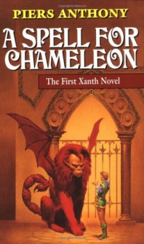 Number Six: A spell for Chameleon, by Piers Anthony, 1977. See, here is another 1977, and also another trend we’re going to see in this list, that being that it was covered by artist Michael Whelan. Whelan seems intrinsically linked to the 70s and appears a whopping 3 times on this list. His extraordinary talents shine in the subdued browns and gold of this rich image. It is actually so powerful, that of all the books in this list, I believe it’s the only one to STILL have this cover on its current print run. In my mind, there are two definitive Manticore images, this one by Whelan and the one represented on the cover of S2 White Plume Mountain by Jeff Dee. I’ve always enjoyed the simplicity of this piece, and the fact that the only divergence from the base colors of the painting are found in the human and his clothes.
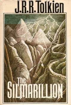 Number Five: The Silmarillion, by J.R.R. Tolkien, 1977. I chose this particular cover not because it outdoes many other entries both in and off this list, but because it’s the only one that was done by the book’s author. Yep, you heard me correctly, this cover was painted by Tolkien himself, and that brings it to the number five position with a bullet. I’m a sucker for landscapes [see pick number seven] and this image of mountains, a perilous road, dark skies and lightening is all I need to imagine the epic scope Tolkien was working with when he began creating this historical epic on Middle-Earth.
Number Four: The White Dragon, Anne McCaffrey, 1978. By the time this book came out McCaffrey was already a Hugo Award winner, and Pern a well established fantasy world, but
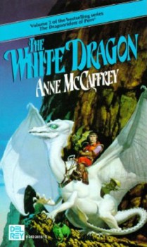
I’d argue that one of the reasons this book was the first by a woman in the fantasy genre to reach the NYT Bestseller list was because of another incredible Michael Whelan cover. Here, Whelan leaves some of his 70s apprentice work behind as he takes a page from The Brother’s Hildebrandt and moves his art into the sharper image and color of the 1980s. White Dragon is a book I’ve owned three times in my life and never managed to get all the way through, but I bought it each time for this cover. I’ve studied it from every angle, taken in every detail, and each year it grows more valuable in my mind. The only reason it sits at number five is because it harkens more toward the future than of the decade it actually was created in.
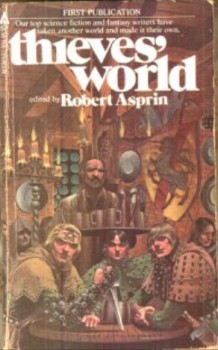 Number Three: Thieves World, edited by Robert Asprin, 1978. You knew this was coming, right? I love Thieves World probably as much as most loathe it, but it’s not just about the short stories to me because the primary reason I love Thieves World are the Walter Velez covers. Velez discovered something in working with Asprin on both Thieves World and the more comical Myth series that absolutely captured my fantasy imagination like nothing else. His work on theme building, on creating a type of southern-euro realm where forest greens matched with studded leather rules and broad blades with X-pattern scabbards are the norm which makes me want to fall into fantasy and never come out. It’s a kind of Robin Hood worldview and Velez steals the show with his supple brush.
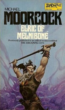 Number Two: Elric of Melniboné, by Michael Moorcock, 1972. For inclusion here, I’m going to feature the 1976 Edition of this book, which again was done by the incomparable talents of Michael Whelan. I like this picture not because it’s the pinnacle of Whelan’s evolution as an artist, but instead because it shows his roots. Here, we see something much more in the school of Frazetta, who of course dominated the 1960s fantasy art scene as much as Whelan dominated the 1970s. As swords and sorcery began to fade from the limelight of the genre, Moorcock and Whelan still championed the cause to incredible heights, and this representation is an absolute favorite in the series which features so many unparalleled paintings of Elric and his magnificent blade, Stormbringer.
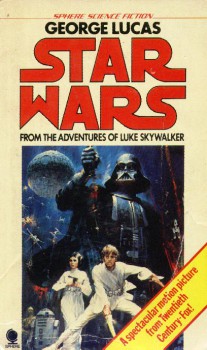 Number One: Star Wars A New Hope, George Lucas, 1977. John Berkey is the final piece of the 70s science fiction cover puzzle. Somewhere along the path, science fiction turned from campy 50s pulp to a sophisticated level of awe-inspiring scope. Berkey was one of the men that intrinsically helped the industry transform. His concepts motivated behemoth franchises like Star Trek and Star Wars, and the incredibly smooth lines and crispness to everything he touched was hard to overcome. Where fantasy had Frazetta, science fiction had Berkey, a far lesser recognized name but certainly no less impressive a talent. His image for A New Hope, apart from the movie poster, combined modern cinematic media with old school novelization, and it is pure genius. He truly could have appeared on this list at least eight times, starting with Asimov’s I, Robot in 1970, but I figured I would take him to number one and give others in a more fantasy vein a shot.
So there you have it, one list of 1970s classic covers, but we all know there can never truly be THE list. There are simply too many, with too many implications and emotions to catalogue, but I’d really, truly, love to hear from you all on this. If you give me other choices I’ll create an honorable mention list below the Top 10. And yes, I will continue this series next month with Top 10 Literary Sci-Fi/Fantasy covers of the 1980s, so if you have any suggestions there, you can post them as well, just be sure to denote wither you are talking 70s or 80s!
Honorable Mentions: Frank Frazetta, Paul Lehr, George Barr, Kelly Freas, Darrell K Sweet.
If you like what you read in Art of the Genre, you can listen to me talk about publishing and my current venture with great artists of the fantasy field here or even come say hello on Facebook here.
[…] Black Gate (Scott Taylor) lists Top 10 Literary Sci-Fi/Fantasy Covers of the 1970s. […]
Um, Just IMO
1. Gotta have something by the late Frazetta. He’s just so awesome unless this list is titled “other than Frazetta”…
2. What about Bob Pepper? My fav cover is from “A voyage to arcturus” and a good one from Dunsany’s “The King of Elfland’s Daughter”… On the surface, looking like watercolor he mixed weird inks to create a luminous effect. Towards the 80s he moved to games and media, doing the “Adventure” cover for the 2600 and of course the “Dark Tower” (no Steven King relation) game’s artwork.
—I think he illustrated the first issue of “The Dreaming City” though that might have been a re-purpoused art cause it had a more orientalist feel, could have been “Sinbad” but still very beautiful.
Paul Lehr did some stunning cover work in the 70s. A *lot* of it, including many if not all of the paperback covers for Damon Knight’s Orbit series of original fiction.
Great list! Landscape-wise, I’d also throw in the Pocket Timescape cover from Vance’s The Dying Earth: http://www.goodreads.com/book/show/951749.The_Dying_Earth
There was also the cover of the 1978 Jove Colour Out of Space — that’s what started me reading Lovecraft: http://www.goodreads.com/book/show/382724.The_Colour_Out_Of_Space
A whole bunch of Heinlein novels were printed in the 1970s with Darrell K. Sweet covers, and those are the “official” covers as far as I’m concerned (since that’s when I bought and read those books). I also read Piers Anthony, Alan Dean Foster, and Jack L. Chalker books in the 1970s with Sweet covers. In short, nothing says “1970s science fiction cover art” to me like Darrell K. Sweet!
The first edition cover of And the Devil Will Drag You Under is what induced me to read Jack L. Chalker when it caught me eye in a supermarket, of all places.
I bought all the Larry Niven I could get my hands on in the del Ray paperback editions with what I now know is Rick Sternbach cover art.
And who could forget the Edgar Rice Burroughs books with the awesome Whelan covers that appeared in the late 1970s?
Green: Bob Pepper is great and I did a feature on him for Art of the Genre if you go back and look for it. The novels he covered, however, weren’t written in the 1970s which was on of my criteria.
Dave: I added Paul, and he’s a great choice, although many of the covers he did were for books originally published in the 60s then recovered by him in the 70s.
Lugo: You don’t need to sing the praises of Darrel K Sweet to me. I was simply holding on to his work for my 1980s piece, when I feel like he REALLY took over the genre. 🙂
For Frazetta covers on books published during the 70’s, you could do a lot worse than his work on the Kane series.
Joe: Agreed, Frazetta is going up on the HMs.
Joe H: Awesome choices, and thanks for the link!
The White Dragon is worth finishing. I read a bunch of Pern novels before drifting away from McCaffrey in the late 80’s, and of all of them, The White Dragon is the only one I’d make time to read again now. I recall the ending as especially delightful.
I love that Silmarillion cover. Tolkien’s own illustrations feel so perfectly like artifacts from Arda. Nobody will ever put one of my own illustrations on the cover of any of my books–or at least I hope not.
Another fun list. Thanks!
Sarah: I’m glad you enjoyed the Silmarillion cover as much as I did, and if I pick up The White Dragon yet again, I’ll be determined to finish it. 🙂
[…] Black Gate (Scott Taylor) on Art of the Genre: Top 10 Literary Sci-Fi/Fantasy Covers of the 1970s. […]
In the “can’t judge a book by its cover” realm, some of the best novels of the 1970s and 1980s had really ugly covers: The Forever War, Inferno, Ender’s Game, and Neuromancer come to mind.
Would note two artists who did covers for books I might not have bought otherwise, but the cover art practically made me buy the books – the George Barr covers for Thomas Burnett Swann’s fantasies and the Kelly Freas covers for EC Tubb’s Dumarest series. Both series were, if I recall correctly, published by DAW books. DAW’s covers in general often made me buy a author unknown to me like the early CJ Cherryh.
Lugo: So true, but I write about art 😉 In my case it’s ALL about the cover!
Chuck: Great choices, and Freas is awesome. You know, DAW and those yellow spines WERE that greatest things in fantasy and science fiction in the 1970s. Whatever happened to those days?