Superman/Tarzan: Sons of the Jungle by Chuck Dixon and Carlos Meglia
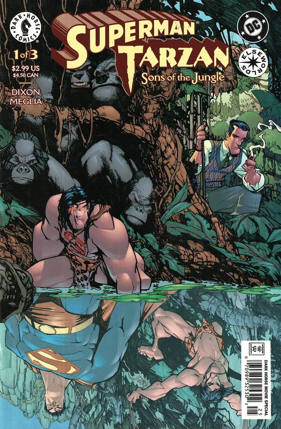
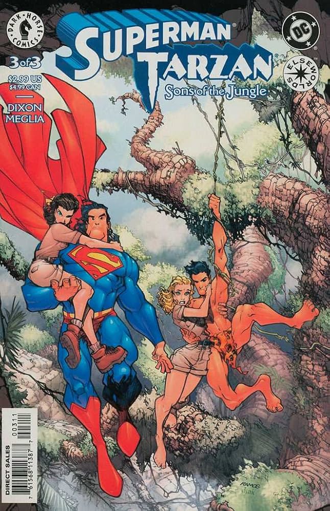
From Dark Horse Comics and DC comes Superman Tarzan: Sons of the Jungle, written by Chuck Dixon with interior art by Carlos Meglia. Cover art on the original issue covers was by Humberto Ramos.
This is a 3-issue comic arc that riffs off the original Tarzan story by Edgar Rice Burroughs. The mutiny aboard The Fuwalda takes place as usual, which is the start of Edgar Rice Burrough’s 1912/1914 serial/novel Tarzan of the Apes.
[Click the images for Superman-sized versions.]

John Clayton and his pregnant wife, Alice, are about to be marooned on the coast of Africa when a flaming meteor sweeps over and crashes right where the crew was set to land. The crew takes that as a bad omen and instead returns to Cape Town to drop off the Claytons. Thus, the infant who would have become Tarzan is raised by his living parents in civilized Britain instead of by Kala and the Apes in the jungle.
Before that twist is completed, though, we find that the meteor which crashed was actually the ship carrying the infant Kal-El from Krypton to Earth. Kala ends up adopting “Superman” instead of Tarzan and he is named Argo-zan (fire-skin). That must have been quite an experience for the apes, though we don’t get to see any of Argo-zan’s earliest years.
By the way, this appears to be the earliest incarnation of Kal-El where he is not so superpowered and can’t fly, but he is still far stronger than any human and cannot be physically injured.
Some spoilers ahead: The last 2 issues of the comic suggest that “fate” cannot be escaped because circumstances conspire to bring the man who would have been Tarzan and Jane Porter back to Africa, and they are accompanied by none other than Lois Lane.
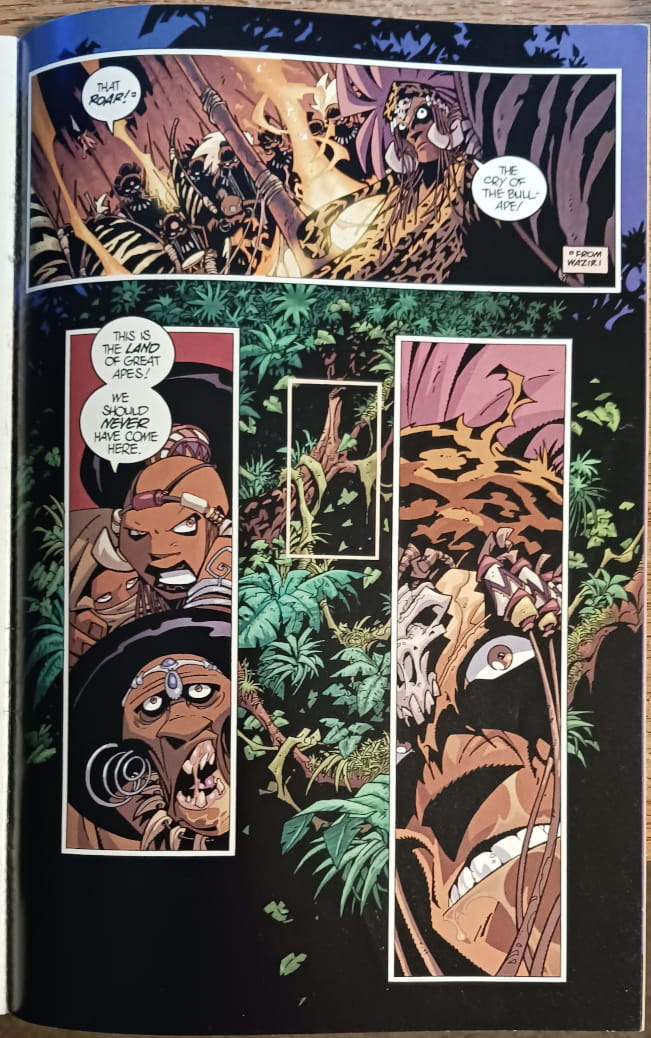
La of Opar is set up as the bad guy and she’s discovered some Kryptonite that she hopes to use to control Argo-Zan. You gotta figure how that works out, and at the end, fate brings everyone back to the places where they should have been in the first place.
 |
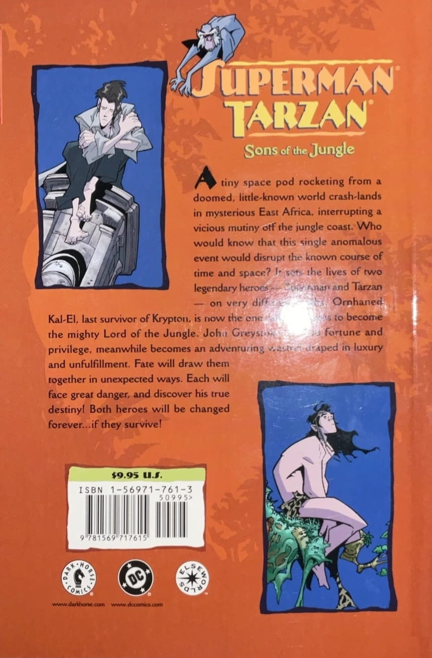 |
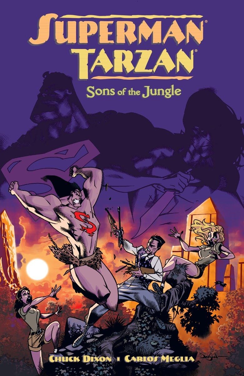
Superman/Tarzan: Sons of the Jungle collected edition (Dark Horse, September 30, 2002)
Here are my thoughts: It’s a cool idea and generally well done. Chuck Dixon does a smooth job with the story itself and the art facilitates the story.
My criticisms are twofold. 1. There’s a lot more story here than could adequately be told in 3 comic book issues. It’s a rich tale and because of word and length limits we only get parts of it.
I understand why but I’d still have liked more story, such as Argo-zan’s childhood and his interactions with the African wildlife, and John Clayton’s early growth as well. We see that John is “unsatisfied” with his civilized life and knows something is missing, but there were many scenes I’d have enjoyed getting a look at. (I’ll just tell them to myself in my head.)
 |
 |
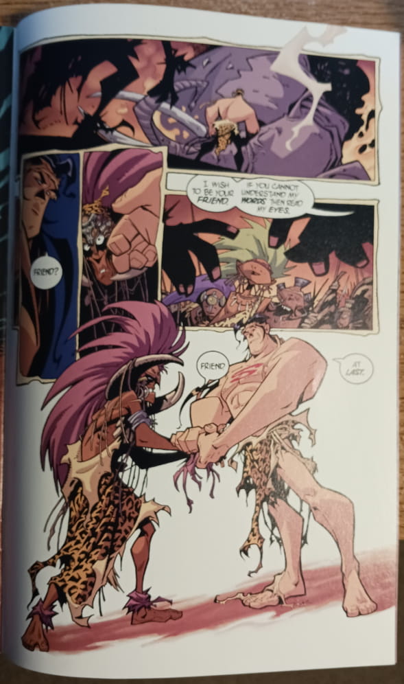
Interior art for Superman/Tarzan: Sons of the Jungle by Carlos Meglia
My second criticism concerns the art. Let it be known that I have no artistic abilities myself and both Meglia and Ramos are immensely more talented than I am. I admire their skills, but I didn’t personally like many of the human images presented here, although I liked a lot of the jungle backgrounds.
The characters, though, are hugely exaggerated, particularly their faces. Superman looks like he has acromegaly on the covers, and some of the interiors are close to caricatures. (See the interior illustrations I include here.)
This may have been done on purpose as a style choice, but I mostly didn’t love that choice. I did like the pool reflection on issue #1’s cover. Your appreciation may differ and that’s perfectly fine.
Charles Gramlich administers The Swords & Planet League group on Facebook, where this post first appeared. His last article for us was a a review of The Iron Tower Trilogy by Dennis L. McKiernan. See all of his recent posts for Black Gate here.
So, what if Tarzan was Superman and uh…
Well, PASS…
Like they really ARE out of ideas, eh?
Thanks for the article, though.
eventually, everything that can be done will be done. It would be nice to see some original stuff, though
This is an Elseworlds miniseries from DC Comics and Dark Horse. Elseworlds is DC’s equivalent to Marvel’s 1970s series What If. With both, the idea is to ask what would have happened if circumstances were different to the ones we’re familiar with (what if the Fantastic Four had different powers? what would happen if baby Kal-El’s ship had crashed in Stalin-era Soviet Russia?). Some concepts work really well, like the Batman/Dracula Elseworlds trilogy; others seem interesting initially but run out of steam well before the final pages or issue. For me, this Tarzan/Superman tale tends towards the latter. I also agree that the art is a poor fit for the story.
I loved their early Elseworlds – and they put Batman:TDKR in it since it’s now well past the dark late 1990s seen from the early 1980s with Reagan being President for life and the Batman of the 60s/70s coming out of retirement… My favorites were their “German Expressionist Cinema” showing things like Metropolis with Superman using TedMcKeever’s art. “Industrial Gothic” which he also did I bet many here would love though that’s just Vertigo, late 90s doom and gloom atmosphere with no super characters.
IMO the comics are now stagnant and out of steam. It’s been said before but enough more detailed YouTube videos on it – some leaked internal documents literally there to prevent change no matter what “Crisis to end all alternative wars” either company resets itself way too often with now. And I won’t even blame “Politics” it’s stapled on as “Fashionably Radical” and nothing new there, they’d always imitate current trends regardless. IMO the best thing would be to shut it down 10+ years. I could reset Marvel back to late Copper age in-canon without any big crisis/event even. Then I’d write going forward as if we’d skipped 20+ years of story but do it “Dreadstar and Company” style so it self-references the meta-story in between. Very unlikely but…
The art is now mostly “Corporate Slop” aka like Ghost Writing is to AiWriting – People for less and less $, competing with the 3rd world, do very bland realisim to help make “Content” but a writer/illustrator could change DURING a comic episode, nothing is invested or connected. Indeed with all the photoSLOP aka crude tracing using tablets and google or Sketchup (3d cheap art meant for architecture) and lots of “Art” filters it’s hard to tell one illustrator from another. Those with distinct styles tend to be the older established ones from 00s at latest since they don’t want a chance of readers following to another company or worse a real indie attempt – gotta keep the “Image” so it dont’ happen again… My favorite corporate SLOP content producer is Greg Land who now blatantly uses pictures from Pronhub and men’s magazines so the ladies often have weird poses that make total sense if you know the source and change body type during the comic … And the sheep public only complained his teenagers like Kitty Pride / Shadowcat (14 since late 1960s…) were drawn like adults with implants – uh, if he looked up legit ‘source material’ he’d be JAILED… Hope he doesn’t have to do Power Pak…
Was following along and could see most of your points from your perspective, and agree with a number of them, but you completely lost me when you laid the blame for the weird female poses in comics. If you want to not see female characters in generally weird poses in comics, you have to go back to the ’30s-’60s.
I’m not sure how well you can see it, but if possible, take a look at the “S” in my little SRC++ icon connected to this posting account. It’s a female character in a standard sci-fi comicbook run-and-shoot pose that I somewhat traced off of a picture of myself in the same pose. (It’s a really awkward pose, whether you try to hold it or move through it, FYI; lots of weird twists and changing momentum.) When I was arriving at that pose for the project that needed that icon, I ended up doing a bit of a survey of female poses in comics, and this is what I found: if you take any long-running comic with female effective characters (doesn’t even have to be main characters, just effective ones) and start replicating their poses minutely in the mirror, in the ’30s-’50s the poses are fairly natural though tending toward feeling passive or fearful, in the ’60s the poses start feeling triumphal but a bit sensualized, in the ’70s the poses are still triumphal but start to adopt contortionist qualities, in the ’80s the poses are powerful but increasingly contorted, in the ’90s-’00s the poses grow highly sensualized and contorted. Just flicking through comics today and remembering that project, I’d probably set many female character poses from ’10s-’20s at “debasingly sensualized and impossibly contorted.” Male or female, I’d challenge anyone to make the same self-posing survey and not start to feel appalled by the ’90s. For a bit of extra “fun,” throw a few WWII pin-up poses before you start– it’s almost a lock that you’ll start feeling more exploited by the ’80s-’90s comicbook poses than you ever do by the pin-up poses.