Art of the Genre: The Top 10 Literary Sci-Fi/Fantasy Covers of the 1980s
There is a line from the band ELO‘s song Ticket to the Moon, on their concept album Time, that says,
Remember the good old 1980s, when things were so uncomplicated, I wish I could go back there again, and everything could be the same…
I can’t listen to that album [and yes, I listen to ELO often, sue me] without having those words haunt me. You see, the 1980s were ‘my’ time. We all have this period, the decade from childhood to young adult that is seemingly perfect. I went from 9 to 19 in that decade, and it was pure unadulterated magic.
In that time I seemed to be playing GI Joes in my sandbox, blinked, and was attending my senior prom. I can’t tell you where the time went, just that it still resonates in my memory with a warm fuzzy feeling because it was all about me. I mean, isn’t that what your teens should be, a time all about you? There are no mortgages, monthly bills, children to ferry about, wives or husbands to cater to. Sure, there’s school, gas money, some relationship hassle, and a summer job, but realistically that’s window dressing to a period in which you can explore nearly anything you wish and are encouraged to do so.
So, that being established, it isn’t hard to imagine that I see everything that happened in the 1980s with rose-colored glasses. This can certainly be said about the literature of the era. Now given, I’ve gone back and reread a few books from my youth, and each time the shine isn’t what it was on first reading, but nonetheless, the art on those book covers still retains the luster of a bygone age.
It was in the 1980s that I first fell in love with fantasy art, and to a certain degree science fiction art, although I think that particular genre was waning as fantasy came into full bloom with the advent of Dungeons & Dragons. To me, there is nothing better than what I found on the shelves in those years, each title laying the foundation for my life in a profound and lasting way.
It is for that love I bring to you the Top 10 Literary Sci-Fi/Fantasy Covers of the 1980s. Again, this is a personal list that was forged with respect to book sales, awards, and exposure to a wide audience, but in the end it’s all about personal choice.
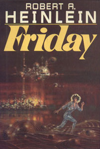 Number Ten: Friday, by Robert A. Heinlein, 1982. This novel was eventually recovered by Michael Whelan, but I’m much more taken by the residual effects of 1970s science fiction art that was bound into its original cover. Done by artist Richard Powers, this cover sets a tone of muddy browns and odd futuristic globes, the detail something that perfectly keyed into the abstract of 1970. Friday, the android protagonist in the novel, is portrayed in motion, her jumpsuit a perfect indicator of time period and the concept of what the future would hold among the genre. For the early 80s, it’s hard to imagine a better science fiction cover that holds anything but a space ship.
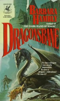 Number Nine: Dragonsbane, Barbara Hambly, 1985. I’m going with this cover because it is a divergence. By the mid 80s everyone knew what Michael Whelan brought to the table, but in this work I find the cover to be inherently anti-Whelan. Now, not that it isn’t a great cover, mind you, but it’s just so different. Having been spoon fed McCaffrey’s Pern dragons for a decade, and seeing his science fiction and horror work burst into full bloom, this cover almost seems some kind of odd throwback. It appears almost too gritty for a Whelan, and yet it is far more polished than Whelan’s Elric work on DAW which harkened back to Frazetta. Today, it looks more like a Royo, but in the end, this cover stands on its own, and still captivates as a kind of side-step in Whelan’s fantastic career. For that, it’s perfect for inclusion on this list.
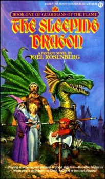 Number Eight: The Sleeping Dragon, Joel Rosenberg, 1983. The 80s really is little more than a death duel between Darrel K. Sweet, who did this cover, and Michael Whelan. I’m talking a veritable Thunderdome where two men enter and one man leaves. Since Whelan got so much love on my list for the 1970s, I’m going into a full action reprisal for Sweet. This book not only moved me as a reader, but it is the first such tome that pulled the ‘D&D players get trapped in another fantasy universe’ card, and the effect is fully realized on the book’s cover. Here we have the usual suspects, Wizard, Fighter, Cleric, Dwarf and of course a dragon. Also, I L-O-V-E Karl Cullinane’s half unsheathed sword… just epic! You also see Sweet’s full-blown ‘tattered’ effect that not only seems to grip the cloth portrayed in his covers but also the dragons we see as well. It’s a wonderful little artistic quirk that makes Sweet all the more endearing to me.
 Number Seven: The Snow Queen, by Joan D. Vinge, 1981. The cover of Snow Queen finally brings Michael Whelan’s talent to the level only whispered in covers that began with The White Dragon. We’d seen promises of what he could do since 1975, but in this cover he absolutely takes us to the next level of his genius. This image makes anyone seeing it stop and take note, the characterization; color, refinement, and alien wonder are all off the chart. This cover is art for the sake of art, and that pushes the envelope of what is acceptable on a novel’s cover. For the first time I think we witness a cover that could be shown in a gallery and not be construed a simple ‘fantasy’ shot. For that reason alone, The Snow Queen makes this list.
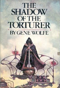 Number Six: The Shadow of the Torturer, Gene Wolfe, 1980. The early 80s were the high water mark of incredible literature by fantasy legend Gene Wolfe, and the covers of his books sang with the promise of what readers would find within the pages. Don Maitz helped define Severian for all those of us who partook of this work, and there is a something ghost-like, pristine, and fey about the image that captures one’s attention. The cloak, the blade, and the clash between the dark figure and the light background make this cover sing. There is also a bit to the unread styling which brings a bit of Bob Pepper comic bent to the image that doesn’t scream reality but instead helps the reader understand that this is fiction, and you should be entertained beyond a hardcore reality by it.
 Number Five: The Mists of Avalon, by Marion Zimmer Bradley, 1983. Now I’m not going to divest too much time in the merits or failures of this book, but whatever one’s feelings on it there is no question it had a direct and lasting impact on fantasy, especially concerning women in the genre. The cover, done by Braldt Bralds, is a complete divergence from what most readers had seen to this point. It has an almost two-dimensional feel, like you are viewing an ancient tapestry done before full perspective had come into vogue among European artists. Still, it is evocative, eye-catching, and the misty essence of the muted colors draw a viewer into a world colder, deeper, and beyond what we live in. That feeling is the key to Mists of Avalon, the beyond, and there is no doubt this cover helped countless readers take a first step into the drama beyond L’Morte D Arthur.
 Number Four: Ender’s Game, Orson Scott Card, 1985. Now it’s been mentioned before that some of the greatest books of the 1980s had horrible and uninspired covers, probably the most noteworthy being William Gibson’s Neuromancer, but when people group Ender’s Game into the conversation I have to disagree. John Harris does an outstanding job of recreating the feel of 1970s science fiction space art, and although the cover is dark and obscure to reference, the same can be said for the spirit of the book it represents. I mean, Ender’s Game was the Sixth Sense before the Sixth Sense existed, and therefore how do you properly define a book of secrets? Harris did all he could do, and I applaud him for it, the scope of the image still capturing one’s attention, and the concepts of deep space are intact and appealing enough to get my attention.
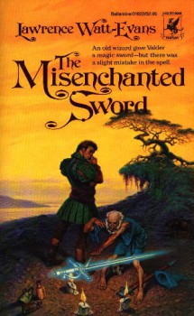 Number Three: The Misenchanted Sword, Lawrence Watt-Evans, 1985. Watt-Evans is credited for the creation of the word ‘misenchanted’, and his book is a small sliver of genius that keeps it short, fast, and real, which is my favorite way to read. Darrel K. Sweet’s cover captures perfectly the pivotal scene in the book, and by this point in his career Sweet has become THE artist of the 1980s. There is a profound sense of magic portrayed here, and a blade that begs the reader to find out what is being done to it, especially if it is ‘misenchanted’. Sweet captures the perfect shading, the swamp feel, and the mad mage hermit to perfection. Soon, the style portrayed here will spill over into blockbusters like L.E. Modessit Jr’s Recluce and Robert Jordan’s Wheel of Time.
 Number Two: Trek to Kraggen-Cor, by Dennis L. McKiernan, 1986. Richard Bober is a recluse, as many a formerly working artist are these days, but that’s not to say that he didn’t hit the perfect home run with his two covers for McKiernan’s Silver Call Duology. This book also includes one of my favorite design mechanisms of the 1980s, the cover frame. Seeing this book wreathed in silver thorns and then splashed with color by Bober’s incredible oil style was a sure bet to bring McKiernan’s work into the hands of buyers ready for an epic dwarven reclamation project. These books moved me, and the covers still resonate with me all these years later because they provided a very Dark Crystal meets Tolkien bent that simply has to be explored beyond the cover.
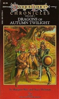 Number One: Dragons of Autumn Twilight, by Margaret Weis and Tracy Hickman, 1984. For all the seeming hatred and bile that can be cast against Larry Elmore by the OSR movement, I dare someone to come up to me and badmouth the cover of any of the three original Dragonlance Novels. Assuming my friend Mark is next to me, you are going to wake up in the hospital. Elmore simply killed this cover. He flat out, no other argument, dead on arrival, killed it, especially with Autumn Twilight. There will never be another more pure representation of gaming in art portrayed on a cover in this lifetime. When you look at this cover, you ARE a gamer. But even putting D&D aside, Elmore hits his high point right here, every fiber of emotion, movement, personality, and threat are bound in oil so colorful it almost pains one to look directly at it. Contrary to the name, Autumn Twilight is like looking into the sun, and it literally pains me to see this book recovered on shelves today. When you create something perfect, why would you ever replace it with another image?
So there you have it, another Top 10 list on covers as we march our way to the current date and time. I hope you’ve enjoyed this trip down memory lane, and if you’d like to hit me up with your thoughts on some covers I’ve missed, I’d love to hear them.
If you like what you read in Art of the Genre, you can listen to me talk about publishing and my current venture with great artists of the fantasy field here or even come say hello on Facebook here.
Very good choices. I can’t agree more with your comments on Larry Elmore. His work brought many to RPG and helped inspire those already playing. I remember reading his comments on the first version of “Dragons of Winter Night”, where he had to hide Kitiara’s identity in the Dragonlord mask, while making her look feminine (http://www.isfdb.org/cgi-bin/pl.cgi?287795).
Another favorite SF cover, although marginally ’80s, is Gary Ruddell’s “Hyperion” (http://www.isfdb.org/cgi-bin/pl.cgi?17594). The Shrike is a memorable monster that has to keep its enigmatic identity and serve as a metaphor for time and death, while looking cool & frightening.
I think I have most of these covers on my bookshelf. I dont have the Vinge or McKeirnan, and I have the Whelan cover for Friday (which is a very nice cover)
I think Winter’s Night is a better cover than Autumn Twilight. The blues and whites are more my colors. Plus that book had a scene that was one of the most painful memories I ever had reading a book…
If I had to name my top 80s covers many of these would be on it, but I would also include Whelan’s cover for Niven’s Integral Trees.
Great picks, but I can’t help feeling that there are some important ones missing.
While I’d never slight Whelan’s Snow Queen, his covers for C.J. Cherryh’s Chanur titles of the 80’s were stunning. Pride of Chanur, Chanur’s Homecoming, and the clear, almost shockingly casual image of Pyanfar Chanur simply pulling a door closed on the cover of Chanur’s Venture, are all stellar work.
I also feel the need to bring up one of the most under-rated cover artists– Richard Hescox. His work showed a strong sense of drama and some of the most striking use of color ever seen on the cover of a paperback. Check out the covers of Masks of Scorpio, L. Neil Smith’s Brightsuit MacBear, or Peter Morwood’s The Dragon Lord (one of the best dragon images I know). All excellent and all very 80’s.
I felt greatly let down by Shadow of the Torturer. There simply wasn’t enough torture in it.
Hard to see how you can mention 1980s science fiction and fantasy without Jack L. Chalker, Piers Anthony, or Alan Dean Foster. All so prolific, and so often with great Darrell K. Sweet covers!
Periklis: Hyperion is a GREAT choice, and would have been a nice inclusion in this list!
TW: When I read Winter Night, I was in Freshman English class and promptly threw the book across the room. Luckily for me, my mother was an English teacher in the same school, so I wasn’t punished for the spontaneous act of ire 😉 I’m sure you know the scene in which I was ‘forced’ to throw.
John H: I’m going to tell you the same thing I’m going to tell Lugo, it would be too easy to make a ‘Top 10 Whelan Covers of the 1980s’ Chanur are all great covers, but I’m no fan of Cherryh, so they got bumped in favor of others. 🙂
Lugo: I could blink and make a ‘Top 10 Sweet Covers of the 80s’, but as this list needs to include various artists, I think Sweet still came out looking good.
I’d throw Tom Canty into the mix
http://www.goodreads.com/book/photo/1149445.Swordspoint
unless you think he’s more of a 90’s guy.
I’d also mention Janny Wurts’ original cover for Daughter of the Empire (the green one) although I’m having trouble finding a link to the specific version.
@ Scott Taylor:
Thanks! Rundell also ilustrated the other three books in the Hyperion/ Endymion Cantos (“Endymion” is my favorite, again due to the portrayal of the main villain, now more ambiguous than before, the Shrike). But they’re all published in the ’90s 😉
Regarding DoWN, I’m guessing you sent it flying across the room when Kitiara’s Dragon flew towards Sturm, near the end of the book…
A print of the Dragonsbane cover signed by Barbara Hambly hangs in a position of pride in the library at my house…nice picks!
While I might not agree with some of your choices, Scott, I’m really glad to see so many pieces by the late, great Darrell Sweet! Rest In Peace
[…] Black Gate (Scott Taylor) on Art of the Genre: The Top 10 Literary Sci-Fi/Fantasy Covers of the 1980s. […]
Love the list. Some great choices on it. Also love the way you snuck a Parkinson cover in without adding him to the list. Very crafty sir. And based on your comments about The Misenchanted Sword, I cut and pasted the title from here into amazon to learn more- there I was assualted by what is currently being used for the cover of that book. Yeesh.
John H: Agreed, the style employed in the Wurts covers with Feist are pretty captivating.
Periklis: Indeed, you’ve hit the right moment in the book for my infamous throw 😉
Shedrick: Me = Jealous
Fultz: RIP… he will be greatly missed!
Terrence: Parkinson rules! If you ever get a chance to read Misenchanted Sword, I highly recommend it, no matter what cover it has 😉
[…] And then, today, there’s an article up at Black Gate about the best sci-fi/fantasy covers of the 80s. […]