The Art of Author Branding: The Ace Robert Silverberg
 |
 |
 |
 |
 |
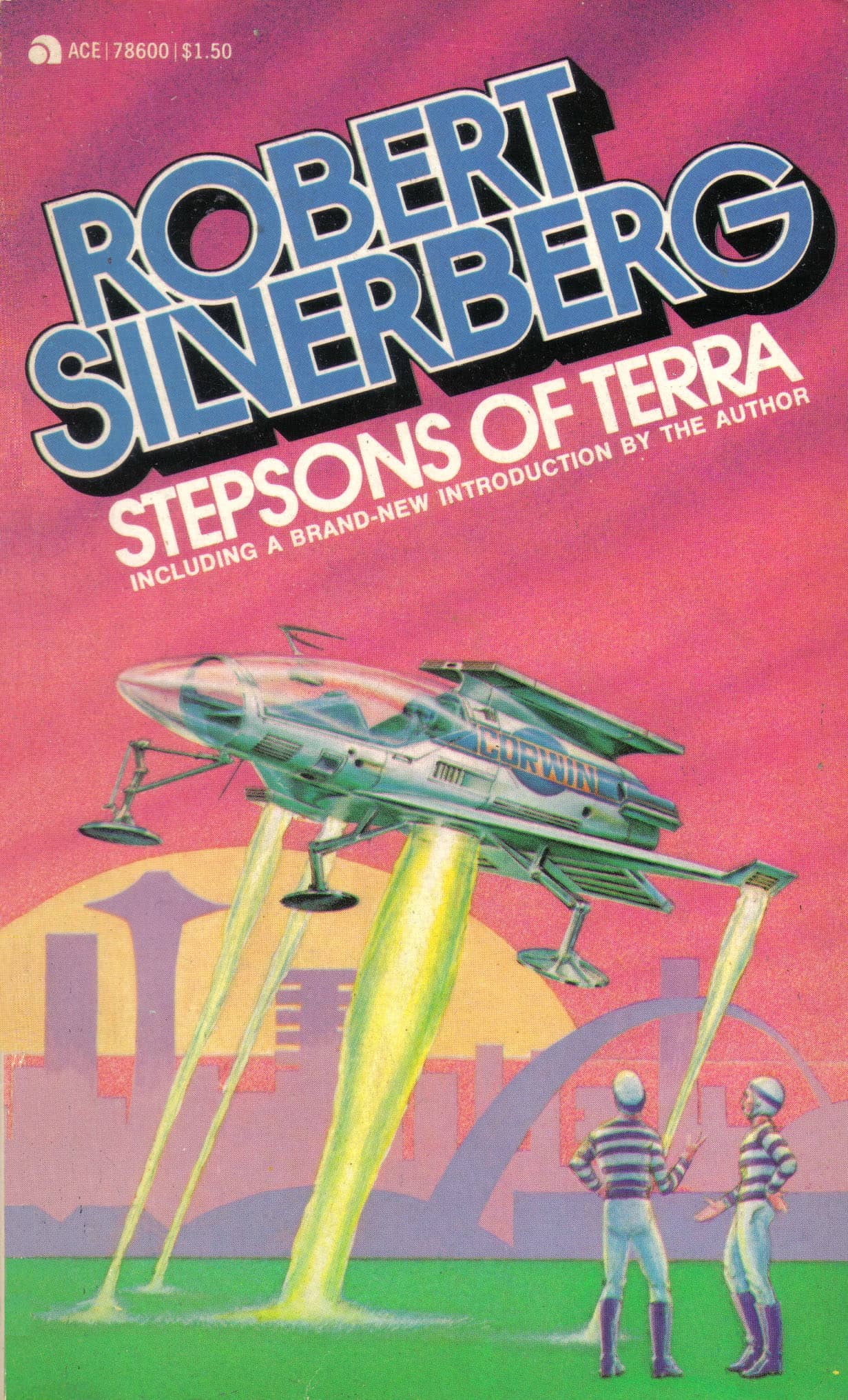 |
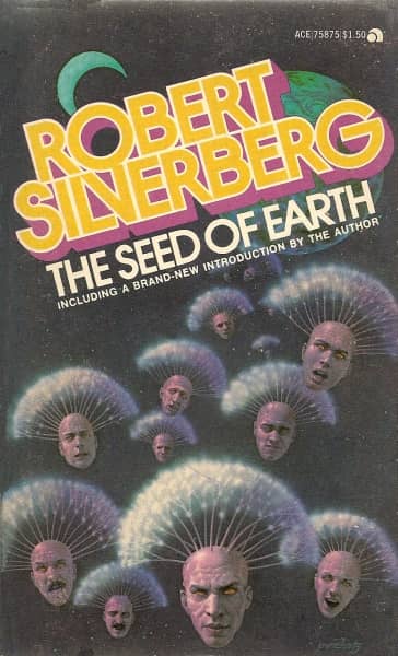
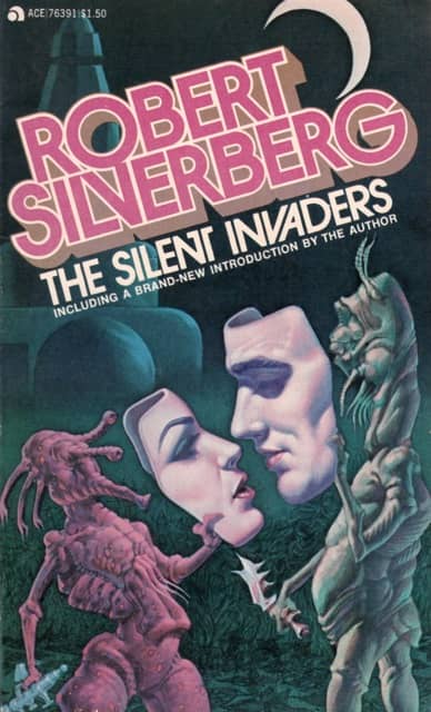
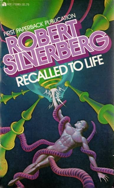
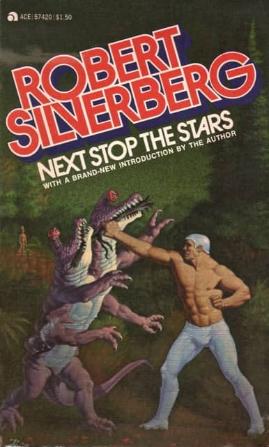
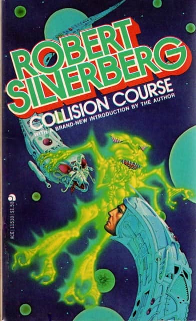
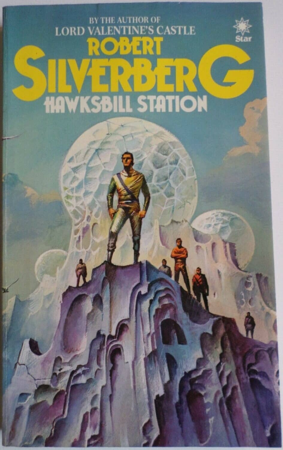
The Ace Robert Silverberg: skewed titles and unclutterd art. The Seed of Earth, The Silent Invaders, Recalled to Life,
Next Stop the Stars, Collision Course and Stepsons of Terra. All from 1977. Covers by Don Punchatz
If you cruised the bookstore and supermarket racks in the 70s and 80s for science fiction paperbacks, Robert Silverberg was everywhere. I mean, everywhere. It wasn’t just that he was enormously productive — that was certainly true. But his books remained in print, or were returned to print, countless times by different publishers.
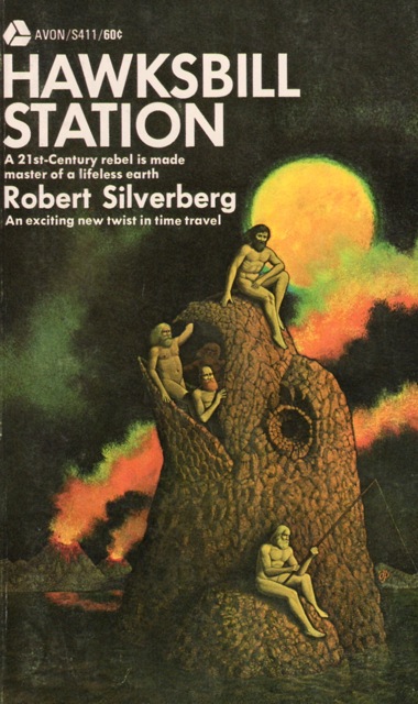
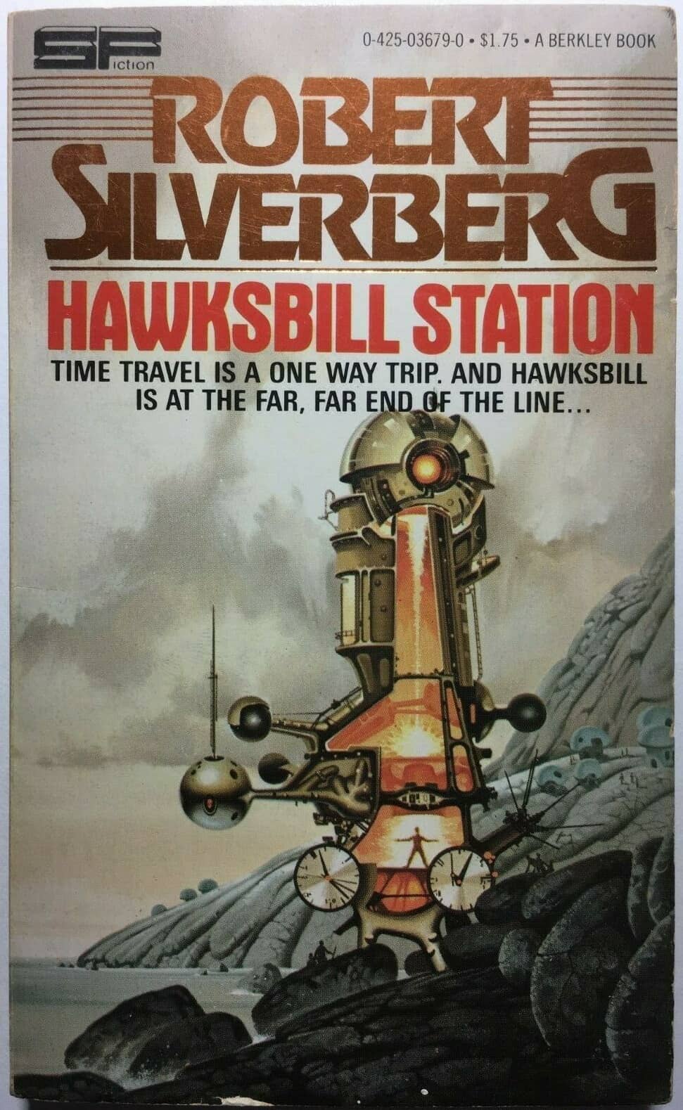
This was the era when agents would package up backlists by top writers en masse, selling the rights to multiple novels, and publishers would release them virtually simultaneously, usually with the same cover artist. If you had a popular novel — and Silverberg had many — a diligent agent could package and re-package it many times. That’s how Silverberg’s Hawksbill Station was released by Doubleday, The Science Fiction Book Club, Avon, Tandem, Berkley, Star, Warner Books, Tor, and many others between 1968 and 1990, just to pick one example.
The 1977 paperback edition of Robert Silverberg’s Collision Course was one of the first science fiction books I bought (the other was Star Trek 2, by James Blish). Mark Kelly reviewed it for us here last month, calling it “a fascinating, ordinary 1950s science fiction novel.” The mix of far-flung space adventure and galactic intrigue was perfectly pitched for a 13-year old however, and I loved it. Naturally I returned to the bookstore to find more in the same vein, and lo and behold, I did: five more Robert Silverberg novels, cleverly packaged by Ace Books to capitalize on the natural brand loyalty of young SF fans (see above).
This practice of bundling authors, and creating custom cover designs for each, was by no means unique to science fiction, of course. But if you’re a student of SF art there’s an enormous amount to learn by examining the visual language built up around the most popular SF authors in the 70s and 80s, and the ways editors and Art Directors at the major publishers used that language to draw in readers with familiar images and themes, and simultaneously differentiate themselves from the competition on overcrowded paperback racks.
There are countless examples, of course. But for our purposes, I’m going to single out Robert Silverberg, mostly because he’s the one I think of when I think of author branding. Well, Silverberg and Larry Niven (whom we’ll get to in a minute).
 |
 |
 |
 |
 |
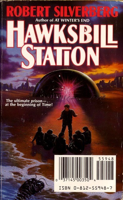 |
The many face of Hawksbill Station: Avon (1970, cover by Don Ivan Punchatz), Berkley Books (1978, Paul Alexander),
Universal-Tandem (1978, uncredited), Star (1982, Bruce Pennington), Warner Books (1986, Jim Burns), and Tor (1990, Jim Warren).
When I trekked back to the bookstore in downtown Ottawa in 1977, looking for a book as exciting and as full of gosh-wow space action as Collision Course, I probably didn’t actually remember the name Robert Silverberg. At thirteen, I was only dimly aware that science fiction books had authors — or at least, that I should bother paying attention to such things. No, mostly what I paid attention to were the covers. I poured over dozens in the aisles at W.H. Smith’s, my buck-fifty in hand, weighing the pros and cons of each. And in general, if it looked very much like a book I’d just read and enjoyed, I was warmly disposed.
Tom Doherty was publisher of Ace Books in 1977; he succeeded the great Donald A. Wollheim, the founding editor of Ace, who left in 1971 to found his own imprint, DAW Books. The editor at Ace in 1977 was Jim Baen. Doherty and Baen understood that when I returned to WH Smith with my hard-earned babysitting money, I was on the lookout for something like Collision Course, and they made it bog easy for me to find. Every Robert Silverberg title from Ace had identical layout and cover design:
- The author’s name in bold, colorful print, slightly skewed from the horizontal
- Subdued colors, mostly against a dark background, by the “elegantly weird” artist Don Ivan Punchatz
- A clean, uncluttered design with minimum text and a small publisher’s colophon on the top left
In addition — and here’s the key point — the Ace Robert Silverberg was clearly different from, say, the Berkley Books Robert Silverberg. There was no brand confusion between the two, and that was very deliberate.
|
 |
 |
 |
 |
 |
 |
 |
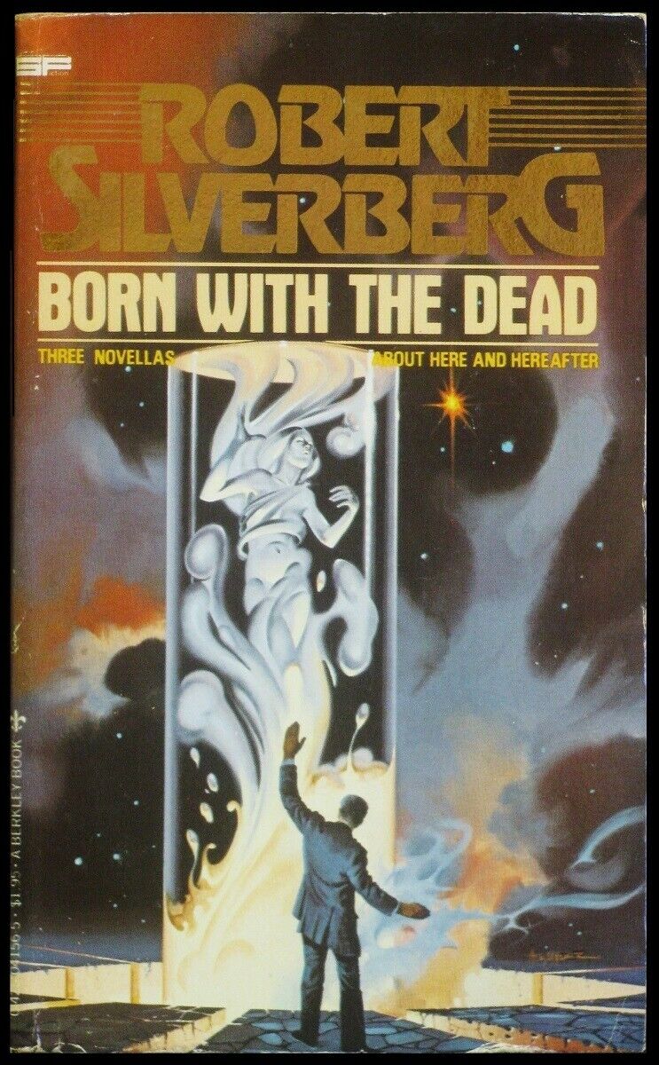 |
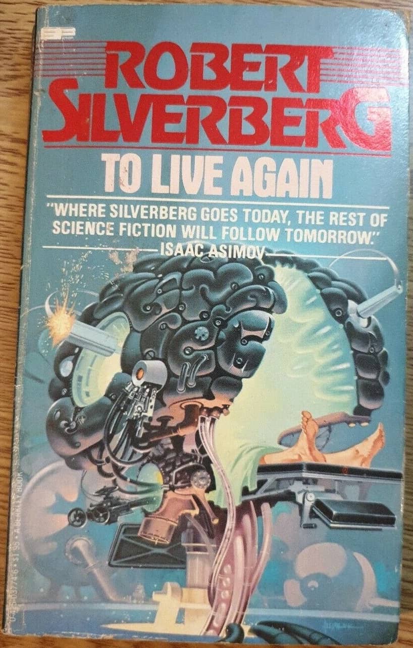
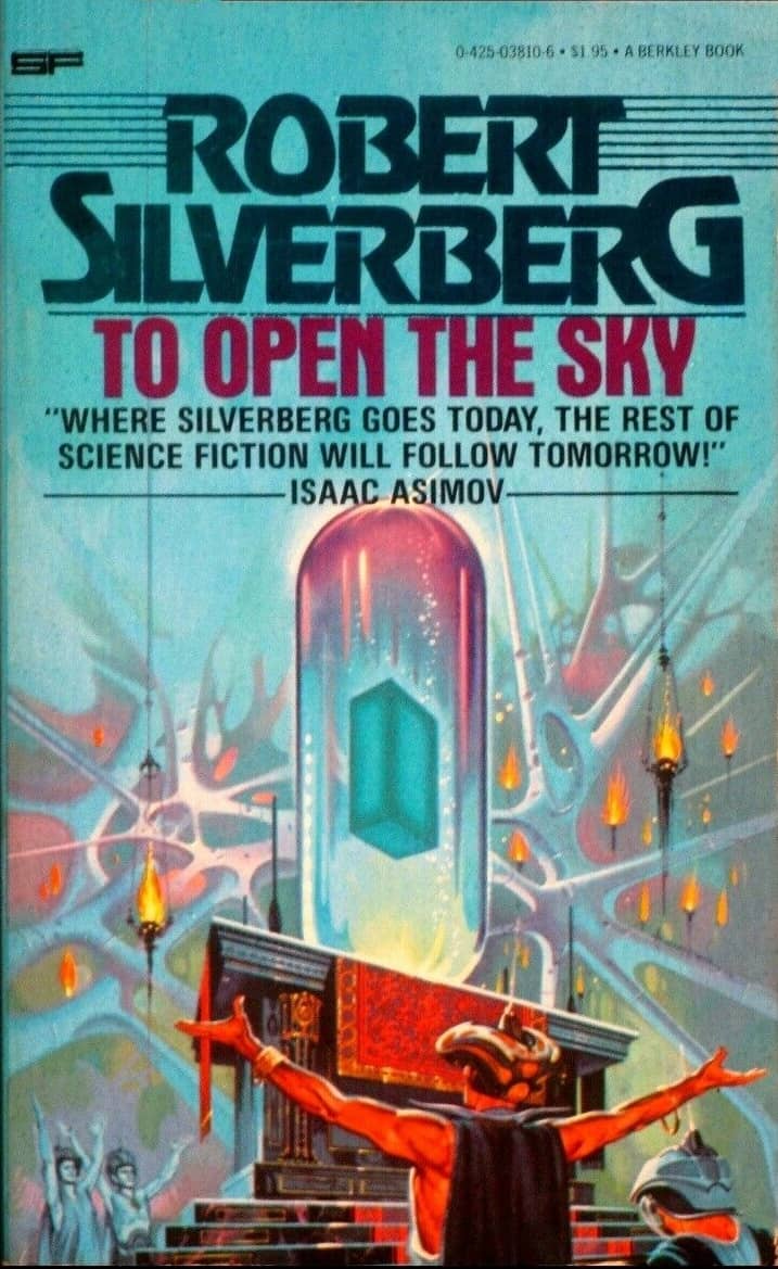
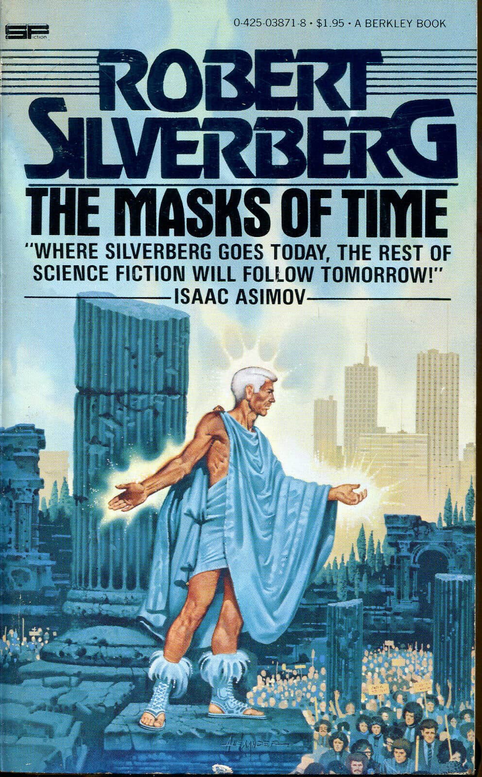
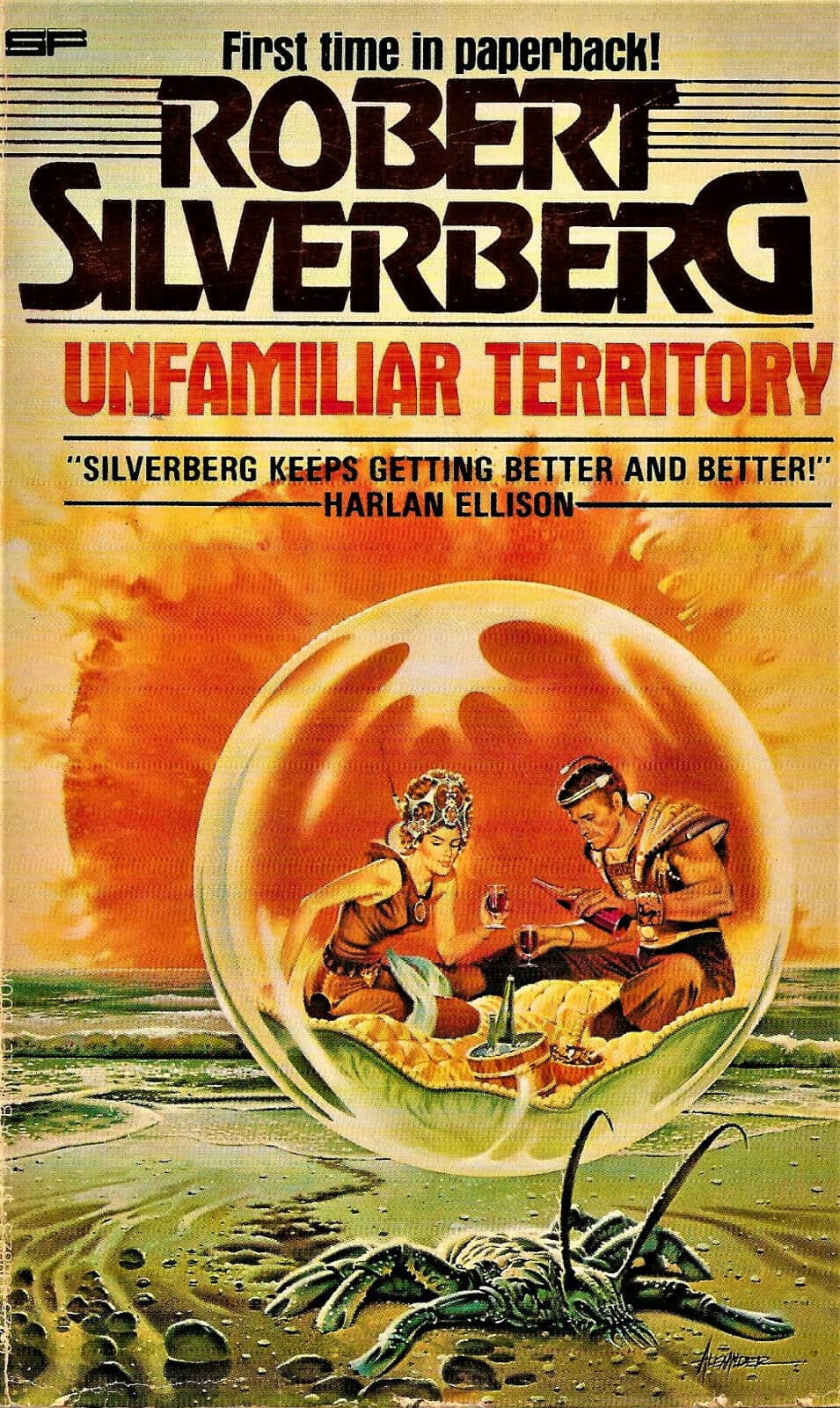
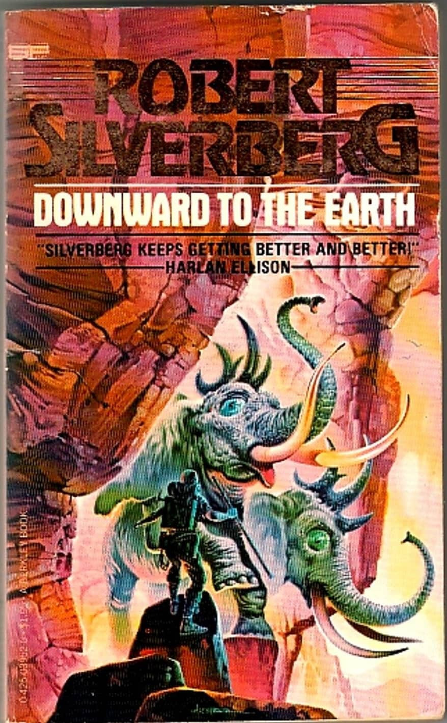
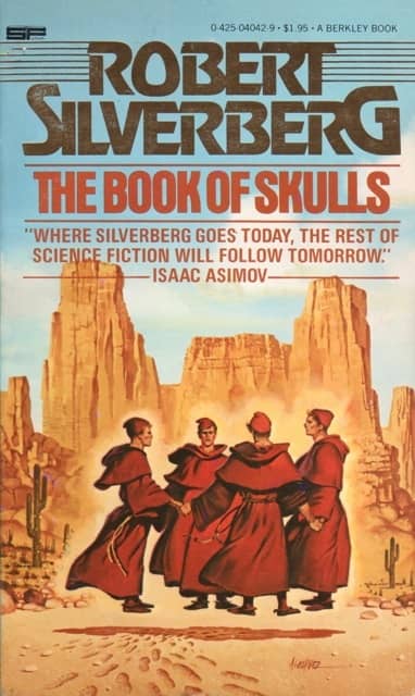
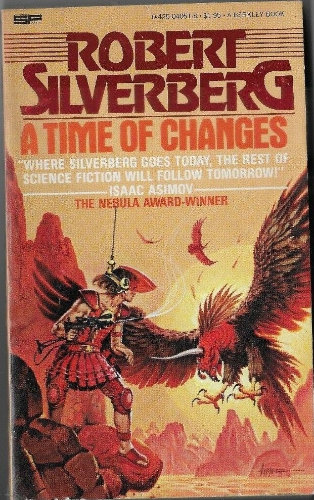
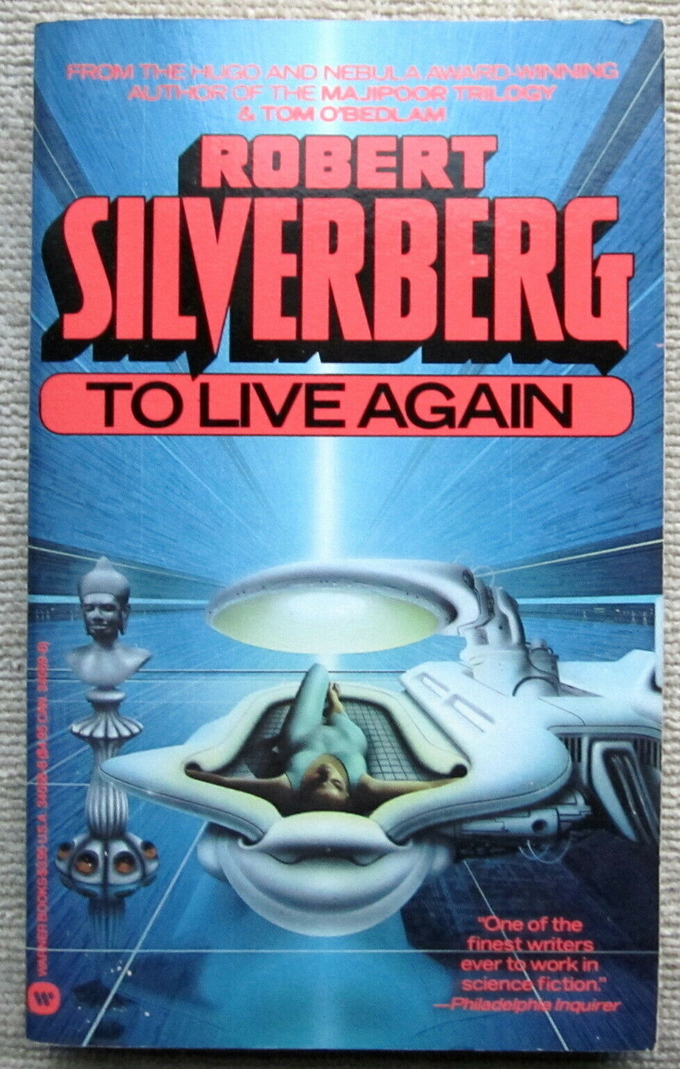
The Berkley Robert Silverberg: dash-lines and prominent blurbs. Hawksbill Station, To Live Again, To Open the Sky, The Masks of Time, and Unfamiliar
Territory, all 1978, and Downward to the Earth, The Book of Skulls, A Time of Changes, and Born With the Dead, from 1979. Covers by Paul Alexander
The Berkley Robert Silverberg (see examples above) had busier covers, with the top third smothered in text, including the author’s name bracketed by dash lines, and prominent blurbs from Isaac Asimov and Harlan Ellison. A reader scanning the racks for another Collision Course wasn’t likely to give the Berkley volumes a second glance.
Doherty, who left Ace to found Tor Books in 1980, and Baen, who left in 1980 to (can you guess?) found his own publishing house, Baen Books, were both extremely skilled in creating and carefully nurturing a brand around house authors. Like Wollheim before them, they learned and honed those skills to a fine art at Ace.
All three men — as a group, perhaps the most successful and prolific publishers of mass market science fiction books in the 20th Century — refined the art of packaging, marketing and selling at Ace Books. I find it fascinating that each of them learned slightly different lessons. Or at the very least, they put those lessons to work slightly differently.
Wollheim, for example, catered to the peculiar collecting mentality of science fiction fans by numbering every DAW title (starting with “DAW Book No. 1,” Andre Norton’s Spell of the Witch World, in April 1972), and making DAW Books easy to spot on bookstore shelves by giving every one a bright yellow spine. Jim Baen relied heavily on design, using bright, bold typography for book titles. And Doherty arguably took the Ace formula the farthest. SF and fantasy series from popular authors were a staple at Tor, and Doherty used the skills he learned at Ace to give each one a unique look — while simultaneously cultivating a house look that made it easy to spot Tor Books at a glance.
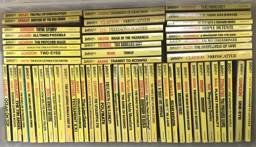
The distinctive DAW yellow spines
It’s an overstatement to say that Ace pioneered the practice of creating a distinct visual brand for their authors. Any student of SF book art can point to numerous examples in the 1960s, and even the 50s. And as you can see from the impressive selection of Berkley titles from Robert Silverberg above, by the late 70s it was fairly common industry-wide. By this point, the best agents in the business were growing increasingly skilled at bundling clients’ back catalogs into attractive package deals for publishers anyway. So it’s tough to say who really drove the practice — authors, agents, or publishers?
But whatever the case, I think it’s accurate to say that by the mid-70s Ace was the most skilled practitioner of author branding in science fiction, and they perfected the art with a simple yet powerful formula:
- Signing up popular SF authors with a deep back catalog
- Pairing them with top-notch cover artists like Michael Whelan, Vincent Di Fate, Boris Vallejo, Jeff Jones, and others
- Using attractive and highly distinctive Art Design to leverage author loyalty into brand loyalty for Ace
This strategy paid off handsomely. Within a few years I wasn’t just looking for cover designs that signaled a familiar author. I was looking for the Ace colophon on the stacks… at first unconsciously, but gradually with more awareness.
For all the strides publishers made building up their own brand awareness — DAW with easy-to-spot yellow spines, and Ace with brilliant Art Design — in many cases the author’s brand still won out. In other words, the delicate art of successfully guiding an unsophisticated thirteen-year-old toward what he wants (more Robert Silverberg novels in the vein of Collision Course, for example) also gradually educates the reader to look for Robert Silverberg. This is precisely how young readers become fans. And when the author’s brand becomes bigger than the publisher’s, it pays off to swap the latter out for the former.
 |
 |
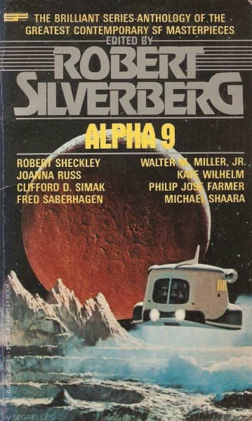 |
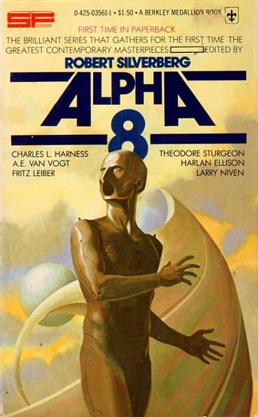
Author branding will trump series branding if the author is big enough. Note the modified cover design for Alpha 9, to match
Robert Silverberg’s. Berkley Books, 1977, 1977, and 1978. Covers by Randy Weidner, unknown, and Vicente Segrelles
For example, in 1970 Ballantine Books launched a reprint SF anthology series to compete with Damon Knight’s Orbit and Terry Carr’s Universe. Alpha was edited by Robert Silverberg, and it lasted for nine years, switching publisher to Berkley with volume 6. Like the authors it competed with on bookstore racks, Alpha had its own branding, including a distinctive typeface(see Alpha 7 and Alpha 8 above).
By 1978 however, Berkley discarded all of that and subsumed it under Silverberg’s house brand, marketing the book alongside their many Silverberg paperbacks, and using the same Art Design. (Compare the look of Alpha 9 to the Berkley Silverberg titles above to see what I mean.)
No matter how carefully you plan an author rollout, of course, there’s always a few quirks. Berkley Books’ impressive 10-book Silverberg reprint in 1978-79 (eleven books, if you count Alpha 9), is an interesting example. Nine volumes had covers by Paul Alexander, an extraordinary feat no matter how you look at it. One, the collection The Feast of St. Dionysus, for reasons lost to the mists of time, had a cover by David Schleinkofer. Did the Art Director feel Schleinkofer was just more suited to this one? Did Alexander have a nervous breakdown after delivering a painting per month for nine months? These are the mysteries that keep us up late at night.

The Feast of St. Dionysus by Robert Silverberg.
(Berkley Books, 1979. Cover by David Schleinkofer)
Ace may have helped pioneer — and arguably perfected — the practice, but the many cover images on this page should tell you that they were by no means the only publisher who successfully used it. By the late 79s and early 80s, the paperback racks were filled with author-branded books from dozens of publishers.
As the market matured, publishers found that this kind of book packaging often yielded more predictable returns than spending the same money on a single big-budget book. Likewise, authors and agents found that well-timed and coordinated publishing events like this helped enormously to raise their profile. And of course, once a publisher treated them this way, authors tended to expect it, or at least favor those publishers who put this level of marketing effort and dollars behind them.
Pretty soon the major SF publishers of the day — including Ace, Ballantine/Del Rey, Pocket, Berkley, DAW, Bantam, and Warner — began to compete to attract the top authors to build brands around. Competition meant more money, and anyone who’s spent time in publishing will tell you that money breeds money. Meaning that that books the cost the most to acquire tend to get the biggest marketing budget. The more expensive a book or book package is, the more a publisher will spend to promote it.
As publishers spent more freely on multi-book deals with science fiction authors, they successfully nurtured brands around them, and made stars of more than a few. It was this gradual process that some folks credit for the impressive number of science fiction authors who burst unto bestseller lists for the first time in the 80s and 90s.
 |
 |
 |
 |
 |
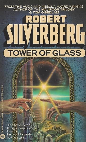 |
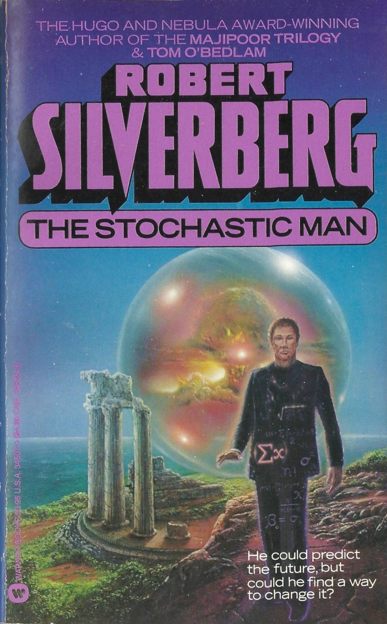
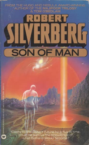
The Warner Robert Silverberg: photorealism and vivid colors, & blurbs that build on the bestselling Majipoor trilogy. Hawksbill Station, To Live Again,
A Times of Changes (all 1986, covers by Jim Burns) and The Stochastic Man, Son of Man, and Tower of Glass (1987, covers by Don Dixon).
If you were a midlist science fiction author in the early 1980s, watching as your peers cashed big checks, you could be forgiven for being a little envious. The truth was that only a few authors really benefited from the process.
You had to be both popular and prolific. While there were a few authors who fit the bill — Larry Niven, Frank Herbert, Arthur C. Clarke, Poul Anderson, Harry Harrison, Clifford D. Simak, Alan Dean Foster, Philip José Farmer, Ray Bradbury, Ursula K. Le Guin, Frederik Pohl, Philip K. Dick, C. J. Cherryh, Alfred Bester, Joe Haldeman, Octavia E. Butler, Jack Vance, Piers Anthony, A. E. van Vogt, Michael Moorcock, Andre Norton, James Blish, John Brunner, Anne McCaffrey, Samuel R. Delany, Fritz Leiber, Roger Zelazny, Robert Heinlein, Isaac Asimov, a few dozen more — the vast majority of writers lacked either the sales figures, or an available back catalog, sufficient to interest publishers. Or, perhaps, an agent with enough savvy to package the books together.
As I mentioned above, all this packaging and re-packaging is one reason there are so many editions of some of your favorite authors around. The continuous appetite for these books, and the lingering interest in the authors who wrote them, is a testament to the long memories of SF readers. It’s a major reason why science fiction has survived as a genre, while so many others popular in the 70s — including Westerns, Gothic Romances, and even mass-market Horror — are dead.
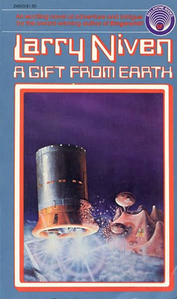
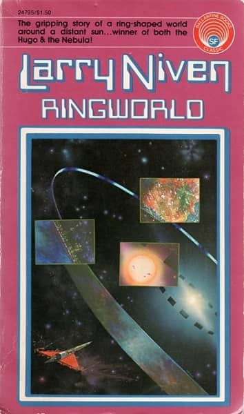
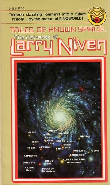
Most science fiction fans of my generation have their favorite authors from the 70s and 80s. If you ask the right questions, you’ll often find that many have favorite editions too. They may be only vaguely aware that Ballantine/Del Rey packaged more than a half-dozen Larry Niven novels and collections with a distinctive framing motif, creating a virtual mini-imprint showcasing Niven in the mid-70s. But they know for sure it’s the 1975 editions of Neutron Star, Ringworld, and Tales From Known Space, featuring Rich Sternbach’s evocative cover art, that carry all the nostalgia for them. Other editions simply don’t mean as much.
 |
 |
 |
 |
 |
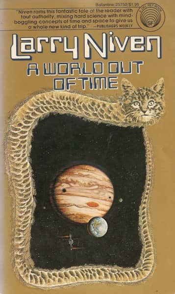 |
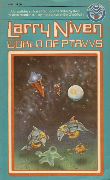
Larry Niven’s easy-to-spot Ballantine/Del Rey brand: A Gift from Earth, Neutron Star, Ringworld, Tales of Known Space,
World of Ptavvs (all 1975, covers by Rick Sternbach) and A World Out of Time (1977, Rick Sternbach and Murray Tinkelman)
Creating a unique brand for an author is an artistic partnership between the editor, Art Director, cover designer, and cover artist. There’s doubtless a good Master’s Thesis topic (or three) here for an interested graphic design or modern art student.
Publishers communicate a ton of information to readers in often very subtle ways using cover art, framing, color, and font. Not just what the book is about, but also the presence (or absence) of strong female characters, sexual themes, LGBTQ characters, the sub-genres (time travel, military SF, space opera), age appropriateness, and much more. Even today, when you stand in front of a book rack, knowingly or not you rely on Art Directors to tell you a great deal about the books you’re looking at. You may not even be aware how they’re telling you those things, but they are.
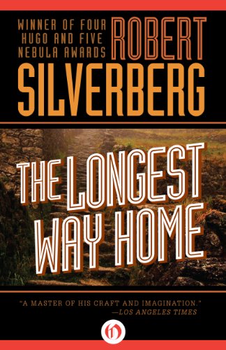
There’s countless modern examples, of course. Sticking with Robert Silverberg as our example (he’s handy that way), when Open Road Media released nearly a dozen Silverberg titles in digital formats in 2014, they issued them with attractive matching covers. Unlike the other examples on this page, they eschewed art in favor of photography-based design that relies heavily on color. Have a look.
 |
 |
 |
 |
 |
 |
 |
 |
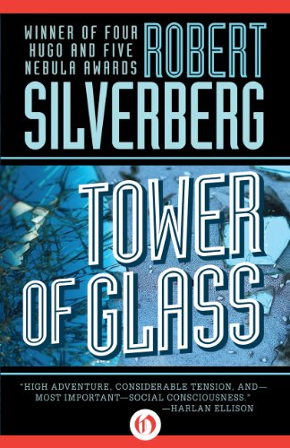
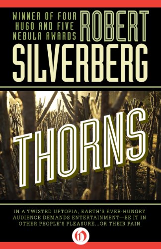
The digital Robert Silverberg: The Stochastic Man, Tower of Glass, Thorns, To Open the Sky, Kingdoms of the Wall,
The Alien Years, The Longest Way Home, and Hot Sky at Midnight. Open Road Media, all 2014.
Call me old-fashioned, but I prefer the print versions. I find the art-based cover design richer and and more reflective of the novels, and the era they were published.
And I like them for another reason that probably won’t be a surprise to anyone: they’re fun to collect. If you’re a Philip K. Dick, Larry Niven, or Samuel R. Delany fan, it can be a lot of fun to track down the matching editions of your favorite books. And it can be fascinating to compare the differences between editions over the years and decades (as we did with the many editions of Fritz Lieber’s Conjure Wife).
Besides, collecting vintage paperbacks isn’t much more expensive than the digital option. You can purchase just about every Larry Niven paperback ever printed for about the cost of a dinner for two at a fine restaurant.
But there’s still enough challenge in it to make it enjoyable. Curious precisely how many Robert Silverberg titles Berkley Books released in 1978-1979 using the same design? ISFDB will tell you… in a roundabout way. Figure out which artist was commissioned for the series (Paul Alexander), and then use ISFDB’s chronological Art Credit page to review them all.
Of course, that won’t tell you if there’s stray book here or there by a different artist — as there was with The Feast of St. Dionysus by David Schleinkofer, or Alpha 9 by Vicente Segrelles. But tracking down the surprises is all part of the fun of collecting, right?
A word of caution though — don’t try to track down every Robert Silverberg paperback ever printed. It’s far from a cheap undertaking, and I’m reasonably sure it’s never been done. I’m not even sure there’s a list of Silverberg books that professes to be complete anywhere (Silverberg himself has admitted he doesn’t know how many books he’s written).
Has any of this reminded you of a favorite publisher-author series you enjoyed, or found particularly interesting? Let us know in the comments, and see all our recent musing on Art in Science Fiction here.
Hard to imagine any author being published almost simultaneously by different houses today! Or maybe they are?
I’ve mentioned Adrian Chesterman before – he basically did all Penguin’s SF books in the late 70’s/early 80’s. They were airbrush, which was a big thing at the time, and helped give the books a contemporary feel (a lot of the stories were actually Golden Age SF). A Liverpudlian called Josh Kirby did all the Discworld books. Just wondering if that’s the case in Canada/US? (He also did the covers for Silverberg’s Majipoor Chronicles).
One random question – the second-hand SF bookshop I went to as a teenager (and where I got pretty much all my books) had a lot of American imports. What’s with the yellow-edged pages? It meant I could instantly recognise an American import, as it’s not done at all on this side of the pond.
John, you just did something I didn’t think was possible: pictured a book by Robert Silverberg I didn’t own and had never heard of. “The Feast of St. Dionysus” was brand-new to me, but since I already had owned some of those Berkley reprints in their original editions, I may have missed seeing this one in my bookstores. And back when I was a little more flush, I’d go ahead and buy titles I already possessed just because I liked the new covers. (Besides, I liked giving SF authors the support.) Thanks! Great piece, by the way; you don’t get enough comments for your posts.
> Hard to imagine any author being published almost simultaneously by different houses today! Or maybe they are?
Aonghus,
Good question! There aren’t nearly as many mass market paperbacks published today. In the US at least the format has been largely displaced by the larger trade paperback, which is considerably more expensive (and hence more profitable).
Tor, Ace and others still release a fair number of mass market reprints every month. I don’t believe the practice of releasing a single author en masse is nearly as prevalent today as it was, unless you count mega-series like Game of Thrones and the Harry Dresden books. I’ve been trying to think of an example, and none came readily to mind, although I’m sure there are a few. (Right? Can anyone think of any?)
> A Liverpudlian called Josh Kirby did all the Discworld books. Just wondering if that’s the case in Canada/US?
I’m very familiar with Kirby! His work isn’t well known in the US, though. The 90s Roc reprints re-used some of his art, but in large part the Discworld books were illustrated in the US by Darrell K. Sweet (for Roc) and later by Ben Perrini (for Harper) and Michael Sabanosh (for HarperTorch).
> What’s with the yellow-edged pages? It meant I could instantly recognise
> an American import, as it’s not done at all on this side of the pond.
I know what you mean. The yellow page edging was used across the industry in the US, not just in SF and fantasy.
I don’t know for sure what this was all about, but I always assumed it was part of publisher branding.
Publishers wanted buyers to identify their books on crowded shelves with at a glance, and this was a cheap (and almost subliminal) way to do it. It was more common in the 60s and 70s than it is today. You’d sometimes see different colors as well.
You sometimes come across paperbacks with one bright red edge. I think that was a printer’s trick, a way to signal ink running low on a run, or something similar. I don’t know for sure though. Anybody out there know?
> John, you just did something I didn’t think was possible: pictured a book by Robert Silverberg
> I didn’t own and had never heard of. “The Feast of St. Dionysus” was brand-new to me
Smitty,
Glad to be of service! I darn near missed it myself as I was preparing this article, until I found a dusty copy buried in the back of the bookcase. I’d completely overlooked it while compiling a list from ISFDB.
> when I was a little more flush, I’d go ahead and buy titles I already possessed just because I liked the new covers
You’re not the only one! I’ve always been interested in different paperback editions.
If I were really hard-core though, I’d be on top of the subtle differences in typeface, color, and text positioning between different printings, the way some collectors are about (say) Philip K. Dick. Here’s a look at six variations in the Ballantine/Del Rey Martian Time-Slip, which had numerous printings between 1976-92, for example.
(Cover art by Darrell K. Sweet. Get all the details at the ISFDB, as usual.)
I admit I’m curious about this sort of thing, but I’m not to the point where I’m tracking down various editions and comparing differences with a microscope…. yet. 🙂
Laser books had a house style to them. The covers were all painted by Kelly Freas with a character’s head in the foreground. I think they were uniformly slim novels. They were also numbered to appeal to the collector. But Harlequin seemed to want to get into the science fiction paperback market on the cheap. Which maybe why they didn’t last long.
I had a phase during my teenage years where I collected DAW paperbacks. They published stuff I really liked such as S & S and anthologies. I enjoyed the Lin Carter DAW series (Green Star, Zanthodon and World’s End). But some of the early DAW SF was beyond my comprehension (new wave?).
I loved the 40 cent Ace Burroughs with their J. Allen St. John or Frazetta covers, and I first read Lovecraft solely because of the 70’s Ballentine paperbacks with the nightmarish John Holmes art, grotesque faces against a black background.
Aonghus,
I was just browsing vintage paperbacks on eBay (as one does), and look what I found that I totally forgot about — the 1979 Dell paperback edition of Judgment Night, with blue-trimmed edging.
Judgment Night by C.L. Moore (Dell, 1979, cover artist uncredited). With blue pages!
Now that I’m reminded, I’m pretty sure Dell was one of the US publishers who experimented a little more widely with colorful edging.
I also remember readers complaining about getting ink all over their hands as they read!
Thomas Parker, those Lovecraft covers scared me as a kid.
> Laser books had a house style to them.
Charles,
They sure did. That’s a good example actually — they were instantly recognizable. As you said, they were numbered, with a distinctive white framing, and Freas created a unique visual motif for the series: a prominent portrait against a colorful background.
> But Harlequin seemed to want to get into the science fiction paperback market on the cheap. Which maybe why they didn’t last long.
The series was edited by Roger Elwood, and I think it developed a mediocre reputation (the association with Harlequin probably didn’t help).
It’s a shame. I enjoyed the Laser Books I read. Some of them quite a bit, like Jerry Pournelle’s West of Honor and Gene Deweese’s Jeremy Case.
They’re not very collectible today, and you can pick up the entire set for less than cover price. Literally — an eBay auction for the first 54 (out of a total of 58) which included the books above sold for $45, less than a buck a book.
For the curious, here’s a few pics I captured from the auction:
First 24 Laser Books
First 24 Laser Books – back
Laser Books 25-54
Laser Books 25-54 – back
> I loved the 40 cent Ace Burroughs with their J. Allen St. John or Frazetta covers
Thomas,
Good pick! Although my favorite Burroughs artist was Roy Krenkel, who did a bunch of the 40-cent Ace Burroughs as well. Here’s a good mix (click for a version you can gawk at):
Art credits:
The Lost Continent (1963) — Frazetta
Pirates of Venus (1963) — Krenkel
The Chessmen of Mars (1962) — Krenkel
The Eternal Savage (1963) — Krenkel
The Moon Men (1963) — Ed Emshwiller
The Moon Maid (1962) — Krenkel
I definitely should have mentioned Krenkel – I loved his work too!
I signed up for the Laser Books subscription offer, and was sent #0, “Seeds of Change” by Thomas Monteleone, as my starter volume. For some reason, my subscription ended at #51. I later found copies of #s 52, 53, and 54, and eventually, two more out of the last three — #55, 56, and 57 (don’t recall which one I could never locate). I’ve read 0-40, and most of them are fairly forgettable, but a few surprised me by being quite good: K. W. Jeter’s “The Dreamfields” stuck out in particular.
Nearly all those Silverberg covers seems unappealing to me, and that one for The Masks of Time with the guy wearing the funky footwear is especially off-putting. But that really was a period of bad sf cover art, perhaps the least appealing era of any comparable stretch of time that I know of, with the miserable covers Ballantine put on its Lord of the Rings editions (Darrell Sweet?). I guess I pretty much stopped buying new sf then.
There’s a dreadful sameness to the cover art of a lot of new sf these days, perhaps reflecting the way authors now spin out stories in multiple books. Hard to work up interest in that sort of thing if you grew up on sf paperbacks that got in there, got the job done, and were finished in 160 or 192 or 220 pages….
> I’ve read 0-40, and most of them are fairly forgettable, but a few surprised me by being quite good: K. W. Jeter’s “The Dreamfields” stuck out in particular.
Smitty — As I recall, there were several authors who went on to fine careers who published Laser Books, including Tim Powers, K. W. Jeter, Dean R. Koontz, Juanita Coulson, George Zebrowski, John Morressy, Jerry Pournelle, Jeffrey Carver, Piers Anthony, Zach Hughes, and others.
Other than the Jeter, and of those stick in your mind?
> that really was a period of bad sf cover art, perhaps the least appealing era of any
> comparable stretch of time that I know of…
Major,
Oh, I don’t know. Ace Books had Whelan doing covers for Poul Anderson, Alan Dean Foster, H. Beam Piper, and many others, and Frazetta, Boris, and Rowena were just getting started.
I’m not wild about the Ace Silverberg covers at the top of this article. But I quite like the work Paul Alexander did for Berkley.
And the Jim Burns covers for Warner — those are terrific.
I bought my first copies of Lord of the Rings because of the Hildebrand Brothers covers.
And Tim Hildebrandt did the first half-dozenish of Glen Cook’s Garrett, PI books. My favorite look for that series.
And those Darrel K. Sweet covers pulled me into Del Rey fantasies.
I mentioned this on Facebook, but my two favorite examples are Zelazny’s 1970s Avon paperbacks (the black covers with the kind of collage art) and Merritt’s 1970s Avon paperbacks (with the really colorful paintings).
And another example, as I think about it: Brian Aldiss’ anthologies — Galactic Empires, Evil Earths and Perilous Planets which were [checks notes] from Avon in the 1970s. I sense a theme here …
Bob,
Sweet was probably the busiest artist in the industry all through the 80s and early 90s. Personally I think Del Rey overused him, to the point where all their fantasy lines started to look alike.
Admittedly, that’s exactly the point of having a house style. Casual buyers could spot a Del Rey fantasy in the stacks at Waldenbooks, and knew exactly what they were getting. But in the long run I think it hurt them.
I totally agree on the Hildebrandt covers for Glen Cook’s The Garrett Files. The first six (up to Red Iron Nights) had covers by Hildebrandt, after that they were largely by Alan Pollack. I think Pollack did a fine job, but Hildebrandt set the mold.
(Also, I started buying Moorcock around the time that DAW was switching from the yellow spines to the colored spines, and for the Hawkmoon books I have yellow spines on 1, 3 and 4, and a blue spine on 2, and every time I look at that on my shelf it’s like a splinter in my mind, driving me mad.)
I remember seeing that top set of Silverberg’s in the bookstores and they didn’t ‘read’ for me, they were pretty much just abstract art to me (Dandelion Head anybody?) . I became a big Silverberg reader later, that was with the Jim Burns covers, and me being a bit older. I’ve still never read any of the Lazer books…
John O’Neill: Other than the Jeter, any [of the other authors] stick in your mind?
Sorry, John — I had the Jeter shelved w/ a bunch of his other titles & it was the only Laser book I could access. I vaguely remember the Pournelle, J. Coulson, and Koontz books being worth the read, primarily because I’d already read other works of theirs. (I didn’t realize Koontz had used his “Aaron Wolfe” pseudonym until I checked the Wolfe name on ISFDB.) Your article here makes me anxious to read the titles I haven’t gotten to yet.
Best article on Blackgate!
> my two favorite examples are Zelazny’s 1970s Avon paperbacks (the black covers with the kind of collage art)
> and Merritt’s 1970s Avon paperbacks (with the really colorful paintings).
Joe,
Man, those are both excellent choices, and I wish I’d thought of them. The Zelazny in particular is a favorite of mine, and I think a really superb example of a distinctive design that is instantly recognizable to thousands of fans nearly half a century later.
I’m thinking that this may be worth a follow-up article or two, just discussing some of the best examples over the last few decades. Someone on Facebook suggested the Del Rey Lovecraft books (the ones with the Whelan covers), and that’s another excellent suggestion.
> Brian Aldiss’ anthologies — Galactic Empires, Evil Earths and Perilous Planets which were [checks notes] from Avon in the 1970s.
Joe,
You know how to pick ’em! The three Aldiss anthologies (really four, since GALACTIC EMPIRES was split into two volumes) were released with gorgeous pulp-inspired covers by Alex Abel. Man, I loved those books.
> for the Hawkmoon books I have yellow spines on 1, 3 and 4, and a blue spine
> on 2, and every time I look at that on my shelf it’s like a splinter in my mind…
Joe,
Ooof, I know EXACTLY what you mean. I’m the same way when I have two hardcovers in a series, and one paperback…. they just look WRONG together on the shelf….
> I became a big Silverberg reader later, that was with the Jim Burns covers…
Jeff,
One of the frustrating things for me was that I collected Silverberg fairly early, so I had many of his books, but I LOVED the Jim Burns covers. I didn’t buy them when they were on the shelves, and it was only decades later than I began to track them down to round out my collection.
> Your article here makes me anxious to read the titles I haven’t gotten to yet.
Smitty,
To be honest, I don’t think Laser Books had a decent rep, so I’m not sure you’ll find too many gems. But yeah, I read a few, and had good luck with the ones I picked. So I remember them fondly.
Ultimately I think the sameness in the design, while it helped make them easy to spot on the shelves, didn’t help in the long run. As I said above in reference to Darrell K. Sweet, and how (for me) Del Rey’s fantasy all started to look the same after a while, nobody really buys science fiction to get the more of the same. It’s an imaginative genre. I think the sameness of the design over 58 books gave Laser a reputation for generic stories, and that hurt them.
> Best article on Blackgate!
Thanks CJN1! It kept growing until I was worried I would never finish it (the published version is over 3,000 words!), but I’m very glad I did.
This isn’t a one-author example, but how about the Leo and Diane Dillon covers on the 1970’s Ace Science Fiction Specials? That art really gave those books a distinctive identity.
Ooooo, that is a good example. Not of author branding specifically, but certainly of an imprint. Leo and Diane Dillon did 36 of the 39 Ace Doubles, working for Terry Carr.
This is probably a different topic, though. I could go on about distinctive imprint branding. The examples that come to mind immediately are Timescape, David Hartwell’s imprint at Pocket Books, and Lou Aronica’s Bantam Spectra, both of which has a distinct look.
Oh, I thought of one more, and it’s an oldie but a goodie – the Ballantine early 60’s editions of Burroughs’ Tarzan books, with the beautiful Dick Powers covers. I’m only a few shy of having the whole set. One of these days…
[…] Black Gate » The Art of Author Branding: The Paperback Robert Silverberg. This is a reflection on visual marketing, using Silverberg (and Niven, and others) as an example. […]