I’ve Got You Covered
In my last post I took a look at SF cover art, and how the fashion in covers changes over the decades. As with fashion in clothing or hairstyles, you can make a pretty accurate guess about time periods and genres just from a book’s cover. Whether you’re influenced in your purchases by that cover is a personal thing. In the spirit of leaving no stone unturned, today I’m looking at Fantasy cover art.
Since I’m a writer and not an art critic, I avoided discussing the work of any particular SF artist – I was looking at how covers change, not how an artist evolves. However, I don’t think we can talk about Fantasy cover art without at least a brief look at Frank Frazetta. In a way, his covers are the perfect example of what I’m talking about. When you look at a Frazetta cover, you know what time period, and what genre you’re looking at.
[Click the images for bigger versions.]
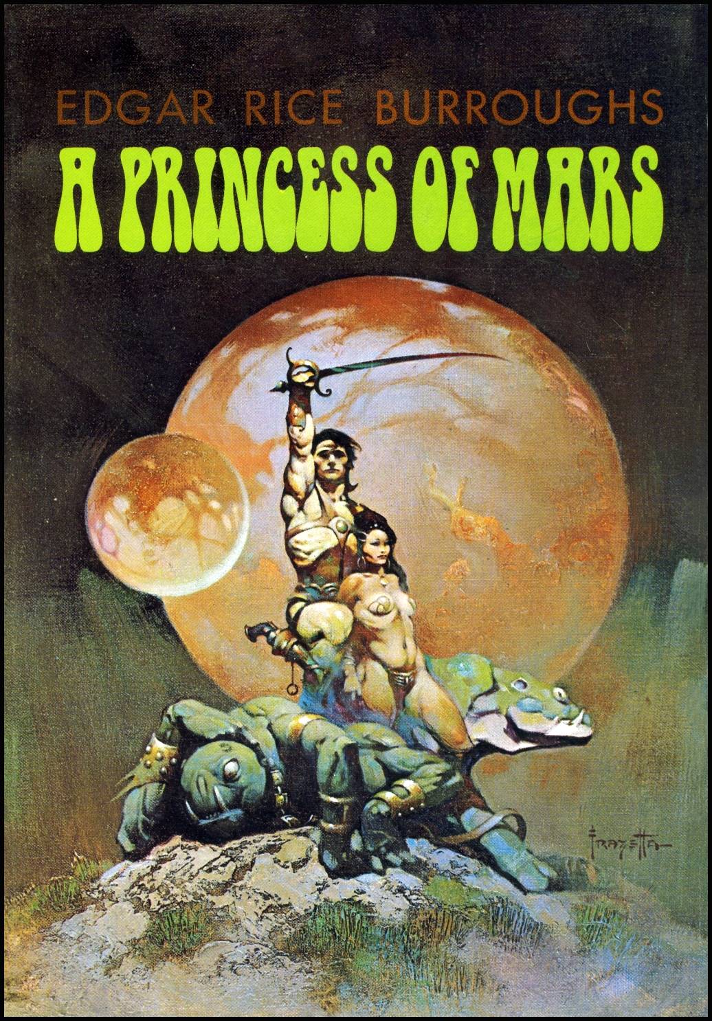
You’re likely familiar already with the examples I show you here. The Death Dealer is probably my favorite of all his work, and I have jig-saw puzzles of both that one and The Silver Warrior. These, along with The Princess of Mars, are typical Frazetta, distinguished by their darkness, by the nudity of the characters portrayed, and by the attention to anatomic detail (occasionally exaggerated) which extends even to the Death Dealer’s horse, and the lizard in the Mars cover.
Many people were influenced by Frazetta’s work, but in my opinion, no one comes near the master.
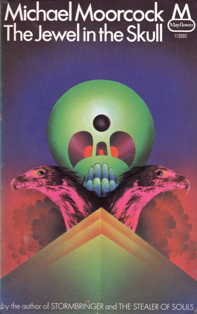
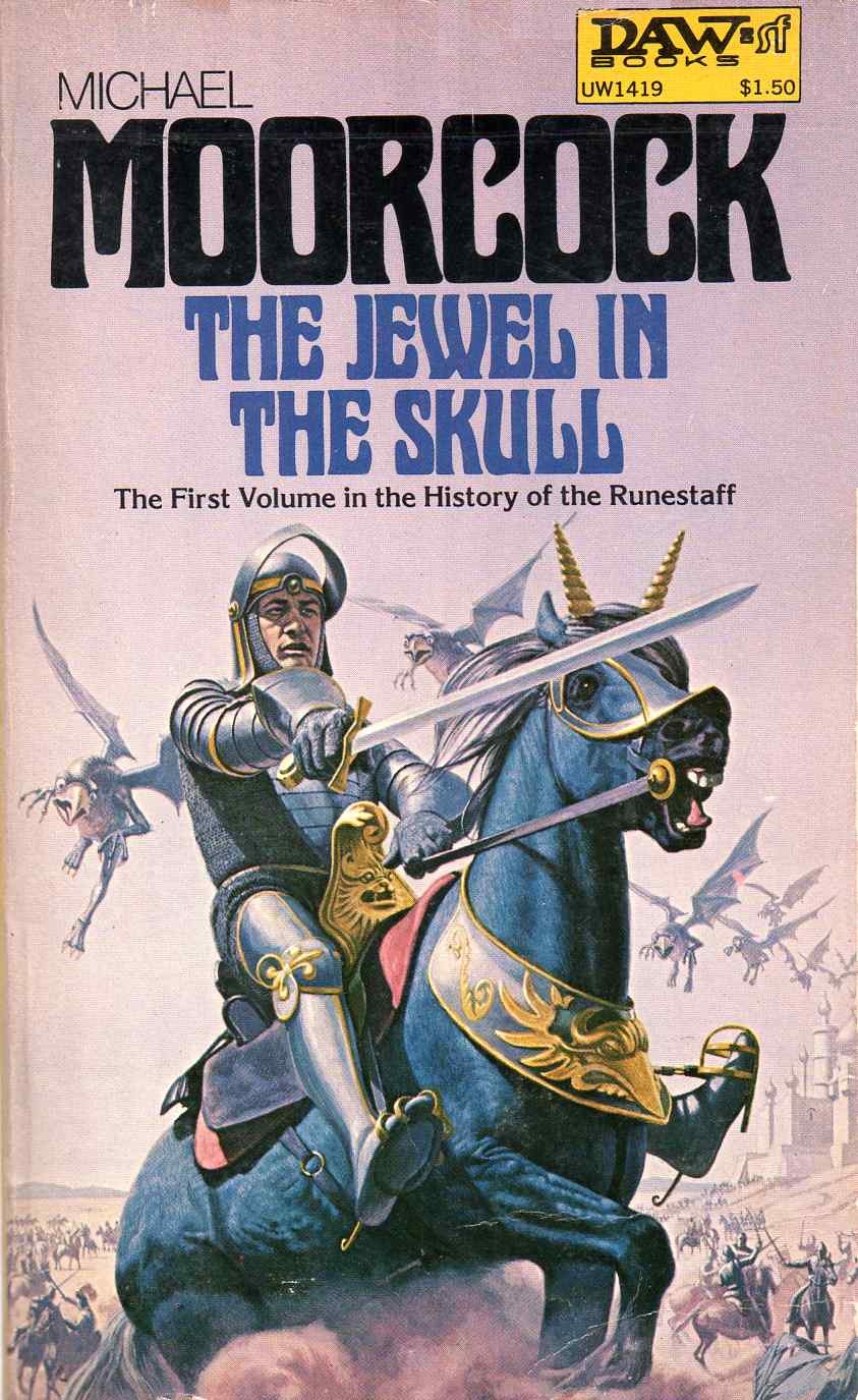
As I mentioned in my last post, in order to compare cover art over a few decades, it’s necessary to use books that have been around that long. Here’s a couple from Michael Moorcock.
 |
 |
 |
The first example from The Jewel in the Skull was the earliest I could find, though I don’t think it’s the actual first cover. You can see that it’s a stylized drawing in the new wave mode. The second is the action pose that became popular later in the century. It’s still a drawing, but more classic comics than new wave. The final example is from 2015, and while it does seem to be an action pose, it feels completely different, as the figure is almost emblematic.
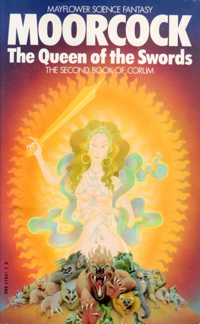 |
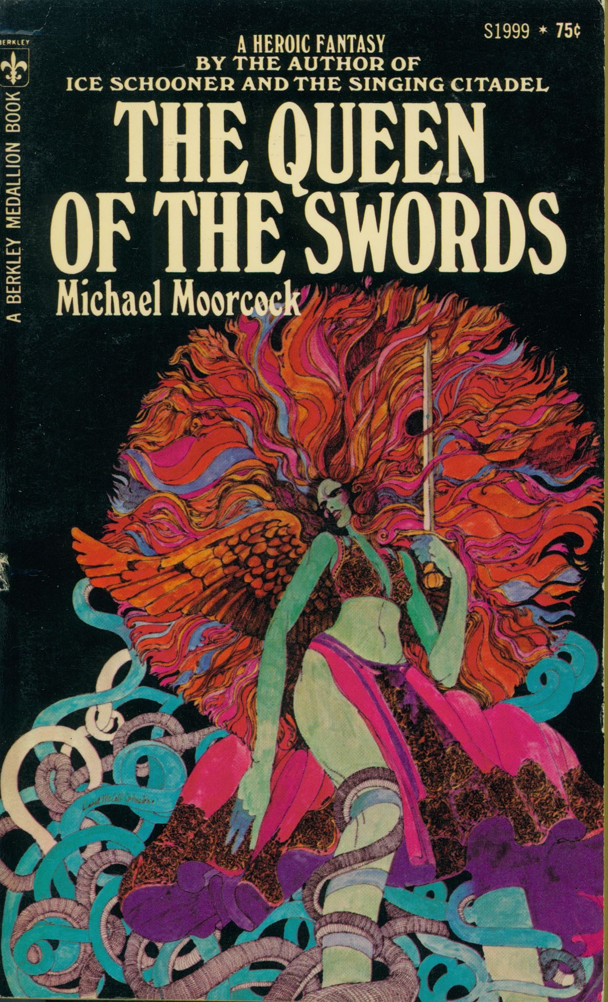 |
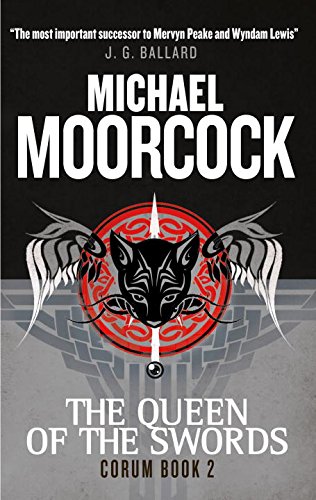 |
We see a similar evolution with The Queen of Swords, though frankly I’d be hard pressed to be certain which of the first two examples is actually first. One definitely has that 60’s psychedelic feel, and the other seems to be more new wave. The final one, however, is very obviously from 2015. No people, and, at first glance, not even any swords.
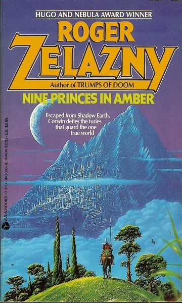
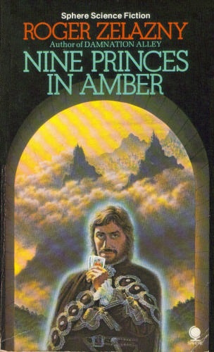
I’ll cap this off as I did my SF post, with one of my favorite writers, Roger Zelazny. Likely his best known work is the Amber series, and there are dozens of different covers for the first in the series, Nine Princes in Amber. I’m only going to show you four of them, however.
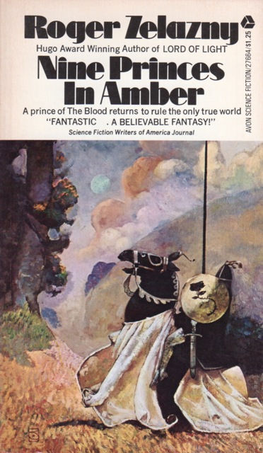 |
 |
 |
 |
The first one is, I think, the earliest of these particular examples, and contrary to what we’ve seen in other cases, I think this is the best. It’s a little Camelotish, if you see what I mean, but it’s a great image for the novel. The second is more along the lines of what we would see in Barbara Hambly’s or Randell Garrett’s work in the 1980-90’s, if slightly better drawn. It interests me because it’s the only one of these that emphasizes Amber rather than the Prince. The third is recognizable as what I’m calling “man in cloak,” an image we’ve been seeing a lot of in the 2000’s. The fourth is from 2015 and is, sadly, the worst. Maybe they were going for a retro feel, but really. Cartoonish, and misleading.
I wanted to end with Fritz Leiber, another of my favourite authors, but his Fafhrd and Grey Mouser stories have gone through so many collections and versions that I got a headache just looking at the art. Besides, whatever we might think about the outside of a book, it’s the inside that counts.
Oh yeah, lest we think fashion is the only thing that affects cover art, have a look at BG editor John O’Neill’s recent A Tale of Two Covers. Apparently geography can also play a role.
Violette Malan is the author of the Dhulyn and Parno series of sword and sorcery adventures (now available in omnibus editions), as well as the Mirror Lands series of primary world fantasies. As VM Escalada, she writes the upcoming Faraman Prophecy series. Find her on Facebook and follow her on Twitter @VioletteMalan.
Moorcock “Jewel in the Skull” image 1 ( I hated this generation of covers, they kept me from Moorcock, they said nothing and still do. ) 2 I dunno, too static, kinda silly. 3 Totally rocks, Vance Kovaks is a descendant of the school of Frazetta but that’s not all, he’s painting ( not drawing ) in a classical romantic manner that allows for action, style and passion. Unlike 1 and 2….
Queen of the Swords
??? I sort of like 2. Or dislike it less than the others ? I really don’t like 3.
Nine Princes in Amber.
The first is Jeffrey Jones and is as always brilliant. I’ve seen #2 the most and as a book seller way back was always wondering who they thought their audience was. 3 is sliding sown hill and the image really says nothing. 4 should locked away and flushed from our minds. Return to # 1 ( Jones ) and refresh your soul.
Frazetta was the man. In the UK, Rodney Matthews was associated with a lot of Moorcock’s stuff – not so much because he did that many covers, but because he produced posters based on Moorcock’s work.
http://vignette1.wikia.nocookie.net/stormbringer/images/8/8a/Tanelorn.jpg/revision/latest?cb=20160512074356
http://www.dana-mad.ru/gal/images/Rodney%20Matthews/Stories/rodney_matthews_stories_elric_the%20dragon%20lord.jpg
That said, I’ll always associate this particular illustrator (Patrick Woodroffe) with my introduction to Corum:
Like you say, there’s a clear transition from Sixties/Early Seventies Psychedelia (ie, a lot of the Ballantine covers) to the modern fetish for the ‘Bloke in a Cloak’, with the Eighties and Nineties occupying some sort of middleground, I guess?
I love these sorts of posts. The evolution of book covers in genre literature in general has some very interesting contours that I think is worth exploring. An additional point, I’ve noticed that the size of paperback books have also changed over the years. For example, in the Moorcock Corum series you’ve mentioned above, the last Corum book on the far right (the Titan version) is actually bigger than the earlier versions. Why? Is there just some marketing issue that answers this question?
My favorite Zelazny covers were the Avons from the 1970s:
http://g-ecx.images-amazon.com/images/G/01/ciu/f7/d9/9c8f12bb9da02463c41fb010.L.jpg
I do kind of like the second one as well.
As for the fourth, I believe that’s when they started self-publishing the Amber books electronically, so maybe there wasn’t much of a budget for cover art? (And I’m still waiting for the eBook of Courts of Chaos. Sigh.)
I have that Silver Warrior Jigsaw puzzle too. I got it when I was a kid and framed it when I got done. I still.
To Barsoomia: I’m with you, your judgment pretty much echoes mine.
Queen 3 I admit I’m ambivalent about. On the one hand, it’s the “now” touch, on the other, I’m not fussy about either of the others, either.
Thanks for letting me know some of the artist’s names. I didn’t need to go there to say what I wanted to say, but I was hoping someone would provide that kind of information.
To James: the short answer to every question is “Marketing.” At least that’s how it seems to me when talking to either my agent or my editor. My interest and (limited) awareness of this whole topic was started by a recent discussion of my own upcoming cover, which I’ll post here at BG as soon as I’m allowed to.
To kid_greg: aren’t they great? I thought about framing mine, but I decided I’d rather have the pleasure of putting them together every couple of years. I use jigsaw puzzles to clear my brain while I’m writing.
I also have the original paperback covers for LOTR, and the map of the Chronicles of Narnia as puzzles.
My favorite Moorcock cover artist is Robert Gould.
Interesting post Violette and actually something I never considered. But if I look back at my Jane Gaskell reviews, one can start seeing a bit of a fashionable timeline.
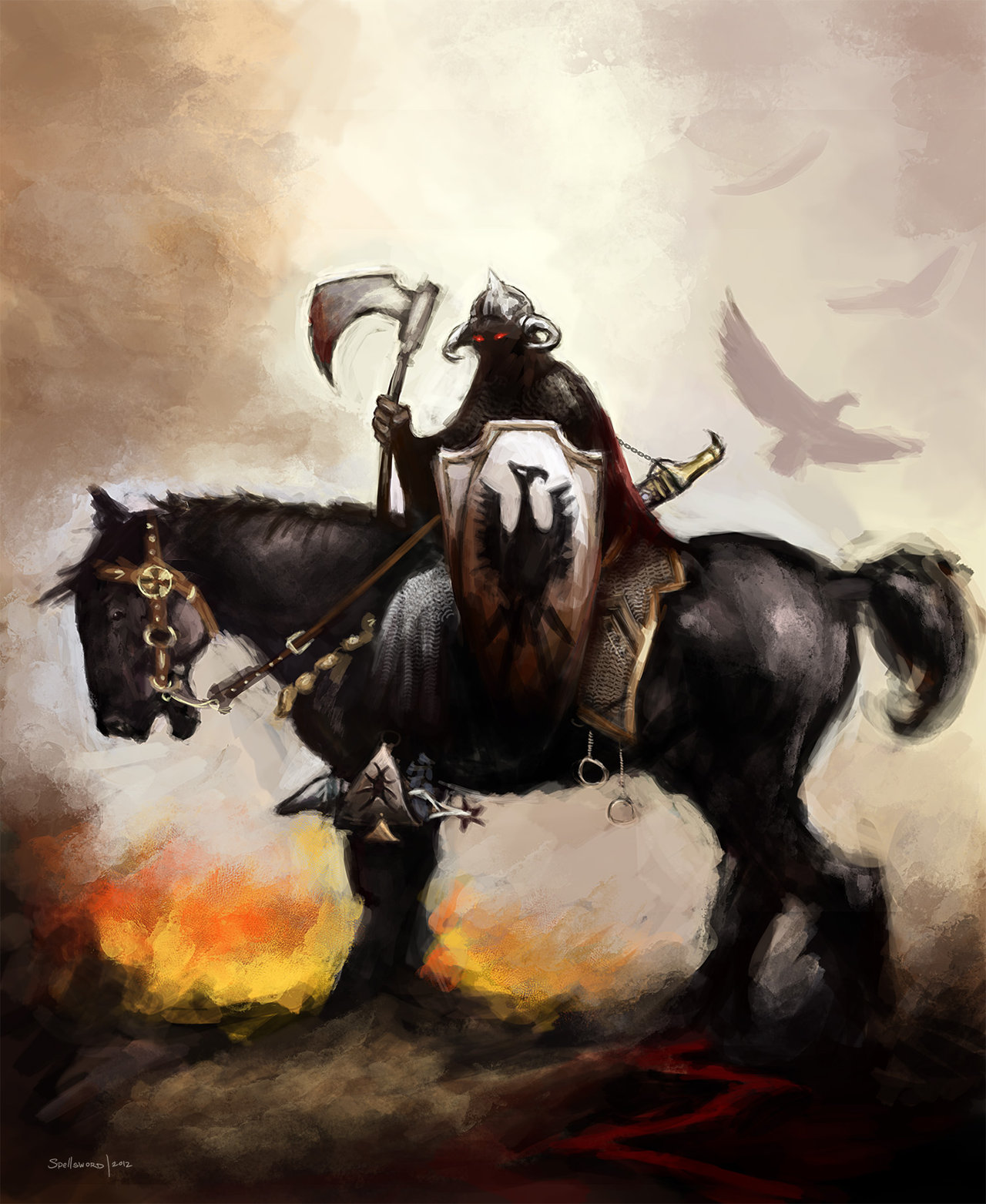
Frazetta and Death Dealer wise, I may be off a bit but I suspect the original horse mounted example you used was done for a Molly Hatchet album cover first. There have been other posts here about the crossover between Metal Music and Fantasy. But Death Dealer became a phenomenon of its own. Spawning at least two comic lines and four novels by James Silke. They were pretty good as I recall, but also possibly books that would never have been written or noticed without the Death Dealer connection?
@ Barsoomia – Agree, Jeff Jones rocks!
Frazetta’s Death Dealer was painted in 1973 and used as the paperback cover for Lin Carter’s FLASHING SWORDS #2. It was reused for Molly Hatchet’s first album in 1978. There were even four novels by James Silke written about the character.
To Aonghus, thanks for these links. I wasn’t familiar with the posters, though I do vaguely remember the Woodroffe covers.
To CMR, any decent links you could give us? I just had a quick Google look, and I find I do remember this series of covers. Has he done other, similar work for other people? Or am I thinking of Thomas Canty? Who was it did the covers for those Terri Windham rewriting of fairy tales? Anyone?
To Tony and Fletcher: thanks for these details about one of my favourite images. I did know about the Lin Carter cover, which I think is the first place I saw it, but I didn’t know about its other appearances.
Yes, the Terri Windly fairy tale covers were Thomas Canty. I have a fair number of Robert Gould Moorcock covers (Elric and Count Brass) just because those were the ones in print when I was buying them; I’m also a fan, although I’m not sure what I’d do if forced to choose between Gould and Whelan for the Elric books.
Argh. Terri Windling, that is.
To Joe H. Ahah! I thought so. I’ve found a few more Canty on my shelves, but I can’t seem to put my hands on any of the Windling stuff besides Charles de Lint’s Jack the Giant-Killer. I know I have others, I just can’t find them.
Also, I wonder who I think Terri Windham is?
Also, further to your earlier comment on self-published and/or e-books, so far the consensus seems to be that there’s where the worst cover art can be found – though I would say self-published is way out in front on that one.
Ha! I didn’t even notice Windham! Other books in the fairy tale series were Brust’s The Sun, the Moon and the Stars, Jane Yolen’s Briar Rose, Tanith Lee’s White as Snow, Pamela Dean’s Tam Lin and others I’m forgetting. Plus all of the Datlow/Windling anthologies.
Canty also did covers for Ellen Kushner’s Thomas the Rhymer (which I think is at least an honorary member of the series) and Swordspoint (which I adore unreservedly).
(and my copy of Jack the Giant-Killer does not have the Canty cover — it’s pretty generic 80s urban fantasy with a motorcycle)
https://www.goodreads.com/book/show/100475.Jack_the_Giant_Killer?ac=1&from_search=true
And this is probably the worst cover ever to adorn a book I actually bought physically; although I bought it because I was already familiar with the stories from reading some of them in a magazine called Black Gate …
https://www.goodreads.com/book/show/1320419.Tumithak_Of_The_Corridors?from_search=true
> And this is probably the worst cover ever to adorn a book I actually bought physically…
Joe,
I know exactly what you mean! I was very dismayed when I saw the cover of the TUMITHAK omnibus, and I’m certain it hurt sales. Still, I bought my own copy, and I’m glad I did.
To Joe, Thanks for reminding me. I’ve read all the books you list, though I only owned the Yolen and the Kushner. They aren’t on my shelves anymore, so they must have been part of a donation I made to the Sunburst Awards (for Canadian Speculative Fiction). I’m getting rid of my collection since we’re planning to move to Spain, and not all of this can go. Problem is, I don’t always remember what’s already gone.
It’s possible the Canty cover for Jack the Giant-Killer appeared only on the hardcover? I’ve seen the one you’re talking about, but on the paperback
As for the Tumithak? Yikes.