A Tale of Two Covers: Skullsworn by Brian Staveley
 |
 |
We covered the first three novels in Brian Staveley’s Chronicle of the Unhewn Throne right here last year. Skullsworn, the new standalone novel in the same world, features the adventures of a priestess-assassin for the God of Death. It will be published by Tor Books this week in both the US and the UK.
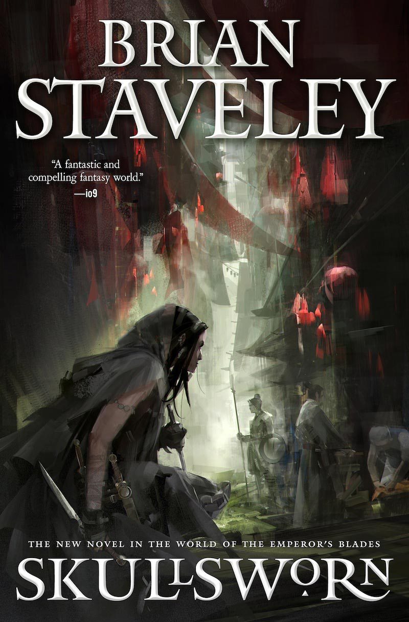
Although the US and UK editions have similar publishing dates, that’s pretty much all they have in common. The descriptions for each book are markedly different — and the covers are dramatically different. The US version by Richard Anderson (above left) has lush colors and and action scene, while the UK cover (above right), designed by Matthew Garrett, is heavily design-focused. In a guest post at Tor.com, Brian Staveley talks about the US cover.
This one hits all the right notes… it gives a feel for the city, but here Pyrre is in the shadows, close to the quotidian world of human affairs, but separate, unnoticed. She’s also motionless. Her knife is drawn, but the drama doesn’t come from the knife itself, or the imminent violence, but from what’s in her mind, from her struggle to understand her own motives and emotions, then to translate them into the life she wants to live. It’s not easy to fall in love, especially when you’re staying up late every night giving women and men to the god of death. That’s the book I’m trying to write… The final version of the cover is just perfect. The color, the claustrophobia of Dombang’s hot, narrow alleys, the fish-scale lanterns, Pyrre’s crouch, ready, predatory, but not yet committed — this cover captures everything I’d hoped about the book.
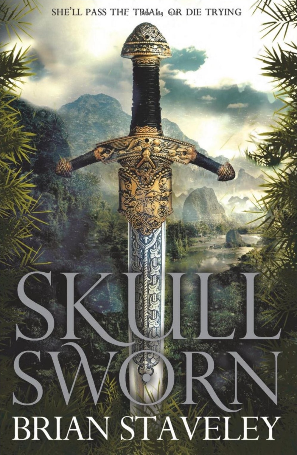
While in their cover reveal for the UK version, Phoebe Taylor at Tor UK reveals some of the thinking behind their version:
For this cover, we wanted a look that would link to the previous trilogy — as it’s set in the same world. However, it shouldn’t look part of that trilogy, as this is a standalone, and can be read by all new readers. We considered various options – having a border and a figure on the cover, or perhaps a close focus on weapons, as per the first trilogy but without a border, or maybe a cityscape background… we left the final decision to our designer, Matthew Garrett, who has created the perfect blend of fresh and familiar.
Working from notes on the setting, the delta city of Dombang — inspired by both Venice and Cambodia – as well as notes on Pyrre and the themes of the book, Matthew has given us the most gorgeous weapon and border design, with a vibrant tropical landscape for a backdrop. This gives us that thematic link to the first three books, but also creates a strong new look that’s just for this book.
Here’s the book description for the US edition:
Pyrre Lakatur is not, to her mind, an assassin, not a murderer ― she is a priestess. At least, she will be once she passes her final trial.
The problem isn’t the killing. The problem, rather, is love. For to complete her trial, Pyrre has ten days to kill the seven people enumerated in an ancient song, including “the one who made your mind and body sing with love / who will not come again.”
Pyrre isn’t sure she’s ever been in love. And if she fails to find someone who can draw such passion from her, or fails to kill that someone, her order will give her to their god, the God of Death. Pyrre’s not afraid to die, but she hates to fail, and so, as her trial is set to begin, she returns to the city of her birth in the hope of finding love . . . and ending it on the edge of her sword.
“A complex and richly detailed world filled with elite soldier-assassins, mystic warrior monks, serpentine politics, and ancient secrets.” ―Library Journal, starred review, on The Emperor’s Blades
And for the UK edition:
For one apprentice assassin, the clock is ticking . . .
Pyrre Lakatur doesn’t like the description skullsworn. It doesn’t capture the beauty of her devotion to Ananshael, God of Death. And she’s not an assassin, but a priestess. Or she will be, if she can pass her final trial. The problem isn’t killing, as Pyrre has spent her life training for this. The problem is love. To pass the trial, she will have fourteen days to kill seven people detailed in an ancient song, including one true love, ‘who will not come again’. However, Pyrre has never been in love, time is short, and if she fails she’ll be given to her god.
Pyrre’s not afraid to die, but she hates to fail. So a month before the trial begins, she returns to the violent city of her birth, where she once offered an abusive father to the god. Here Pyrre hopes to find love – and end it with the edge of her knife.
Both versions are 310 pages, available in hardcover this week from Tor.
Our previous articles in the Tale of Two Covers series include:
The Last Page by Anthony Huso
Stand on Zanzibar by John Brunner
Ellen Kushner on Basilisk
Shadows and Tall Trees 7 edited by Michael Kelly
Alan Baxter’s Crow Shine and Sarah Remy’s The Bone Cave
Swords Against Darkness
Richard Adams’ Watership Down
The Collapsing Empire by John Scalzi, and The Corroding Empire by Johan Kalsi
A Tale of Three Covers: Allen Steele Resurrects Captain Future
I do like both of those covers; if forced to choose, though, I think I’d lean towards the UK version.
And this reminds me that I still need to read Stavely. Sigh. Someday.
I’d pick a the US cover all day. I wouldn’t even give the UK cover a second look. Much less pick it up and read the back.
I read all 3 volumes of the trilogy that starts with The Emperor’s blades, intending to write a review. I’m so ambivalent about those books. They’re well executed, but I feel that they argue too blatantly for a philosophical theme that… Okay, dammit, this book release is a good occasion to back up and write the review after all.
I like the sword on the UK cover but I’m drawn to the atmosphere of the US cover.
I don’t have any books with the cop-out ‘sword cover’. I try to avoid hoods too 😉
I think what I like about the sword cover isn’t just that it’s a sword — it’s an intricately-worked sword set against a distinctly exotic landscape. I’d probably be less drawn to it if it was Standard RenFest Longsword Hilt #2b set against Misty Unspecific Moorlands or something.
I have to agree with the folks who lean towards the US cover. I find Richard Anderson’s scene to be both compelling and mysterious, and that’s a powerful combo.
And Sarah — I’ll hold you to that review offer! 🙂