Writing Business: Web Design

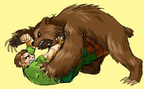
The other day, I shared a tactic I often use to keep myself on task when writing, the McCoy test. In honor of my favorite Star Fleet surgeon, I ask myself if I’m a writer, or a blank, the blank being whatever I’m doing instead of writing (sorting laundry, eating spinach, performing one-handed push-ups, bear wrasslin’). If I have to ask myself that question during my scheduled writing time, then I put down the spinach fork or the bear and get to work.
Well, I haven’t written or revised any of my fiction now for the last week. That admittedly drives me a little crazy, but I’m still a writer because part of the business of writing is business. It took me a long time to finally admit that a writer is a small business owner with a product. I discovered that I have to make the promotion of my work a central part of my job if I’m going to be able to afford spinach and bear wrasslin’ lessons.
In my case, I’ve been re-designing my web site. Because I already spent the two chests of pirate gold my publisher sent me when I got my book deal, I’ve been on a pretty tight budget for such things. Thus I decided to purchase a WordPress theme rather than pay someone to create one completely from scratch. I’m not usually a skinflint, but I figured that since I know a LITTLE WordPress, I could tweak a good theme to reflect me so that it didn’t look generic.
There are a lot of places to get WordPress theme packages. I had to make sure I could have the option of modifying the theme with professional help should my feeble WordPress skills fail me, so I found a site, Werkpress, that promises to supply the aid I needed (although so far I haven’t needed them). Once there, I looked through the theme designers allied with their site. There were a lot of great themes, but in the end I chose one from Organic Themes. $69.00 later, I had what I needed.

I found a great step-by-step guide to making my own web site banner on a site titled Fabulously Artsy. I wish I’d seen something like this do-it-yourself banner instruction years ago, because banner creation had seemed a completely mysterious concept. Not to sound too much like a commercial spokesman, but once I downloaded the free art program, I seriously did have a banner ready in about a half hour.
I spruced the whole thing up a bit with some customization options and some assistance from the Organic Themes support team. I then had to teach myself how to game the WordPress code to get my book covers to appear in the center of the display page.
I’m fairly happy with the end result right now, although I’ll probably keep tweaking for a while.
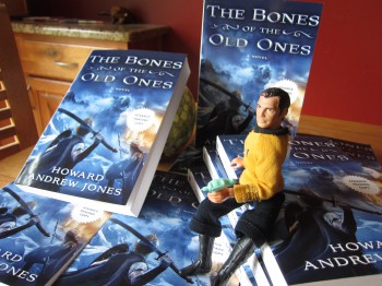
So why am I doing this now? Well, having a good web site is good at any time, of course, but I’ve just received the arcs of The Bones of the Old Ones. I’ve learned a lot about what to do, marketing wise, after The Desert of Souls, and in the following months I’ll be trying to DO those very things. And I’ll be blogging about them here so that other writers can learn from my wisdom… and my mistakes… One of those things is to have a good looking web site, one that looks stylish enough to be professional. My last site incarnation was just passable. Now I hope it’s a lot more inviting.
Howard Andrew Jones is the author of the historical fantasy novels The Desert of Souls, and the forthcoming The Bones of the Old Ones, as well as the related short story collection The Waters of Eternity, and the Paizo Pathfinder novel Plague of Shadows. You can keep up with him at his website, www.howardandrewjones.com, and keep up with him on Twitter or follow his occasional meanderings on Facebook.
Oh boy. The actual blog theme looks very good. Clean and professional. But I got to say. You’ve never heard from me before Howard and probably never seen any of my comments here before, but I’ve read about you here and I respect you too much to let you get away with that banner and background tile. >_<
I don’t feel that the background tile, for example, works with the rest of the theme. It needs to be darker, perhaps. And it’s striking me as being pretty grainy and ‘pixely’, not exactly appropriate for your blog. You may disagree, though.
As for the banner, the outer stroke/black glow on the yellow type overpowers the text, and doesn’t do it any favours against that background, which is in pretty bad shape.
It has resizing/compression artifacts everywhere. You’ve taken a portion of one of your novel covers and enlarged it, which is never good for a raster jpeg image. What you need to do is to start with a large resolution, then shrink it down instead or use it as-is.
I want to help. I would love to help. I will make you a banner, if you like, for no charge. I’ll find you a good tile, or make one. I’m not a professional, I’m just guy who knows how to use Photoshop. My WordPress blog is http://rjcreaney.wordpress.com/. I know it’s not much, but take a look and see what you think.
Thanks.
“Kirk and Bones, together again.”
You bust me up, Jones!
[…] Writing-business-Web-Design […]