Art of the Genre: I.C.E.’s Middle-Earth Roleplaying Part One, Gail B McIntosh
Yes indeed, I bring you another tale of art before you attempt to burst the buttons off your jeans with a hearty Thanksgiving feast. All winter holidays are something strange here in L.A., and it’s hard to think about turkey, snow, and roasting anything when the sun is bright and ocean breeze carries the promise of white-tipped surf and meditative tranquility.
Art, however, never takes a holiday [nor do we here at Black Gate L.A. since John O’Neill thinks days off are a grand waste of time]. That being said, I began a project some time ago that is very dear to my heart, so much so that Ryan Harvey doesn’t even argue with me about it which is saying something.
Below, I’ll lay the groundwork for my argument in case you who read this would like to contradict me, but I warn you, my passion is unmatched, and without vacations I’ll simply outlast you. Today, then, begins Part One of a small series dedicated to this topic, and I hope you’ll take the time to read them and educate yourself.
Part One:
I would argue that the prettiest role-playing game ever produced was Iron Crown Enterprises the Middle-Earth Role-Playing. Certainly the game’s popularity in the RPG boom decade of the 1980s was only rivaled by the gorilla in the room of TSR’s AD&D, statistics from the time indicating MERP was second in sales totals for the decade behind the RPG giant.
This kind of success gave the game a wide range of artistic options to use in its recreation of Middle-Earth. Like Easley and Elmore defined AD&D for that period, two artists were also the mainstay of color covers for MERP.
These two were dramatic painters, visionaries, and had talent far surpassing almost any contemporary in the genre. The first of these I’ll go into today, and I’m very pleased to have had the opportunity to discuss her work with her personally over the past couple of weeks.
So first, let me introduce Gail B. McIntosh. This groundbreaking RPG artist studied at The Pennsylvania Academy of Fine Art in Philadelphia and at the L’Acdeamie della Belli Arti in Florence, Italy before spending a year apprenticing to famed sculptor Antonio Berti.
There was a kind mental romance in the time spent walking the halls of European museums that filled her blood with the knowledge and power of some of the greatest works of art the world has ever seen. Still, the experience was only a stepping stone as she explored the passions of her favorite artists such as the progenitor of fantasy art, Arthur Rackham, and the dulcet illustrations of Edmund Dulac.
Armed with this incredible education and experience, Gail returned to the U.S. and was quickly snatched up to do work for Iron Crown.
Of the thirty seminal supplements I.C.E. produced during the 80s, Gail produced covers for eight of them. She was also the first contributor, her work on the initial MERP campaign module beginning in 1982.
Then Art Director of I.C.E. Rick Britton asked Gail to create a style that exaggerated the drama of Tolkien’s world, bringing a more adventurous nature to the subject matter, as indeed he was trying to sell a gaming supplement. Games, if you know, are truly about two things, treasure and experience points. Tolkien, however, is about the journey, always the journey, so his world is a slippery slope for a true RPG.
Britton relates his experience with Gail as follows: “Gail McIntosh was an absolute pleasure to work with. Once we [I.C.E.] had decided to put a bigger effort into our product covers—and therefore hopefully sell more products—Gail was an obvious choice; her studio was literally only blocks away from our first office, and she had already made a name for herself in the Charlottesville area. I have very fond memories of working with her.”
That being said, in early works for the system, namely her cover contributions to the 1982-83 campaign modules Aidor: in Southern Middle-Earth, Angmar: Land of the Witch King, and Umbar: Haven of the Corsairs, there is an unheralded ‘genesis’ style that speaks of feeling ones way into Tolkien’s vision while trying to placate the RPG audience. I’m not sure Gail knew what she wanted to be here, or what Mr. Britton wanted his game to look like, and the covers thus floundered a bit without a true sense of style to bind them into a cohesive marketing tool.
Umbar is perhaps the most noteworthy as an oddly angled combat scene and in its simplicity. Gail’s style here is so recently birthed and yet underdeveloped in its nature. Still, Angmar is a step closer, and Ardor another move toward a concept that recaptures Gail’s Rackham roots and the true essence for what MERP will become.
She describes the process as in this wonderful quote: “Gradually, the emotional connection to Botticelli and others began to guide the direction of the work. I think this made for a more romantic approach to the work than was currently in fashion and produced art that was much more satisfying to me. Rather than representing the moment of impact, that moment, just before, held far more tension and suspense. I think my most successful images rest in that quiet before the storm. The understatement allows the viewer far more room to interpret the action.”
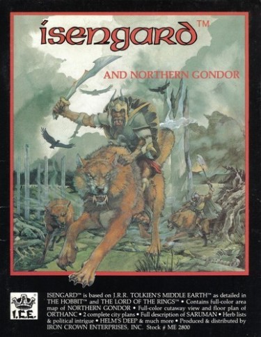
The above descriptor can best be realized on the cover of the 1983 Isengard and Northern Gondor. Here, the transition has begun in full. Gail brings forth action to be anticipated, and the muted colors found in Angmar and Ardor start to bleed into a finer pallet of her watercolor-born nature. Dulac and Rackham gain influence, especially the former, and a world of subtle romance transitions into Tolkien’s turn of the 19th century refinement.
However successful Isengard was at pushing Gail’s creative envelope, nothing could prepare the reader for what would come next. Between 1984 and 85, Gail produced four of the most beautiful supplements to any gaming universe the world has ever seen.
Here, on the covers of I.C.E.’s burgeoning adventure module series, Gail hit her mark like Robin Hood, each ‘arrow’ of her art splitting the next in precise succession of bull’s-eye atop bull’s-eye.
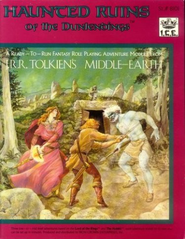
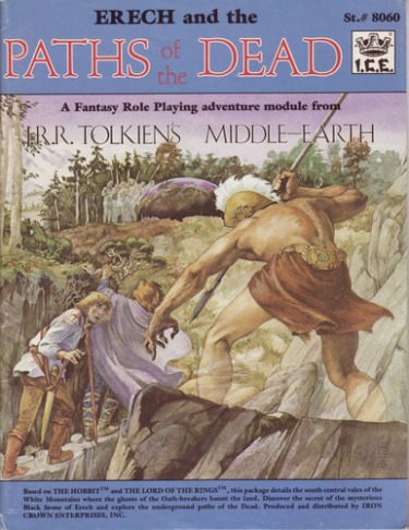
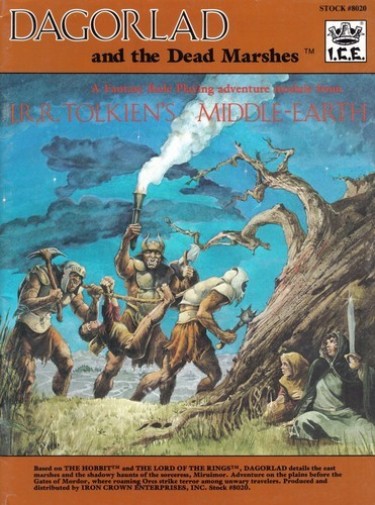
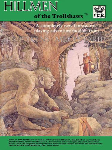
The modules Erech and the Paths of the Dead, Dagorlad and the Dead Marshes, Hillmen of the Trollshaws, and Haunted Ruins of the Dunlendings go beyond cover art to simply art as a masterpiece of human creation. These pieces combine everything that is good in Tolkien’s world with an artist both blossoming in skill and conquering of her craft.
I weep in happiness for the Rackham/Dulac flair and faith brought to these images. This is Middle-Earth before it was run about in Hollywood celluloid, and thus an overbearing splendor by Peter Jackson. To me, this style is THE Middle-Earth we should all know and love.
Gail ‘gets it’, she encompasses the fable, the whimsy and of course the regality of Tolkien’s vision while still providing the sword’s edge of adventure needed to sell the reader on participation in the world. That is the heart of it all, combining two opposed worlds and allowing them to make sense together.
We are gifted with lurking stone-skinned trolls amid the forest greens in Trollshaws, blessed with ghostly warriors in Paths, empowered with magical blade in Haunted Halls, and bound as captives and hunted fugitives amid the yellowed grass of Dagorlad.
There can be no mistake this is high fantasy, the ladies all garbed in dresses, and the men making more a show of the wandering poet than questing knight. There is no armor about, and even weapons show themselves as simple implements that serve a mundane purpose rather than artifacts to win a war.
It’s as if these covers whisper in words of old English, tales that use words like thence and hither-to. They are resplendent in ancient tradition, garbed in Nordic finery, and they come alive because they are reality based beyond the fantastic and yet truly otherworldly in subject.
Here, among these four covers, Gail becomes Queen of the Middle-Earth, each regal brushstroke adding another layer of beauty to a world already so rich it drips with splendor like the juice of an overripe mango down one’s fingers. She’s becomes the perfect complement to the venerable English Professor from Oxford, and I can almost see his smiling face, pipe in hand, as he views these works with apt appreciation for what she’s done.
This is Gail’s gift to our genre, and perhaps fantasy as a whole, and I hope everyone who sees these works will give them the credit they’re due. I, for one, will continue to wrest these aged and weathered modules from my shelf as time permits to remind myself that there is always a place for beauty next to a blade and that a male-dominated career path doesn’t mean that a woman can’t rise to the pinnacle.
Thank you, Gail, for showing us a collection of art that may very well have been missed if so many things didn’t align to make it so. You’re an inspiration to me and I’m sure many others. I give you my word that your work will not be forgotten as long as I have a voice to speak of it.
Marvelous!
> I would argue that the prettiest role-playing game ever produced was Iron Crown Enterprises the Middle-Earth Role-Playing.
Absolutely. The game quickly became VERY collectible as well, and a huge part of its appeal was the exceptional cover art. It wasn’t just excellent — it was totally different. Gail’s work turned a lot of heads.
[…] for some classic fantasy art? Check out Scott Taylor’s latest “Art of the Genre” article at Black Gate, focused on the ama…. The first part of the article details the background and work of Gail B. McIntosh with some […]
[…] This first introduction to the game didn’t include either of the two pillars of the MERP genre where art was concerned, but it was more than enough to get me hooked. After beginning play, I often went out looking for more information and adventures on the haunts of the Fellowship of the Ring and Bilbo Baggins, with the bulk of the supplementation during that early 80s timeline being covered by artist Gail B. McIntosh. […]
[…] can check out Part One of this series here and Part Two […]
[…] the Bronze Age, or the Wild West, King Arthur, horror movies, the fall of Moria, the Federation, Middle Earth, Jack Vance’s Dying Earth, Judge Dredd’s Mega-City One, the Marvel Universe… […]
[…] you’ve missed any of the previous posts concerning MERP, you can click the following for Part One, Part Two, and Part […]
[…] for some classic fantasy art? Check out Scott Taylor’s latest “Art of the Genre” article at Black Gate, focused on the ama…. The first part of the article details the background and work of Gail B. McIntosh with some […]
[…] was the first MERP book released in 1982 and authored by Heiki Kubasch. Cover art was done by Gail McIntosh, and like all of her work, not only depicted a great “action” scene, but one that […]